
Form-Based App with Widget Form
This topic explains how to create a widget form in the Modern Add an App Experience.
Background and Setup
Video: Form-Based App (Modern)
Video: Know Your App Builder IDE (Modern)
Prerequisites
- AgilePoint NX OnDemand (public cloud), or AgilePoint NX PrivateCloud or AgilePoint NX OnPremises v8.0 or higher.
Good to Know
- After you create a form-based app, you cannot change the app to use a different data source. For example, you can not change a form-based app to use a different entity or SharePoint list than the one specified when the app was created. This limitation also applies to cloned apps. That is, you cannot clone a form-based app, and then change the data source in the cloned app.
- Once configured, the primary data source in a data source bound app cannot be deleted. Deleting the primary data source can lead to unexpected behavior or errors in your app because it is the main source of data for the app.
- When you create a form-based app, these forms are created:
- New form
- Update form
- 3 types of View form:
- All Records - Shows all the records created for the form-based app.
- Recently Created Records - Shows the records created for the form-based app in the last 7 days.
- Recently Modified Records - Shows the records changed for the form-based app in the last 7 days.
A lookup is created for each view form.
How to Start
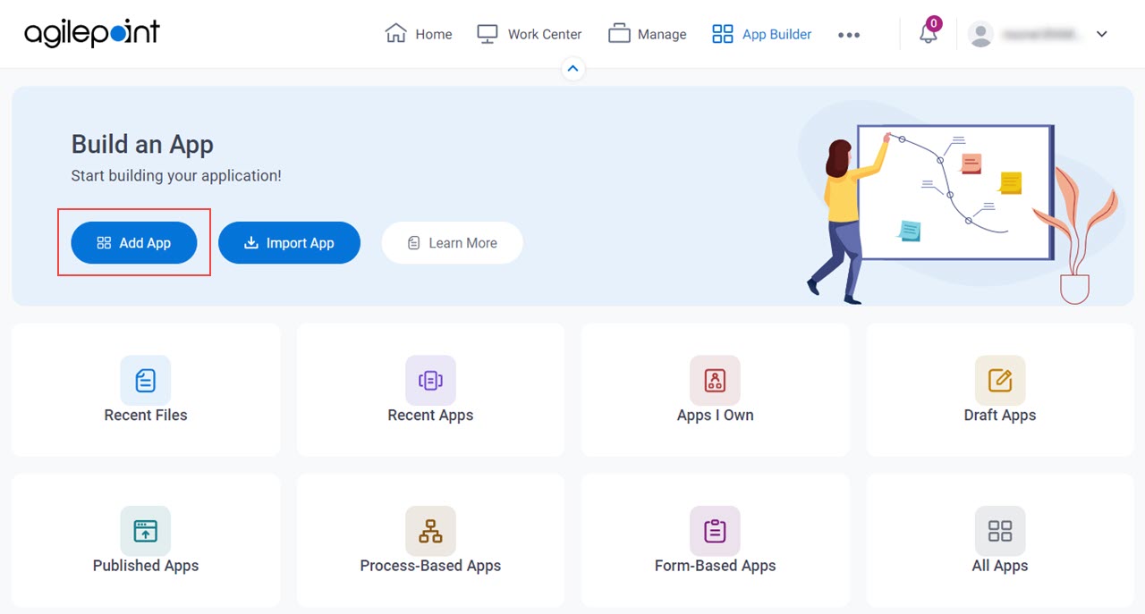
- Click App Builder.
- On the App Builder Home screen, click Add App.
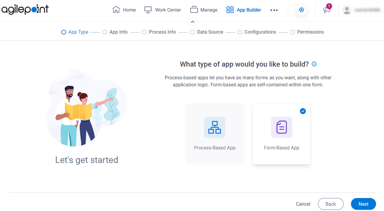
- On the What type of app would you like to build? screen, click Form-Based App.
What type of app would you like to build? screen
Configures the type of app to create.
Fields
| Field Name | Definition |
|---|---|
|
App Type |
|
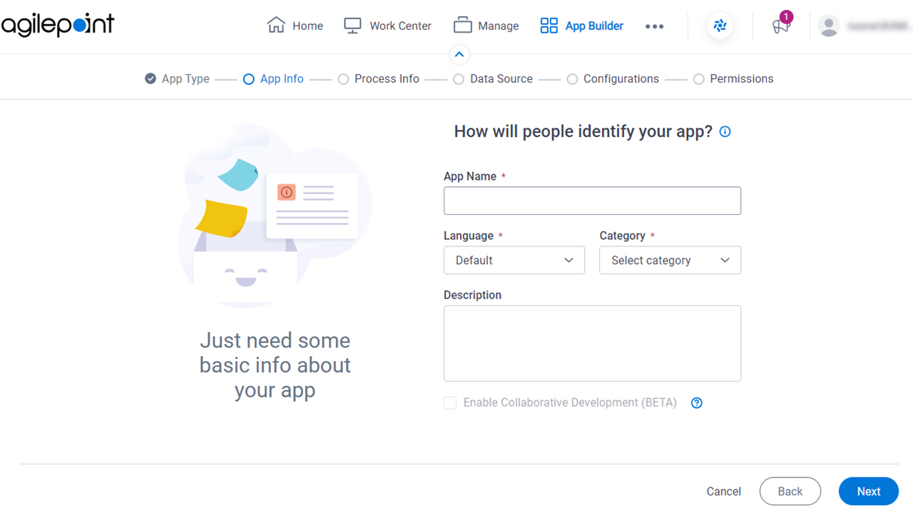
How will people identify your app? screen
Configures the basic information for your app.
Fields
| Field Name | Definition |
|---|---|
|
App Name |
|
|
Language |
|
Category |
|
|
Description |
|
|
Enable Collaborative Development |
|
Do you want create widget Form (not typical) screen
Specifies whether to create a widget form.
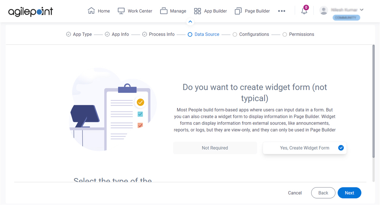
Fields
| Field Name | Definition |
|---|---|
Widget Form |
|
How do you want to set up your form? screen
Configures the basic settings for a widget form.
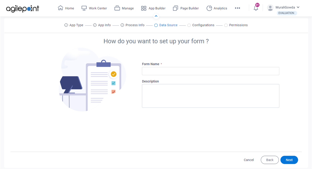
Fields
| Field Name | Definition |
|---|---|
|
Form Name |
|
|
Description |
|
Anything else right now? screen
Configures the optional features for your form-based app.
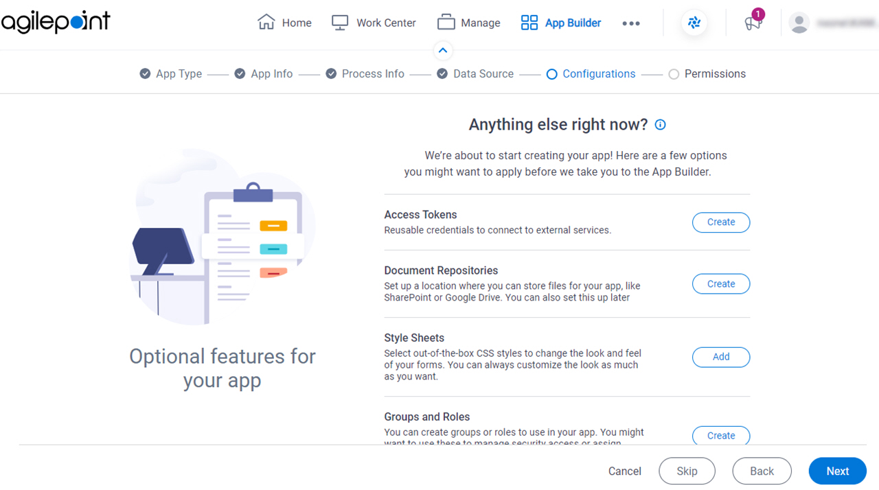
Fields
| Field Name | Definition |
|---|---|
|
Access Tokens |
|
|
Document Repositories |
|
|
Style Sheets | |
|
Groups and Roles |
|
|
Images |
|
|
JavaScript |
|
Who can access your app? screen
Configures the permission groups for an app.
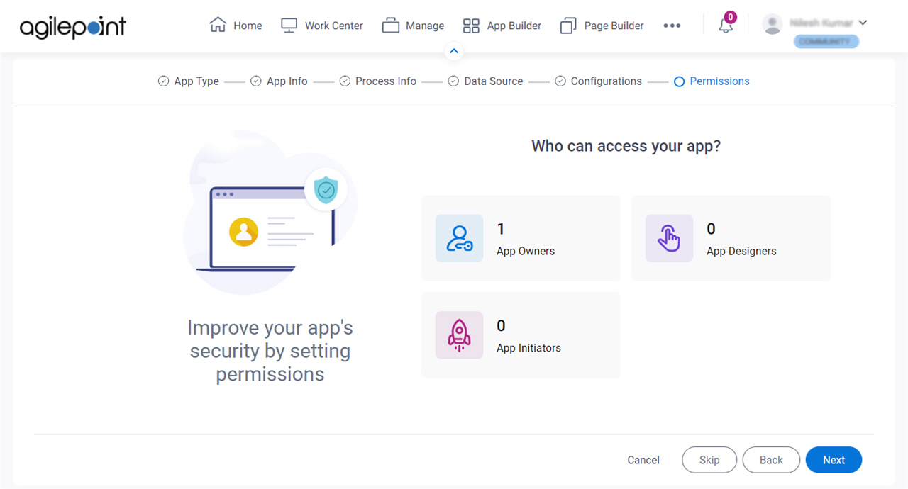
Fields
| Field Name | Definition |
|---|---|
|
App Owners |
|
|
App Designers |
|
|
App Initiators |
|