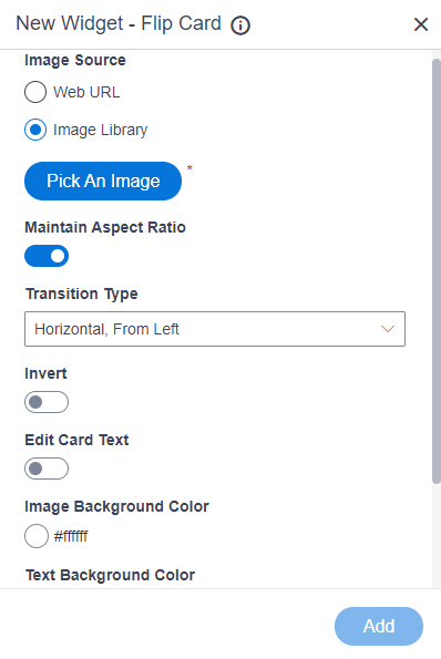
Image Source |
- Function:
- Specifies the source for an image to show on your flip card.
- Accepted Values:
-
- Default Value:
- Image Library
- Limitations:
- This field
is available in these releases:
|
Image URL |
- Function:
- Specifies the URL of the image to show on your flip card.
- To Open this Field:
-
- In the Image Source field, click Web URL.
- Accepted Values:
- One line of text (a string) in URL format that points to an image file.
The file can be one of these types:
- Default Value:
- None
- Example:
-
- https://mysite.com/demo/image/upload/Sample.jpg
- Refer to:
|
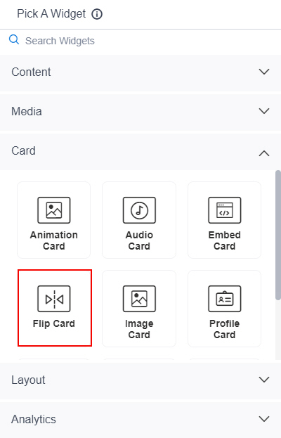
Pick An Image |
- Opens this Screen:
- Image Picker screen
- To Open this Field:
-
- In the Image Source field, click Image Library.
- Function of this Screen:
- Specifies an image file to show on your page or menu.
- Limitations:
- This field
is available in these releases:
|
Maintain Aspect Ratio |
- Function:
- Specifies whether to keep the image in its original size.
- Accepted Values:
-
- On - Keeps the image in its original size.
- Off - You can change the height or width of an image as necessary to show on the widget.
- Default Value:
- On
|
Image Height |
- Function:
- Specifies the height of an image.
- To Open this Field:
-
- On the Flip Card screen,
turn off the Maintain Aspect Ratio field.
- Accepted Values:
- An integer.
- Default Value:
- 200
|
Image Width |
- Function:
- Specifies the width of an image.
- To Open this Field:
-
- On the Flip Card screen,
turn off the Maintain Aspect Ratio field.
- Accepted Values:
- An integer.
- Default Value:
- 200
|
Unit |
- Function:
- Specifies the unit for the height or width of an image.
- To Open this Field:
-
- On the Flip Card screen,
turn off the Maintain Aspect Ratio field.
- Accepted Values:
-
- Pixels (px)
- Percentage (%)
- Default Value:
- Pixels (px)
|
Transition Type |
- Function:
- Specifies the transition type for an image
to turn in flip view.
- Accepted Values:
-
- Horizontal, From Left - The image turns from left to right.
- Horizontal, From Right - The image turns from right to left.
- Vertical, From Top - The image turns from top to bottom.
- Vertical, From Bottom - The image turns from bottom to top.
- Default Value:
- Horizontal, From Left
|
Invert |
- Function:
- Specifies whether to show an image or text when you mouse over the flip card.
- Accepted Values:
-
- On - Shows an image on the flip card.
- Off - Shows the text on the flip card.
- Default Value:
- Off
|
Edit Card Text |
- Function:
- Specifies whether to turn on the text mode on the flip card.
- Accepted Values:
-
- On - Turn on the text mode, and turn off the flip mode.
- Off - Turn off the text mode, and turn on the flip mode.
- Default Value:
- Off
|
Image Background Color |
- Function:
- Specifies the background color for the
flip image.
- Accepted Values:
- A color value using a hex code, RGB code, or RGBA code.
You can enter a color code, or select a color from the palette.
- Default Value:
- ffffff
- Example:
-
- #ff0000
- #183048
- #e16229
- rgb(25,151,66)
- rgba(87,177,201,2)
|
Text Background Color |
- Function:
- Specifies the background color for the
text to show in the flip card.
- Accepted Values:
- A color value using a hex code, RGB code, or RGBA code.
You can enter a color code, or select a color from the palette.
- Default Value:
- ffffff
- Example:
-
- #ff0000
- #183048
- #e16229
- rgb(25,151,66)
- rgba(87,177,201,2)
|
Hyperlink |
- Function:
- Specifies whether to make the card or button into a hyperlink.
- To Open this Field:
-
- Turn on the Hyperlink field.
- Accepted Values:
-
- On - Makes the card or button into hyperlink.
- Off - Shows the card on the custom page without a hyperlink.
- Default Value:
- Off
|
Link URL |
- Function:
- Specifies the URL to open a link when the user click the card or button.
- To Open this Field:
-
- Turn on the Hyperlink field.
- Accepted Values:
- One line of text (a string) in URL format.
- Default Value:
- None
- Example:
- https://mysite.com/mypage.html
|
Type of Link |
- Function:
- Specifies whether to make an entire card into a hyperlink.
- To Open this Field:
-
- Turn on the Hyperlink field.
- Accepted Values:
-
- Entire Card - Makes an entire card into a hyperlink.
- Button - Makes a button into a hyperlink.
- Default Value:
- Button
|
Button Settings - Background Color |
- Function:
- Specifies the background color for the
button.
- To Open this Field:
-
- Turn on the Hyperlink field.
- Select Button.
- Accepted Values:
- A color value using a hex code, RGB code, or RGBA code.
You can enter a color code, or select a color from the palette.
- Default Value:
- ffffff
- Example:
-
- #ff0000
- #183048
- #e16229
- rgb(25,151,66)
- rgba(87,177,201,2)
|
Button Settings - Text Color |
- Function:
- Specifies the color for the label text to show in the button.
- To Open this Field:
-
- Turn on the Hyperlink field.
- Select Button.
- Accepted Values:
- A color value using a hex code, RGB code, or RGBA code.
You can enter a color code, or select a color from the palette. - Default Value:
- 000000
- Example:
-
- #ff0000
- #183048
- #e16229
- rgb(25,151,66)
- rgba(87,177,201,2)
|
Button Text |
- Function:
- Specifies the text label for the button.
- To Open this Field:
-
- Turn on the Hyperlink field.
- Select Button.
- Accepted Values:
- One line of text that can have spaces.
- Default Value:
- Learn More
- Example:
-
|
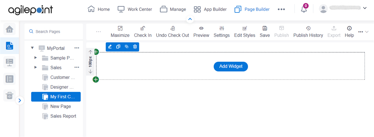
Add |
- Function:
- Adds the widget
to the custom page.
|
