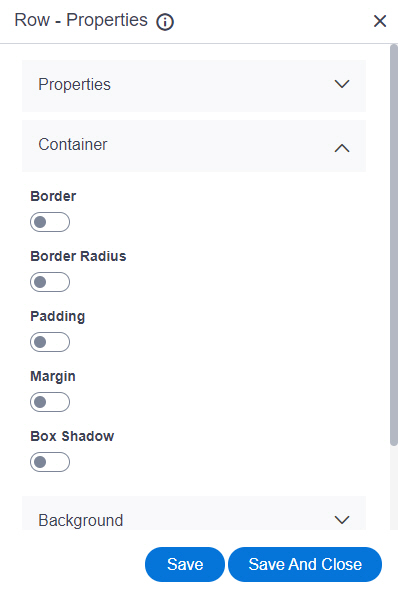
Border Style |
- Function:
- Specifies the border style around the row.
- To Open this Field:
-
- Turn on the Border field.
- Accepted Values:
-
- Dashed
- Dotted
- Double
- Groove
- Hidden
- Inset
- None
- Outset
- Ridge
- Solid
- Default Value:
- None
|
Border Left (px) |
- Function:
- Specifies the width in pixels for the left side border of the row.
- To Open this Field:
-
- Turn on the Border field.
- Accepted Values:
- A positive integer.
- Default Value:
- None
|
Border Right (px) |
- Function:
- Specifies the width in pixels for the right side border of the row.
- To Open this Field:
-
- Turn on the Border field.
- Accepted Values:
- A positive integer.
- Default Value:
- None
|
Border Bottom (px) |
- Function:
- Specifies the width in pixels for the bottom border of the row.
- To Open this Field:
-
- Turn on the Border field.
- Accepted Values:
- A positive integer.
- Default Value:
- None
|
Border Top (px) |
- Function:
- Specifies the width in pixels for the top border of the row.
- To Open this Field:
-
- Turn on the Border field.
- Accepted Values:
- A positive integer.
- Default Value:
- None
|
Border Color |
- Function:
- Specifies the border color for the row.
- To Open this Field:
-
- Turn on the Border field.
- Accepted Values:
- A color value using a hex code, RGB code, or RGBA code.
You can enter a color code, or select a color from the palette.
- Default Value:
- ffffff
- Example:
-
- #ff0000
- #183048
- #e16229
- rgb(25,151,66)
- rgba(87,177,201,2)
|
Border Radius Top Left (px) |
- Function:
- Specifies the radius in pixels for the top-left border of the row.
- To Open this Field:
-
- Turn on the Border Radius field.
- Accepted Values:
- A positive integer.
- Default Value:
- None
|
Border Radius Top Right (px) |
- Function:
- Specifies the radius in pixels
for the top-right border of the row.
- To Open this Field:
-
- Turn on the Border Radius field.
- Accepted Values:
- A positive integer.
- Default Value:
- None
|
Border Radius Bottom Left (px) |
- Function:
- Specifies the radius in pixels
for the bottom-left border of the row.
- To Open this Field:
-
- Turn on the Border Radius field.
- Accepted Values:
- A positive integer.
- Default Value:
- None
|
Border Radius Bottom Right (px) |
- Function:
- Specifies the radius in pixels
for the bottom-right border of the row.
- To Open this Field:
-
- Turn on the Border Radius field.
- Accepted Values:
- A positive integer.
- Default Value:
- None
|
Padding Top (px) |
- Function:
- Specifies space in pixels on the
top between the content and border of the row.
- To Open this Field:
-
- Turn on the Padding field.
- Accepted Values:
- A positive integer.
- Default Value:
- None
|
Padding Right (px) |
- Function:
- Specifies space in pixels on the right side
between the content and border of the row.
- To Open this Field:
-
- Turn on the Padding field.
- Accepted Values:
- A positive integer.
- Default Value:
- None
|
Padding Bottom (px) |
- Function:
- Specifies space in pixels on the bottom
between the content and border of the row.
- To Open this Field:
-
- Turn on the Padding field.
- Accepted Values:
- A positive integer.
- Default Value:
- None
|
Padding Left (px) |
- Function:
- Specifies space in pixels on the left side
between the content and border of the row.
- To Open this Field:
-
- Turn on the Padding field.
- Accepted Values:
- A positive integer.
- Default Value:
- None
|
Margin Top (px) |
- Function:
- Specifies space in pixels on the
top of the container, outside of the border.
- To Open this Field:
-
- Turn on the Margin field.
- Accepted Values:
- A positive integer.
- Default Value:
- None
|
Margin Right (px) |
- Function:
- Specifies space in pixels on the
right side of the container, outside of the border.
- To Open this Field:
-
- Turn on the Margin field.
- Accepted Values:
- A positive integer.
- Default Value:
- None
|
Margin Bottom (px) |
- Function:
- Specifies space in pixels on the bottom of the container, outside of the border.
- To Open this Field:
-
- Turn on the Margin field.
- Accepted Values:
- A positive integer.
- Default Value:
- None
|
Margin Left (px) |
- Function:
- Specifies space in pixels on the
left side of the container, outside of the border.
- To Open this Field:
-
- Turn on the Margin field.
- Accepted Values:
- A positive integer.
- Default Value:
- None
|
Shadow Color |
- Function:
- Specifies the shadow color for a row.
- To Open this Field:
-
- Turn on the Box Shadow field.
- Accepted Values:
- A color value using a hex code, RGB code, or RGBA code.
You can enter a color code, or select a color from the palette.
- Default Value:
- ffffff
|
Horizontal Offset (px) |
- Function:
- Specifies a horizontal distance in pixels between the shadow and the vertical line.
- To Open this Field:
-
- Turn on the Box Shadow field.
- Accepted Values:
-
- A positive whole number - Shows the box shadow on the right side of a row.
- A negative whole number - Shows the box shadow on the left side of a row.
- Default Value:
- 0
|
Vertical Offset (px) |
- Function:
- Specifies a vertical distance in pixels between the shadow and the horizontal line.
- To Open this Field:
-
- Turn on the Box Shadow field.
- Accepted Values:
-
- A positive whole number - Shows the box shadow on the bottom side of a row.
- A negative whole number - Shows the box shadow on the top side of a row.
- Default Value:
- 0
|
Blur (px) |
- Function:
- Specifies the number in pixels to create the blur effect on the box shadow.
- To Open this Field:
-
- Turn on the Box Shadow field.
- Accepted Values:
- A positive integer.
- Default Value:
- 0
|
Spread (px) |
- Function:
- Specifies the radius in pixels for a box shadow.
If the value is not specified, the shadow shows on the same size as the widget.
- To Open this Field:
-
- Turn on the Box Shadow field.
- Accepted Values:
-
- A positive whole number - Increases the size of a box shadow.
- A negative whole number - Decreases the size of a box shadow.
- Default Value:
- 0
|
Set Shadow Inside |
- Function:
- Specifies whether to show the box shadow into the row.
- To Open this Field:
-
- Turn on the Box Shadow field.
- Accepted Values:
-
- On - Shows the box shadow into the row.
- Off - Shows the box shadow outside the row.
- Default Value:
- Off
|
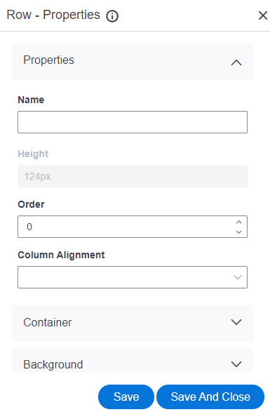
Save |
- Function:
- Saves your changes.
|
Save and Close |
- Function:
- Saves your changes
and closes the screen.
|
