
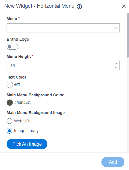
Horizontal Menu Wizard screen
Shows a horizontal menu on a custom page.
Video: Page Builder Overview
Examples
- (Example) Horizontal Menu Widget in Page Builder
- Examples - Step-by-step use case examples, information about what types of examples are provided in the AgilePoint NX Product Documentation, and other resources where you can find more examples.
Prerequisites
- AgilePoint NX OnDemand (public cloud), or AgilePoint NX Private Cloud or AgilePoint NX OnPremises v7.0 or higher.
How to Start
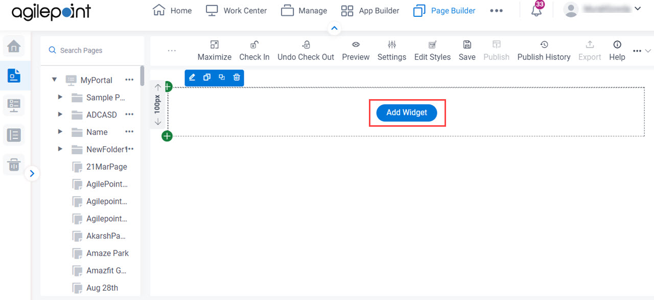
- Open the Custom Page Design screen.
For information about how to open this screen, refer to Custom Page Design screen.
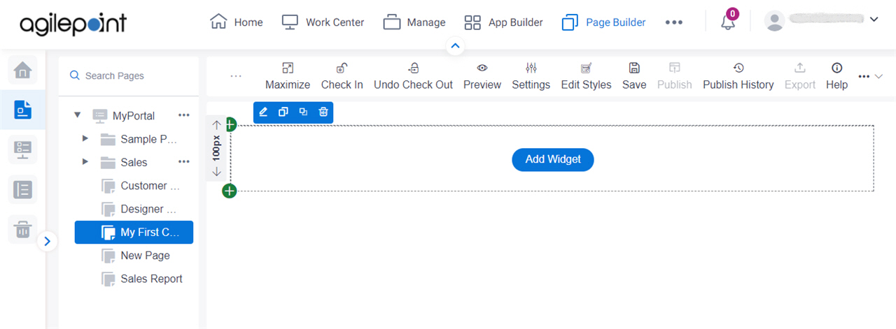
- Click Add Widget.
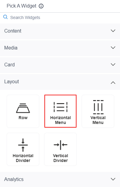
- On the Pick A Widget screen,
on the Layout tab, click Horizontal Menu.
Fields
| Field Name | Definition |
|---|---|
Menu |
|
Brand Logo |
|
Logo Source |
|
URL |
|
Pick An Image |
|
Logo Preview |
|
Menu Height |
|
Text Color |
|
Main Menu Background Color |
|
Main Menu Background Image |
|
Image URL |
|
Pick An Image |
|
Main Menu Background Repeat |
|
Submenu Background Color |
|
Submenu Background Image |
|
Image URL |
|
Pick An Image |
|
Submenu Background Repeat |
|
Main Menu Items Alignment |
|
Show Icons |
|
Icon Position |
|
Icon Width |
|
Menu State |
|
Font Family |
|
Font Size |
|
Bold |
|
Italic |
|
Underline |
|
Menu Item Foreground Color |
|
Menu Item Background Color |
|
Add |
|