Auto Width |
- Function:
- Specifies whether to change the width of an image in carousel view.
- To Open this Field:
-
- On the Image Carousel screen,
turn on the Customize Dimensions field.
- Accepted Values:
-
- Deselected - Enables the width field.
- Selected - Changes the width of an image in carousel view.
- Default Value:
- Deselected
|
Width (px) |
- Function:
- Specifies the width of an image.
- To Open this Field:
-
- On the Image Carousel screen,
turn on the Customize Dimensions field.
- Accepted Values:
- An integer.
- Default Value:
- 600
|
Height (px) |
- Function:
- Specifies the height of an image.
- To Open this Field:
-
- On the Image Carousel screen,
turn on the Customize Dimensions field.
- Accepted Values:
- An integer.
- Default Value:
- 600
|
Navigation Style |
- Function:
- Specifies the navigation pattern to show images in carousel view.
- To Open this Field:
-
- On the Image Carousel screen,
turn on the Navigation field.
- Accepted Values:
-
- Chevron - To navigate images in chevron pattern.
- Dots - To navigate images in dots pattern.
- Default Value:
- Deselected
|
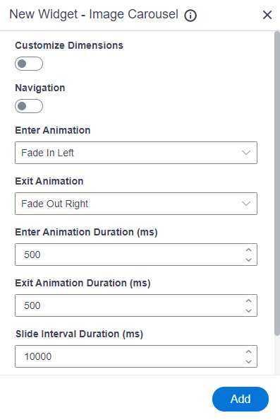
Enter Animation |
- Function:
- Specifies the transition type for an image to enter in carousel view.
- Accepted Values:
-
- Fade In
- Fade In Up
- Fade In Down
- Fade In Left
- Fade In Right
- Filp Horizontal
- Flip Vertical
- Zoom In
- Zoom In Up
- Zoom In Down
- Zoom In Left
- Zoom In Right
- Roll In
- Slide In Up
- Slide In Down
- Slide In Left
- Slide In Right
- Default Value:
- Fade In Left
|
Exit Animation |
- Function:
- Specifies the transition type for an image to exit in carousel view.
- Accepted Values:
-
- Fade Out
- Fade Out Up
- Fade Out Down
- Fade Out Left
- Fade Out Right
- Filp Horizontal
- Flip Vertical
- Zoom Out
- Zoom Out Up
- Zoom Out Down
- Zoom Out Left
- Zoom Out Right
- Roll Out
- Slide Out Up
- Slide Out Down
- Slide Out Left
- Slide Out Right
- Default Value:
- Fade Out Right
|
Enter Animation Duration (ms) |
- Function:
- Specifies the time duration in milliseconds (ms) for an image to enter in carousel view.
- Accepted Values:
- An integer.
- Default Value:
- 500
|
Exit Animation Duration (ms) |
- Function:
- Specifies the time duration in milliseconds (ms) for an image to exit in carousel view.
- Accepted Values:
- An integer.
- Default Value:
- 500
|
Slide Interval Duration (ms) |
- Function:
- Specifies the time duration in milliseconds (ms) for an image to show in carousel view.
- Accepted Values:
- An integer.
- Default Value:
- 10000
|
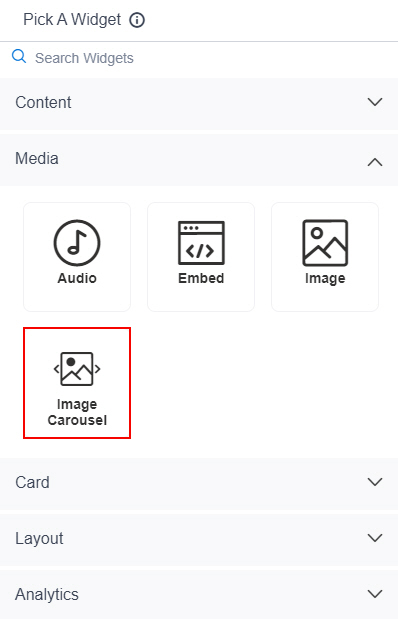
Image Source |
- Function:
- Specifies whether to select an image from the image library.
- To Open this Field:
-
- On the Image Carousel screen,
click Add Image.
- Accepted Values:
-
- Default Value:
- Web URL
- Limitations:
- This field
is available in these releases:
|
Image URL |
- Function:
- Specifies the URL of the image to show in the carousel view.
- To Open this Field:
-
- On the Image Carousel screen,
click Add Image.
- In the Image Source field, click Web URL.
- Accepted Values:
- One line of text (a string) in URL format that points to an image file.
The file can be one of these types:
- .png
- .jpg
- .jpeg
- .gif
- .bmp
- .tif
- Default Value:
- None
- Example:
-
- https://mysite.com/demo/image/upload/Sample.jpg
- Refer to:
- Limitations:
-
.jpeg and .tif format files are permitted, and .bmp format files are
not permitted in these releases:
|
Pick An Image |
- Opens this Screen:
- Image Picker screen
- To Open this Field:
-
- On the Image Carousel screen,
click Add Image.
- In the Image Source field, click Image Library.
- Function of this Screen:
- Specifies an image file to show on your page or menu.
- Limitations:
- This field
is available in these releases:
|
Image Caption |
- Function:
- Specifies the title for the image to show in the carousel view.
- To Open this Field:
-
- On the Image Carousel screen,
click Add Image.
- Accepted Values:
- One line of text that can have spaces.
- Default Value:
- None
|
Link URL |
- Function:
- Specifies the URL to open a link when the user click the image caption.
- To Open this Field:
-
- On the Image Carousel screen,
click Add Image.
- Turn on the Hyperlink field.
- Accepted Values:
- One line of text (a string) in URL format.
- Default Value:
- None
- Example:
- https://mysite.com/mypage.html
|
Open in New Tab |
- Function:
- Specifies whether to open the URL in a new tab.
- Accepted Values:
-
- On - The URL opens in a new tab.
- Off - The URL opens in the same tab.
- Default Value:
- Off
|
Delete |
- Function:
- Deletes the image that shows in the carousel view.
|
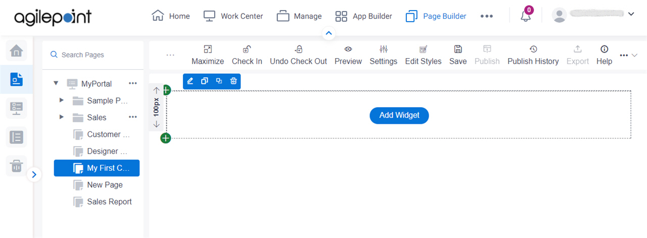
Add |
- Function:
- Adds the widget
to the custom page.
|
