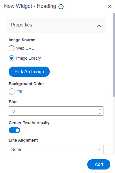
Image Source |
- Function:
- Specifies whether to select an image from the image library.
- Accepted Values:
-
- Default Value:
- Image Library
- Limitations:
- This field
is available in these releases:
|
Background Image URL |
- Function:
- Specifies the URL of an image file to set as a background for the
heading.
- To Open this Field:
-
- In the Image Source field, click Web URL.
- Accepted Values:
- One line of text (a string) in URL format that points to an image file.
The file can be one of these types:
- .png
- .jpg
- .jpeg
- .gif
- .bmp
- .tif
- Default Value:
- None
- Example:
- https://mysite.com/demo/image/upload/Sample.jpg
- Limitations:
-
.jpeg and .tif format files are permitted, and .bmp format files are
not permitted in these releases:
|
Pick An Image |
- Opens this Screen:
- Image Picker screen
- To Open this Field:
-
- In the Image Source field, click Image Library.
- Function of this Screen:
- Specifies an image file to show on your page or menu.
- Limitations:
- This field
is available in these releases:
|
Background Color |
- Function:
- Specifies the background color for the
heading.
- Accepted Values:
- A color value using a hex code, RGB code, or RGBA code.
You can enter a color code, or select a color from the palette.
- Default Value:
- ffffff
- Example:
-
- #ff0000
- #183048
- #e16229
- rgb(25,151,66)
- rgba(87,177,201,2)
|
Blur |
- Function:
- Specifies the number to create the blur effect on the background image.
- Accepted Values:
- A positive integer.
- Default Value:
- None
|
Center Text Vertically |
- Function:
- Specifies to center your heading vertically.
- Accepted Values:
-
- On - Center your heading vertically.
- Off - Top your heading vertically.
- Default Value:
- On
|
Line Alignment |
- Function:
- Specifies where to show the line in your heading.
- Accepted Values:
-
- None - The heading does not have a line.
- Line At Left - The line shows on the left side of your heading.
- Text Between Line - The line shows on both sides of your heading.
- Line At Right - The line shows on the right side of your heading.
- Default Value:
- None
- Limitations:
-
|
Line Thickness |
- Function:
- Specifies the thickness, in pixels, for the line associated with the heading.
- To Open this Field:
-
- In the Line Alignment field,
select one of these:
- Text Between Line
- Line At Left
- Line At Right
- Accepted Values:
- A positive integer.
- Default Value:
- 1
- Limitations:
-
|
Line Color |
- Function:
- Specifies the color for the line associated with the heading.
- To Open this Field:
-
- In the Line Alignment field,
select one of these:
- Text Between Line
- Line At Left
- Line At Right
- Accepted Values:
- A color value using a hex code, RGB code, or RGBA code.
You can enter a color code, or select a color from the palette. - Default Value:
- 000000
- Example:
-
- #ff0000
- #183048
- #e16229
- rgb(25,151,66)
- rgba(87,177,201,2)
- Limitations:
-
|
Line Style |
- Function:
- Specifies the style for the line associated with the heading.
- To Open this Field:
-
- In the Line Alignment field,
select one of these:
- Text Between Line
- Line At Left
- Line At Right
- Accepted Values:
-
- Default Value:
- Solid
- Limitations:
-
|
Vertical Offset |
- Function:
- Specifies a vertical distance between the heading and the horizontal line.
- To Open this Field:
-
- In the Line Alignment field,
select one of these:
- Text Between Line
- Line At Left
- Line At Right
- Accepted Values:
- An integer.
- Default Value:
- 0
- Limitations:
-
|
Repeat Image |
- Function:
- Specifies whether the background image is repeated vertically.
- Accepted Values:
-
- On - The background image repeats vertically.
- Off - The background image does not repeat. The image shows one time.
- Default Value:
- On
|
Preview |
- Function:
- Shows the preview of your heading.
|
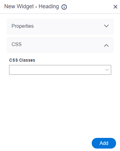
Add |
- Function:
- Adds the widget
to the custom page.
|
