
Configure the Settings for an eForm
To configure the settings for your eForm, do the procedure in this topic.
Video: eForm Builder Interface
Video: Create Your First eForm
Video: Show the Save Button on an eForm
Video: Hide the Top Banner on an eForm
Examples
- (Example) Configure the Form Settings for the Create Absence Request eForm
- Examples - Step-by-step use case examples, information about what types of examples are provided in the AgilePoint NX Product Documentation, and other resources where you can find more examples.
How to Start
- On the Application Explorer screen, do one of these:
- On the eForm Builder screen, click Settings
 .
.
Procedure
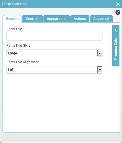
- On the Form Settings screen, in the General tab, complete these fields
as necessary.
Field Name Definition Form Title
- Function:
- Specifies the title text for your eForm.
- Accepted Values:
- More than one line of text that can have letters, numbers, spaces, and special characters.
- Default Value:
- None
- Example:
- Refer to:
Form Title Style
- Function:
- Specifies the size of the title for your eForm.
- Accepted Values:
- Small
- Medium
- Large
- Extra Large
- Default Value:
- Large
- Example:
- Refer to:
Form Title Alignment
- Function:
- Specifies the position of the title for your eForm.
- Accepted Values:
- Left
- Center
- Right
- Default Value:
- Left
- Example:
- Refer to:
- On the Controls tab, complete these fields
as necessary.
Field Name Definition Label Position
- Function:
- Specifies the position of the text label that shows on your form for the control.
- Accepted Values:
- Left - Specifies that the position of the label is to the left of the container.
- Top - Specifies that the position of the label is to the top of the container.
- Default Value:
- Top
- Example:
- Refer to:
Tab Key Orientation
- Function:
- Specifies the direction form controls are selected when a form user presses the Tab key.
- Accepted Values:
- Horizontal - The cursor moves horizontally when Tab key is used.
- Vertical - The cursor moves vertically when Tab key is used.
- Default Value:
- Horizontal
- Example:
- Refer to:
- On the Appearance tab, complete these fields
as necessary.
Field Name Definition Font Family
- Function:
- Specifies the font family of the input text and label.
- Accepted Values:
- A font name from the list.
- Default Value:
- Arial
- Example:
- Refer to:
Font Size (px)
- Function:
- Specifies the size of the input text and label for your form control.
- Accepted Values:
- A positive integer.
- Default Value:
- 12
- Example:
- Refer to:
Font Style
- Function:
- Specifies the style of the font for the input text and label.
- Accepted Values:
-
- Bold - Shows the input text and label in bold.
- Underline - Shows the label underlined.
- Italic - Shows the label in italic.
- Default Value:
- None
- Example:
- Refer to:
Background Color
- Function:
- Specifies the background color for your control.
- Accepted Values:
- A color value using a hex code, RGB code, or RGBA code.
You can enter a color code, or select a color from the palette.
- Default Value:
- #ff0000
- Example:
- Refer to:
Form Title Color
- Function:
- Specifies the foreground color for your control.
- Accepted Values:
- A color value using a hex code, RGB code, or RGBA code.
You can enter a color code, or select a color from the palette.
- Default Value:
- #ff0000
- Example:
- Refer to:
Set Image
- Opens this Screen:
- Image Picker screen
- Function of this Screen:
- Specifies an image for your eForm.
- Example:
- Refer to:
Image Position
- Opens this Screen:
- Background Image Position screen
- Function of this Screen:
- Specifies the position of background image of your eForm.
- Example:
- Refer to:
Apply Global CSS
- Function:
- Specifies whether to use the global CSS file on the eForm.
- Accepted Values:
-
- Selected - The eForm uses the global CSS file.
- Deselected - The eForm does not use global CSS file.
- Default Value:
- Selected
- Limitations:
-
This field is available in these releases:
- AgilePoint NX OnDemand (public cloud)
- AgilePoint NX PrivateCloud or AgilePoint NX OnPremises v7.0 Software Update 2 or higher
CSS Class
- Function:
- Specifies a CSS class for the container of your control.
- Accepted Values:
- A valid CSS class.
- Default Value:
- None
If you specify your CSS
 on the top menu, the CSS is populated.
 - Example:
- Refer to:
Show Form Background to User
- Function:
- Specifies whether to show the eForm container background at runtime.
- Accepted Values:
- Yes - Shows the eForm container background.
- No - The eForm page size expands to the page borders, and the eForm container background does not show.
- Default Value:
- Yes
- Limitations:
-
This field is available in these releases:
- AgilePoint NX OnDemand (public cloud)
- AgilePoint NX PrivateCloud or AgilePoint NX OnPremises v7.0 Software Update 2 or higher
Show Header to Form User
- Function:
- Specifies whether to show the top section of an eForm page to runtime app user.
- Accepted Values:
- Yes - Shows the top section of an eForm page to runtime app user.
- No - Hides the top section of an eForm page and aligns the lower sections with the top of the page.
- Default Value:
- Yes
- Limitations:
-
This field is available in these releases:
- AgilePoint NX OnDemand (public cloud)
- AgilePoint NX PrivateCloud or AgilePoint NX OnPremises v7.0 Software Update 2 or higher
- On the Actions tab, complete these fields
as necessary.
Field Name Definition Show Submit Button
- Function:
- Specifies if the eForm shows the submit button.
- Accepted Values:
-
- Selected - The submit button shows, and you can specify custom text.
- Deselected - The submit button does not show.
- Default Value:
- Selected
- Example:
- Refer to:
Show Cancel Button
- Function:
- Specifies if the eForm shows a cancel button.
- Accepted Values:
-
- Selected - The cancel button shows, and you can specify a custom text for the cancel button.
- Deselected - The cancel button does not show.
- Default Value:
- Selected
- Example:
- Refer to:
Show Save Button
- Function:
- Specifies if the eForm shows the save button.
- Accepted Values:
-
- Selected - The Save button shows, and you can specify custom text.
- Deselected - The Save button does not show.
- Default Value:
- Deselected
- Example:
- Refer to:
Show Reset Button
- Function:
- Specifies if the eForm shows the reset button.
- Accepted Values:
-
- Selected - The reset button shows and lets you specify a custom text for the reset button.
- Deselected - The reset button does not show.
- Default Value:
- Deselected
- Example:
- Refer to:
Show Print Button
- Function:
- Specifies if the eForm shows the print button.
- Accepted Values:
-
- Selected - The print button shows and lets you specify a custom text for the print button.
- Deselected - The print button does not show.
- Default Value:
- Deselected
- Example:
- Refer to:
Show Save as PDF Button
- Function:
- Specifies if the eForm shows the Save as PDF button.
- Accepted Values:
-
- Selected - The Save as PDF button shows and lets you specify a custom text for the save as PDF button.
- Deselected - The Save as PDF button does not show.
- Default Value:
- Deselected
- Example:
- Refer to:
Action Buttons Position
- Function:
- Specifies the positions of the action buttons in the eForm.
- Accepted Values:
-
- Left - The action button shows to the left in the eForm.
- Center - The action button shows to the center in the eForm.
- Right - The action button shows to the right in the eForm.
- Default Value:
- None
- Example:
- Refer to:
URL on Submit
URL on Cancel
- On the Advanced tab, complete these fields
as necessary.
Field Name Definition Cell Padding (px)
- Function:
- Specifies the space, in pixels, between the cell wall and the cell content.
- Accepted Values:
- An integer between 5 and 50.
- Default Value:
- 10
- Example:
- Refer to:
Row Spacing (px)
- Function:
- Specifies the space, in pixels, between the rows of the eForm.
- Accepted Values:
- An integer up to 50.
- Default Value:
- 0
- Example:
- Refer to:
Show Header to Form User
- Function:
- Specifies if the eForm header shows when the eForm opens.
- Accepted Values:
-
- Yes - Shows the header.
- No - Does not show the header.
- Default Value:
- Yes
- Example:
- Refer to:
Enable Multiple Languages on the Form
- Function:
- Specifies if the form user can select a language from a list of available languages in the eForm.
- Accepted Values:
-
- Selected - You can select more than one language in the eForm.
- Deselected - You can not select more than one language in the eForm.
- Default Value:
- Deselected
- Example:
- Refer to:
Allow User to Switch Form Language
- Function:
- Specifies if the form user can change the language in the eForm.
- To Open this Field:
-
- Select Enable Multiple Languages on the Form.
- Accepted Values:
-
- Selected - Lets the form user change the language in the eForm.
- Deselected - The language shows in the eForm based on the form user's settings.
- Default Value:
- Deselected
- Example:
- Refer to:
Default Language Name
- Function:
- Specifies the default language to show on an eForm.
- To Open this Field:
-
- Select Allow User to Switch Form Language.
- Accepted Values:
- A language from the list.
- Default Value:
- None
- Example:
- Refer to:
Show Validation Summary
- Function:
- Specifies whether the eForm shows all the validation messages.
- Accepted Values:
-
- Selected - The summary of validation messages shows in the form preview or when the eForm opens.
- Deselected - The summary of validation messages does not show.
- Default Value:
- Deselected
- Example:
- Refer to:
Ask Confirmation On Submit
Ask Confirmation On Save
Submit Validation Fail Message
Section Validation Fail Message (For Sections with Sequential Navigation Style)
- Function:
- Specifies a validation message that shows when the form user submits an eForm that has validation errors in the form section.
- Accepted Values:
- One line of text that can have spaces.
- Default Value:
- Validation Fails. Cannot be navigated.
- Example:
- Refer to: