
Configure the Sections for an eForm
To configure the settings for form sections, do the procedure in this topic.
Video: eForm Builder Interface
Video: Form Designer Overview
Video: Salesforce Query and Second Form
Examples
- (Example) Configure the Form Settings for the Create Absence Request eForm
- (Example) Create the Form Sections for the Set Available Leave Hours eForm
- (Example) Set Sections for the Manager Approval eForm
- Examples - Step-by-step use case examples, information about what types of examples are provided in the AgilePoint NX Product Documentation, and other resources where you can find more examples.
Good to Know
- You can configure
validation rules and display rules for specific form sections. For more information, refer to:
How to Start
- On the Application Explorer screen, do one of these:
- On the eForm Builder screen, click Sections
 .
.
Procedure
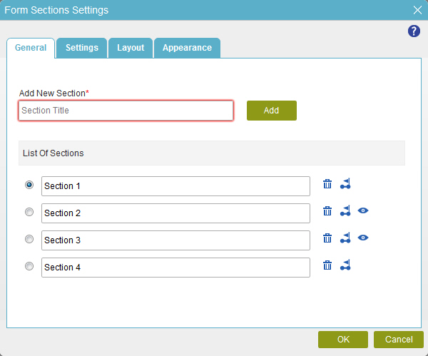
- On the Form Section Settings screen, in the General tab, complete these fields
as necessary.
- On the Settings tab, complete these fields
as necessary.
Field Name Definition Navigation Style
- Function:
- Specifies how the form user can go through the form section.
- Accepted Values:
-
- Sequential - Lets the form user go through the sections in a specified sequence.
- Adhoc - Lets the form user go to any section.
- Default Value:
- Sequential
- Example:
- Refer to:
Show Navigation Bar
- Function:
- Specifies if the navigation bar shows on the eForm.
- Accepted Values:
-
- Yes - Shows the navigation bar in the eForm.
- No - Does not the navigation bar in the eForm.
- Default Value:
- Yes
- Example:
- Refer to:
Next Button Text
- Function:
- Specifies the text to show on your next button.
- Accepted Values:
- One line of text that can have spaces
- Default Value:
- Next
- Example:
- Refer to:
Set Fixed Height
- Function:
- Specifies if the sections are set to a specified height.
- Accepted Values:
-
- Yes - The sections have a fixed height.
- No - The sections do not have a fixed height.
- Default Value:
- Yes
- Example:
- Refer to:
Clickable Navigation Bar
- Function:
- Specifies if the form user can click the navigation bar to go to a different form section.
- Accepted Values:
-
- Yes - The form user can click the navigation bar.
- No - The form user can not click the navigation bar.
- Default Value:
- Yes
- Example:
- Refer to:
Previous Button Text
- Function:
- Specifies the text to show on your previous button.
- Accepted Values:
- One line of text that can have spaces
- Default Value:
- Previous
- Example:
- Refer to:
Execute Display Rules on Form Load also
- Function:
- Specifies whether to run the display rules for the form section.
- Accepted Values:
-
- Yes - The display rules run when the form shows.
- No - The display rules do not run when the form shows.
- Default Value:
- Yes
- Example:
- Refer to:
- On the Layout tab, complete these fields
as necessary.
Field Name Definition Navigation Bar Style
- Function:
- Specifies the style of the navigation bar.
- Accepted Values:
- A list of navigation bar styles.
- Default Value:
- The first navigation bar style.
- Example:
- Refer to:
Navigation Bar Position
- Function:
- Specifies the position of the navigation bar.
- Accepted Values:
- Top
- Left
- Right
- Bottom
- Default Value:
- Top
- Example:
- Refer to:
Pagination Buttons Position
- Function:
- Specifies the position of the page navigation buttons.
- Accepted Values:
- Bottom Right
- Bottom Left
- Bottom Center
- Bottom Left and Right
- Top Left
- Top Right
- Top Center
- Top Left and Right
- Default Value:
- Bottom Right
- Example:
- Refer to:
- On the Appearance tab, complete these fields
as necessary.
Field Name Definition Background
- Function:
- Specifies the background color for your navigation bar.
- Accepted Values:
- A color value using a hex code, RGB code, or RGBA code.
You can enter a color code, or select a color from the palette.
- Default Value:
- #ff0000
- Example:
- Refer to:
Title Background
- Function:
- Specifies the title background color of your navigation bar.
- Accepted Values:
- A color value using a hex code, RGB code, or RGBA code.
You can enter a color code, or select a color from the palette.
- Default Value:
- #ff0000
- Example:
- Refer to:
Title Foreground
- Function:
- Specifies the title foreground color of your navigation bar.
- Accepted Values:
- A color value using a hex code, RGB code, or RGBA code.
You can enter a color code, or select a color from the palette.
- Default Value:
- #ff0000
- Example:
- Refer to:
Selected Title Background
- Function:
- Specifies the title background color of the selected navigation bar.
- Accepted Values:
- A color value using a hex code, RGB code, or RGBA code.
You can enter a color code, or select a color from the palette.
- Default Value:
- #ff0000
- Example:
- Refer to:
Selected Title Foreground
- Function:
- Specifies the title foreground color of selected navigation bar.
- Accepted Values:
- A color value using a hex code, RGB code, or RGBA code.
You can enter a color code, or select a color from the palette.
- Default Value:
- #ff0000
- Example:
- Refer to:
Visited Title Background
- Function:
- Specifies the title background color of the section of the navigation bar the form user has opened before.
- Accepted Values:
- A color value using a hex code, RGB code, or RGBA code.
You can enter a color code, or select a color from the palette.
- Default Value:
- #ff0000
- Example:
- Refer to:
Visited Title Foreground
- Function:
- Specifies the title foreground color of the section of the navigation bar the form user has opened before.
- Accepted Values:
- A color value using a hex code, RGB code, or RGBA code.
You can enter a color code, or select a color from the palette.
- Default Value:
- #ff0000
- Example:
- Refer to:
Title Hover Background
- Function:
- Specifies the title background color of the navigation bar when the form user hovers the cursor over it.
- Accepted Values:
- A color value using a hex code, RGB code, or RGBA code.
You can enter a color code, or select a color from the palette.
- Default Value:
- #ff0000
- Example:
- Refer to:
Title Hover Foreground
- Function:
- Specifies the title foreground color of the navigation bar when the form user hovers the cursor over it.
- Accepted Values:
- A color value using a hex code, RGB code, or RGBA code.
You can enter a color code, or select a color from the palette.
- Default Value:
- #ff0000
- Example:
- Refer to:
Background (Section Style)
- Function:
- Specifies the background color of the form section.
- Accepted Values:
- A color value using a hex code, RGB code, or RGBA code.
You can enter a color code, or select a color from the palette.
- Default Value:
- #ff0000
- Example:
- Refer to:
Show Border
- Function:
- Specifies if the eForm shows a border around the panel.
- Accepted Values:
-
- Deselected - Shows no border.
- Selected - Shows the border.
- Default Value:
- Selected
- Example:
- Refer to:
Border Width (px)
- Function:
- Specifies the width of the border in pixels.
- Accepted Values:
- 1
- 2
- 3
- 4
- 5
- Default Value:
- 1
- Example:
- Refer to:
Border Color
- Function:
- Specifies the border color for your control.
- Accepted Values:
- A color value using a hex code, RGB code, or RGBA code.
You can enter a color code, or select a color from the palette.
- Default Value:
- #ff0000
- Example:
- Refer to:

