Shows a metro card on a custom page .
Figure: Metro Card Widget screen
How to Start
Click Build Pages
On the Pages screen ,
do one of these
Create a Custom Page
Click Add Row .
Open a custom page
Click the bottom horizontal line of the row or right side vertical line of the row or column.Click Add
Click Add Widget .
On the Pick a Widget screen ,
on the Card tab, clickMetro Card
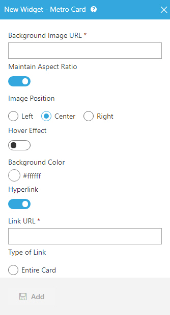
Fields
Field Name
Definition
Background Image URL
Function:
Specifies the URL of an image file to set as a background for the metro card.
Accepted Values:
A string in URL format that points to an image file.
The file can be one of these types :
.png
.jpg
.jpeg
.gif
.tif
Default Value:
None Example:
https://mysite.com/demo/image/upload/Sample.jpg Refer to :
Maintain Aspect Ratio
Function:
Specifies whether to keep the image in its original size.
Accepted Values:
On - Keeps the image in its original size.Off - You can change the height or width of an image as necessary to show on the widget.
Default Value:
On
Image Height
Function:
Specifies the height of an image.
To Open this Field:
On the Metro Card screen,
turn off the Maintain Aspect Ratio field .
Accepted Values:
An integer .Default Value:
200
Image Width
Function:
Specifies the width of an image.
To Open this Field:
On the Metro Card screen,
turn off the Maintain Aspect Ratio field .
Accepted Values:
An integer .Default Value:
200
Unit
Function:
Specifies the unit for the height or width of an image.
To Open this Field:
On the Metro Card screen,
turn off the Maintain Aspect Ratio field .
Accepted Values:
Pixels (px)
Percentage (%)
Default Value:
Pixels (px)
Image Position
Function:
Specifies the position of an image .Accepted Values:
Left - Shows an image on the left side of the metro card.Center - Shows an image at the center of the metro card.Right - Shows an image on the right side of the metro card.
Default Value:
Center
Hover Background Color
Function:
Specifies the background color for the
metro card when you mouse over it.To Open this Field:
On the Metro Card screen, turn on Hover Effect .
Accepted Values:
A color value using a hex code, RGB code, or RGBA code .
You can enter a color code, or select a color from the palette.
Default Value:
ffffff
Example:
#ff0000
#183048
#e16229
rgb(25,151,66)
rgba(87,177,201,2)
Background Color
Function:
Specifies the background color for the metro card.Accepted Values:
A color value using a hex code, RGB code, or RGBA code .
You can enter a color code, or select a color from the palette.
Default Value:
ffffff
Example:
#ff0000
#183048
#e16229
rgb(25,151,66)
rgba(87,177,201,2)
Link URL
Function:
Specifies the URL to open a link when the user click the card or button.
To Open this Field:
Turn on the Hyperlink field .
Accepted Values:
A string in URL format .Default Value:
None Example:
https://mysite.com/mypage.html
Type of Link
Function:
Specifies whether to make an entire card into a hyperlink.
To Open this Field:
Turn on the Hyperlink field .
Accepted Values:
Entire Card - Makes an entire card into a hyperlink.Button - Makes a button into a hyperlink.
Default Value:
Button
Button - Background Color
Function:
Specifies the background color for the
button.To Open this Field:
Turn on the Hyperlink field .Select Button .
Accepted Values:
A color value using a hex code, RGB code, or RGBA code .
You can enter a color code, or select a color from the palette.
Default Value:
ffffff
Example:
#ff0000
#183048
#e16229
rgb(25,151,66)
rgba(87,177,201,2)
Button - Text Color
Function:
Specifies the color for the label text to show in the button.
To Open this Field:
Turn on the Hyperlink field .Select Button .
Accepted Values:
A color value using a hex code, RGB code, or RGBA code .
You can enter a color code, or select a color from the palette.
Default Value:
000000
Example:
#ff0000
#183048
#e16229
rgb(25,151,66)
rgba(87,177,201,2)
Button Text
Function:
Specifies the text label for the button.
To Open this Field:
Turn on the Hyperlink field .Select Button .
Accepted Values:
One line of text that can have spaces .Default Value:
Learn More
Example:
Add
Function:
Adds the widget

 .
. .
. .
.