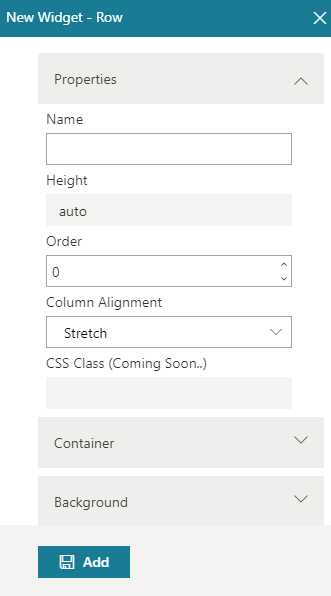
Name |
- Function:
- Specifies the name of the row.
- Accepted Values:
- One line of text that can have spaces.
- Default Value:
- None
|
Height |
- Function:
- Shows the height of the row in pixels.
To change the height of row, refer Add Section field in the
Custom Page Design screen.
- Accepted Values:
- Read only.
|
Order |
- Function:
- Specifies in which order the row shows on a custom page.
- Accepted Values:
- A positive integer.
|
Column Alignment |
- Function:
- Specifies whether to stretch the column to completely fill the width.
- Accepted Values:
-
- Stretch - Stretches the column to completely fill the width.
- Center - Column is aligned in center.
- Default Value:
- Stretch
|
Border Style |
- Function:
- Specifies the border style around the row.
- To Open this Field:
-
- Turn on the Border field.
- Accepted Values:
-
- Dashed
- Dotted
- Double
- Groove
- Hidden
- Inset
- None
- Outset
- Ridge
- Solid
- Default Value:
- None
|
Border Left (px) |
- Function:
- Specifies the width in pixels for the left side border of the row.
- To Open this Field:
-
- Turn on the Border field.
- Accepted Values:
- A positive integer.
- Default Value:
- None
|
Border Right (px) |
- Function:
- Specifies the width in pixels for the right side border of the row.
- To Open this Field:
-
- Turn on the Border field.
- Accepted Values:
- A positive integer.
- Default Value:
- None
|
Border Bottom (px) |
- Function:
- Specifies the width in pixels for the bottom border of the row.
- To Open this Field:
-
- Turn on the Border field.
- Accepted Values:
- A positive integer.
- Default Value:
- None
|
Border Top (px) |
- Function:
- Specifies the width in pixels for the top border of the row.
- To Open this Field:
-
- Turn on the Border field.
- Accepted Values:
- A positive integer.
- Default Value:
- None
|
Padding Top (px) |
- Function:
- Specifies space in pixels on the
top between the content and border of the row.
- To Open this Field:
-
- Turn on the Padding field.
- Accepted Values:
- A positive integer.
- Default Value:
- None
|
Padding Right (px) |
- Function:
- Specifies space in pixels on the right side
between the content and border of the row.
- To Open this Field:
-
- Turn on the Padding field.
- Accepted Values:
- A positive integer.
- Default Value:
- None
|
Padding Bottom (px) |
- Function:
- Specifies space in pixels on the bottom
between the content and border of the row.
- To Open this Field:
-
- Turn on the Padding field.
- Accepted Values:
- A positive integer.
- Default Value:
- None
|
Padding Left (px) |
- Function:
- Specifies space in pixels on the left side
between the content and border of the row.
- To Open this Field:
-
- Turn on the Padding field.
- Accepted Values:
- A positive integer.
- Default Value:
- None
|
Margin Top (px) |
- Function:
- Specifies space in pixels on the
top of the container, outside of the border.
- To Open this Field:
-
- Turn on the Margin field.
- Accepted Values:
- A positive integer.
- Default Value:
- None
|
Margin Right (px) |
- Function:
- Specifies space in pixels on the
right side of the container, outside of the border.
- To Open this Field:
-
- Turn on the Margin field.
- Accepted Values:
- A positive integer.
- Default Value:
- None
|
Margin Bottom (px) |
- Function:
- Specifies space in pixels on the bottom of the container, outside of the border.
- To Open this Field:
-
- Turn on the Margin field.
- Accepted Values:
- A positive integer.
- Default Value:
- None
|
Background Color |
- Function:
- Specifies the background color for the row.
- Accepted Values:
- A color value using a hex code, RGB code, or RGBA code.
You can enter a color code, or select a color from the palette.
- Default Value:
- ffffff
- Example:
-
- #ff0000
- #183048
- #e16229
- rgb(25,151,66)
- rgba(87,177,201,2)
|
Background Image URL |
- Function:
- Specifies the URL of an image file to set as a background for the row.
- Accepted Values:
- A string in URL format that points to an image file.
The file can be one of these types:
- .png
- .jpg
- .jpeg
- .gif
- .bmp
- .tif
- Default Value:
- None
- Example:
- https://mysite.com/demo/image/upload/Sample.jpg
- Limitations:
-
.jpeg and .tif format files are permitted, and .bmp format files are
not permitted in these releases:
|
Stretch Background Image |
- Function:
- Specifies whether to stretch the background image to fully fill the row.
- Accepted Values:
-
- On - Stretches the background image to fully fill the row.
- Off - Shows the background image in original size. You can set the
background image of the row to be repeated.
- Default Value:
- Off
|
Repeat Mode |
- Function:
- Specifies whether the background image of the row is repeated.
- To Open this Field:
-
- Turn off Stretch Background Image.
- Accepted Values:
-
- Don't Repeat - The background image does not repeat. The image shows one time.
- Repeat Mode - The background image repeats both vertically and horizontally.
- Repeat Horizontally - The background image repeats horizontally.
- Repeat Vertically - The background image repeats vertically.
- Default Value:
- None
|
Add |
- Function:
- Adds the widget
to your custom page.
|

 .
. .
. .
.