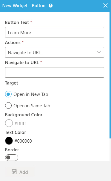
Button Text |
- Function:
- Specifies the text for the button to show on your custom page.
- Accepted Values:
- One line of text.
- Default Value:
- None
- Example:
-
- Click Here
- Submit
- Next
- Refer to:
|
Action |
- Function:
- Specifies what the button does.
- Accepted Values:
-
- Default Value:
- Navigate to URL
- Limitations:
- The Action field is available in these releases:
|
Navigate to URL |
- Function:
- Specifies the URL link for the button to open.
- To Open this Field:
-
- On the Button Widget screen, in the Actions list,
select Navigate to URL.
- Accepted Values:
- A string in URL format.
- Default Value:
- None
- Limitations:
- The Navigate to URL field is available in these releases:
- Example:
-
- https://mysite.com/mypage.html
- Refer to:
|
Row Names |
- Function:
- Specifies the name of the row where the button goes.
The row names come from the Name field in
Row Properties screen.
- To Open this Field:
-
- On the Button Widget screen, in the Actions list,
select
Scroll in To.
- Accepted Values:
- A row name from the list.
- Default Value:
- None
- Limitations:
- The Row Names field is available in these releases:
|
Target |
- Function:
- Specifies whether to open the URL in a new tab or a same tab.
- Accepted Values:
-
- Open in New Tab - The URL opens in a new tab.
- Open in Same Tab - The URL opens in a same tab.
- Default Value:
- Open in New Tab
|
Background Color |
- Function:
- Specifies the background color for the button.
- Accepted Values:
- A color value using a hex code, RGB code, or RGBA code.
You can enter a color code, or select a color from the palette.
- Default Value:
- ffffff
- Example:
-
- #ff0000
- #183048
- #e16229
- rgb(25,151,66)
- rgba(87,177,201,2)
|
Text Color |
- Function:
- Specifies the color for the label text to show in the button.
- Accepted Values:
- A color value using a hex code, RGB code, or RGBA code.
You can enter a color code, or select a color from the palette.
- Default Value:
- 000000
- Example:
-
- #ff0000
- #183048
- #e16229
- rgb(25,151,66)
- rgba(87,177,201,2)
|
Border Style |
- Function:
- Specifies the border style around the button.
- To Open this Field:
-
- On the Button Widget screen,
Turn on the Border field.
- Accepted Values:
-
- Dashed
- Dotted
- Double
- Groove
- Hidden
- Inset
- None
- Outset
- Ridge
- Solid
- Default Value:
- None
|
Border Left (px) |
- Function:
- Specifies the width in pixels for the left side border of the button.
- To Open this Field:
-
- On the Button Widget screen,
Turn on the Border field.
- Accepted Values:
- A positive integer.
- Default Value:
- None
|
Border Right (px) |
- Function:
- Specifies the width in pixels for the right side border of the button.
- To Open this Field:
-
- On the Button Widget screen,
Turn on the Border field.
- Accepted Values:
- A positive integer.
- Default Value:
- None
|
Border Bottom (px) |
- Function:
- Specifies the width in pixels for the bottom border of the button.
- To Open this Field:
-
- On the Button Widget screen,
Turn on the Border field.
- Accepted Values:
- A positive integer.
- Default Value:
- None
|
Border Top (px) |
- Function:
- Specifies the width in pixels for the top border of the button.
- To Open this Field:
-
- On the Button Widget screen,
Turn on the Border field.
- Accepted Values:
- A positive integer.
- Default Value:
- None
|
Border Radius Top Left (px) |
- Function:
- Specifies the radius in pixels
for the top-left border of the button.
- To Open this Field:
-
- On the Button Widget screen,
Turn on the Border Radius field.
- Accepted Values:
- A positive integer.
- Default Value:
- None
|
Border Radius Top Right (px) |
- Function:
- Specifies the radius in pixels
for the top-right border of the button.
- To Open this Field:
-
- On the Button Widget screen,
Turn on the Border Radius field.
- Accepted Values:
- A positive integer.
- Default Value:
- None
|
Border Radius Bottom Left (px) |
- Function:
- Specifies the radius in pixels
for the bottom-left border
of the button.
- To Open this Field:
-
- On the Button Widget screen,
Turn on the Border Radius field.
- Accepted Values:
- A positive integer.
- Default Value:
- None
|
Border Radius Bottom Right (px) |
- Function:
- Specifies the radius in pixels
for the bottom-right border
of the button.
- To Open this Field:
-
- On the Button Widget screen,
Turn on the Border Radius field.
- Accepted Values:
- A positive integer.
- Default Value:
- None
|
Add |
- Function:
- Adds the widget
to your custom page.
|

 .
. .
. .
.