Subform (Legacy) form control

A form control that holds a group of form controls. Optionally, groups of form controls can be added or deleted by a runtime app user. This is referred to as a repeating subform.

Note: In AgilePoint NX v8.0, a new version of the Subform form control was created to improve performance and the runtime app user experience. AgilePoint recommends you to use the enhanced Subform form control to create your apps. The legacy Subform control exists in eForm Builder for backward compatibility. For more information, refer to Subform form control.

Configure the Subform (Legacy) form control

To configure the Subform (Legacy) Subform icon control, do the procedure in this topic.

Video: Common Configuration Settings in eForm Controls

Examples

How to Start

  1. Open eForm Builder.

    For information about how to open this screen, refer to eForm Builder screen.


    Eform Builder screen
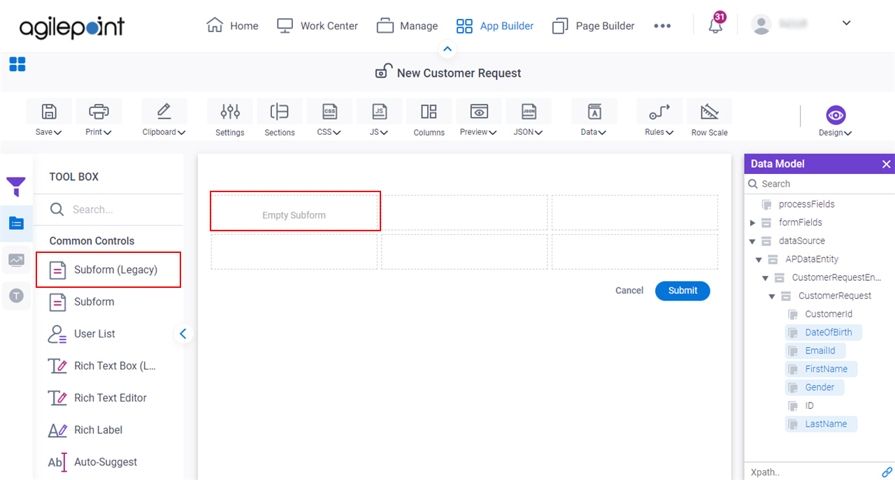
  2. On the eForm Builder screen, in the Tool Box, open the Commmon Controls tab.
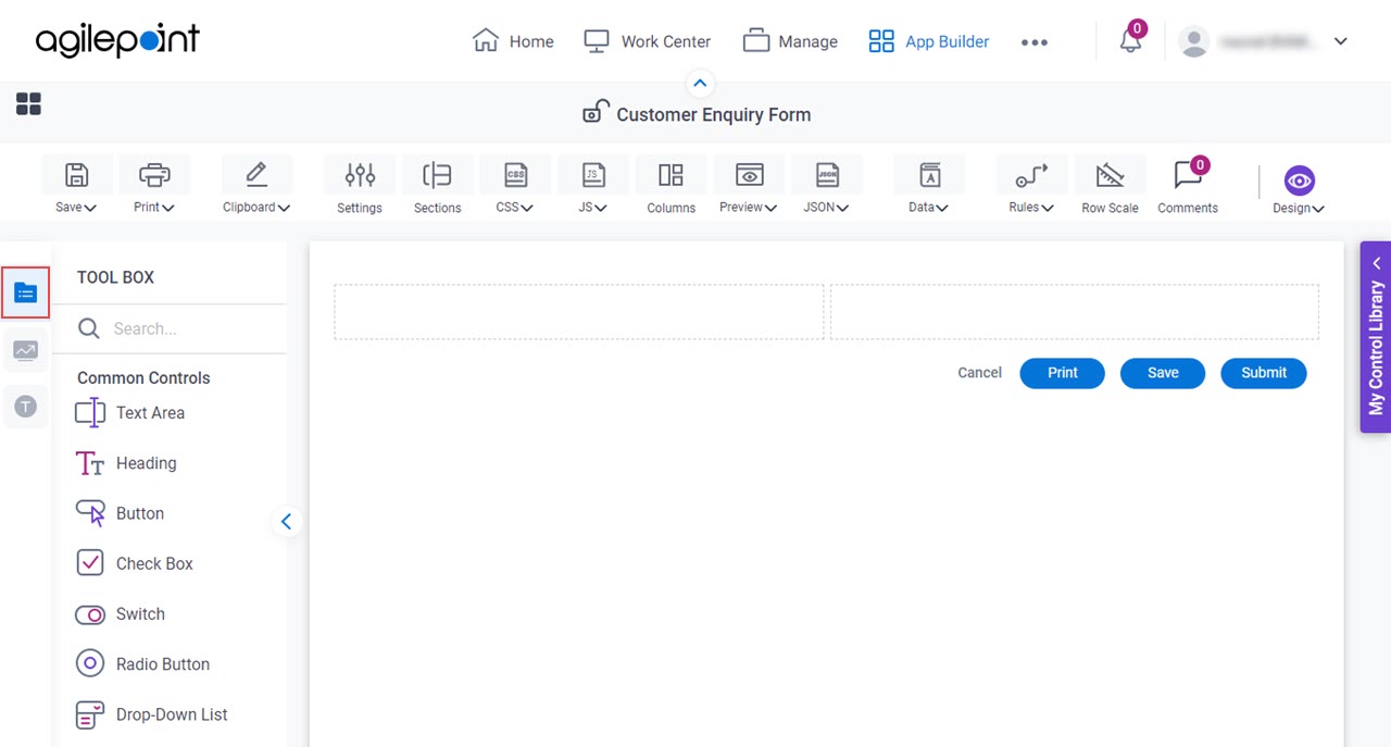
    Common Controls tab
  3. On the Common Controls tab, drag a Subform (Legacy) Subform icon form control onto your eForm.

    SubForm Form Control

Procedure

  1. Complete the settings on the configuration screens.

    You can use the Data screen screen to specify a variable.

General

Specifies the basic configuration for the Subform (Legacy) form control.
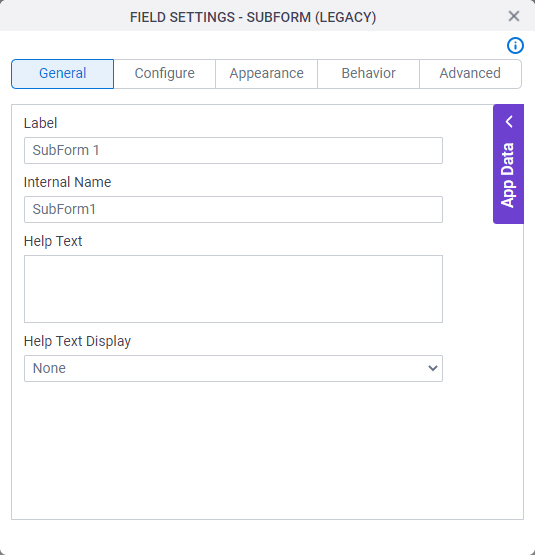
Figure: General tab

General tab

Fields

Field NameDefinition

Label

Description:
Specifies the text label that shows on your form for the control.
Allowed Values:
One line of text (a string).

Accepted:

  • Letters
  • Numbers
  • Spaces
Default Value:
Different for different controls.
Example:
This is a common configuration field that is used in many examples. Refer to:
  • Examples - Step-by-step use case examples, information about what types of examples are provided in the AgilePoint NX Product Documentation, and other resources where you can find more examples.

Internal Name

Description:
Specifies a unique, technical name for your control.
Allowed Values:
One line of text (a string).

Not Accepted:

  • Spaces
Default Value:
Different for different controls.
Example:
This is a common configuration field that is used in many examples. Refer to:
  • Examples - Step-by-step use case examples, information about what types of examples are provided in the AgilePoint NX Product Documentation, and other resources where you can find more examples.

Help Text

Description:
Specifies the text to shows when a runtime app user hovers their cursor over the form control.
Allowed Values:
More than one line of text.
Default Value:
None
Example:
Refer to:

Help Text Display

Description:
Specifies if the field shows the text in the Help Text field when the runtime app user hovers over the label or field.
Allowed Values:
  • None - Does not show the help text.
  • Hover On Label - Shows the help text when you put your mouse on the label.
  • Hover On Field - Shows the help text when you put your mouse on the field.
  • Hover On Both - Shows the help text when you put your mouse on the label and Field.
Default Value:
None
Example:
Refer to:

Configure

Configures advanced settings for your form control.
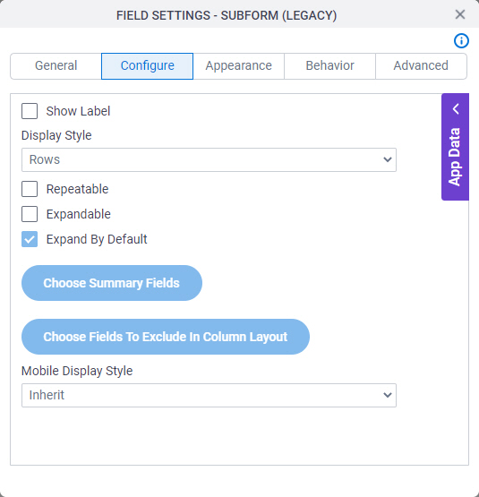
Figure: Configure tab

Configure tab

Fields

Field NameDefinition

Show Label

Description:
Specifies if the form panel shows a label at the top.
Allowed Values:
  • Deselected - Shows no label at the top.
  • Selected - Shows label at the top.
Default Value:
Selected
Example:
Refer to:

Display Style

Description:
Specifies if the form control shows the values in rows or columns.
Allowed Values:
  • Rows - Shows the form controls of the subform as columns in rows.
  • Columns - Shows the form controls of the subform as columns.
  • Summary Columns - Shows a summary of the form controls in the subform as columns. You can not use summary columns in a child subform within a group of nested subforms.
Default Value:
Rows
Example:
Refer to:

Repeatable

Description:
Specifies if the form control values can repeat.

If this field is selected, the subform is referred to as a repeating subform.

Allowed Values:
  • Deselected - The form control values do not repeat.
  • Selected - The form control values repeat.
Default Value:
Deselected
Example:
Refer to:

Expandable

Description:
Specifies if the process participant can expand the form control values.
To Open this Field:
  1. In the Display Style field, select Rows.
Allowed Values:
  • Deselected - The participant can not expand the form control values.
  • Selected - The participant can expand the form control values.
Default Value:
Deselected

Expand By Default

Description:
Specifies if the form control values are expanded by default.
To Open this Field:
  1. Select Expandable.
Allowed Values:
  • Deselected - The form control values are expanded by default.
  • Selected - The form control values are expanded by default.
Default Value:
Selected

Choose Summary Fields

Description:
Specifies the form controls to include and make it editable in the summary column in the subform.
To Open this Field:
In the Display Style field, select Summary Columns.

Choose Fields To Exclude In Column Layout

Description:
Specifies the form controls to hide in the subform.
To Open this Field:
In the Display Style field, select Columns.

List Options

Description:
Specifies the data source to get the options in the list.
To Open this Field:
  1. Select Repeatable.
Allowed Values:
  • None
  • Inline List - Completes the list with the values specified in the form control.
  • Lookup List - Completes the list with the values from an external data source.
Default Value:
None
Example:
Refer to:

Name

Description:
Specifies the name of the option shown in the drop-down list.
To Open this Field:
  1. In the List Options field, select Inline List.
Allowed Values:
One line of text (a string).

Accepted:

  • Letters
  • Numbers
  • Spaces
Default Value:
Option 1

Value

Description:
Specifies the value of the name option that shows in the list.
To Open this Field:
  1. In the List Options field, select Inline List.
Allowed Values:
One line of text (a string).

Accepted:

  • Letters
  • Numbers
  • Spaces
Default Value:
Option 1

Choose a Default Option Choose a Default Option icon

Description:
Specifies the name option shown to the form user as default in the drop-down list.
To Open this Field:
  1. In the List Type field, select Inline List.
Allowed Values:
  • Selected - The selected option is the default list name.
  • Deselected - The option is not the default list name.
Default Value:
Deselected

Delete Delete icon

Function:
Deletes the selected row.
To Open this Field:
  1. In the List Type field, select Inline List.

Add Option

Function:
Adds more rows.

You can drag the rows to change the order.

To Open this Field:
  1. In the List Type field, select Inline List.

Lookup Source

Description:
Specifies a reusable lookup configuration. The lookup configuration includes the data source and other configuration values for the lookup.
To Open this Field:
  1. In the List Options field, select Lookup List.
Allowed Values:
A valid lookup source
Default Value:
None

Add Lookup Add Lookup icon

Function:
Opens the screen to configure a lookup.

There is more than one path to configure a lookup. Make sure you use the document that shows the path for your lookup.

To Open this Field:
  1. In the List Type field, select Lookup List.
Example:
Refer to:

Allow Add

Description:
Specifies whether the form user can add new records.
Allowed Values:
  • Selected - Lets the form user add new records.
  • Deselected - Does not let the form user add new records.
Default Value:
Selected
Example:
Refer to:

Allow Delete

Description:
Specifies whether the form user can delete records.
Allowed Values:
  • Selected - Lets the form user delete records.
  • Deselected - Does not let the form user delete records.
Default Value:
Selected
Example:
Refer to:

Allow Copy

Description:
Specifies if the runtime app user can copy records.
To Open this Field:
  1. Select Repeatable.
Allowed Values:
  • Selected - Lets the runtime app user copy records.
  • Deselected - Records can not be copied on the eForm.
Default Value:
Selected
Example:
Refer to:

Confirm Deletion

Description:
Specifies if the form user must confirm before they delete the record.
To Open this Field:
  1. Select Repeatable.
Allowed Values:
  • Selected - The form user must confirm before they delete the record.
  • Deselected - The form user does not confirm before they delete the record.
Default Value:
Selected
Example:
Refer to:

Show Row Number

Description:
Specifies whether the row numbers show on the subform.
To Open this Field:
  1. Select Repeatable.
Allowed Values:
  • Selected - The row numbers show.
  • Deselected - The row numbers do not show.
Default Value:
Deselected

Read-Only History

Description:
Specifies whether the runtime app user can change the records after the task is submitted.
To Open this Field:
  1. Select Repeatable.
Allowed Values:
  • Selected - The records are read-only after the task is submitted.
  • Deselected - The runtime app user can change the records after the task is submitted.
Default Value:
Deselected

Minimum Occurrences

Description:
Specifies the minimum number of times a record shows on a subform.
To Open this Field:
  1. Select Repeatable.
Allowed Values:
An integer.

Range

  • 1-999
Default Value:
1

Maximum Occurrences

Description:
Specifies the maximum number of times a record shows on a subform.
To Open this Field:
  1. Select Repeatable.
Allowed Values:
An integer.

Range

  • 1-9999999
Default Value:
5
Example:
Refer to:

Default Occurrences

Description:
Specifies if the default number of times a record shows on the subform.
To Open this Field:
  1. Select Repeatable.
Allowed Values:
An integer.

Range

  • 1-999
Default Value:
1

Page Results

Description:
Specifies if the results show on more than one page.
To Open this Field:
  1. Select Repeatable.
Allowed Values:
  • Yes - The results show on more than one page.
  • No - All results show on one page.
Default Value:
No

Number Of Records Per Page

Description:
Specifies the number of records per page.
To Open this Field:
  1. In the Page Results field, select Yes.
Allowed Values:
An integer.
Default Value:
5

Show Action Buttons As Image

Description:
Specifies if the action buttons use images or text labels.
To Open this Field:
  1. Select Repeatable.
Allowed Values:
  • Selected - The action buttons use images.
  • Deselected - The action buttons use text labels.
Default Value:
Selected

Add Button Text

Description:
Specifies the text to show on the Add button.
To Open this Field:
  1. Deselect Show Action Buttons As Image field.
Allowed Values:
One line of text (a string).
Default Value:
Add Record

Copy Button Text

Description:
Specifies the text to show on the Copy button.
To Open this Field:
  1. Deselect Show Action Buttons As Image.
Allowed Values:
One line of text (a string).
Default Value:
Copy Record

Delete Button Text

Description:
Specifies the text to show on the Delete button.
To Open this Field:
  1. Deselect Show Action Buttons As Image.
Allowed Values:
One line of text (a string).

Accepted:

  • Letters
  • Numbers
  • Spaces
Default Value:
Delete Record

Mobile Display Style

Description:
Specifies if the subform shows one form controls per row on a mobile device. Showing form controls in rows saves space on a small screen.
Allowed Values:
  • Inherit - Shows the form controls on the subform in the format you specify.
  • Rows - Shows one form control per row on the subform.
Default Value:
Inherit

Appearance

Specifies the look and feel for your form control.
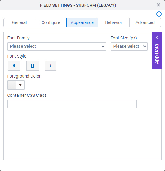
Figure: Appearance tab

Appearance tab

Fields

Field NameDefinition

Font Family

Description:
Specifies the font family of the input text and label.
Allowed Values:
A font name from the list.
Default Value:
  • Modern theme - Roboto
  • Classic theme - Arial
Example:
Refer to:

Font Style

Description:
Specifies the style of the font for the input text and label.
Allowed Values:
  • Bold - Shows the input text and label in bold.
  • Underline - Shows the label underlined.
  • Italic - Shows the label in italic.
Default Value:
None
Example:
Refer to:

Foreground Color

Description:
Specifies the foreground color for your control.
Allowed Values:
A color value using a hex code, RGB code, or RGBA code.

You can enter a color code, or select a color from the palette.

Default Value:
#ff0000
Example:
Refer to:

Container CSS Class

Description:
Specifies a CSS class for the container of your control.
Allowed Values:
A valid CSS class.
Default Value:
None

If you specify your CSS CSS icon on the top menu, the CSS is populated.

Example:
Refer to:

Font Size (px)

Description:
Specifies the size of the input text and label for your form control.
Allowed Values:
An integer.

Range

  • Greater than 0
Default Value:
  • Classic theme - 12
  • Modern theme - 14
Example:
Refer to:

Behavior

Specifies how the control shows on your form.
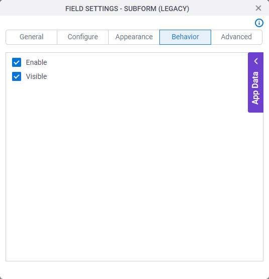
Figure: Behavior tab

Behavior tab

Fields

Field NameDefinition

Enable

Description:
Specifies if the form user can change the value of a field.
Allowed Values:
  • Selected - The form user can change the value.
  • Deselected - The form user cannot change the value.
Default Value:
Selected
Example:
Refer to:

Visible

Description:
Specifies if the runtime app user sees the field.
Allowed Values:
  • Selected - The runtime app user sees the field.
  • Deselected - The runtime app user does not see the field.
Default Value:
Selected
Example:
Refer to:

Advanced

Specifies advanced settings for your form control.
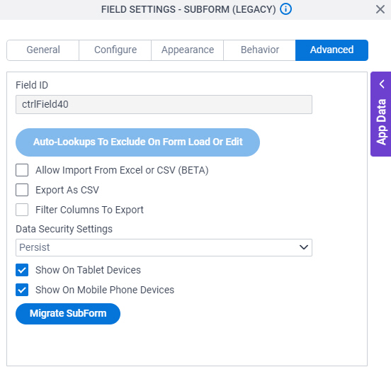
Figure: Advanced tab

Advanced tab

Fields

Field NameDefinition

Field ID

Description:
Shows an ID of the control.
Allowed Values:
Read only.
Default Value:
Different for different controls.
Example:
Refer to:

Sub Total

Description:
Shows the total number of rows.

This is not available for nested subforms.

To Open this Field:
  1. In the Configure tab, select Repeatable.

Sort Columns

Description:
Specifies the sort order for the columns.

Auto-Lookups To Exclude On Form Load Or Edit

Description:
Specifies the form controls to exclude from a lookup in the subform when the eForm loads in the browser, or the user changes the value in the form control.

Excluding Auto-Lookups is recommended in these conditions:

  • You do not want to overwrite user input when a form loads in the browser.
  • Under some conditions, such as Summary View, form controls open for editing in a pop-up screen. A user may input data in a form control, and then the control opens again in a pop-up, such as in Summary View. In this case, you may not want to execute the Auto-Lookup again because it will overwrite the user's input.

    There are some exceptions to this recommendation. For more information, refer to Limitations.

Limitations:
Excluding Auto-Lookups is not recommended for lists or other form controls whose options populate using an Auto-Lookup. If you exclude the Auto-Lookup, the values do not populate. That includes a value the user has selected. This limitation applies on both form load and form control edit events.

This is an exception to the recommended case where the form control opens for editing in a pop-up screen.

To Open this Field:
On the Configure tab, in the Display Style field, select Summary Columns.

Allow Import From Excel or CSV

Description:
Specifies whether to show the Import option on the subform so the runtime app user can import data from a Microsoft Excel or CSV file.
Allowed Values:
  • Selected - Shows the Import button on the subform, and runtime app users can import data.
  • Deselected - Hides the Import option on the subform, and runtime app users can not import data.
Default Value:
Deselected
Example:
Refer to:
Limitations:

This field is available in these releases:

Export As CSV

Description:
Specifies to export the subform data in .csv format. For a nested subform, it may not be possible to give correctly formatted values.
Allowed Values:
  • Selected - The subform data is exported in .csv format.
  • Deselected - The subform data is not exported in .csv format.
Default Value:
Deselected

Filter Columns To Export

Description:
Specifies whether the Columns To Export screen lets the runtime app user select columns to include or exclude when they export the data from the subform in .csv format.
To Open this Field:
  1. In the Advanced tab, select Export As CSV.
Allowed Values:
  • Selected - Shows the Columns To Export screen to select the columns when the runtime app user exports the data from the subform.
  • Deselected - Exports the data in .csv format from all columns in the subform, and does not show the Columns To Export screen.
Default Value:
Deselected
Limitations:

This field is available in these releases:

Data Security Settings

Description:
Specifies whether to store information from the field in the process schema, so the app can use it again, or to simply pass on the information after the form is submitted without storing the information. This option helps to protect sensitive user information.
Allowed Values:
  • Persist - Stores the data from the field in the process schema, so the app can use it again.
  • Do Not Persist - Does not store the data from the field in the process schema. This option provides greater security for sensitive user information.
Default Value:
Persist
Example:
Refer to:

Show On Tablet Devices

Description:
Specifies if the form field shows on a tablet.
Allowed Values:
  • Selected - The form field shows on a tablet.
  • Deselected - The form field does not show on a tablet.
Default Value:
Selected
Example:
Refer to:

Show On Mobile Phone Devices

Description:
Specifies if the form field shows on a mobile device.
Allowed Values:
  • Selected - The form field shows on a mobile device.
  • Deselected - The form field does not show on a mobile device.
Default Value:
Selected
Example:
Refer to: