Horizontal Line form control

A form control that shows a horizontal line on your form.

Configure the Horizontal Line form control

To configure the Horizontal Line Horizontal Line icon control, do the procedure in this topic.

Video: Common Configuration Settings in eForm Controls

How to Start

  1. Open eForm Builder.

    For information about how to open this screen, refer to eForm Builder screen.


    Eform Builder screen
  2. On the eForm Builder screen, in the Tool Box, open the Commmon Controls tab.
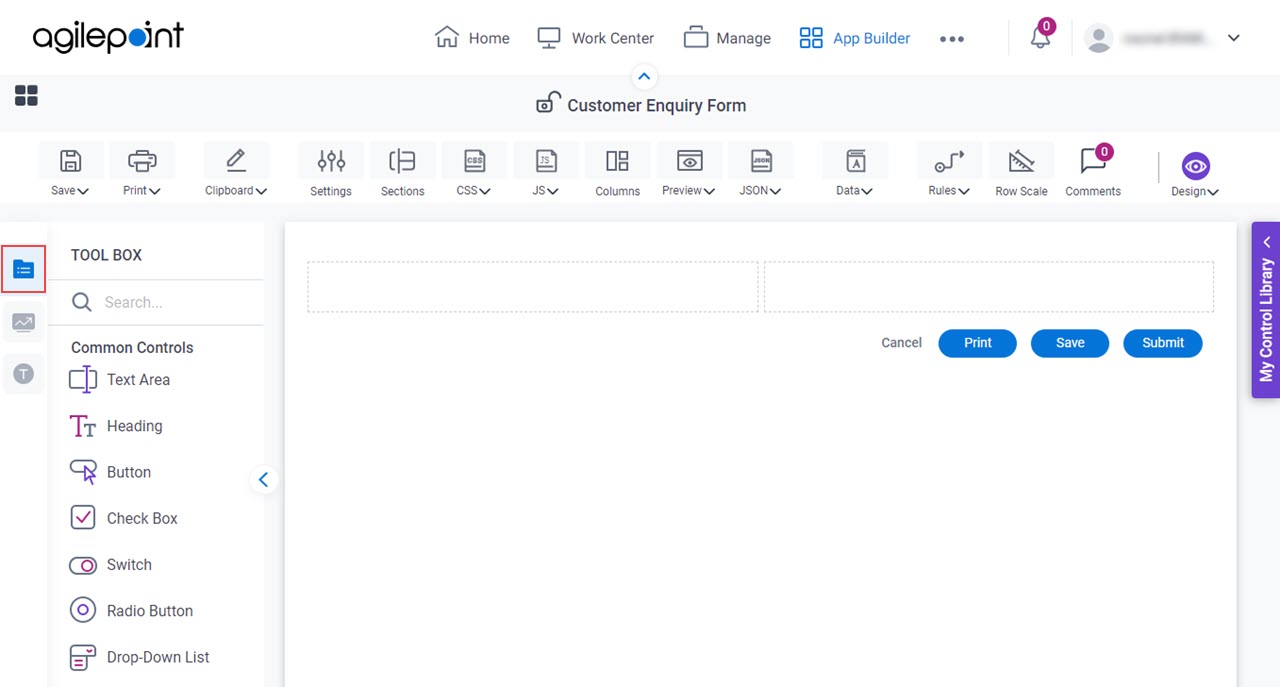
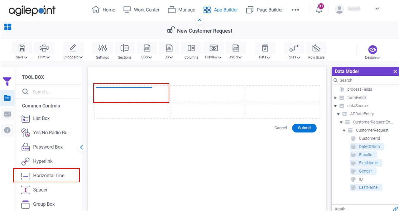
    Common Controls tab
  3. On the Common Controls tab, drag a Horizontal Line Horizontal Line icon form control onto your eForm.

    Horizontal Line Form Control

Procedure

  1. Complete the settings on the configuration screens.

    You can use the Data screen screen to specify a variable.

General

Specifies the basic configuration for the Horizontal Line form control.
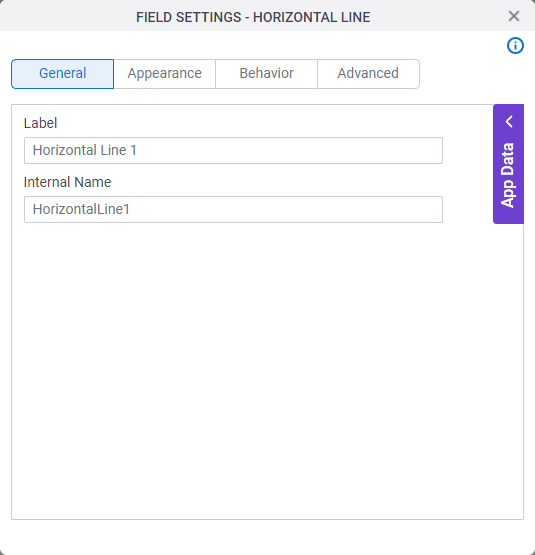
Figure: General tab

General tab

Fields

Field NameDefinition

Label

Description:
Specifies the text label that shows on your form for the control.
Allowed Values:
One line of text (a string).

Accepted:

  • Letters
  • Numbers
  • Spaces
Default Value:
Different for different controls.
Example:
This is a common configuration field that is used in many examples. Refer to:
  • Examples - Step-by-step use case examples, information about what types of examples are provided in the AgilePoint NX Product Documentation, and other resources where you can find more examples.

Internal Name

Description:
Specifies a unique, technical name for your control.
Allowed Values:
One line of text (a string).

Not Accepted:

  • Spaces
Default Value:
Different for different controls.
Example:
This is a common configuration field that is used in many examples. Refer to:
  • Examples - Step-by-step use case examples, information about what types of examples are provided in the AgilePoint NX Product Documentation, and other resources where you can find more examples.

Appearance

Specifies the look and feel for your form control.
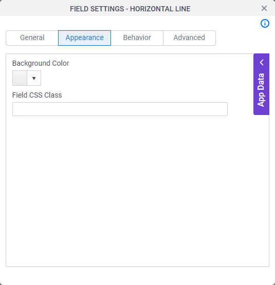
Figure: Appearance tab

Appearance tab

Fields

Field NameDefinition

Background Color

Description:
Specifies the background color for your control.
Allowed Values:
A color value using a hex code, RGB code, or RGBA code.

You can enter a color code, or select a color from the palette.

Default Value:
#ff0000
Example:
Refer to:

Field CSS Class

Description:
Specifies a CSS class for the field in your control.
Allowed Values:
A valid CSS class.
Default Value:
None

If you specify your CSS CSS icon on the top menu, the CSS is populated.

Example:
Refer to:

Behavior

Specifies how the control shows on your form.
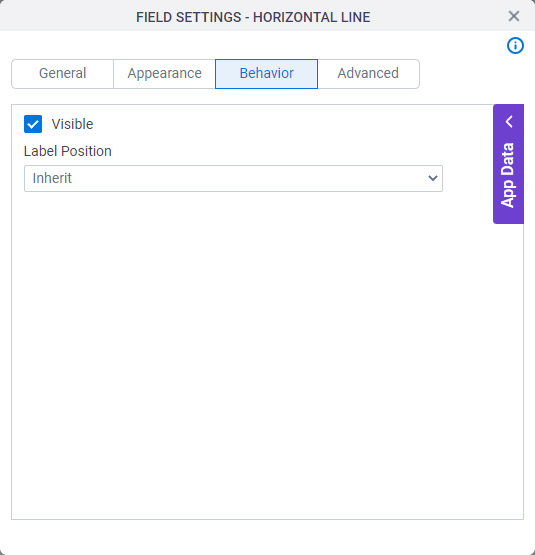
Figure: Behavior tab

Behavior tab

Fields

Field NameDefinition

Visible

Description:
Specifies if the runtime app user sees the field.
Allowed Values:
  • Selected - The runtime app user sees the field.
  • Deselected - The runtime app user does not see the field.
Default Value:
Selected
Example:
Refer to:

Label Position

Description:
Specifies the position of the text label that shows on your form for the control.
Allowed Values:
  • Inherit - The position of the label is as specified in the form settings.
  • Left - Specifies that the position of the label is to the left of the container.
  • Top - Specifies that the position of the label is to the top of the container.
Default Value:
Inherit
Example:
Refer to:

Advanced

Specifies advanced settings for your form control.
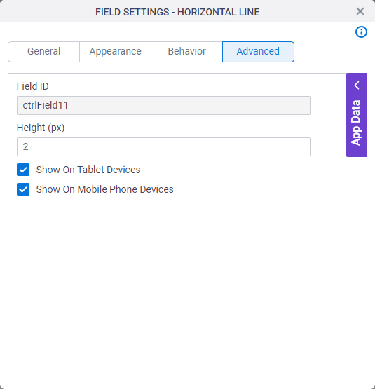
Figure: Advanced tab

Advanced tab

Fields

Field NameDefinition

Field ID

Description:
Shows an ID of the control.
Allowed Values:
Read only.
Default Value:
Different for different controls.
Example:
Refer to:

Height (px)

Description:
Specifies the height for your control.
Allowed Values:
An integer.
Default Value:
2

Show On Tablet Devices

Description:
Specifies if the form field shows on a tablet.
Allowed Values:
  • Selected - The form field shows on a tablet.
  • Deselected - The form field does not show on a tablet.
Default Value:
Selected
Example:
Refer to:

Show On Mobile Phone Devices

Description:
Specifies if the form field shows on a mobile device.
Allowed Values:
  • Selected - The form field shows on a mobile device.
  • Deselected - The form field does not show on a mobile device.
Default Value:
Selected
Example:
Refer to: