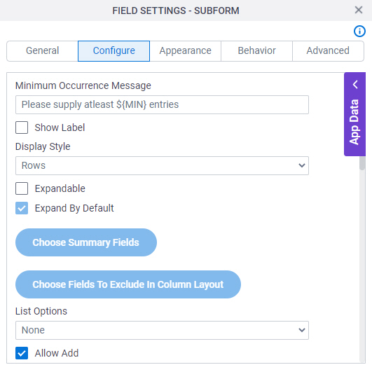
Minimum Occurrence Message |
- Description:
- Specifies the message to show if the participant does not
enter the minimum number of items.
- Allowed Values:
- More than one line of text.
- Default Value:
- Please supply at least ${MIN} entries
{MIN} is a process data variable that shows the minimum number of occurrences for your form control.
|
Show Label |
- Description:
- Specifies if the form panel shows a label at the top.
- Allowed Values:
-
- Deselected - Shows no label at the top.
- Selected - Shows label at the top.
- Default Value:
- Selected
- Example:
- Refer to:
|
Display Style |
- Description:
- Specifies if the form control shows the values in rows or columns.
- Allowed Values:
-
- Rows - Shows the form controls of the subform as columns in rows.
- Columns - Shows the form controls of the subform as columns.
- Summary Columns - Shows a summary of the form controls in the subform as columns.
You can not use summary columns in a child subform within a group of nested subforms.
- Default Value:
- Rows
- Example:
- Refer to:
|
Validate On Form Submission |
- Description:
- Specifies whether to validate the required fields in the subform have a value when the runtime app user clicks OK on the Summary Columns pop-up screen.
- To Open this Field:
-
- On the Configure Lookup screen,
in the Display Style list, select Summary Columns.
- Allowed Values:
-
- Selected - Does not validate the required fields in the subform when the runtime app user clicks OK on the Summary Columns pop-up screen.
With this option, the user can save the subform as a draft.
- Deselected - Validates the required fields in the subform when the user clicks Ok on the Summary Columns pop-up screen.
With this option, the user must enter the value for all the required fields in the subform before the pop-up screen closes.
- Default Value:
- Deselected
- Limitations:
-
This field
is available in these releases:
|
Expandable |
- Description:
- Specifies if the process participant can expand the form control values.
- To Open this Field:
-
- In the Display Style field, select Rows.
- Allowed Values:
- Deselected - The participant can not expand the form control values.
- Selected - The participant can expand the form control values.
- Default Value:
- Deselected
|
Expand By Default |
- Description:
- Specifies if the form control values are expanded by default.
- To Open this Field:
-
- Select Expandable.
- Allowed Values:
- Deselected - The form control values are expanded by default.
- Selected - The form control values are expanded by default.
- Default Value:
- Selected
|
Choose Summary Fields |
- Description:
- Specifies the form controls to include and make it editable in the summary column in the subform.
- To Open this Field:
- In the Display Style field, select Summary Columns.
|
Choose Fields To Exclude In Column Layout |
- Description:
- Specifies the form controls to hide in the subform.
- To Open this Field:
- In the Display Style field, select Columns.
|
List Options |
- Description:
- Specifies the data source to get the options in the list.
- Allowed Values:
-
- Default Value:
- None
- Example:
- Refer to:
|
Name |
- Description:
- Specifies the name of the option shown in the drop-down list.
- To Open this Field:
-
- In the List Options field, select Inline List.
- Allowed Values:
- One line of text (a string).
Accepted:
- Default Value:
- Option 1
|
Value |
- Description:
- Specifies the value of the name option that shows in the list.
- To Open this Field:
-
- In the List Options field, select Inline List.
- Allowed Values:
- One line of text (a string).
Accepted:
- Default Value:
- Option 1
|
Delete 
|
- Function:
- Deletes the selected row.
- To Open this Field:
-
- In the List Type field, select Inline List.
|
Add Option
|
- Function:
- Adds more rows.
You can drag the rows to change the order.
- To Open this Field:
-
- In the List Type field, select Inline List.
|
Lookup Source |
- Description:
- Specifies a reusable lookup configuration. The lookup configuration
includes the data source and other configuration values for the lookup.
- To Open this Field:
-
- In the List Options field, select Lookup List.
- Allowed Values:
- A valid lookup source
- Default Value:
- None
|
Add Lookup  |
- Function:
- Opens the screen to configure a lookup.
There is more than one path to configure a lookup. Make sure you use the document that shows the path for your lookup.
- To Open this Field:
-
- In the List Type field, select Lookup List.
- Example:
- Refer to:
|
Allow Add |
- Description:
- Specifies whether the form user can add new records.
- Allowed Values:
-
- Selected - Lets the form user add new records.
- Deselected - Does not let the form user add new records.
- Default Value:
- Selected
- Example:
- Refer to:
|
Allow Delete |
- Description:
- Specifies whether the form user can delete records.
- Allowed Values:
-
- Selected - Lets the form user delete records.
- Deselected - Does not let the form user delete records.
- Default Value:
- Selected
- Example:
- Refer to:
|
Allow Copy |
- Description:
- Specifies if the runtime app user can copy records.
- Allowed Values:
-
- Selected - Lets the runtime app user copy records.
- Deselected - Records can not be copied on the eForm.
- Default Value:
- Selected
- Example:
- Refer to:
|
Confirm Deletion |
- Description:
- Specifies if the form user must confirm before they delete the record.
- Allowed Values:
-
- Selected - The form user must confirm before they delete the record.
- Deselected - The form user does not confirm before they delete the record.
- Default Value:
- Selected
- Example:
- Refer to:
|
Allow Expand All |
- Description:
- Specifies whether the runtime app user can expand the records on the subform.
- To Open this Field:
-
- Select Expandable.
- Allowed Values:
-
- Selected - The runtime app user can expand the records.
- Deselected - The list of records is fixed on the eForm.
- Default Value:
- Deselected
|
Allow Collapse All |
- Description:
- Specifies whether the runtime app user can collapse the records on the subform.
- To Open this Field:
-
- Select Expandable.
- Allowed Values:
-
- Selected - The runtime app user can collapse the records.
- Deselected - The list of records is fixed on the eForm.
- Default Value:
- Deselected
|
Show Row Number |
- Description:
- Specifies whether the row numbers show on the subform.
- Allowed Values:
-
- Selected - The row numbers show.
- Deselected - The row numbers do not show.
- Default Value:
- Deselected
|
Read-Only History |
- Description:
- Specifies whether the runtime app user can change the records after the task is submitted.
- Allowed Values:
-
- Selected - The records are read-only after the task is submitted.
- Deselected - The runtime app user can change the records after the task is submitted.
- Default Value:
- Deselected
|
Minimum Occurrences |
- Description:
- Specifies the minimum number of times a record shows on a subform.
- Allowed Values:
- An integer.
Range:
- Default Value:
- 1
|
Maximum Occurrences |
- Description:
- Specifies the maximum number of times a record shows on a subform.
- Allowed Values:
- An integer.
Range:
- Default Value:
- 5
- Example:
- Refer to:
|
Default Occurrences |
- Description:
- Specifies if the default number of times a record shows on the subform.
- Allowed Values:
- An integer.
Range:
- Default Value:
- 1
|
Page Results |
- Specifies if the results show on more than one page.
-
- Yes - The results show on more than one page.
- No - All results show on one page.
- No
|
Number Of Records Per Page |
- Description:
- Specifies the number of records per page.
- To Open this Field:
-
- In the Page Results field, select Yes.
- Allowed Values:
- An integer.
- Default Value:
- 5
|
Show Action Buttons As Image |
- Description:
- Specifies if the action buttons use images or text labels.
- Allowed Values:
-
- Selected - The action buttons use images.
- Deselected - The action buttons use text labels.
- Default Value:
- Selected
|
Add Button Text |
- Description:
- Specifies the text to show on the Add button.
- To Open this Field:
-
- Deselect Show Action Buttons As Image field.
- Allowed Values:
- One line of text (a string).
- Default Value:
- Add Record
|
Expand All Button Text |
- Description:
- Specifies the text label to show on the Expand All button.
- To Open this Field:
-
- Deselect Show Action Buttons As Image.
- Allowed Values:
- One line of text (a string).
Accepted:
- Default Value:
- Expand All
|
Collapse All Button Text |
- Description:
- Specifies the text label to show on the Collapse All button.
- To Open this Field:
-
- Deselect Show Action Buttons As Image.
- Allowed Values:
- One line of text (a string).
Accepted:
- Default Value:
- Collapse All
|
Copy Button Text |
- Description:
- Specifies the text to show on the Copy button.
- To Open this Field:
-
- Deselect Show Action Buttons As Image.
- Allowed Values:
- One line of text (a string).
- Default Value:
- Copy Record
|
Delete Button Text |
- Description:
- Specifies the text to show on the Delete button.
- To Open this Field:
-
- Deselect Show Action Buttons As Image.
- Allowed Values:
- One line of text (a string).
Accepted:
- Default Value:
- Delete Record
|
Mobile Display Style |
- Description:
- Specifies if the subform
shows one form controls
per row on a mobile device. Showing form controls in rows saves
space on a small screen.
- Allowed Values:
-
- Inherit - Shows the form controls on the subform in the format you specify.
- Rows - Shows one form control per row on the subform.
- Default Value:
- Inherit
|

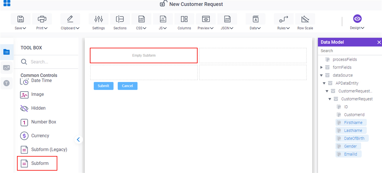
 control, do the procedure in this topic.