
Image form control
A form control that shows an image on your form.
Configure the Image form control
To configure
the
Image  control,
do the procedure in this topic.
control,
do the procedure in this topic.
Video: Customer Survey Demo App
Video: Common Configuration Settings in eForm Controls
Examples
- (Example) Create an eForm to Start the Process (Create Absence Request)
- (Example) Create an eForm (Set Available Leave Hours)
- (Example) Create an eForm (Manager Approval)
- Examples - Step-by-step use case examples, information about what types of examples are provided in the AgilePoint NX Product Documentation, and other resources where you can find more examples.
Good to Know
- To configure the image that shows on the eForm, refer to Image Picker screen.
How to Start
- Open eForm Builder.
For information about how to open this screen, refer to eForm Builder screen.

- On the eForm Builder screen, in the Tool Box, open the Commmon Controls tab.
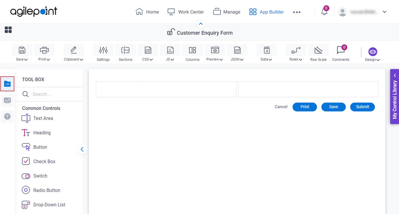
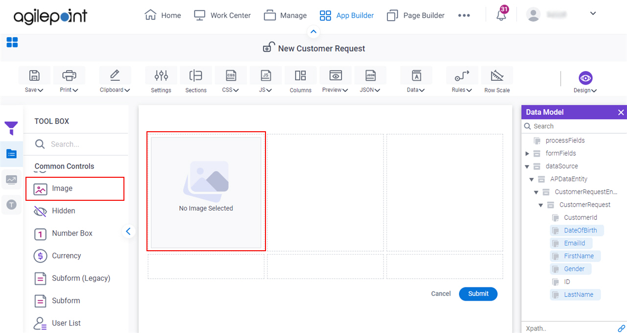
- On the
Common Controls tab, drag a Image
form control onto your eForm.
Procedure
- Complete the settings on the configuration screens.
You can use the Data screen screen to specify a variable.
General
Specifies the basic configuration for the Image form control.
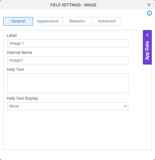
Fields
| Field Name | Definition |
|---|---|
Label |
|
Internal Name |
|
Help Text |
|
Help Text Display |
|
Appearance
Specifies the look and feel for your form control.
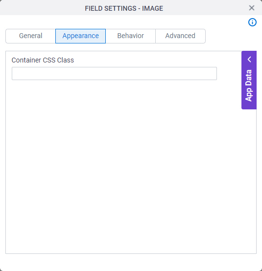
Fields
| Field Name | Definition |
|---|---|
Container CSS Class |
|

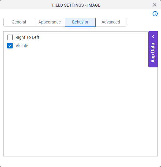
Behavior
Specifies how the control shows on your form..
Fields
| Field Name | Definition |
|---|---|
Right To Left |
|
Visible |
|
Label Position |
|
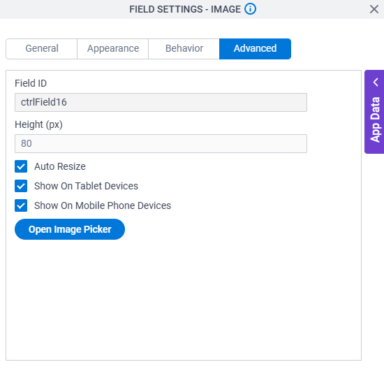
Advanced
Specifies advanced settings for your form control.
Fields
| Field Name | Definition |
|---|---|
Field ID |
|
Height (px) |
|
Auto Resize |
|
Show On Tablet Devices |
|
Show On Mobile Phone Devices |
|
Open Image Picker |
|