
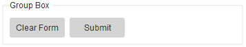
Group Box form control
A form control that shows a group of buttons on your form.
Configure the Group Box form control
To configure
the
Group Box  control,
do the procedure in this topic.
control,
do the procedure in this topic.
Video: Common Configuration Settings in eForm Controls
Good to Know
- In a Group Box form control, you can configure rules
for a Button form control.
This feature requires AgilePoint NX OnDemand (public cloud), or AgilePoint NX PrivateCloud or AgilePoint NX OnPremises v8.0 Software Update 2 or higher.
How to Start
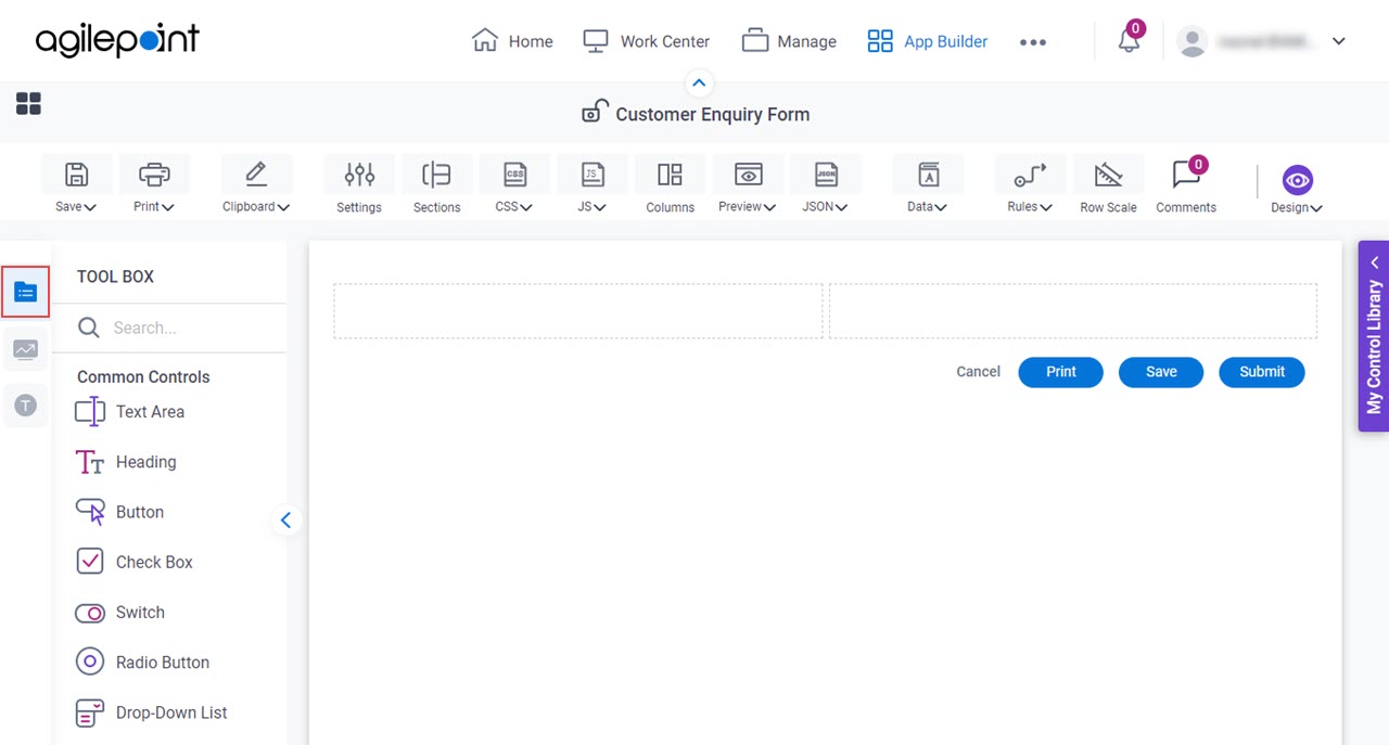
- Open eForm Builder.
For information about how to open this screen, refer to eForm Builder screen.

- On the eForm Builder screen, in the Tool Box, open the Commmon Controls tab.
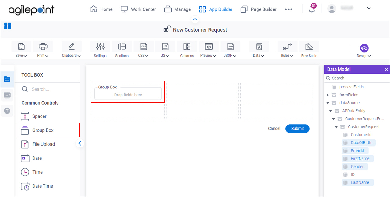
- On the
Common Controls tab, drag a Group Box
form control onto your eForm.
Procedure
- Complete the settings on the configuration screens.
You can use the Data screen screen to specify a variable.
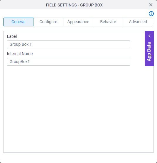
General
Specifies the basic configuration for the Group Box form control.
Fields
| Field Name | Definition |
|---|---|
Label |
|
Internal Name |
|
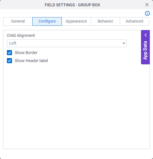
Configure
Configures advanced settings for your form control.
Fields
| Field Name | Definition |
|---|---|
Child Alignment |
|
Show Border |
|
Show Header Label |
|
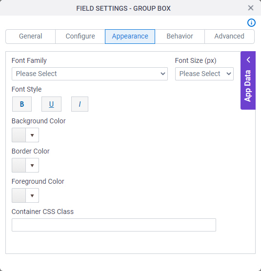
Appearance
Specifies the look and feel for your form control.
Fields
| Field Name | Definition |
|---|---|
Font Family |
|
Font Style |
|
Background Color |
|
Border Color |
|
Foreground Color |
|
Container CSS Class |
|
Font Size (px) |
|

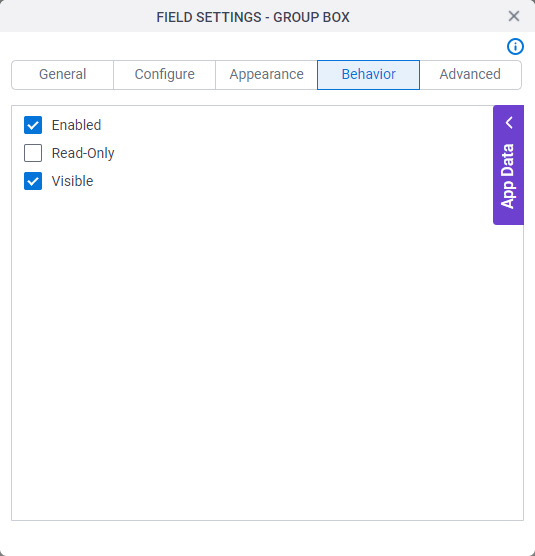
Behavior
Specifies how the control shows on your form.
Fields
| Field Name | Definition |
|---|---|
Enabled |
|
Read-Only |
|
Visible |
|
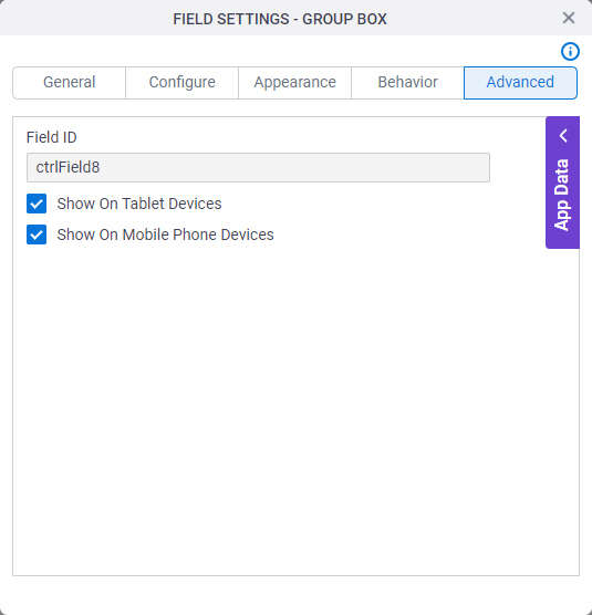
Advanced
Specifies advanced settings for your form control.
Fields
| Field Name | Definition |
|---|---|
Field ID |
|
Show On Tablet Devices |
|
Show On Mobile Phone Devices |
|