
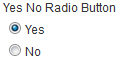
Yes No Radio Button form control
A form control that lets a form user select Yes or No from a radio button.
Configure the Yes No Radio Button form control
To configure the Yes No Radio Button  control, do the procedure in this topic.
Video: Common Configuration Settings in eForm Controls
Good to Know
- The data type for this form control is Boolean.
How to Start
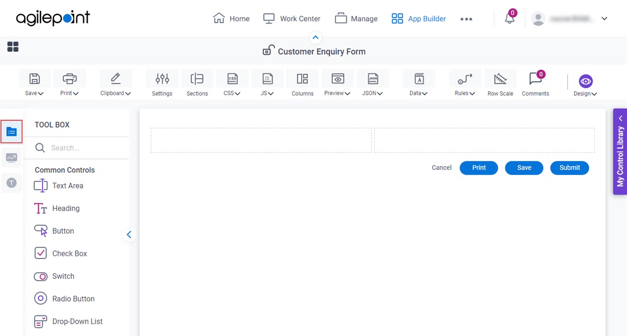
- Open eForm Builder.
For information about how to open this screen, refer to eForm Builder screen.

- On the eForm Builder screen, in the Tool Box, open the Commmon Controls tab.
- On the
Common Controls tab, drag a Yes No Radio Button
form control onto your eForm.
General tab - Yes No Radio Button
Specifies the basic configuration for the Yes No Radio Button form control.
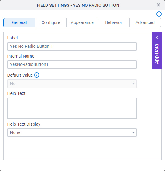
Fields
| Field Name | Definition |
|---|---|
Language |
|
Label |
|
Internal Name |
|
Default Value |
|
Help Text |
|
Help Text Display |
|
Configure tab - Yes No Radio Button
Configures the settings that are specific to the Yes No Radio Button form control.
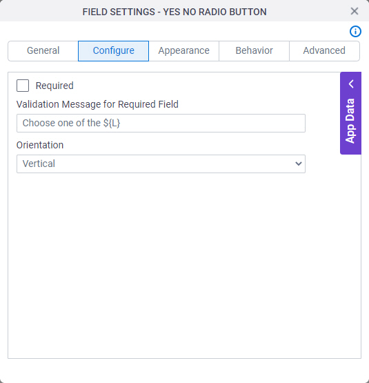
Fields
| Field Name | Definition |
|---|---|
Required |
|
Mandatory Field Validation Message |
|
Orientation |
|
Appearance tab - Yes No Radio Button
Specifies the look and feel for the Yes No Radio Button form control.
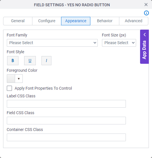
Fields
| Field Name | Definition |
|---|---|
Font Family |
|
Font Size (px) |
|
Font Style |
|
Foreground Color |
|
Apply Font Properties To Control |
|
Label CSS Class |
|
Field CSS Class |
|
Container CSS Class |
|

Behavior tab - Yes No Radio Button
Specifies how the Yes No Radio Button control shows on your form.
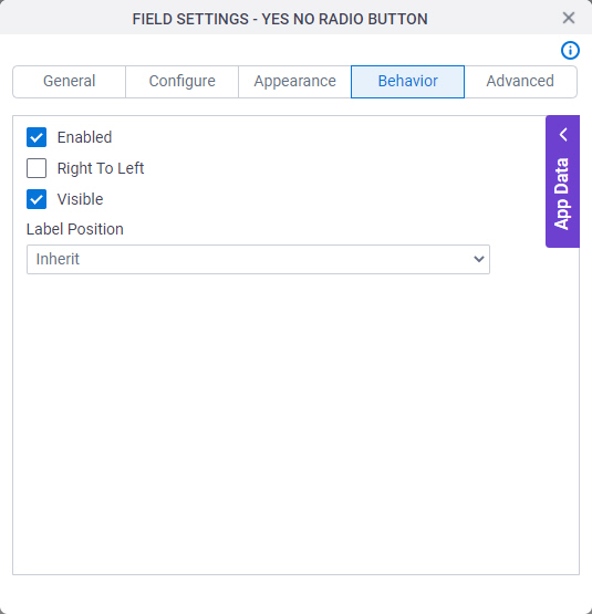
Fields
| Field Name | Definition |
|---|---|
Enabled |
|
Read-Only |
|
Right To Left |
|
Visible |
|
Advanced tab - Yes No Radio Button
Specifies the advanced settings for the Yes No Radio Button form control.
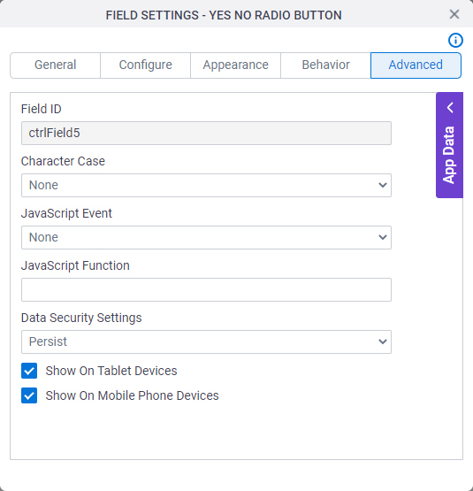
Fields
| Field Name | Definition |
|---|---|
Field ID |
|
Character Case |
|
JavaScript Event |
|
JavaScript Function |
|
Data Security Settings |
|
Show On Tablet Devices |
|
Show On Mobile Phone Devices |
|