
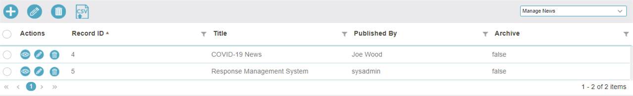
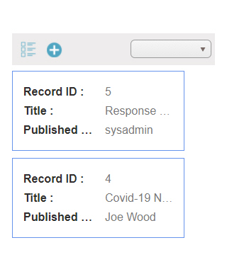
List View form control
A form control that lets a form user view the form-based app data in a table.
Configure the List View form control
To configure the
List View  control,
do the procedure in this topic.
control,
do the procedure in this topic.
Video: Build a Custom Search Screen
Video: Common Configuration Settings in eForm Controls
Prerequisites
- The List View form control is only available for View forms in form-based apps.
How to Start
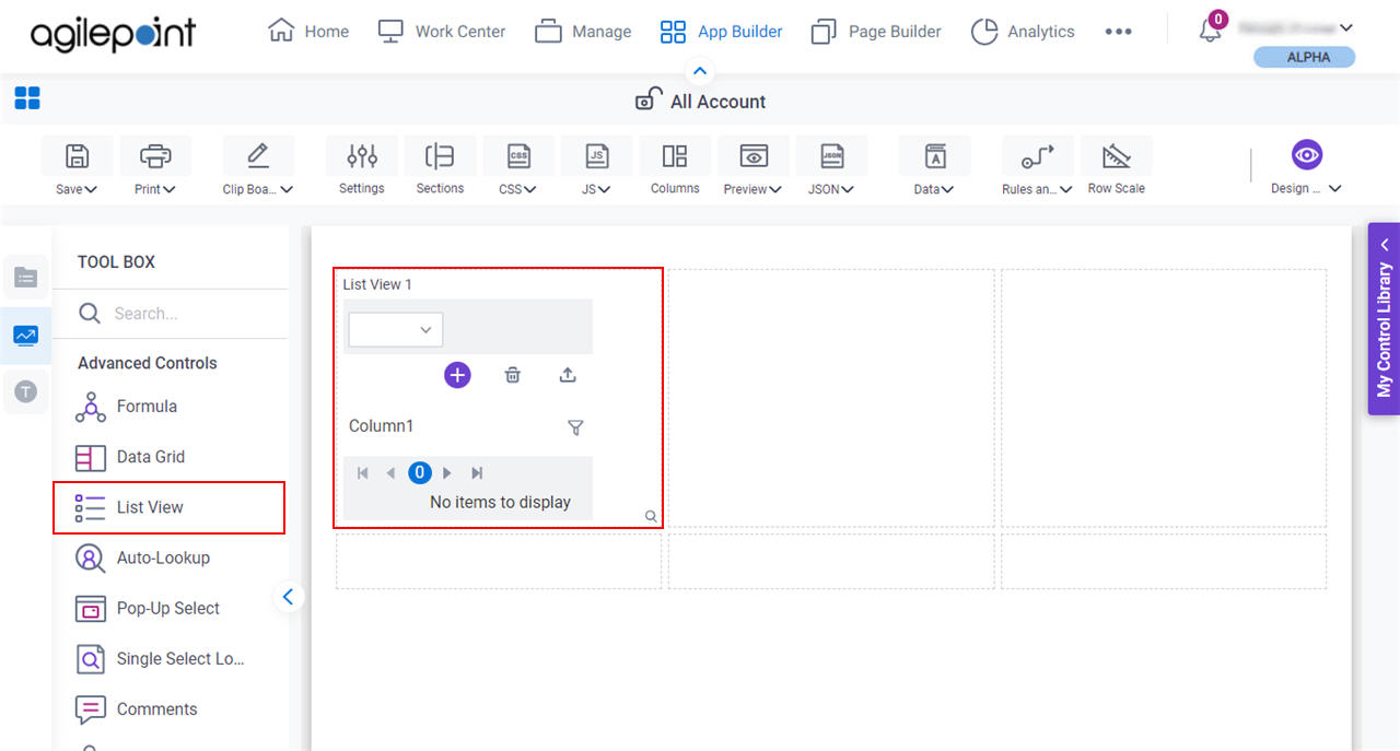
- Open eForm Builder in a form-based app.
For information about how to open this screen, refer to eForm Builder screen.

- On the eForm Builder screen, in the Toolbox, open the Advanced Controls tab.
- On the Advanced Controls tab,
drag a List View
form control onto your eForm.
Procedure
- Complete the settings on the configuration screens.
You can use the Data screen screen to specify a variable.
General
Specifies the basic configuration for the List View form control.
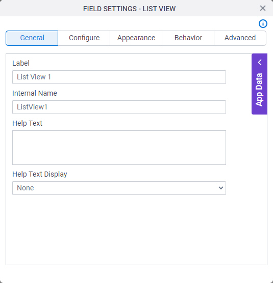
Fields
| Field Name | Definition |
|---|---|
Label |
|
Internal Name |
|
Help Text |
|
Help Text Display |
|
Configure
Configures advanced settings for your form control.
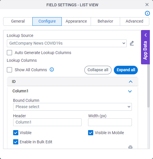
Fields
| Field Name | Definition |
|---|---|
Lookup Source |
|
Add Lookup |
|
Auto Generate Lookup Columns |
|
Header |
|
Bound Column |
|
Width (px) |
|
Visible |
|
Visible in Mobile |
|
Enable in Bulk Edit |
|
Add Column |
|
Allow Add |
|
Allow Delete |
|
Allow Edit |
|
Allow Clone |
|
Allow Bulk Edit |
|
Allow runtime user to select Views |
|

Appearance
Specifies the look and feel for your form control.
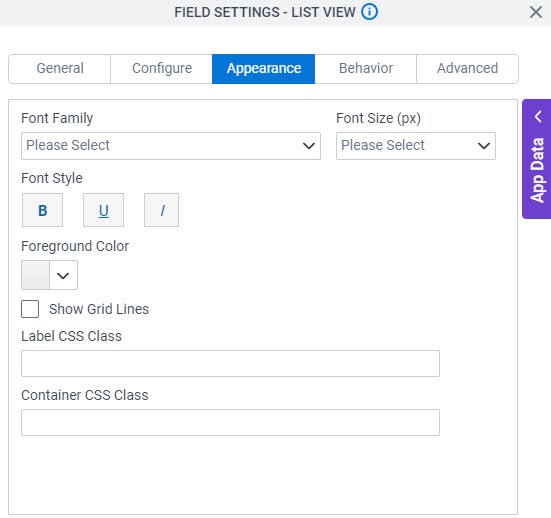
Fields
| Field Name | Definition |
|---|---|
Font Family |
|
Font Size (px) |
|
Font Style |
|
Foreground Color |
|
Show Grid Lines |
|
Label CSS Class |
|
Container CSS Class |
|

Behavior
Specifies how the control shows on your form.
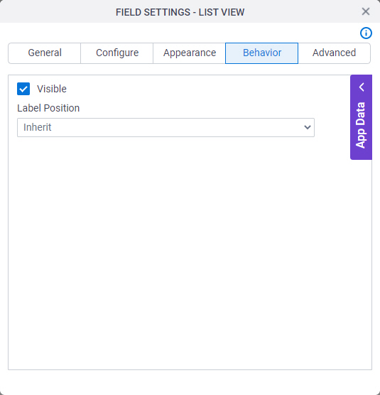
Fields
| Field Name | Definition |
|---|---|
Visible |
|
Label Position |
|
Advanced
Specifies advanced settings for your form control.
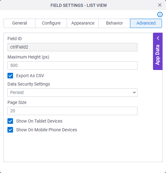
Fields
| Field Name | Definition |
|---|---|
Field ID |
|
Maximum Height (px) |
|
Export as CSV |
|
Enable Filtering |
|
Data Security Settings |
|
Page Size |
|
Show On Tablet Devices |
|
Show On Mobile Phone Devices |
|