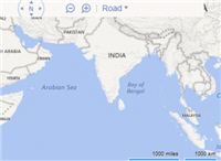
Map form control

A form control that shows an interactive map on an eForm.


Map form control

Configure the Map form control

To configure the Map Map icon control, do the procedure in this topic.

Video: Use a Form-Based App to Create a Widget (Modern)

Video: Common Configuration Settings in eForm Controls

Examples

Good to Know

  • This form control does not show in print or PDF formats.
  • Some information about third-party integrations is outside the scope of the AgilePoint NX Product Documentation. It is the responsibility of the vendors who create and maintain these technologies to provide this information. This includes specific business use cases and examples; explanations for third-party concepts; details about the data models and input and output data formats for third-party technologies; and various types of IDs, URL patterns, connection string formats, or other technical information that is specific to the third-party technologies. For more information, refer to Where Can I Find Information and Examples for Third-Party Integrations?

How to Start

  1. Open eForm Builder.

    For information about how to open this screen, refer to eForm Builder screen.


    Eform Builder screen
  2. On the eForm Builder screen, in the Toolbox, open the Advanced Controls tab.

    Advanced Controls tab
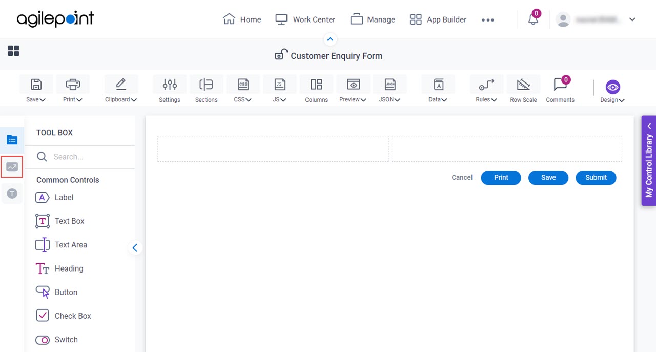
  3. On the Advanced Controls tab, drag a Map Map icon form control onto your eForm.

    Map Form Control

Procedure

  1. Complete the settings on the configuration screens.

    You can use the Data screen screen to specify a variable.

General

Specifies the basic configuration for the Map form control.
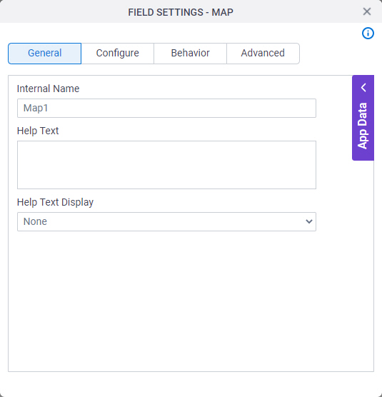
Figure: General tab

General tab

Fields

Field NameDefinition

Internal Name

Description:
Specifies a unique, technical name for your control.
Allowed Values:
One line of text (a string).

Not Accepted:

  • Spaces
Default Value:
Different for different controls.
Example:
This is a common configuration field that is used in many examples. Refer to:
  • Examples - Step-by-step use case examples, information about what types of examples are provided in the AgilePoint NX Product Documentation, and other resources where you can find more examples.

Help Text

Description:
Specifies the text to shows when a runtime app user hovers their cursor over the form control.
Allowed Values:
More than one line of text.
Default Value:
None
Example:
Refer to:

Help Text Display

Description:
Specifies if the field shows the text in the Help Text field when the runtime app user hovers over the label or field.
Allowed Values:
  • None - Does not show the help text.
  • Hover On Label - Shows the help text when you put your mouse on the label.
  • Hover On Field - Shows the help text when you put your mouse on the field.
  • Hover On Both - Shows the help text when you put your mouse on the label and Field.
Default Value:
None
Example:
Refer to:

Configure

Configures advanced settings for your form control.
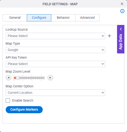
Figure: Configure tab

Configure tab

Fields

Field NameDefinition

Lookup Source

Description:
Specifies a reusable lookup configuration. The lookup configuration includes the data source and other configuration values for the lookup.
Allowed Values:
A valid lookup source
Default Value:
None
Example:
Refer to:

Add Lookup Add Lookup icon

Function:
Opens the screen to configure a lookup.

There is more than one path to configure a lookup. Make sure you use the document that shows the path for your lookup.

To Open this Field:
  1. In the List Type field, select Lookup List.
Example:
Refer to:

Map Type

Description:
Specifies the type of maps you want to show on the form control.
Allowed Values:
Default Value:
Google

API Key Token

Description:
Specifies the access token that connects to your Google or Bing application.
Allowed Values:
A list of access tokens configured for your environment.
Default Value:
None
Example:
Refer to:

Map Zoom Level

Description:
Specifies the map zoom level.
Example:
Refer to:

Map Center Option

Description:
Specifies the address and location on the map.
Allowed Values:
  • Address - Shows the address on the map.
  • Coordinates - Shows the latitude and longitude value from the Map Options.
  • Current Location - Shows the form user's current location on the map.
Default Value:
Address
Example:
Refer to:

Map Center (Latitude)

Description:
Specifies the latitude of the coordinates.
To Open this Field:
  1. In the Map Center Option list, select Coordinates.
Allowed Values:
A valid latitude value
Default Value:
42.3601

Map Center (Longitude)

Description:
Specifies the Longitude of the coordinates.
To Open this Field:
  1. In the Map Center Option list, select Coordinates.
Allowed Values:
A valid longitude value
Default Value:
-98.05

Default Value

Description:
Specifies the name of the address shown to the form user as default on the map.
To Open this Field:
  1. In the Map Center Option list, select Address.
Allowed Values:
One line of text (a string).

Accepted:

  • Letters
  • Numbers
  • Spaces
Default Value:
California

Enable Search

Description:
Specifies whether to show a search field on the Map form control for a form user to search a location.
Allowed Values:
  • Deselected - Does not show a search field on the Map form control.
  • Selected - Shows a search field on the Map form control.
Default Value:
Deselected

Configure Markers

Opens this Screen:
Map Options
Function of this Screen:
Configures marker to identify a location on a map.

Behavior

Specifies how the control shows on your form.
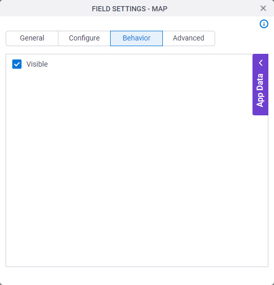
Figure: Behavior tab

Behavior tab

Fields

Field NameDefinition

Visible

Description:
Specifies if the runtime app user sees the field.
Allowed Values:
  • Selected - The runtime app user sees the field.
  • Deselected - The runtime app user does not see the field.
Default Value:
Selected
Example:
Refer to:

Advanced

Specifies advanced settings for your form control.
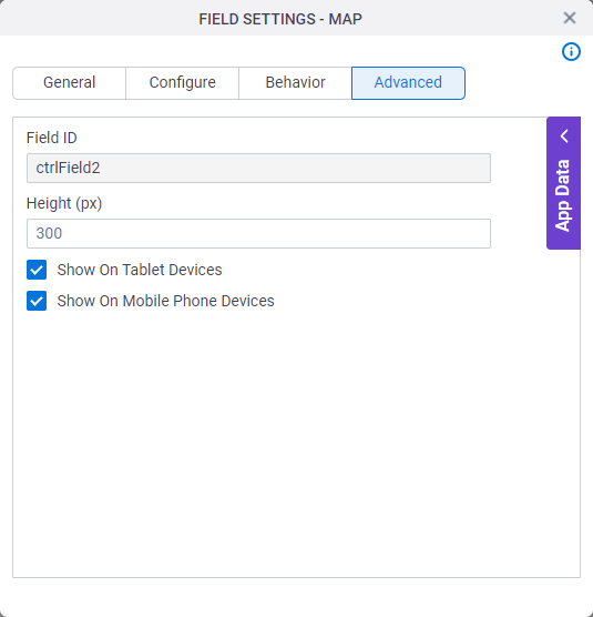
Figure: Advanced tab

Advanced tab

Fields

Field NameDefinition

Field ID

Description:
Shows an ID of the control.
Allowed Values:
Read only.
Default Value:
Different for different controls.
Example:
Refer to:

Height (px)

Description:
Specifies the height for your control.
Allowed Values:
An integer.
Default Value:
300

Show On Tablet Devices

Description:
Specifies if the form field shows on a tablet.
Allowed Values:
  • Selected - The form field shows on a tablet.
  • Deselected - The form field does not show on a tablet.
Default Value:
Selected
Example:
Refer to:

Show On Mobile Phone Devices

Description:
Specifies if the form field shows on a mobile device.
Allowed Values:
  • Selected - The form field shows on a mobile device.
  • Deselected - The form field does not show on a mobile device.
Default Value:
Selected
Example:
Refer to: