
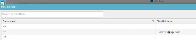
People Picker form control
A form control that lets a form user find information about a user in a data source for people.
Configure the People Picker form control
To configure
the
People Picker  control,
do the procedure in this topic.
control,
do the procedure in this topic.
Video: Common Configuration Settings in eForm Controls
Examples
- (Example) Create an eForm to Start the Process (Create Absence Request)
- Examples - Step-by-step use case examples, information about what types of examples are provided in the AgilePoint NX Product Documentation, and other resources where you can find more examples.
How to Start
- Open eForm Builder.
For information about how to open this screen, refer to eForm Builder screen.

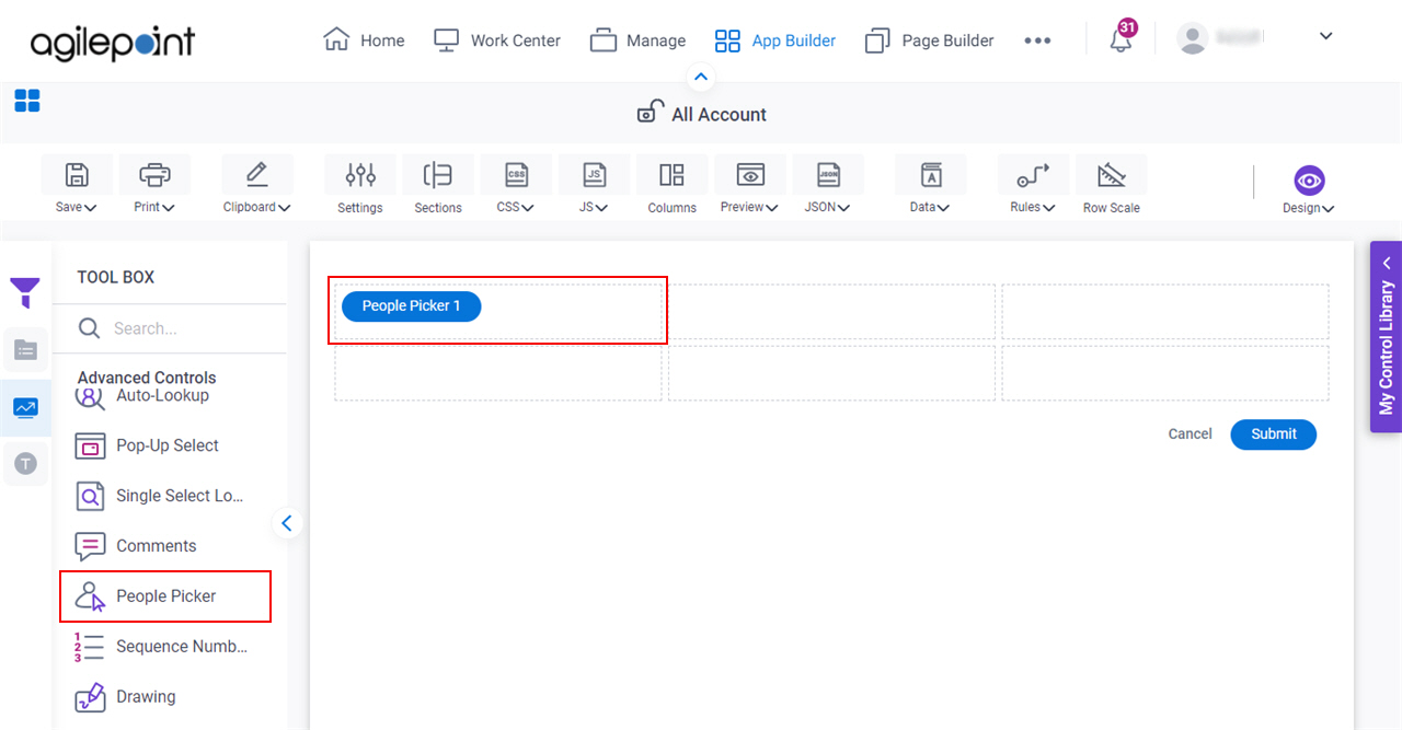
- On the eForm Builder screen, in the Toolbox, open the Advanced Controls tab.
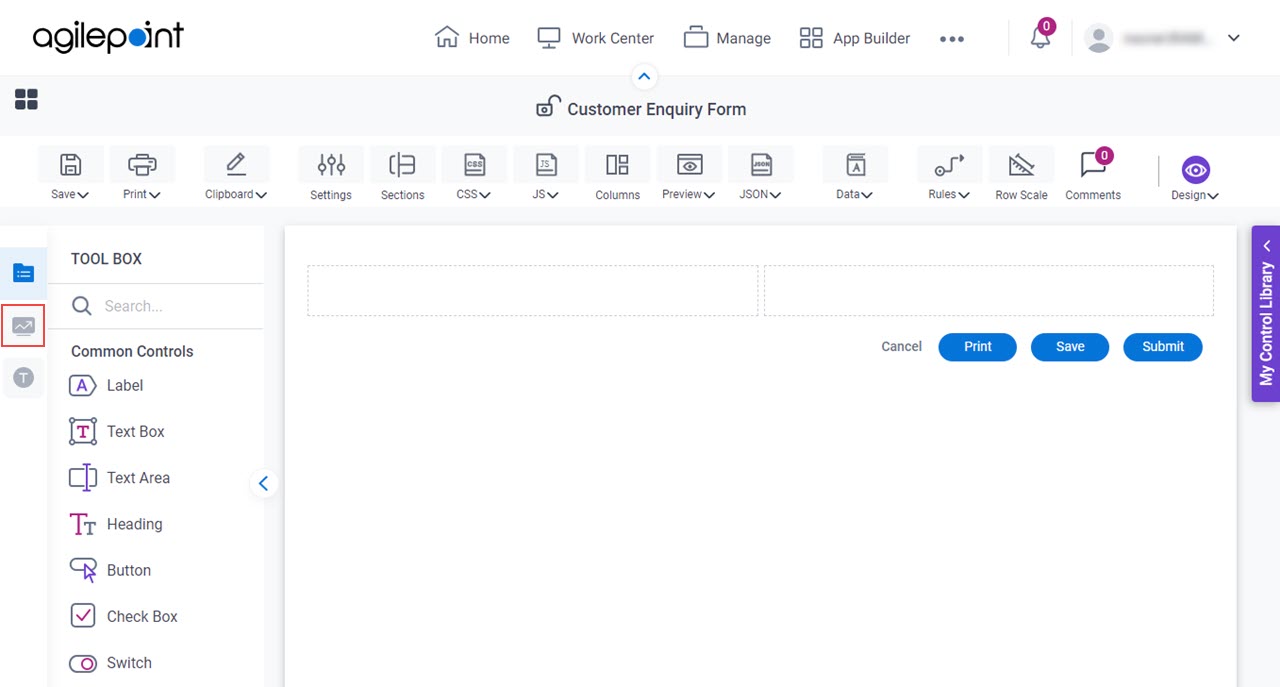
- On the Advanced Controls tab,
drag a People Picker
form control onto your eForm.
Procedure
- Complete the settings on the configuration screens.
You can use the Data screen screen to specify a variable.
General
Specifies the basic configuration for the People Picker form control.
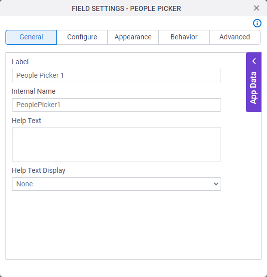
Fields
| Field Name | Definition |
|---|---|
Label |
|
Internal Name |
|
Help Text |
|
Help Text Display |
|
Configure
Configures advanced settings for your form control.
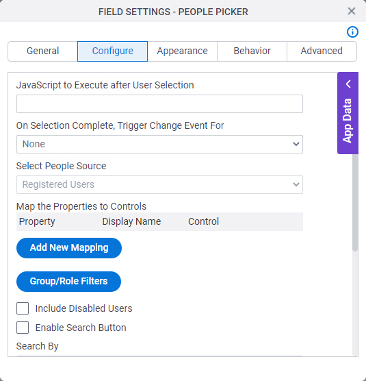
Fields
| Field Name | Definition |
|---|---|
Javascript To Execute After User Selection |
|
On Selection Complete, Trigger Change Event For |
|
Select People Source |
|
Map the Properties to Controls - Property |
|
Map the Properties to Controls - Display Name |
|
Map the Properties to Controls - Control |
|
Group/Role Filters |
|
Include Disabled Users |
|
Select Property to Search With |
|
Maximum number of users to display by default |
|
Show As Image Button |
|
Pick Group/Role Filters screen
Specifies the AgilePoint groups or roles that can show on the eForm.
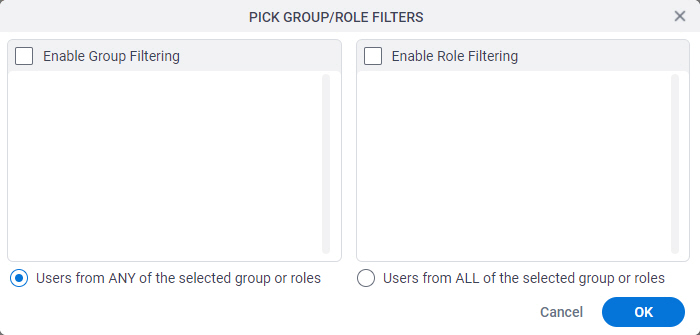
Fields
| Field Name | Definition |
|---|---|
Enable Group Filtering |
|
Enable Role Filtering |
|
Users From the Selected Group/Roles |
|
Appearance
Specifies the look and feel for your form control.
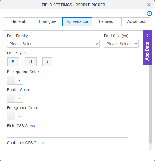
Fields
| Field Name | Definition |
|---|---|
Font Family |
|
Font Size (px) |
|
Font Style |
|
Background Color |
|
Border Color |
|
Foreground Color |
|
Field CSS Class |
|
Container CSS Class |
|

Behavior
Specifies how the control shows on your form.
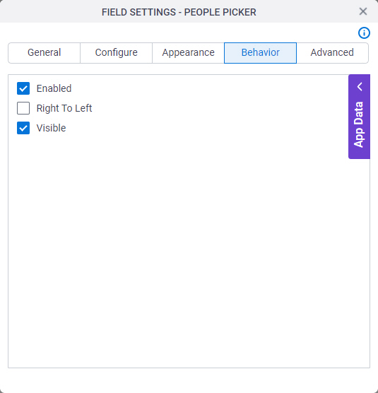
Fields
| Field Name | Definition |
|---|---|
Enabled |
|
Right To Left |
|
Visible |
|
Advanced
Specifies advanced settings for your form control.
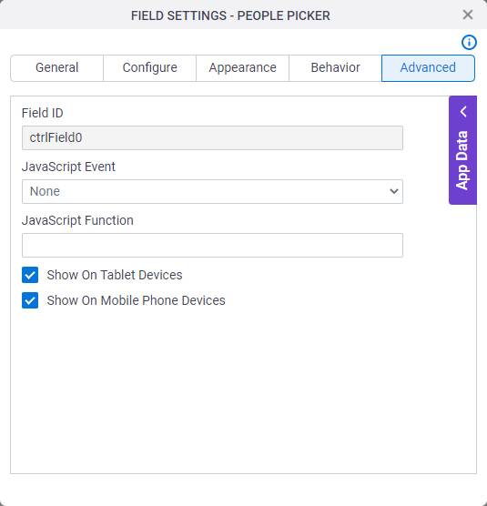
Fields
| Field Name | Definition |
|---|---|
Field ID |
|
JavaScript Event |
|
JavaScript Function |
|
Show On Tablet Devices |
|
Show On Mobile Phone Devices |
|