Video form control

A form control that shows a video on an eForm.


Video form control

Configure the Video form control

To configure the Video Video Control icon control, do the procedure in this topic.

Video: Common Configuration Settings in eForm Controls

Prerequisites

How to Start

  1. Open eForm Builder.

    For information about how to open this screen, refer to eForm Builder screen.


    Eform Builder screen
  2. On the eForm Builder screen, in the Toolbox, open the Advanced Controls tab.

    Advanced Controls tab
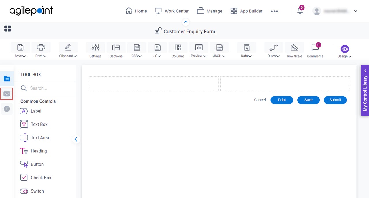
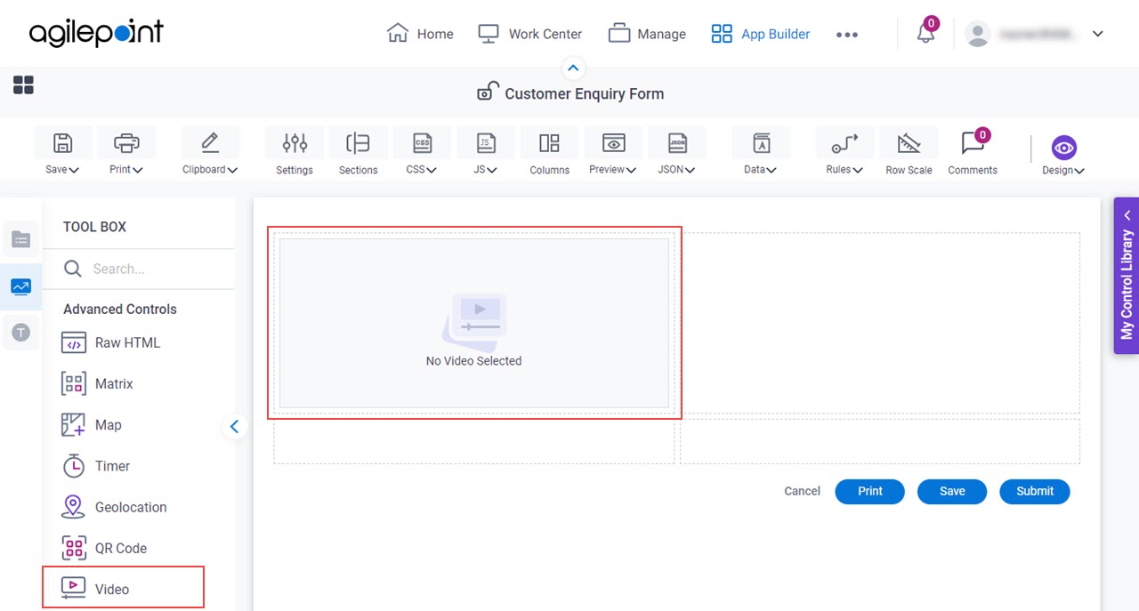
  3. On the Advanced Controls tab, drag a Video Video Control icon form control onto your eForm.

    Video Form Control

General tab - Video

Specifies the basic configuration for the Video form control.
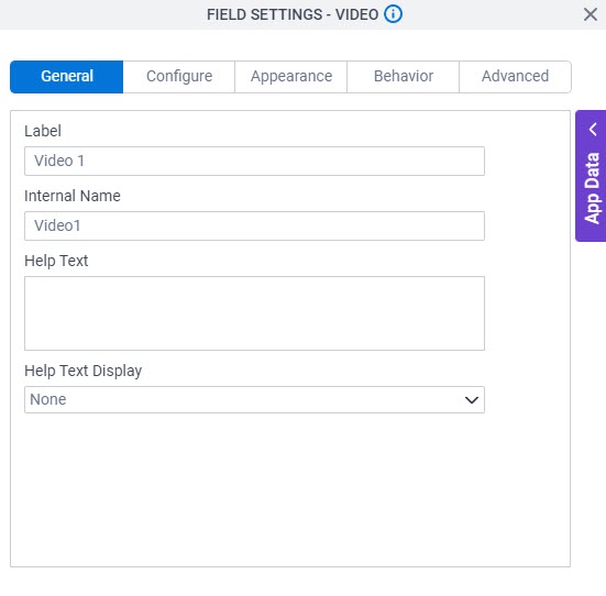
Figure: General tab

General tab

Fields

Field NameDefinition

Label

Description:
Specifies the text label that shows on your form for the control.
Allowed Values:
One line of text (a string).

Accepted:

  • Letters
  • Numbers
  • Spaces
Default Value:
Different for different controls.
Example:
This is a common configuration field that is used in many examples. Refer to:
  • Examples - Step-by-step use case examples, information about what types of examples are provided in the AgilePoint NX Product Documentation, and other resources where you can find more examples.

Internal Name

Description:
Specifies a unique, technical name for your control.
Allowed Values:
One line of text (a string).

Not Accepted:

  • Spaces
Default Value:
Different for different controls.
Example:
This is a common configuration field that is used in many examples. Refer to:
  • Examples - Step-by-step use case examples, information about what types of examples are provided in the AgilePoint NX Product Documentation, and other resources where you can find more examples.

Help Text

Description:
Specifies the text to shows when a runtime app user hovers their cursor over the form control.
Allowed Values:
More than one line of text.
Default Value:
None
Example:
Refer to:

Help Text Display

Description:
Specifies if the field shows the text in the Help Text field when the runtime app user hovers over the label or field.
Allowed Values:
  • None - Does not show the help text.
  • Hover On Label - Shows the help text when you put your mouse on the label.
  • Hover On Field - Shows the help text when you put your mouse on the field.
  • Hover On Both - Shows the help text when you put your mouse on the label and Field.
Default Value:
None
Example:
Refer to:

Configure tab - Video

Configures the settings that are specific to the Video form control.
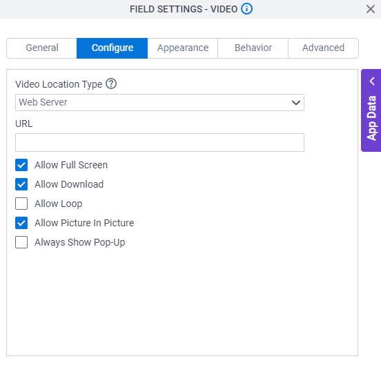
Figure: Configure tab

Configure tab

Fields

Field NameDefinition

Video Location Type

Description:
Specifies the type of source location for the video to show on your eForm.
Allowed Values:
  • Web Server - Specifies the video from your web server that all runtime app users for your eForm can access.
  • Streaming - Specifies the video embedded from an external service or cloud-based platform, such as on YouTube.
Default Value:
Web Server

URL

Description:
Specifies the URL of a video file.
Allowed Values:
One line of text (a string) in URL format that points to a video file.
Default Value:
None

Allow Full Screen

Description:
Specifies whether to show the Full screen option on the video so the runtime app user can view the video in full screen mode.
Allowed Values:
  • Selected - Shows the Full screen option on the video, and runtime app users can view the video in full screen mode.
  • Deselected - The Full screen option is disabled on the video, and runtime app users can not view the video in full screen mode.
Default Value:
Selected

Allow Download

Description:
Specifies whether to show the Download option on the video so the runtime app user can download the video.
To Open this Field:
  1. In the Video Location Type field, select Web Server.
Allowed Values:
  • Selected - Shows the Download option on the video, and runtime app users can download the video.
  • Deselected - Hides the Download option on the video. The runtime app users can only view the video and can not download it.
Default Value:
Selected

Allow Loop

Description:
Specifies whether to play the video on repeat after it ends.
To Open this Field:
  1. In the Video Location Type field, select Web Server.
Allowed Values:
  • Selected - The eForm plays the video on repeat after it ends.
  • Deselected - The eForm plays the video once only, and it does not play the video again.
Default Value:
Deselected

Allow Picture In Picture

Description:
Specifies whether to show the picture in picture option on the video so the runtime app user can view the video in a floating window.
To Open this Field:
  1. In the Video Location Type field, select Web Server.
Allowed Values:
  • Selected - Shows the picture in picture option on the video, and runtime app users can view the video in a floating window.

    With this option, the runtime app user can keep watching the video while using other apps.

  • Deselected - Hides the picture in picture option on the video, and runtime app users can not view the video in a floating window.
Default Value:
Selected

Always Show Pop-Up

Description:
Specifies whether the eForm opens the video in a pop-up window.
Allowed Values:
  • Selected - Shows the button for a video on an eForm with the text specified on the Label field.

    The eForm opens the video in a pop-up window when a runtime app user clicks the button.

  • Deselected - Shows the video on an eForm and the runtime app users can not open it in a pop-up window.
Default Value:
Selected

Show Pop-Up Icon (No Label Or Preview)

Description:
Specifies whether the eForm shows the video as a pop-up icon with no text.
To Open this Field:
  1. Select Always Show Pop-Up.
Allowed Values:
  • Selected - Shows the video as a pop-up icon with no text on an eForm.

    The eForm opens the video in a pop-up window when a runtime app user clicks the icon.

  • Deselected - Shows the button for a video on an eForm with the text specified on the Label field.

    The eForm opens the video in a pop-up window when a runtime app user clicks the button.

Default Value:
Deselected

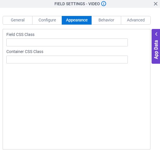
Appearance tab - Video

Specifies the look and feel for the Video form control.

Figure: Appearance tab

Appearance tab

Fields

Field NameDefinition

Field CSS Class

Description:
Specifies a CSS class for the field in your control.
Allowed Values:
A valid CSS class.
Default Value:
None

If you specify your CSS CSS icon on the top menu, the CSS is populated.

Example:
Refer to:

Container CSS Class

Description:
Specifies a CSS class for the container of your control.
Allowed Values:
A valid CSS class.
Default Value:
None

If you specify your CSS CSS icon on the top menu, the CSS is populated.

Example:
Refer to:

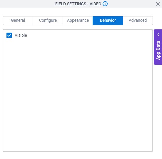
Behavior tab - Video

Specifies how the Video control shows on your form.

Figure: Behavior tab

Behavior tab

Fields

Field NameDefinition

Visible

Description:
Specifies if the runtime app user sees the field.
Allowed Values:
  • Selected - The runtime app user sees the field.
  • Deselected - The runtime app user does not see the field.
Default Value:
Selected
Example:
Refer to:

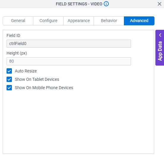
Advanced tab - Video

Specifies the advanced settings for the Video form control.

Figure: Advanced tab

Advanced tab

Fields

Field NameDefinition

Field ID

Description:
Shows an ID of the control.
Allowed Values:
Read only.
Default Value:
Different for different controls.
Example:
Refer to:

Height (px)

Description:
Specifies height of the video form control in pixels.
Allowed Values:
An integer.

Range

  • Greater than 0

Rules:

  • If Auto Resize is selected, you can not change this field.
Default Value:
80

Auto Resize

Description:
Specifies whether the form control changes the height of the video based on the browser window size.
Allowed Values:
  • Selected - The form control height is static.
  • Deselected - Changes the height of the image based on the browser window size.

    With this option, you can specify the default height of the video form control in the Height (px) field.

Default Value:
Selected

Show On Tablet Devices

Description:
Specifies if the form field shows on a tablet.
Allowed Values:
  • Selected - The form field shows on a tablet.
  • Deselected - The form field does not show on a tablet.
Default Value:
Selected
Example:
Refer to:

Show On Mobile Phone Devices

Description:
Specifies if the form field shows on a mobile device.
Allowed Values:
  • Selected - The form field shows on a mobile device.
  • Deselected - The form field does not show on a mobile device.
Default Value:
Selected
Example:
Refer to: