Comments form control

A form control that lets a form user enter a comment.


Comments form control

Configure the Comments form control

To configure the Comments Comments icon control, do the procedure in this topic.

Video: Common Configuration Settings in eForm Controls

Examples

Good to Know

How to Start

  1. Open eForm Builder.

    For information about how to open this screen, refer to eForm Builder screen.


    Eform Builder screen
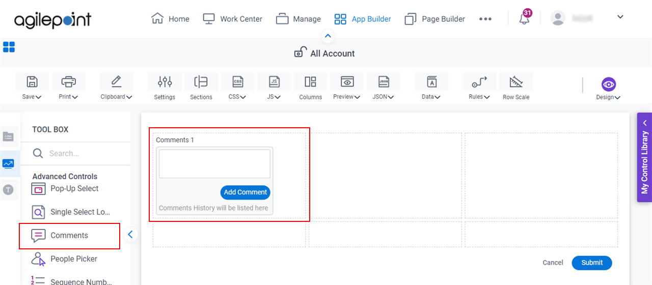
  2. On the eForm Builder screen, in the Toolbox, open the Advanced Controls tab.

    Advanced Controls tab
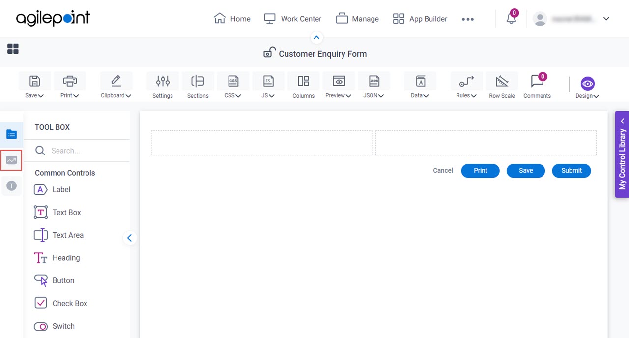
  3. On the Advanced Controls tab, drag a Comments Comments icon form control onto your eForm.

    Comments Form Control

Procedure

  1. Complete the settings on the configuration screens.

    You can use the Data screen screen to specify a variable.

General

Specifies the basic configuration for the Comments form control.
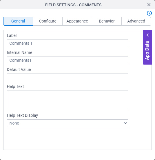
Figure: General tab

General tab

Fields

Field NameDefinition

Label

Description:
Specifies the text label that shows on your form for the control.
Allowed Values:
One line of text (a string).

Accepted:

  • Letters
  • Numbers
  • Spaces
Default Value:
Different for different controls.
Example:
This is a common configuration field that is used in many examples. Refer to:
  • Examples - Step-by-step use case examples, information about what types of examples are provided in the AgilePoint NX Product Documentation, and other resources where you can find more examples.

Internal Name

Description:
Specifies a unique, technical name for your control.
Allowed Values:
One line of text (a string).

Not Accepted:

  • Spaces
Default Value:
Different for different controls.
Example:
This is a common configuration field that is used in many examples. Refer to:
  • Examples - Step-by-step use case examples, information about what types of examples are provided in the AgilePoint NX Product Documentation, and other resources where you can find more examples.

Default Value

Description:
Specifies the default value in the field.
Allowed Values:
An integer.
Default Value:
Different for different controls.

Help Text

Description:
Specifies the text to shows when a runtime app user hovers their cursor over the form control.
Allowed Values:
More than one line of text.
Default Value:
None
Example:
Refer to:

Help Text Display

Description:
Specifies if the field shows the text in the Help Text field when the runtime app user hovers over the label or field.
Allowed Values:
  • None - Does not show the help text.
  • Hover On Label - Shows the help text when you put your mouse on the label.
  • Hover On Field - Shows the help text when you put your mouse on the field.
  • Hover On Both - Shows the help text when you put your mouse on the label and Field.
Default Value:
None
Example:
Refer to:

Configure

Configures advanced settings for your form control.
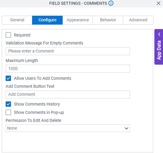
Figure: Configure tab

Configure tab

Fields

Field NameDefinition

Required

Description:
Specifies if the field is mandatory.
Allowed Values:
  • Deselected - The field is not mandatory.
  • Selected - The field is mandatory.
Default Value:
Deselected
Example:
Refer to:

Validation Message for Required Field

Description:
Specifies the message to show if the form user does not enter data in a mandatory form control.
Allowed Values:
More than one line of text.
Default Value:
Enter the ${L}

${L} is a variable that shows the name of the form control.

Example:
Refer to:

Empty Comment Validation Message

Description:
Specifies the message to show if the participant does not enter a comment in the form.
Allowed Values:
More than one line of text.
Default Value:
None

Maximum Length

Description:
Specifies the maximum number of characters permitted in an input field.
Allowed Values:
An integer.
Default Value:
1000

Allow Users To Add Comments

Description:
Specifies if the participant can add new comments.
Allowed Values:
  • Selected - Lets the participant add new comments.
  • Deselected - Does not let the participant add new comments.
Default Value:
Selected

Add Comment Button Text

Description:
Specifies the message to show on the button.
To Open this Field:
  1. Select Allow Add Comment.
Allowed Values:
One line of text (a string).
Default Value:
None

Show Comments History

Description:
Specifies if the comment history shows on the form.
Allowed Values:
  • Selected - Shows the comment history.
  • Deselected - Does not show the comment history.
Default Value:
Selected

Show Comments in Pop-up

Description:
Specifies if the comments show on a new screen.
Allowed Values:
  • Selected - Shows the comments on a new screen.
  • Deselected -Shows the comments on the current screen.
Default Value:
Deselected

Shows Comment Button Text

Description:
Specifies the message to show on the button.
To Open this Field:
  1. Select Show Comments in Pop-up.
Allowed Values:
One line of text (a string).
Default Value:
None

Appearance

Specifies the look and feel for your form control.
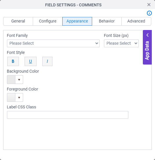
Figure: Appearance tab

Appearance tab

Fields

Field NameDefinition

Font Family

Description:
Specifies the font family of the input text and label.
Allowed Values:
A font name from the list.
Default Value:
  • Modern theme - Roboto
  • Classic theme - Arial
Example:
Refer to:

Font Style

Description:
Specifies the style of the font for the input text and label.
Allowed Values:
  • Bold - Shows the input text and label in bold.
  • Underline - Shows the label underlined.
  • Italic - Shows the label in italic.
Default Value:
None
Example:
Refer to:

Background Color

Description:
Specifies the background color for your control.
Allowed Values:
A color value using a hex code, RGB code, or RGBA code.

You can enter a color code, or select a color from the palette.

Default Value:
#ff0000
Example:
Refer to:

Foreground Color

Description:
Specifies the foreground color for your control.
Allowed Values:
A color value using a hex code, RGB code, or RGBA code.

You can enter a color code, or select a color from the palette.

Default Value:
#ff0000
Example:
Refer to:

Label CSS Class

Description:
Specifies a CSS class for the label of your control.
Allowed Values:
A valid CSS class.
Default Value:
None

If you specify your CSS CSS icon on the top menu, the CSS is populated.

Example:
Refer to:

Font Size (px)

Description:
Specifies the size of the input text and label for your form control.
Allowed Values:
An integer.

Range

  • Greater than 0
Default Value:
  • Classic theme - 12
  • Modern theme - 14
Example:
Refer to:

Behavior

Specifies how the control shows on your form.
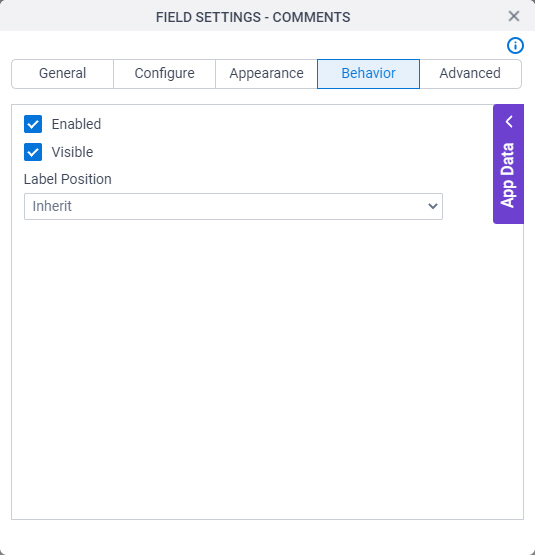
Figure: Behavior tab

Behavior tab

Fields

Field NameDefinition

Enabled

Description:
Specifies if the form user can change the value of a field.
Allowed Values:
  • Selected - The form user can change the value.
  • Deselected - The input cannot change the value.
Default Value:
Selected
Example:
Refer to:

Visible

Description:
Specifies if the runtime app user sees the field.
Allowed Values:
  • Selected - The runtime app user sees the field.
  • Deselected - The runtime app user does not see the field.
Default Value:
Selected
Example:
Refer to:

Label Position

Description:
Specifies the position of the text label that shows on your form for the control.
Allowed Values:
  • Inherit - The position of the label is as specified in the form settings.
  • Left - Specifies that the position of the label is to the left of the container.
  • Top - Specifies that the position of the label is to the top of the container.
Default Value:
Inherit
Example:
Refer to:

Advanced

Specifies advanced settings for your form control.
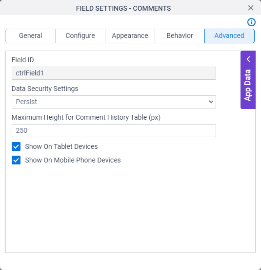
Figure: Advanced tab

Advanced tab

Fields

Field NameDefinition

Field ID

Description:
Shows an ID of the control.
Allowed Values:
Read only.
Default Value:
Different for different controls.
Example:
Refer to:

Data Security Settings

Description:
Specifies whether to store information from the field in the process schema, so the app can use it again, or to simply pass on the information after the form is submitted without storing the information. This option helps to protect sensitive user information.
Allowed Values:
  • Persist - Stores the data from the field in the process schema, so the app can use it again.
  • Do Not Persist - Does not store the data from the field in the process schema. This option provides greater security for sensitive user information.
Default Value:
Persist
Example:
Refer to:

Maximum Height for Comment History Table (px)

Description:
Specifies the maximum height for the comment history table in pixels.
Allowed Values:
An integer.
Default Value:
250

Show On Tablet Devices

Description:
Specifies if the form field shows on a tablet.
Allowed Values:
  • Selected - The form field shows on a tablet.
  • Deselected - The form field does not show on a tablet.
Default Value:
Selected
Example:
Refer to:

Show On Mobile Phone Devices

Description:
Specifies if the form field shows on a mobile device.
Allowed Values:
  • Selected - The form field shows on a mobile device.
  • Deselected - The form field does not show on a mobile device.
Default Value:
Selected
Example:
Refer to: