
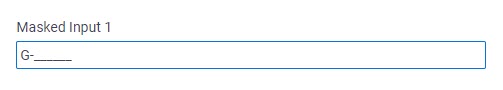
Masked Input form control
A form control that lets a runtime app user enter data in a specific format.
Configure the Masked Input form control
To configure the Masked Input  control,
do the procedure in this topic.
control,
do the procedure in this topic.
Video: Common Configuration Settings in eForm Controls
Examples
- (External) Masked Input Control for AgilePoint NX eForms
- Examples - Step-by-step use case examples, information about what types of examples are provided in the AgilePoint NX Product Documentation, and other resources where you can find more examples.
Prerequisites
- AgilePoint NX OnDemand (public cloud), AgilePoint NX PrivateCloud, or AgilePoint NX OnPremises v9.0 or higher.
How to Start
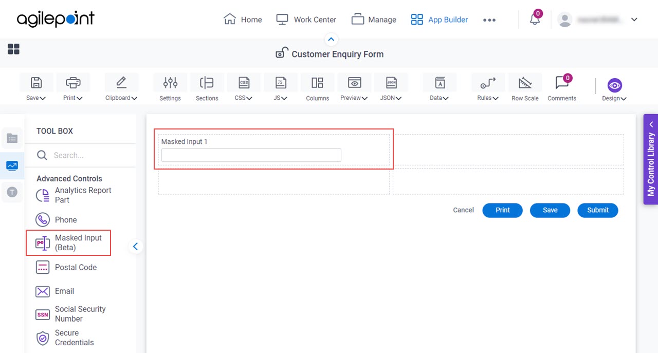
- Open eForm Builder.
For information about how to open this screen, refer to eForm Builder screen.

- On the eForm Builder screen, in the Toolbox, open the Advanced Controls tab.
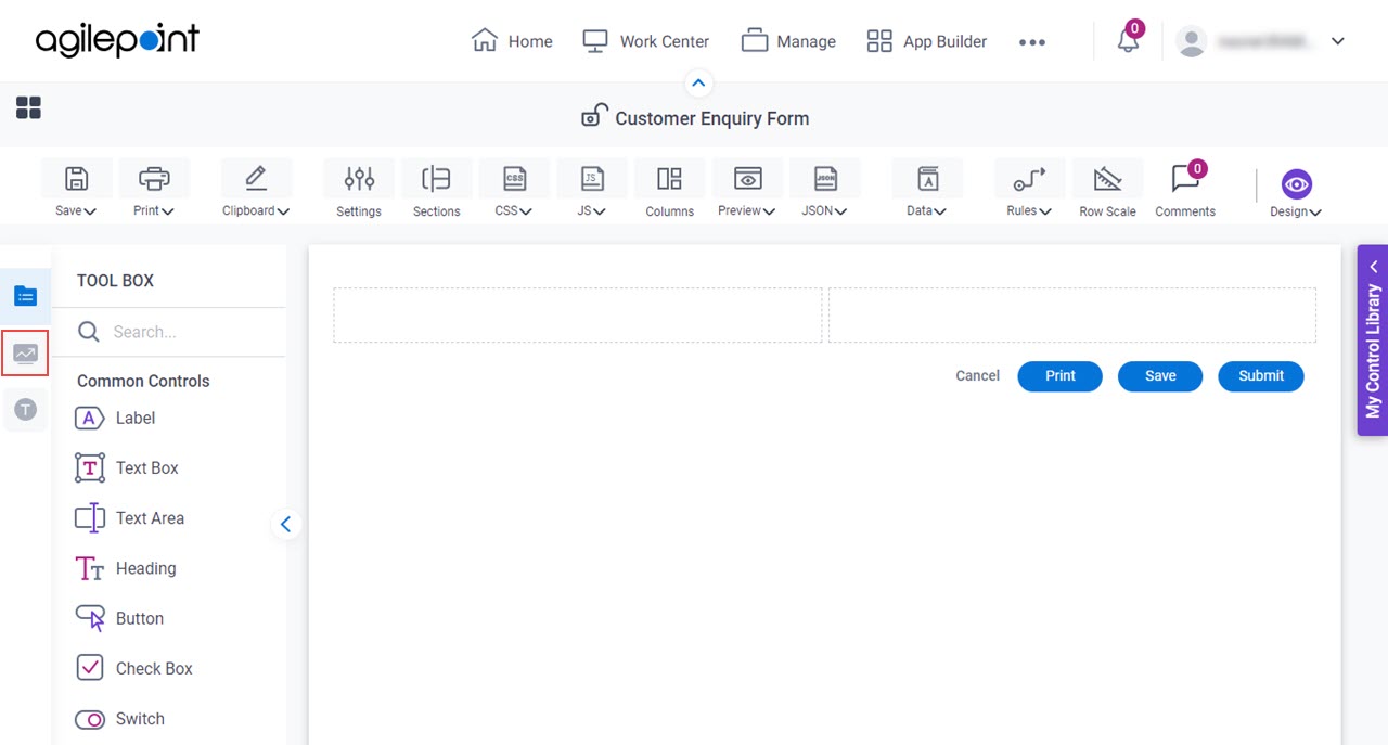
- On the Advanced Controls tab, drag a Masked Input form control onto your eForm.
General tab - Masked Input
Specifies the basic configuration for the Masked Input form control.
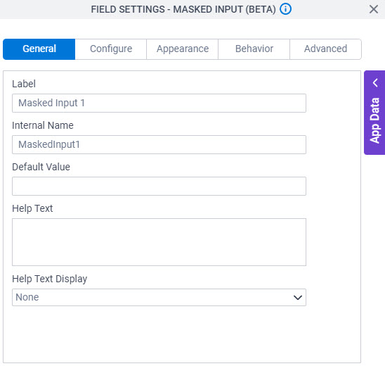
Fields
| Field Name | Definition |
|---|---|
Label |
|
Internal Name |
|
Default Value |
|
Help Text |
|
Help Text Display |
|
Configure tab - Masked Input
Configures the settings that are specific to the Masked Input form control.
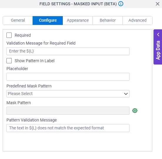
Fields
| Field Name | Definition |
|---|---|
Required |
|
Validation Message for Required Field |
|
Show Pattern In Label |
|
Placeholder |
|
Predefined Mask Pattern |
|
Mask Pattern |
|
Configure Mask Pattern |
|
Pattern Validation Message |
|
Appearance tab - Masked Input
Specifies the look and feel for the Masked Input form control.
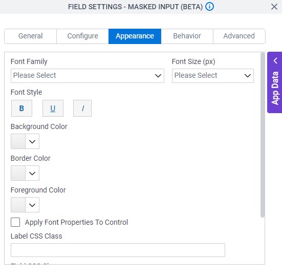
Fields
| Field Name | Definition |
|---|---|
Font Family |
|
Font Size (px) |
|
Font Style |
|
Background Color |
|
Border Color |
|
Foreground Color |
|
Apply Font Properties To Control |
|
Label CSS Class |
|
Field CSS Class |
|
Container CSS Class |
|

Behavior tab - Masked Input
Specifies how the Masked Input control shows on the form.
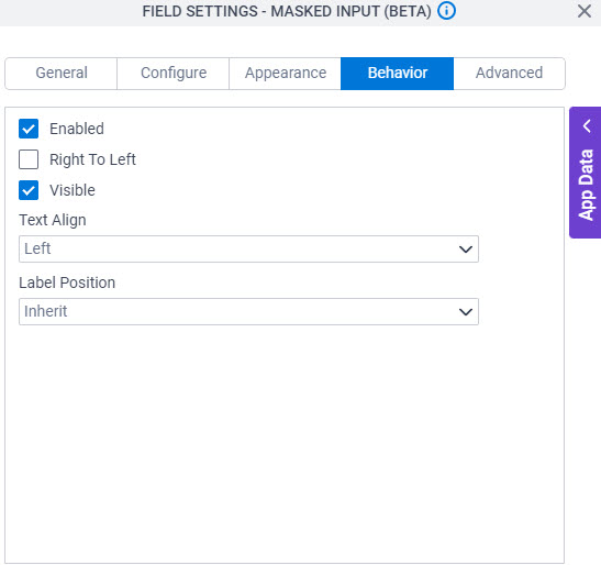
| Field Name | Definition |
|---|---|
Enabled |
|
Right To Left |
|
Visible |
|
Text Align |
|
Label Position |
|
Advanced tab - Masked Input
Specifies the advanced settings for the Masked Input form control.
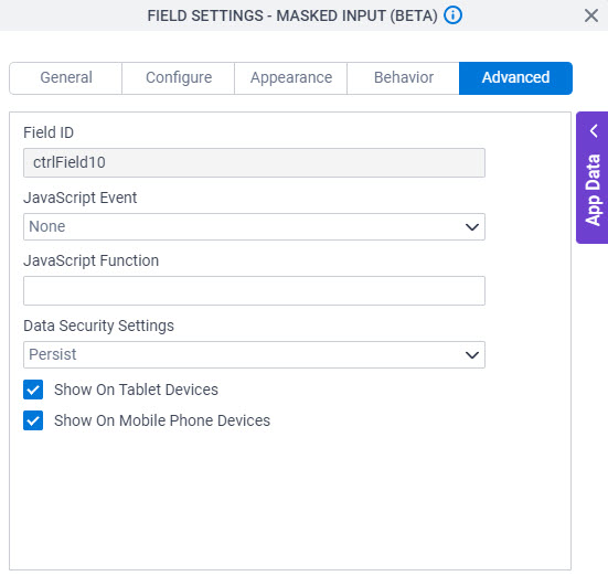
Fields
| Field Name | Definition |
|---|---|
Field ID |
|
JavaScript Event |
|
JavaScript Function |
|
Data Security Settings |
|
Show On Tablet Devices |
|
Show On Mobile Phone Devices |
|