
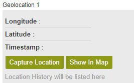
Geolocation form control
A form control that lets a form user select a geographical location.
Configure the Geolocation form control
To configure
the Geolocation  control, do the procedure in this topic.
Video: Use a Form-Based App to Create a Widget (Modern)
Video: Common Configuration Settings in eForm Controls
How to Start
- Open eForm Builder.
For information about how to open this screen, refer to eForm Builder screen.

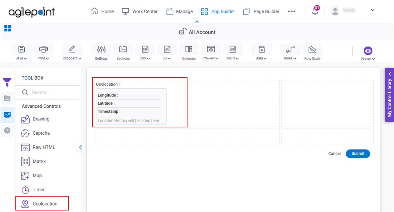
- On the eForm Builder screen, in the Toolbox, open the Advanced Controls tab.
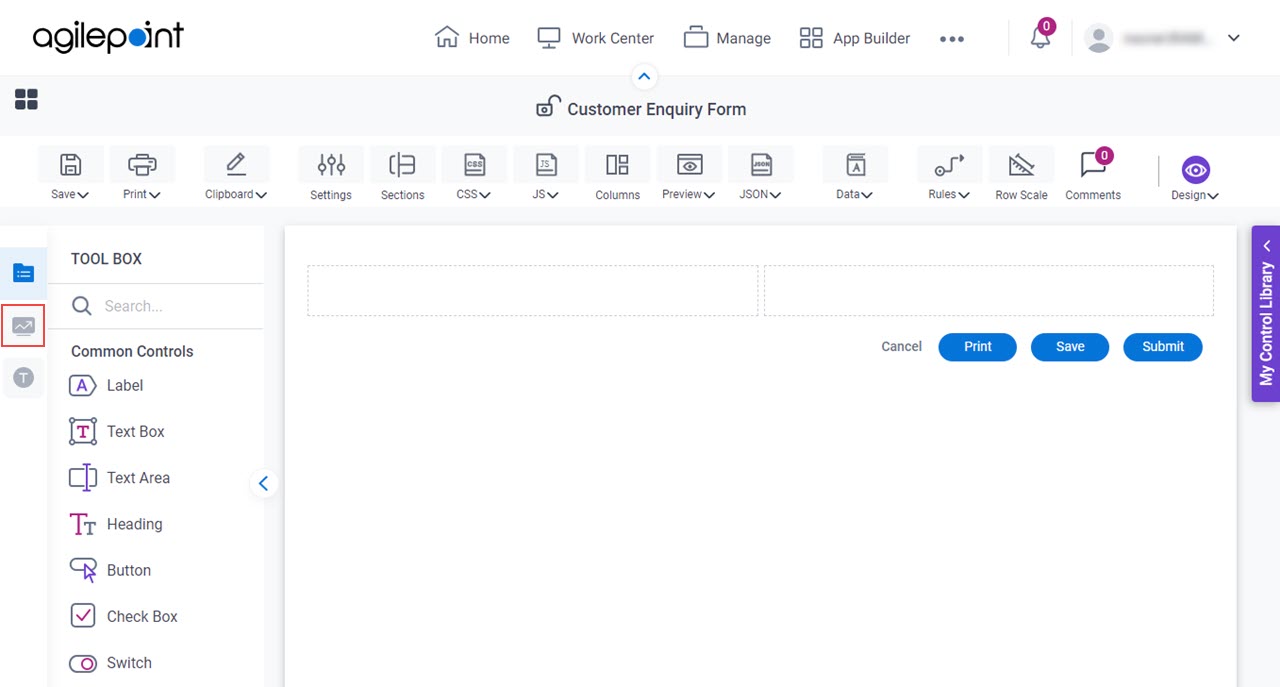
- On the Advanced Controls tab, drag a Geolocation form control onto your eForm.
Procedure
- Complete the settings on the configuration screens.
You can use the Data screen screen to specify a variable.
General
Specifies the basic configuration for the Geolocation form control.
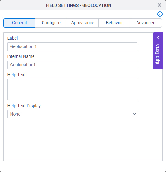
Fields
| Field Name | Definition |
|---|---|
Label |
|
Internal Name |
|
Help Text |
|
Help Text Display |
|
Configure
Configures advanced settings for your form control.
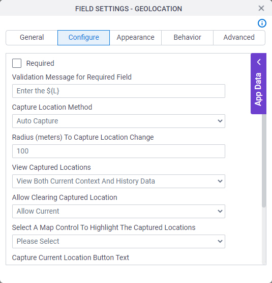
Fields
| Field Name | Definition |
|---|---|
Required |
|
Validation Message for Required Field |
|
Capture Location Method |
|
Radius (meters) To Capture Location Change |
|
View Captured Location |
|
Allow Clearing Captured Location |
|
Select a Map Control to Highlight the Captured Location |
|
Capture Current Location Button Text |
|
Show Location In Map Button Text |
|
Show Timestamp |
|
Show Altitude |
|
Appearance
Specifies the look and feel for your form control.
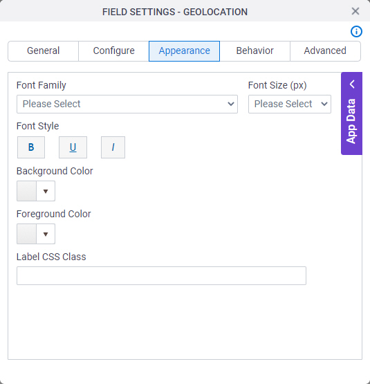
Fields
| Field Name | Definition |
|---|---|
Font Family |
|
Font Size (px) |
|
Font Style |
|
Background Color |
|
Foreground Color |
|
Label CSS Class |
|

Behavior
Specifies how the control shows on your form.
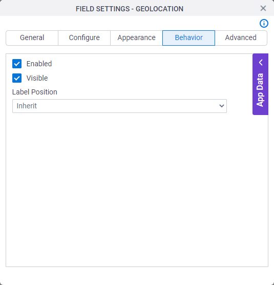
Fields
| Field Name | Definition |
|---|---|
Enabled |
|
Visible |
|
Label Position |
|
Advanced
Specifies advanced settings for your form control.
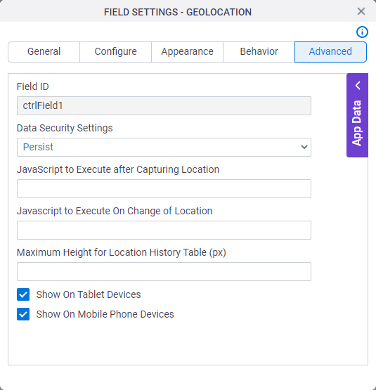
Fields
| Field Name | Definition |
|---|---|
Field ID |
|
Data Security Settings |
|
Javascript To Execute After Capturing Location |
|
Javascript To Execute On Change of Location |
|
Maximum Height for Location History Table (px) |
|
Show On Tablet Devices |
|
Show On Mobile Phone Devices |
|