Sequence Number form control

A form control that lets you create an alphanumeric string with a number that increments each time a new instance of an eForm starts. You can use the sequence number generated by this form control for tracking purposes, such as a request number or purchase order number.


Sequence Number form control

Configure the Sequence Number form control

To configure the Sequence Number Sequence Number icon control, do the procedure in this topic.

Video: Common Configuration Settings in eForm Controls

Examples

Prerequisites

  • Microsoft SQL Server 2012 or higher.

Good to Know

  • If a form user starts a new instance of an eForm, and then cancels it without submitting the form, the sequence number created for the eForm instance becomes unusable. The next time an eForm instance is created, a new sequence number is created.

How to Start

  1. Open eForm Builder.

    For information about how to open this screen, refer to eForm Builder screen.


    Eform Builder screen
  2. On the eForm Builder screen, in the Toolbox, open the Advanced Controls tab.

    Advanced Controls tab
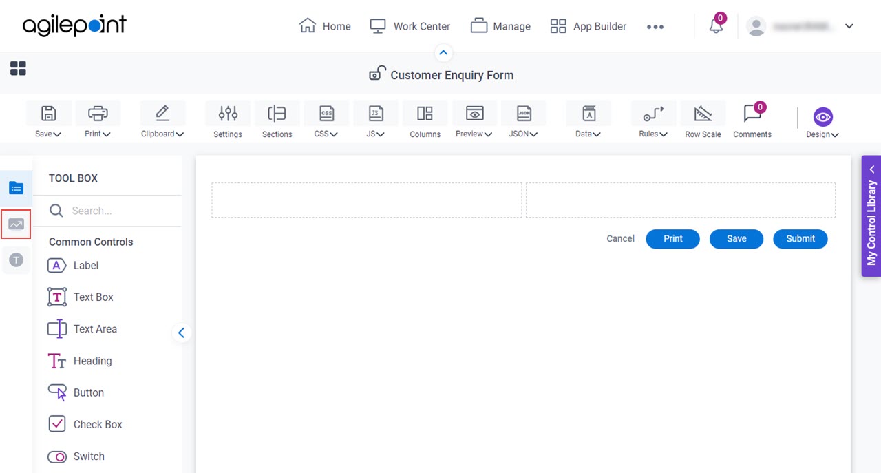
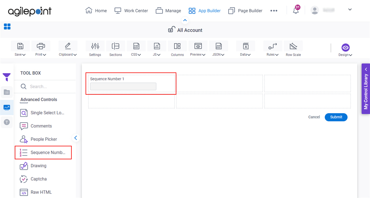
  3. On the Advanced Controls tab, drag a Sequence Number Sequence Number icon form control onto your eForm.

    Sequence Number Form Control

Procedure

  1. Complete the settings on the configuration screens.

    You can use the Data screen screen to specify a variable.

General

Specifies the basic configuration for the Sequence Number form control.
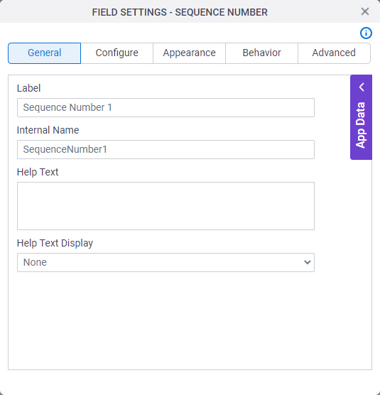
Figure: General tab

General tab

Fields

Field NameDefinition

Label

Description:
Specifies the text label that shows on your form for the control.
Allowed Values:
One line of text (a string).

Accepted:

  • Letters
  • Numbers
  • Spaces
Default Value:
Different for different controls.
Example:
This is a common configuration field that is used in many examples. Refer to:
  • Examples - Step-by-step use case examples, information about what types of examples are provided in the AgilePoint NX Product Documentation, and other resources where you can find more examples.

Internal Name

Description:
Specifies a unique, technical name for your control.
Allowed Values:
One line of text (a string).

Not Accepted:

  • Spaces
Default Value:
Different for different controls.
Example:
This is a common configuration field that is used in many examples. Refer to:
  • Examples - Step-by-step use case examples, information about what types of examples are provided in the AgilePoint NX Product Documentation, and other resources where you can find more examples.

Help Text

Description:
Specifies the text to shows when a runtime app user hovers their cursor over the form control.
Allowed Values:
More than one line of text.
Default Value:
None
Example:
Refer to:

Help Text Display

Description:
Specifies if the field shows the text in the Help Text field when the runtime app user hovers over the label or field.
Allowed Values:
  • None - Does not show the help text.
  • Hover On Label - Shows the help text when you put your mouse on the label.
  • Hover On Field - Shows the help text when you put your mouse on the field.
  • Hover On Both - Shows the help text when you put your mouse on the label and Field.
Default Value:
None
Example:
Refer to:

Configure

Specifies detailed configuration settings for your form control.
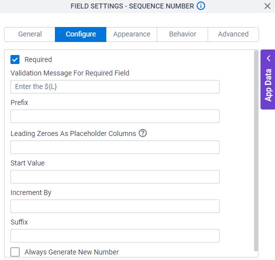
Figure: Configure tab

Configure tab

Fields

Field NameDefinition

Prefix

Description:
Specifies text to show before each incremented number in a series.
Allowed Values:
One line of text (a string).

Accepted:

  • Letters
  • Spaces
  • Special characters
Default Value:
None
Accepts Variables:
Yes
Example:
INT-

If the prefix is INT-, the start value is 1, and the increment is 1, the form control creates the series, INT-1, INT-2, INT-3,... INT-9, INT-10

Also refer to:

Leading Zeroes As Placeholder Columns

Description:
Specifies the number of leading zeros (0) used in the sequence number form control. Based on the value specified in this field, the form control adds the leading zeros (0) before each increment number in a series.

Leading zeros (0) act as placeholder columns to keep the same number of characters for each value, especially when the 10s column increases.

This value is separate from the prefix and suffix values.

Allowed Values:
An integer.
Default Value:
None
Example:
3

If the prefix is INT-, the leading zeroes as placeholder columns is 3, the start value is 1, and the increment is 1, the form control creates the series, INT-001, INT-002,...INT-009, INT-010

Limitations:

This field is available in these releases:

Start Value

Description:
Specifies the first number in the increment series.
Allowed Values:
An integer.

Range

  • Greater than 0
Default Value:
None
Example:
Refer to:

Increment By

Description:
Specifies the amount to increase the each number in a series.
Allowed Values:
An integer.

Range

  • Greater than 0
Default Value:
None
Example:
Refer to:

Suffix

Description:
Specifies the text to show after each number in an incremented series.
Allowed Values:
One line of text (a string).

Accepted:

  • Letters
  • Spaces
  • Special characters
Default Value:
None
Accepts Variables:
Yes
Example:
th

If the suffix is th, the start value is 10, and the increment by number is 1, the form control creates the series, 10th, 11th, 12th...

Always Generate New Number

Description:
Specifies whether to create a new sequence number each time a runtime app user opens the eForm.
Allowed Values:
  • Selected - Creates a new sequence number each time a runtime app user opens the eForm. The sequence number increments each time the form opens. The form does not need to submit to change the sequence number.

    With this option, the sequence number is related to an instance of the form opening.

  • Deselected - Creates a new sequence number once the first time the eForm opens in a process instance. The sequence number does not increase after the first time the form opens.

    With this option, the sequence number is related to a process instance.

Default Value:
Deselected

Appearance

Specifies the look and feel for your form control.

Figure: Appearance tab

Appearance tab

Fields

Field NameDefinition

Font Family

Description:
Specifies the font family of the input text and label.
Allowed Values:
A font name from the list.
Default Value:
  • Modern theme - Roboto
  • Classic theme - Arial
Example:
Refer to:

Font Style

Description:
Specifies the style of the font for the input text and label.
Allowed Values:
  • Bold - Shows the input text and label in bold.
  • Underline - Shows the label underlined.
  • Italic - Shows the label in italic.
Default Value:
None
Example:
Refer to:

Font Size (px)

Description:
Specifies the size of the input text and label for your form control.
Allowed Values:
An integer.

Range

  • Greater than 0
Default Value:
  • Classic theme - 12
  • Modern theme - 14
Example:
Refer to:

Border Color

Description:
Specifies the border color for your control.
Allowed Values:
A color value using a hex code, RGB code, or RGBA code.

You can enter a color code, or select a color from the palette.

Default Value:
#ff0000
Example:
Refer to:

Foreground Color

Description:
Specifies the foreground color for your control.
Allowed Values:
A color value using a hex code, RGB code, or RGBA code.

You can enter a color code, or select a color from the palette.

Default Value:
#ff0000
Example:
Refer to:

Apply Font Properties To Control

Description:
Specifies if the control gets the font properties from the properties set in the form settings.
Allowed Values:
  • Selected - The control gets the font properties from the properties set in the form settings.
  • Deselected - The control does not get the font properties from the properties set in the form settings.
Default Value:
Deselected
Example:
Refer to:

Label CSS Class

Description:
Specifies a CSS class for the label of your control.
Allowed Values:
A valid CSS class.
Default Value:
None

If you specify your CSS CSS icon on the top menu, the CSS is populated.

Example:
Refer to:

Field CSS Class

Description:
Specifies a CSS class for the field in your control.
Allowed Values:
A valid CSS class.
Default Value:
None

If you specify your CSS CSS icon on the top menu, the CSS is populated.

Example:
Refer to:

Container CSS Class

Description:
Specifies a CSS class for the container of your control.
Allowed Values:
A valid CSS class.
Default Value:
None

If you specify your CSS CSS icon on the top menu, the CSS is populated.

Example:
Refer to:

Behavior

Specifies how the control shows on your form.
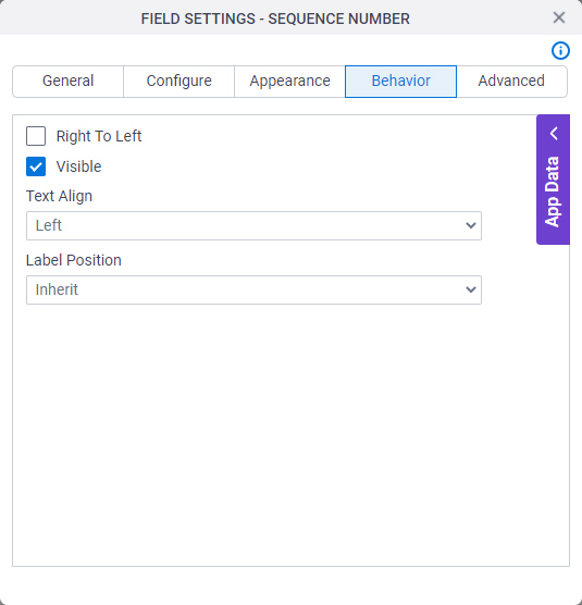
Figure: Behavior tab

Behavior tab

Fields

Field NameDefinition

Right To Left

Description:
Specifies if the text for this control, including user input, shows from right to left.
Allowed Values:
  • Deselected - The text shows from left to right.
  • Selected - The text shows from right to left.
Default Value:
Deselected
Example:
Refer to:

Visible

Description:
Specifies if the runtime app user sees the field.
Allowed Values:
  • Selected - The runtime app user sees the field.
  • Deselected - The runtime app user does not see the field.
Default Value:
Selected
Example:
Refer to:

Text Align

Description:
Specifies the horizontal alignment of user input for this control.
Allowed Values:
  • Left - Aligns the text to the left.
  • Center - Centers the text.
  • Right - Aligns the text to the right.
Default Value:
Left
Example:
Refer to:

Label Position

Description:
Specifies the position of the text label that shows on your form for the control.
Allowed Values:
  • Inherit - The position of the label is as specified in the form settings.
  • Left - Specifies that the position of the label is to the left of the container.
  • Top - Specifies that the position of the label is to the top of the container.
Default Value:
Inherit
Example:
Refer to:

Advanced

Specifies advanced settings for your form control.
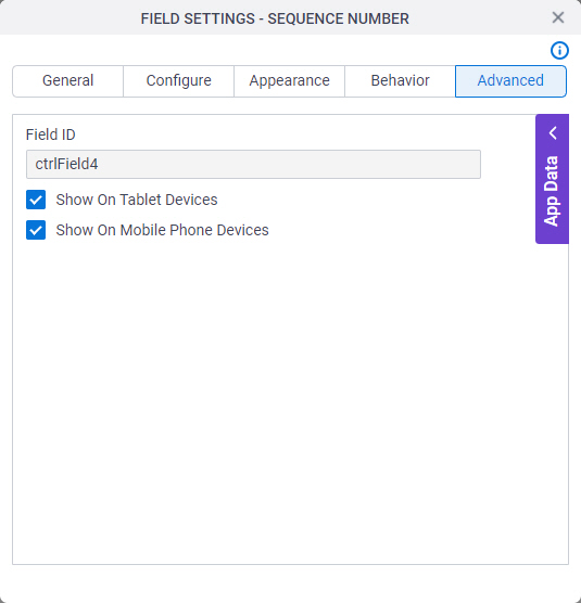
Figure: Advanced tab

Advanced tab

Fields

Field NameDefinition

Field ID

Description:
Shows an ID of the control.
Allowed Values:
Read only.
Default Value:
Different for different controls.
Example:
Refer to:

Show On Tablet Devices

Description:
Specifies if the form field shows on a tablet.
Allowed Values:
  • Selected - The form field shows on a tablet.
  • Deselected - The form field does not show on a tablet.
Default Value:
Selected
Example:
Refer to:

Show On Mobile Phone Devices

Description:
Specifies if the form field shows on a mobile device.
Allowed Values:
  • Selected - The form field shows on a mobile device.
  • Deselected - The form field does not show on a mobile device.
Default Value:
Selected
Example:
Refer to: