
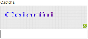
Captcha form control
A form control that shows a Captcha identity checker to your form. Captcha helps to prevent spam from bots.
Configure the Captcha form control
To configure
the
Captcha  control,
do the procedure in this topic.
control,
do the procedure in this topic.
Video: Common Configuration Settings in eForm Controls
How to Start
- Open eForm Builder.
For information about how to open this screen, refer to eForm Builder screen.

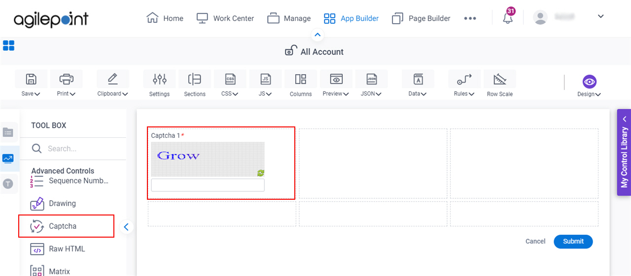
- On the eForm Builder screen, in the Toolbox, open the Advanced Controls tab.
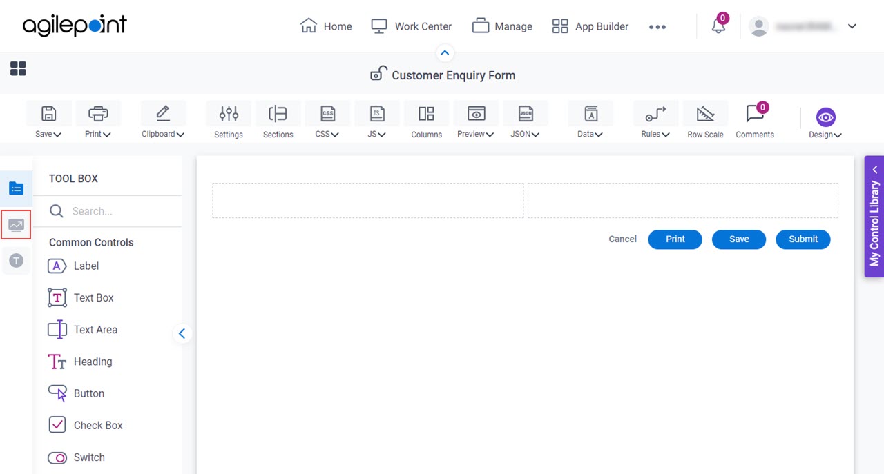
- On the Advanced Controls tab, drag a Captcha
form control onto your eForm.
Procedure
- Complete the settings on the configuration screens.
You can use the Data screen screen to specify a variable.
General
Specifies the basic configuration for the Captcha form control.
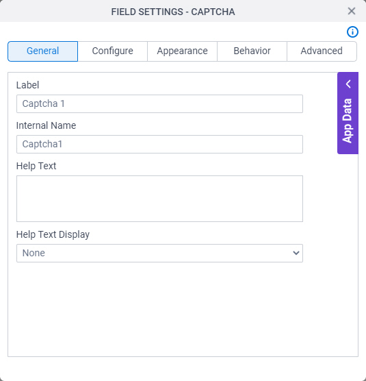
Fields
| Field Name | Definition |
|---|---|
Label |
|
Internal Name |
|
Help Text |
|
Help Text Display |
|
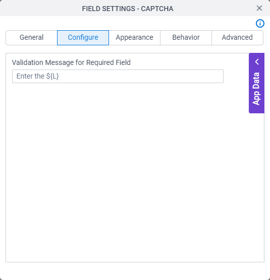
Configure
Configures advanced settings for your form control.
Fields
| Field Name | Definition |
|---|---|
Validation Message for Required Field |
|
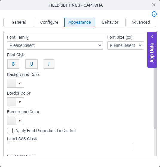
Appearance
Specifies the look and feel for your form control.
Fields
| Field Name | Definition |
|---|---|
Font Family |
|
Font Size (px) |
|
Font Style |
|
Background Color |
|
Border Color |
|
Foreground Color |
|
Apply Font Properties To Control |
|
Label CSS Class |
|
Field CSS Class |
|
Container CSS Class |
|

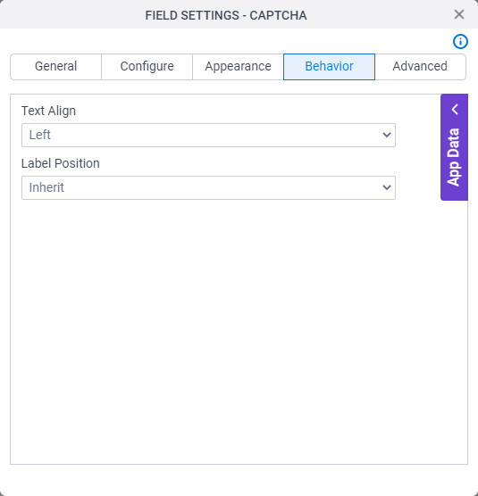
Behavior
Specifies how the control shows on your form.
Fields
| Field Name | Definition |
|---|---|
Text Align |
|
Label Position |
|
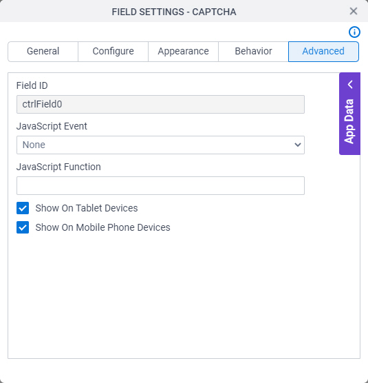
Advanced
Specifies advanced settings for your form control.
Fields
| Field Name | Definition |
|---|---|
Field ID |
|
JavaScript Event |
|
JavaScript Function |
|
Show On Tablet Devices |
|
Show On Mobile Phone Devices |
|