
Heading Widget screen
Shows a heading on a custom page.
Configure the Heading widget
To configure the Heading widget for a custom page, do the procedure in this topic.
Video: Page Builder Overview
Examples
- (Example) Heading Widget in Page Builder
- Examples - Step-by-step use case examples, information about what types of examples are provided in the AgilePoint NX Product Documentation, and other resources where you can find more examples.
Prerequisites
- AgilePoint NX OnDemand (public cloud), or AgilePoint NX PrivateCloud or AgilePoint NX OnPremises v7.0 or higher.
How to Start
- Open the Custom Page Design screen.
For information about how to open this screen, refer to Custom Page Design screen.
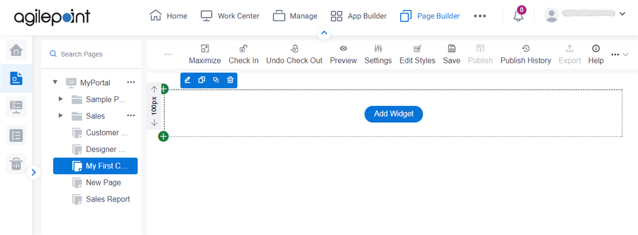
- Click Add Widget.
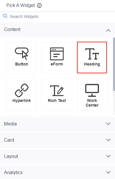
- On the Pick A Widget screen,
on the Content tab, click Heading.
Heading Widget screen > Properties tab
Configures the properties for a heading on a custom page.
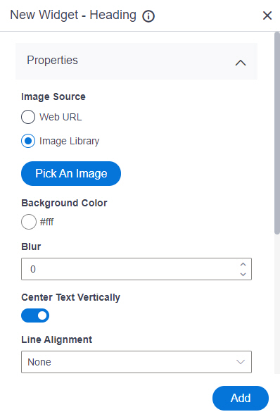
Fields
| Field Name | Definition |
|---|---|
Image Source |
|
Background Image URL |
|
Pick An Image |
|
Background Color |
|
Blur |
|
Center Text Vertically |
|
Line Alignment |
|
Line Thickness |
|
Line Color |
|
Line Style |
|
Vertical Offset |
|
Repeat Image |
|
Preview |
|
Add |
|
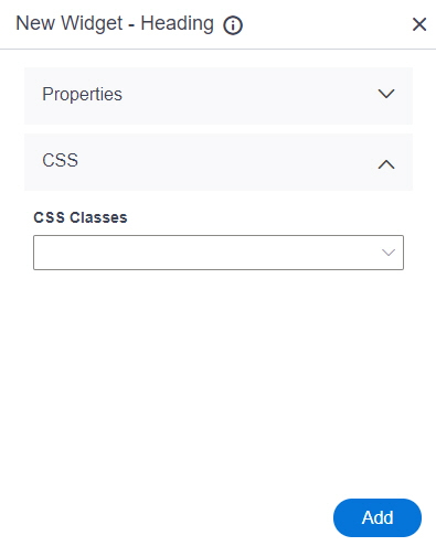
Heading Widget screen > CSS tab
Configures the CSS classes for a heading on a custom page.
Prerequisites
- On the Style Properties screen, add one or more CSS files in the CSS Files field.
Fields
| Field Name | Definition |
|---|---|
CSS Classes |
|
Add |
|