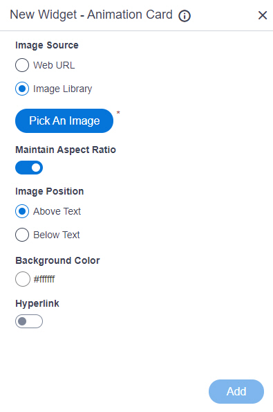
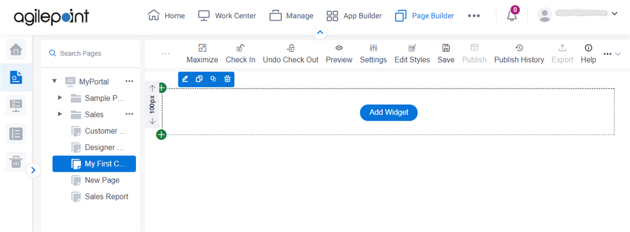
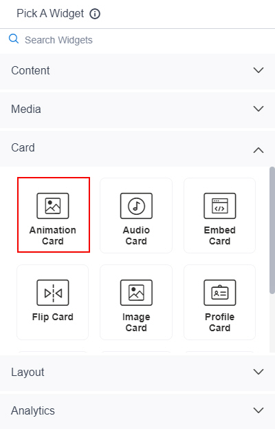
Shows an animation card on a custom page .
Figure 1 . Animation Card Widget screen Video: Page Builder Overview
VIDEO
Fields Field Name Definition Image Source
Description: Specifies the source for an animated image to set as a background for the card. Allowed Values:
Default Value: Image Library Limitations: This field
is available in these releases Background Image URL
Description: Specifies the URL of an animated image file to set as a background for the card. To Open this Field:
In the Image Source field, click Web URL . Allowed Values: One line of text (a string) that represents a path to an image file.
Different types of URLs can be used . For more information, refer to
How Do I Create a URL For Images In Page Builder?
The file can be one of these types :
Default Value: None Example: Refer to :
Limitations:
For information about URL requirements, refer to
How Do I Create a URL For Images In Page Builder? Support for relative URLs is available in these releases :
.jpeg and .tif format files are permitted, and .bmp format files are
not permitted in these releases Pick An Image
Opens this Screen: Image Picker screen To Open this Field:
In the Image Source field, click Image Library . Function of this Screen: Specifies an image file to show on your page or menu .Limitations: This field
is available in these releases Maintain Aspect Ratio
Description: Specifies whether to keep the image in its original size. Allowed Values:
On - Keeps the image in its original size.Off - You can change the height or width of an image as necessary to show on the widget. Default Value: On Image Height
Description: Specifies the height of an image. To Open this Field:
On the Animation Card screen,
turn off the Maintain Aspect Ratio field . Allowed Values: An integer .Default Value: 200 Unit
Description: Specifies the unit for the height or width of an image. To Open this Field:
On the Animation Card screen,
turn off the Maintain Aspect Ratio field . Allowed Values:
Pixels (px) Percentage (%) Default Value: Pixels (px) Image Width
Description: Specifies the width of an image. To Open this Field:
On the Animation Card screen,
turn off the Maintain Aspect Ratio field . Allowed Values: An integer .Default Value: 200 Image Position
Description: Specifies the position of an image .Allowed Values:
Above Text - Shows an image above the text.Below Text - Shows an image below the text. Default Value: Above Text Background Color
Description: Specifies the background color for the
card.Allowed Values: A color value using a hex code , RGB code, or RGBA codeYou can enter a color code, or select a color from the palette.
Default Value: ffffff Example:
#ff0000 #183048 #e16229 rgb(25,151,66) rgba(87,177,201,2) Hyperlink
Description: Specifies whether to make the card or button into a hyperlink. To Open this Field:
Turn on the Hyperlink field . Allowed Values:
On - Makes the card or button into hyperlink.Off - Shows the card on the custom page without a hyperlink. Default Value: Off Link URL
Description: Specifies the URL to open a link when the user click the card or button. To Open this Field:
Turn on the Hyperlink field . Allowed Values: One line of text (a string) in URL formatDefault Value: None Example: https://mysite.com/mypage.html Type of Link
Description: Specifies whether to make an entire card into a hyperlink. To Open this Field:
Turn on the Hyperlink field . Allowed Values:
Entire Card - Makes an entire card into a hyperlink.Button - Makes a button into a hyperlink. Default Value: Button Button Settings - Background Color
Description: Specifies the background color for the
button.To Open this Field:
Turn on the Hyperlink field .Select Button . Allowed Values: A color value using a hex code , RGB code, or RGBA codeYou can enter a color code, or select a color from the palette.
Default Value: ffffff Example:
#ff0000 #183048 #e16229 rgb(25,151,66) rgba(87,177,201,2) Button Settings - Text Color
Description: Specifies the color for the label text to show in the button. To Open this Field:
Turn on the Hyperlink field .Select Button . Allowed Values: A color value using a hex code , RGB code, or RGBA codeYou can enter a color code, or select a color from the palette.
Default Value: 000000 Example:
#ff0000 #183048 #e16229 rgb(25,151,66) rgba(87,177,201,2) Button Text
Description: Specifies the text label for the button. To Open this Field:
Turn on the Hyperlink field .Select Button . Allowed Values: One line of text (a string) .
Accepted:
Default Value: Learn More Example:
Add
Description: Adds the widget
