Portal Menu Designer screen

Lets you manage a custom menu in Page Builder.
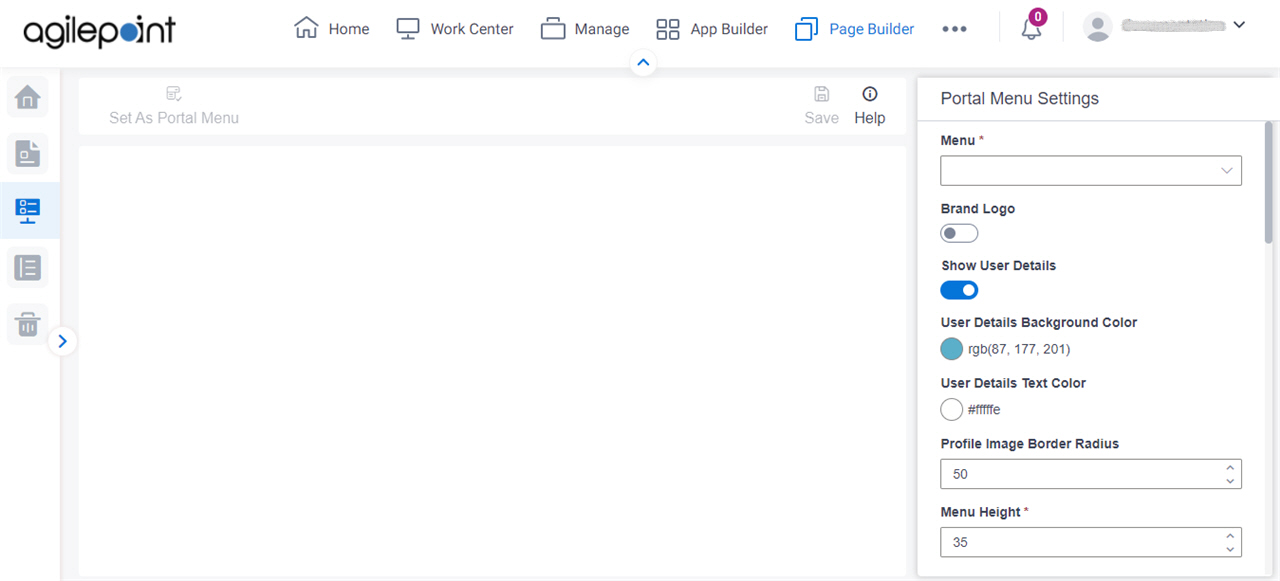
Figure: Portal Menu Designer screen

Portal Menu Designer screen

Video: Page Builder Overview

Prerequisites

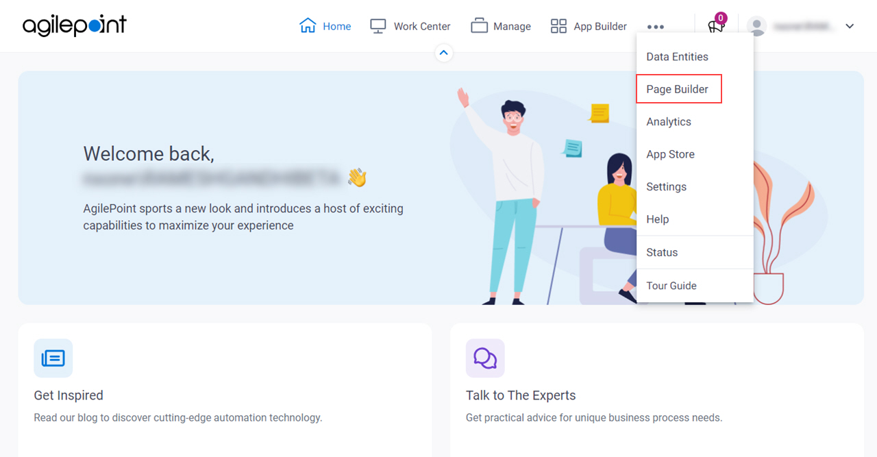
How to Start

  1. Click Page Builder.

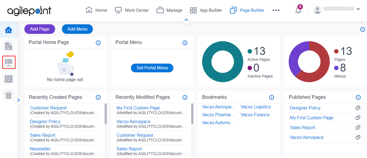
    Build Pages
  2. On the Home screen, in the left pane, click Portal Menu Designer Portal Menu Designer icon.

    Portal Menu Designer

Fields

Field NameDefinition

Set As Portal Menu

Opens this Screen:
Type CONFIRM To... screen
Function of this Screen:
Shows the specified custom menu as the Portal menu.

Save

Description:
Saves your changes.

Menu

Description:
Specifies the menu to configure.

This field shows the display name of menu you created.

Brand Logo

Description:
Specifies whether to add a logo on your menu.
Allowed Values:
  • On - Adds a logo on your menu.
  • Off - You can not add a logo on your menu.
Default Value:
Off

Logo Source

Description:
Specifies the source for the logo image to show on your custom menu.
To Open this Field:
  1. On the Portal Menu Settings screen, turn on the Brand Logo field.
Allowed Values:
  • Web URL - Specifies the absolute URL for an image.
  • Image Library - Uses an image from the image library.

    To use image from image library, click Pick An Image.

Default Value:
Image Library
Limitations:
This field is available in these releases:

URL

Description:
Specifies the URL for your logo image file to show on the menu.
To Open this Field:
  1. On the Portal Menu Settings screen, turn on the Brand Logo field.
  2. In the Logo Source field, click Web URL.
Allowed Values:
One line of text (a string) in URL format that points to an image file.

The file can be one of these types:

  • .png
  • .jpg
  • .jpeg
  • .gif
  • .bmp
  • .tif
Default Value:
None
Example:
https://mysite.com/demo/image/upload/Sample.jpg
Limitations:

.jpeg and .tif format files are permitted, and .bmp format files are not permitted in these releases:

Pick An Image

Opens this Screen:
Image Picker screen
To Open this Field:
  1. On the Portal Menu Settings screen, turn on the Brand Logo field.
  2. In the Logo Source field, click Image Library.
Function of this Screen:
Specifies an image file to show on your page or menu.
Limitations:
This field is available in these releases:

Show User Details

Description:
Specifies whether to show the authenticated user's full name on the menu.
Allowed Values:
  • On - Shows the authenticated user's full name on the menu.
  • Off - The menu does not show the user's name.
Default Value:
On

User Details Background Color

Description:
Specifies the background color for the user's full name on the menu.
To Open this Field:
  1. On the Portal Menu Settings screen, turn on Show User Details.
Allowed Values:
A color value using a hex code, RGB code, or RGBA code.

You can enter a color code, or select a color from the palette.

Default Value:
rgb(87, 177, 201)
Example:
  • #ff0000
  • #183048
  • #e16229
  • rgb(25,151,66)
  • rgba(87,177,201,2)

User Details Text Color

Description:
Specifies the label text color for the user's full name.
To Open this Field:
  1. On the Portal Menu Settings screen, turn on Show User Details.
Allowed Values:
A color value using a hex code, RGB code, or RGBA code.

You can enter a color code, or select a color from the palette.

Default Value:
#fffffe
Example:
  • #ff0000
  • #183048
  • #e16229
  • rgb(25,151,66)
  • rgba(87,177,201,2)

Profile Image Border Radius

Description:
Specifies the radius in pixels for the border of the profile image.
To Open this Field:
  1. On the Portal Menu Settings screen, turn on Show User Details.
Allowed Values:
An integer.

Range:

  • Greater than 0
Default Value:
50

Menu Height

Description:
Specifies the height of the menu in pixels.
To Open this Field:
  1. On the Portal Menu Settings screen, turn on Show User Details.
Allowed Values:
An integer.

Range:

  • Greater than 0
Default Value:
35

Text Color

Description:
Specifies the label text color for the menu item.
Allowed Values:
A color value using a hex code, RGB code, or RGBA code.

You can enter a color code, or select a color from the palette.

Default Value:
ffffff
Example:
  • #ff0000
  • #183048
  • #e16229
  • rgb(25,151,66)
  • rgba(87,177,201,2)

Main Menu Background Color

Description:
Specifies the background color for the main menu.
Allowed Values:
A color value using a hex code, RGB code, or RGBA code.

You can enter a color code, or select a color from the palette.

Default Value:
54544c
Example:
  • #ff0000
  • #183048
  • #e16229
  • rgb(25,151,66)
  • rgba(87,177,201,2)

Main Menu Background Image

Description:
Specifies whether to select the image to set as a background from the image library.
Allowed Values:
  • Web URL - Specifies the absolute URL for an image.
  • Image Library - Uses an image from the image library.

    To use image from image library, click Pick An Image.

Default Value:
Image Library
Limitations:
This field is available in these releases:

Image URL

Description:
Specifies the URL of an image file to set as a background for the main menu.
To Open this Field:
  1. In the Main Menu Background Image field, click Web URL.
Allowed Values:
One line of text (a string) in URL format that points to an image file.

The file can be one of these types:

  • .png
  • .jpg
  • .jpeg
  • .gif
  • .bmp
  • .tif
Default Value:
None
Example:
https://mysite.com/demo/image/upload/Sample.jpg
Limitations:

.jpeg and .tif format files are permitted, and .bmp format files are not permitted in these releases:

Pick An Image

Opens this Screen:
Image Picker screen
To Open this Field:
  1. In the Main Menu Background Image field, click Image Library.
Function of this Screen:
Specifies an image file to show on your page or menu.
Limitations:
This field is available in these releases:

Main Menu Background Repeat

Description:
Specifies whether the background image of the main menu is repeated.
Allowed Values:
  • Don't Repeat - The background image does not repeat. The image shows one time.
  • Repeat Mode - The background image repeats both vertically and horizontally.
  • Repeat Horizontally - The background image repeats horizontally.
  • Repeat Vertically - The background image repeats vertically.
Default Value:
Don't Repeat

Submenu Background Color

Description:
Specifies the background color for the submenu.
Allowed Values:
A color value using a hex code, RGB code, or RGBA code.

You can enter a color code, or select a color from the palette.

Default Value:
54544c
Example:
  • #ff0000
  • #183048
  • #e16229
  • rgb(25,151,66)
  • rgba(87,177,201,2)

Submenu Background Image

Description:
Specifies the source for the background image to show on the submenu.
Allowed Values:
  • Web URL - Specifies the absolute URL for an image.
  • Image Library - Uses an image from the image library.

    To use image from image library, click Pick An Image.

Default Value:
Image Library
Limitations:
This field is available in these releases:

Image URL

Description:
Specifies the URL of an image file to set as a background for the submenu.
To Open this Field:
  1. In the Submenu Background Image field, click Web URL.
Allowed Values:
One line of text (a string) in URL format that points to an image file.

The file can be one of these types:

  • .png
  • .jpg
  • .jpeg
  • .gif
  • .bmp
  • .tif
Default Value:
None
Example:
https://mysite.com/demo/image/upload/Sample.jpg
Limitations:

.jpeg and .tif format files are permitted, and .bmp format files are not permitted in these releases:

Pick An Image

Opens this Screen:
Image Picker screen
To Open this Field:
  1. In the Submenu Background Image field, click Image Library.
Function of this Screen:
Specifies an image file to show on your page or menu.
Limitations:
This field is available in these releases:

Submenu Background Repeat

Description:
Specifies whether the background image of the submenu is repeated.
Allowed Values:
  • Don't Repeat - The background image does not repeat. The image shows one time.
  • Repeat Mode - The background image repeats both vertically and horizontally.
  • Repeat Horizontally - The background image repeats horizontally.
  • Repeat Vertically - The background image repeats vertically.
Default Value:
Don't Repeat

Main Menu Items Alignment

Description:
Specifies the position of the menu items that show on the main menu.
Allowed Values:
  • Left - Specifies that the position of the menu items are to the left.
  • Right - Specifies that the position of the menu items are to the right.
Default Value:
Left

Show Icons

Description:
Specifies whether to show an icon for each menu item.
Allowed Values:
  • On - Lets you add icons to the menu items.
  • Off - The menu items do not have icons.
Default Value:
Off

Icon Position

Description:
Specifies the position of the icon that shows on the menu items.
To Open this Field:
  1. On the Portal Menu Settings screen, turn on the Show Icons field.
Allowed Values:
  • Left - Specifies that the position of the icon is to the left of the menu items.
  • Right - Specifies that the position of the icon is to the right of the menu items.
Default Value:
Left

Menu State

Description:
Specifies the status of the menu item when a user views the page at runtime.
Allowed Values:
  • Idle - The menu item stays static.
  • Hover - Selects menu item when you mouse over it.
  • Active - The menu item is highlighted. So, the user can see that he is now at this page.
Default Value:
Idle

Icon Width

Description:
Specifies the width of the icon to show on the menu items.
To Open this Field:
  1. On the Portal Menu Settings screen, turn on the Show Icons field.
Allowed Values:
An integer.

Range:

  • Greater than 0
Default Value:
40

Font Family

Description:
Specifies the font family for your menu item.
Allowed Values:
A font name from the list.
Default Value:
None
Limitations:
The Font Family field is available in these releases:

Font Size

Description:
Specifies the font size in pixel for your menu item.
Allowed Values:
An integer.

Range:

  • Greater than 0
Default Value:
None
Limitations:
The Font Size field is available in these releases:

Bold

Description:
Specifies whether the menu item is bold.
Allowed Values:
  • On - Shows the menu item in bold.
  • Off - Shows the menu item in normal font weight.
Default Value:
Off
Limitations:
The Bold field is available in these releases:

Italic

Description:
Specifies whether the menu item of your menu is italic.
Allowed Values:
  • On - Shows the menu item in italic.
  • Off - Does not show the menu item in italic.
Default Value:
Off
Limitations:
The Italic field is available in these releases:

Underline

Description:
Specifies whether the menu item is underlined.
Allowed Values:
  • On - Shows the menu item underlined.
  • Off - Shows the menu item with no underline.
Default Value:
Off
Limitations:
The Underline field is available in these releases:

Menu Item Foreground Color

Description:
Specifies the foreground color for your menu item.
Allowed Values:
A color value using a hex code, RGB code, or RGBA code.

You can enter a color code, or select a color from the palette.

Default Value:
F0FFFF
Example:
  • #ff0000
  • #183048
  • #e16229
  • rgb(25,151,66)
  • rgba(87,177,201,2)

Menu Item Background Color

Description:
Specifies the background color for your menu item.
Allowed Values:
A color value using a hex code, RGB code, or RGBA code.

You can enter a color code, or select a color from the palette.

Default Value:
#54544C
Example:
  • #ff0000
  • #183048
  • #e16229
  • rgb(25,151,66)
  • rgba(87,177,201,2)