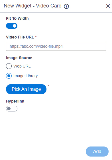
Fit To Width |
- Description:
- Specifies whether to stretch the file such as image, audio to 100% width of the
column.
- Allowed Values:
-
- On - Stretches the file to 100% of the column width.
- Off - Shows the file in its original size.
- Default Value:
- On
|
Video File URL |
- Description:
- Specifies the URL of a video file.
- Allowed Values:
- One line of text (a string) in URL format
that points to a video file.
The file can be one of these types:
- .avi
- .mp4
- .wmv
- .flv
- .mov
- .3gp
- .ogg
- .webm
Note that links to embedded videos, such as
on YouTube, are not accepted in for this widget.
- Default Value:
- None
- Example:
-
- https://mystorage.com/video1.mp4
- Refer to:
- Limitations:
-
.3gp, .ogg and .webm format files are permitted, and .avi, .wmv,
and .mov format files are not permitted in these releases:
|
Image Source |
- Description:
- Specifies the source for the thumbnail image to set as a background for the video card.
- Allowed Values:
-
- Default Value:
- Image Library
- Limitations:
- This field
is available in these releases:
|
Thumbnail URL |
- Description:
- Specifies the URL of thumbnail image file that shows as a background for audio or video card.
- To Open this Field:
-
- In the Image Source field, click Web URL.
- Allowed Values:
- One line of text (a string) that represents a path to an image file.
Different types of URLs can be used. For more information, refer to
How Do I Create a URL For Images In Page Builder?
The file can be one of these types:
- Default Value:
- None
- Example:
-
- https://mysite.com/mythumbnail.jpg
- Refer to:
- Limitations:
-
- For information about URL requirements, refer to
How Do I Create a URL For Images In Page Builder?
- Support for relative URLs is available in these releases:
- .jpeg and .tif format files are permitted, and .bmp format files are
not permitted in these releases:
|
Pick An Image |
- Opens this Screen:
- Image Picker screen
- To Open this Field:
-
- In the Image Source field, click Image Library.
- Function of this Screen:
- Specifies an image file to show on your page or menu.
- Limitations:
- This field
is available in these releases:
|
Hyperlink |
- Description:
- Specifies whether to make the card or button into a hyperlink.
- To Open this Field:
-
- Turn on the Hyperlink field.
- Allowed Values:
-
- On - Makes the card or button into hyperlink.
- Off - Shows the card on the custom page without a hyperlink.
- Default Value:
- Off
|
Link URL |
- Description:
- Specifies the URL to open a link when the user click the card or button.
- To Open this Field:
-
- Turn on the Hyperlink field.
- Allowed Values:
- One line of text (a string) in URL format.
- Default Value:
- None
- Example:
- https://mysite.com/mypage.html
|
Type of Link |
- Description:
- Specifies whether to make an entire card into a hyperlink.
- To Open this Field:
-
- Turn on the Hyperlink field.
- Allowed Values:
-
- Entire Card - Makes an entire card into a hyperlink.
- Button - Makes a button into a hyperlink.
- Default Value:
- Button
|
Button Settings - Background Color |
- Description:
- Specifies the background color for the
button.
- To Open this Field:
-
- Turn on the Hyperlink field.
- Select Button.
- Allowed Values:
- A color value using a hex code, RGB code, or RGBA code.
You can enter a color code, or select a color from the palette.
- Default Value:
- ffffff
- Example:
-
- #ff0000
- #183048
- #e16229
- rgb(25,151,66)
- rgba(87,177,201,2)
|
Button Settings - Text Color |
- Description:
- Specifies the color for the label text to show in the button.
- To Open this Field:
-
- Turn on the Hyperlink field.
- Select Button.
- Allowed Values:
- A color value using a hex code, RGB code, or RGBA code.
You can enter a color code, or select a color from the palette. - Default Value:
- 000000
- Example:
-
- #ff0000
- #183048
- #e16229
- rgb(25,151,66)
- rgba(87,177,201,2)
|
Button Text |
- Description:
- Specifies the text label for the button.
- To Open this Field:
-
- Turn on the Hyperlink field.
- Select Button.
- Allowed Values:
- One line of text (a string).
Accepted:
- Default Value:
- Learn More
- Example:
-
|
Add |
- Description:
- Adds the widget
to the custom page.
|
