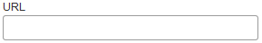
URL form control

A form control that lets a form user enter a URL.


URL form control

Configure the URL form control

To configure the URL URL icon control, do the procedure in this topic.

Video: Common Configuration Settings in eForm Controls

How to Start

  1. On the Application Explorer screen, do one of these:
  2. Do one of these:
    • Add a URL URL icon control:
      1. On the eForm Builder screen, in the Toolbox, open the Advanced Controls Advanced Controls icon tab.
      2. On the Advanced Controls Advanced Controls icon tab, drag a URL URL icon form control onto your eForm.
    • Change a URL URL icon control:
      1. On your eForm, click the control, and click Edit Edit icon.

Procedure

  1. Complete the settings on the configuration screens. You can use the Process Data screen to specify a variable.

General

Specifies the basic configuration for the URL form control.
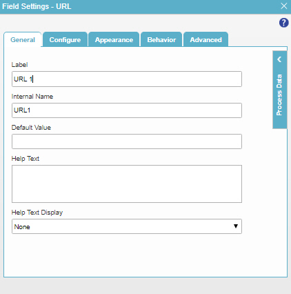
Figure: General tab

General tab

Fields

Field Name Definition

Label

Function:
Specifies the text label that shows on your form for the control.
Accepted Values:
One line of text that can have spaces.
Default Value:
Different for different controls.
Example:
This is a common configuration field that is used in many examples. Refer to:
  • Examples - Step-by-step use case examples, information about what types of examples are provided in the AgilePoint NX Product Documentation, and other resources where you can find more examples.

Internal Name

Function:
Specifies a unique, technical name for your control.
Accepted Values:
One line of text with no spaces.
Default Value:
Different for different controls.
Example:
This is a common configuration field that is used in many examples. Refer to:
  • Examples - Step-by-step use case examples, information about what types of examples are provided in the AgilePoint NX Product Documentation, and other resources where you can find more examples.

Default Value

Function:
Specifies the default value in the field.
Accepted Values:
An integer.
Default Value:
Different for different controls.

Help Text

Function:
Specifies the text to shows when a runtime app user hovers their cursor over the form control.
Accepted Values:
More than one line of text.
Default Value:
None
Example:
Refer to:

Help Text Display

Function:
Specifies if the field shows the text in Help Text field when the form user puts the mouse on the label or field.
Accepted Values:
  • None - Does not show the help text.
  • Hover On Label - Shows the help text when you put your mouse on the label.
  • Hover On Field - Shows the help text when you put your mouse on the field.
  • Hover On Both - Shows the help text when you put your mouse on the label and Field.
Default Value:
None
Example:
Refer to:

Configure

Configures advanced settings for your form control.
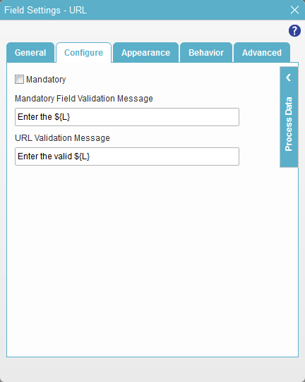
Figure: Configure tab

Configure tab

Fields

Field Name Definition

Mandatory

Function:
Specifies if the field is mandatory.
Accepted Values:
  • Deselected - The field is not mandatory.
  • Selected - The field is mandatory.
Default Value:
Deselected
Example:
Refer to:

Mandatory Field Validation Message

Function:
Specifies the message to show if the form user does not enter data in a mandatory form control.
Accepted Values:
More than one line of text that can have letters, numbers, spaces, and special characters.
Default Value:
Enter the ${L}

${L} is a process data variable that shows the label for a form control.

Example:
Refer to:

URL Validation Message

Function:
Specifies the message the form user sees if he enters an invalid URL.
Accepted Values:
One line of text that can have spaces.
Default Value:
Enter the valid ${L}

${L} is a process data variable that shows the label for a form control.

Appearance

Specifies the look and feel for your form control.
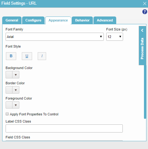
Figure: Appearance tab

Appearance tab

Fields

Field Name Definition

Font Family

Function:
Specifies the font family of the input text and label.
Accepted Values:
A font name from the list.
Default Value:
Arial
Example:
Refer to:

Font Size (px)

Function:
Specifies the size of the input text and label for your form control.
Accepted Values:
A positive integer.
Default Value:
12
Example:
Refer to:

Font Style

Function:
Specifies the style of the font for the input text and label.
Accepted Values:
  • Bold - Shows the input text and label in bold.
  • Underline - Shows the label underlined.
  • Italic - Shows the label in italic.
Default Value:
None
Example:
Refer to:

Background Color

Function:
Specifies the background color for your control.
Accepted Values:
A color value using a hex code, RGB code, or RGBA code.

You can enter a color code, or select a color from the palette.

Default Value:
#ff0000
Example:
Refer to:

Border Color

Function:
Specifies the border color for your control.
Accepted Values:
A color value using a hex code, RGB code, or RGBA code.

You can enter a color code, or select a color from the palette.

Default Value:
#ff0000
Example:
Refer to:

Foreground Color

Function:
Specifies the foreground color for your control.
Accepted Values:
A color value using a hex code, RGB code, or RGBA code.

You can enter a color code, or select a color from the palette.

Default Value:
#ff0000
Example:
Refer to:

Apply Font Properties To Control

Function:
Specifies if the control gets the font properties from the properties set in the form settings.
Accepted Values:
  • Selected - The control gets the font properties from the properties set in the form settings.
  • Deselected - The control does not get the font properties from the properties set in the form settings.
Default Value:
Deselected
Example:
Refer to:

Label CSS Class

Function:
Specifies a CSS class for the label of your control.
Accepted Values:
A valid CSS class.
Default Value:
None

If you specify your CSS CSS icon on the top menu, the CSS is populated.

Example:
Refer to:

Field CSS Class

Function:
Specifies a CSS class for the field in your control.
Accepted Values:
A valid CSS class.
Default Value:
None

If you specify your CSS CSS icon on the top menu, the CSS is populated.

Example:
Refer to:

Container CSS Class

Function:
Specifies a CSS class for the container of your control.
Accepted Values:
A valid CSS class.
Default Value:
None

If you specify your CSS CSS icon on the top menu, the CSS is populated.

Example:
Refer to:

Behavior

Specifies how the control shows on your form.
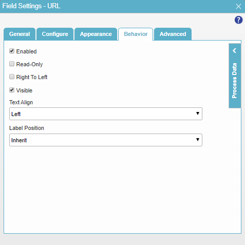
Figure: Behavior tab

Behavior tab

Fields

Field Name Definition

Enabled

Function:
Specifies if the form user can change the value of a field.
Accepted Values:
  • Selected - The form user can change the value.
  • Deselected - The input cannot change the value.
Default Value:
Selected
Example:
Refer to:

Read-Only

Function:
Specifies if the field accepts user input.
Accepted Values:
  • Selected - A user cannot enter a value for the field. The field shows as read-only.
  • Deselected - A user can enter a value for the field.
Default Value:
Selected

Right To Left

Function:
Specifies if the text for this control, including user input, shows from right to left.
Accepted Values:
  • Deselected - The text shows from left to right.
  • Selected - The text shows from right to left.
Default Value:
Deselected
Example:
Refer to:

Visible

Function:
Specifies if the form user sees the field.
Accepted Values:
  • Selected - The form user sees the field.
  • Deselected - The form user does not see the field.
Default Value:
Selected
Example:
Refer to:

Text Align

Function:
Specifies the horizontal alignment of user input for this control.
Accepted Values:
  • Left - Aligns the text to the left.
  • Center - Centers the text.
  • Right - Aligns the text to the right.
Default Value:
Left
Example:
Refer to:

Label Position

Function:
Specifies the position of the text label that shows on your form for the control.
Accepted Values:
  • Inherit - The position of the label is as specified in the form settings.
  • Left - Specifies that the position of the label is to the left of the container.
  • Top - Specifies that the position of the label is to the top of the container.
Default Value:
Inherit
Example:
Refer to:

Advanced

Specifies advanced settings for your form control.
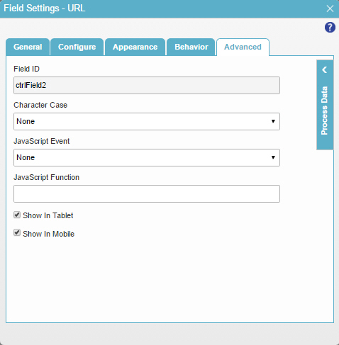
Figure: Advanced tab

Advanced tab

Fields

Field Name Definition

Field ID

Function:
Shows an ID of the control.
Accepted Values:
Read only.
Default Value:
Different for different controls.
Example:
Refer to:

Character Case

Function:
Specifies the character case for your label.
Accepted Values:
  • None - The characters show as you enter them.
  • Upper Case - Changes all characters to capital letters.
  • Lower Case - Changes all characters to small letters.
Default Value:
None

JavaScript Event

Function:
Specifies the JavaScript event that causes an effect.
Accepted Values:
  • None - No action.
  • Blur - When a form user leaves an input field.
  • Change - When a form user changes the content of an input field or selects a value.
  • Click - When the form user clicks a button.
  • Double Click - When the form user double-clicks text.
  • Focus - When an input field gets focus.
  • Keydown - When a form user holds down a key.
  • Keypress - When the form user presses a key.
  • Keyup - When the form user releases a key.
Default Value:
None
Example:
Refer to:

JavaScript Function

Function:
Specifies the name of a JavaScript function to complete the activity.
Accepted Values:
The name of a Javascript function that exists in your application.

For more information, refer to Add a JavaScript Code Snippet to an eForm.

Default Value:
None
Example:

ConfirmSubmission where one of these is your function:

function ConfirmSubmission()
  {
    alert ('Are you sure to submit this form?');
    return true;
  }
function ConfirmSubmission(parameter1,parameter2)
  {
    window.alert ( parameter1 * parameter2);
    
  }

Also refer to:

Show In Tablet

Function:
Specifies if the form field shows on a tablet.
Accepted Values:
  • Selected - The form field shows on a tablet.
  • Deselected - The form field does not show on a tablet.
Default Value:
Selected
Example:
Refer to:

Show In Mobile

Function:
Specifies if the form field shows on a mobile device.
Accepted Values:
  • Selected - The form field shows on a mobile device.
  • Deselected - The form field does not show on a mobile device.
Default Value:
Selected
Example:
Refer to: