Geolocation form control

A form control that lets a form user select a geographical location.
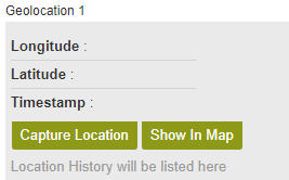

Geolocation form control

Configure the Geolocation form control

To configure the Geolocation Geolocation icon control, do the procedure in this topic.

Video: Use a Form-Based App to Create a Widget

Video: Common Configuration Settings in eForm Controls

How to Start

  1. On the Application Explorer screen, do one of these:
  2. Do one of these:
    • Add a Geolocation Geolocation icon control:
      1. On the eForm Builder screen, in the Toolbox, open the Advanced Controls Advanced Controls icon tab.
      2. On the Advanced Controls Advanced Controls icon tab, drag a Geolocation Geolocation icon form control onto your eForm.
    • Change a Geolocation Geolocation icon control:
      1. On your eForm, click the control, and click Edit Edit icon.

Procedure

  1. Complete the settings on the configuration screens. You can use the Process Data screen to specify a variable.

General

Specifies the basic configuration for the Geolocation form control.
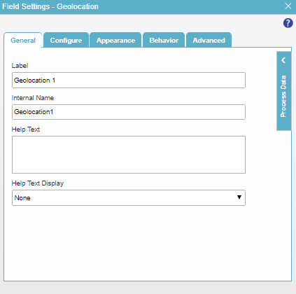
Figure: General tab

General tab

Fields

Field Name Definition

Label

Function:
Specifies the text label that shows on your form for the control.
Accepted Values:
One line of text that can have spaces.
Default Value:
Different for different controls.
Example:
This is a common configuration field that is used in many examples. Refer to:
  • Examples - Step-by-step use case examples, information about what types of examples are provided in the AgilePoint NX Product Documentation, and other resources where you can find more examples.

Internal Name

Function:
Specifies a unique, technical name for your control.
Accepted Values:
One line of text with no spaces.
Default Value:
Different for different controls.
Example:
This is a common configuration field that is used in many examples. Refer to:
  • Examples - Step-by-step use case examples, information about what types of examples are provided in the AgilePoint NX Product Documentation, and other resources where you can find more examples.

Help Text

Function:
Specifies the text to shows when a runtime app user hovers their cursor over the form control.
Accepted Values:
More than one line of text.
Default Value:
None
Example:
Refer to:

Help Text Display

Function:
Specifies if the field shows the text in Help Text field when the form user puts the mouse on the label or field.
Accepted Values:
  • None - Does not show the help text.
  • Hover On Label - Shows the help text when you put your mouse on the label.
  • Hover On Field - Shows the help text when you put your mouse on the field.
  • Hover On Both - Shows the help text when you put your mouse on the label and Field.
Default Value:
None
Example:
Refer to:

Configure

Configures advanced settings for your form control.
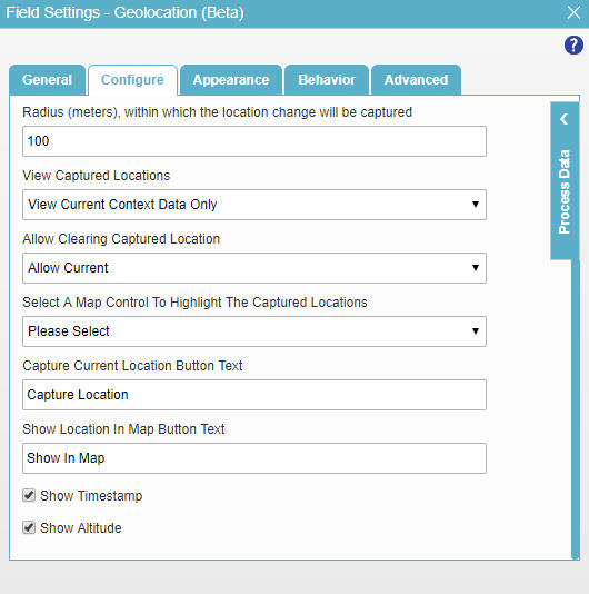
Figure: Configure tab

Configure tab

Fields

Field Name Definition

Mandatory

Function:
Specifies if the field is mandatory.
Accepted Values:
  • Deselected - The field is not mandatory.
  • Selected - The field is mandatory.
Default Value:
Deselected
Example:
Refer to:

Mandatory Field Validation Message

Function:
Specifies the message to show if the form user does not enter data in a mandatory form control.
Accepted Values:
More than one line of text that can have letters, numbers, spaces, and special characters.
Default Value:
Enter the ${L}

${L} is a process data variable that shows the label for a form control.

Example:
Refer to:

Select How to Capture Location

Function:
Specifies how a form user can select the geographical location.
Accepted Values:
  • Do not capture - The form user can not select the geographical location.
  • Manual - The form user can select the geographical location.
  • Auto Capture - Selects the geographical location of the form user with no user input.
Default Value:
Auto Capture

Radius (meters), within which the location change is captured

Function:
Lets you specify the radius in meters from the selected geographical location of the form user to take action based on the value of the Select How to Capture Location control:
  • Manual - Shows a message on the eForm that tells the user to select the location again .
  • Auto Capture - Selects the location again based on the user's new location. This location is based on information from their Internet connection.
Accepted Values:
A positive integer.
Default Value:
100

View Captured Location

Function:
Specifies how to show the geographical location that a form user selects.
Accepted Values:
  • Cannot View - Does not show the selected geographical location.
  • View Current Context Data Only - Shows the current geographical location the form user selects.
  • View Both Current Context and History Data - Shows all the geographical locations the form user has ever selected.
Default Value:
View Current Context Data Only

Allow Clearing Captured Location

Function:
Specifies if the form user can deselect a selected geographical location.
Accepted Values:
  • Do Not Allow - The form user can not deselect the geographical location.
  • Allow Current - The form user can deselect the geographical location.
Default Value:
Allow Current

Select a Map Control to Highlight the Captured Location

Function:
Specifies the Map form control field on your eForm to highlight the selected geographical location.
Accepted Values:
A Map form control field on your eForm from the list.
Default Value:
None
Example:
Refer to:

Capture Current Location Button Text

Function:
Specifies the message to show on the button to select the current location.
Accepted Values:
One line of text.
Default Value:
Capture Location

Show Location In Map Button Text

Function:
Specifies the message to show on the button to show the location on the map.
Accepted Values:
One line of text.
Default Value:
Show In Map

Show Timestamp

Function:
Specifies whether to show the date and time the geographical location was selected.
Accepted Values:
  • Selected - Shows the date and time the geographical location was selected.
  • Deselected -Does not show the date and time the geographical location was selected.
Default Value:
Selected

Show Altitude

Function:
Specifies whether to show the altitude above mean sea level in meters.
Accepted Values:
  • Selected - Shows the altitude value.
  • Deselected - Does not show the altitude value.
Default Value:
Selected

Appearance

Specifies the look and feel for your form control.
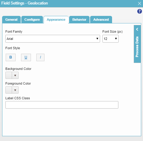
Figure: Appearance tab

Appearance tab

Fields

Field Name Definition

Font Family

Function:
Specifies the font family of the input text and label.
Accepted Values:
A font name from the list.
Default Value:
Arial
Example:
Refer to:

Font Size (px)

Function:
Specifies the size of the input text and label for your form control.
Accepted Values:
A positive integer.
Default Value:
12
Example:
Refer to:

Font Style

Function:
Specifies the style of the font for the input text and label.
Accepted Values:
  • Bold - Shows the input text and label in bold.
  • Underline - Shows the label underlined.
  • Italic - Shows the label in italic.
Default Value:
None
Example:
Refer to:

Background Color

Function:
Specifies the background color for your control.
Accepted Values:
A color value using a hex code, RGB code, or RGBA code.

You can enter a color code, or select a color from the palette.

Default Value:
#ff0000
Example:
Refer to:

Foreground Color

Function:
Specifies the foreground color for your control.
Accepted Values:
A color value using a hex code, RGB code, or RGBA code.

You can enter a color code, or select a color from the palette.

Default Value:
#ff0000
Example:
Refer to:

Label CSS Class

Function:
Specifies a CSS class for the label of your control.
Accepted Values:
A valid CSS class.
Default Value:
None

If you specify your CSS CSS icon on the top menu, the CSS is populated.

Example:
Refer to:

Behavior

Specifies how the control shows on your form.
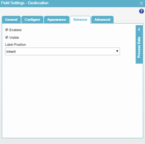
Figure: Behavior tab

Behavior tab

Fields

Field Name Definition

Enabled

Function:
Specifies if the form user can change the value of a field.
Accepted Values:
  • Selected - The form user can change the value.
  • Deselected - The input cannot change the value.
Default Value:
Selected
Example:
Refer to:

Visible

Function:
Specifies if the form user sees the field.
Accepted Values:
  • Selected - The form user sees the field.
  • Deselected - The form user does not see the field.
Default Value:
Selected
Example:
Refer to:

Label Position

Function:
Specifies the position of the text label that shows on your form for the control.
Accepted Values:
  • Inherit - The position of the label is as specified in the form settings.
  • Left - Specifies that the position of the label is to the left of the container.
  • Top - Specifies that the position of the label is to the top of the container.
Default Value:
Inherit
Example:
Refer to:

Advanced

Specifies advanced settings for your form control.
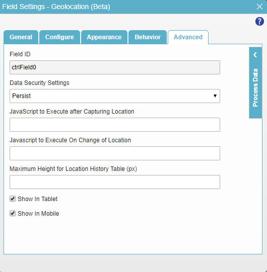
Figure: Advanced tab

Advanced tab

Fields

Field Name Definition

Field ID

Function:
Shows an ID of the control.
Accepted Values:
Read only.
Default Value:
Different for different controls.
Example:
Refer to:

Data Security Settings

Function:
Specifies whether to store information from the field in the process schema, so the application can use it again, or to simply pass on the information after the form is submitted without storing the information. This option helps to protect sensitive user information.
Accepted Values:
  • Persist - Stores the data from the field in the process schema, so the application can use it again.
  • Do Not Persist - Does not store the data from the field in the process schema. This option provides greater security for sensitive user information.
Default Value:
Persist
Example:
Refer to:

Javascript To Execute After Capturing Location

Function:
Specifies a JavaScript method to run after a form user selects the geographical location.
Accepted Values:
The name of a Javascript function that exists in your application.

For more information, refer to Add a JavaScript Code Snippet to an eForm.

Default Value:
None
Example:
function LocationCaptured()
  {
    alert("Location Captured!");
    //write code to execute on location capture.
  }

Javascript To Execute On Change of Location

Function:
Specifies a JavaScript method to run if a user changes his geographical location.
Accepted Values:
The name of a Javascript function that exists in your application.

For more information, refer to Add a JavaScript Code Snippet to an eForm.

Default Value:
None
Example:
function LocationChanged()
  {
    alert("Location Changed!");
    //write code to execute on location change.
  }

Maximum Height for Location History Table (px)

Function:
Specifies the maximum height for the location history table in pixels.
Accepted Values:
A positive integer.
Default Value:
None

Show In Tablet

Function:
Specifies if the form field shows on a tablet.
Accepted Values:
  • Selected - The form field shows on a tablet.
  • Deselected - The form field does not show on a tablet.
Default Value:
Selected
Example:
Refer to:

Show In Mobile

Function:
Specifies if the form field shows on a mobile device.
Accepted Values:
  • Selected - The form field shows on a mobile device.
  • Deselected - The form field does not show on a mobile device.
Default Value:
Selected
Example:
Refer to: