
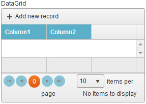
Data Grid form control
A form control that lets a form user view, change, or delete the data in a table.
Configure the Data Grid form control
To configure the Data Grid  control, do the procedure in this topic.
Video: Common Configuration Settings in eForm Controls
Examples
- (Example) How Do I Configure a Pop-Up Select Control to Bind the Lookup Values to a Data Grid?
- Examples - Step-by-step use case examples, information about what types of examples are provided in the AgilePoint NX Product Documentation, and other resources where you can find more examples.
How to Start
- On the Application Explorer screen, do one of these:
- Do one of these:
- Add a Data Grid control:
- On the eForm Builder screen, in the Toolbox, open the Advanced Controls
 tab.
tab. - On the Advanced Controls tab, drag a Data Grid
form control onto your eForm.
- On the eForm Builder screen, in the Toolbox, open the Advanced Controls
- Change a Data Grid control:
- On your eForm, click the control, and click Edit
 .
.
- On your eForm, click the control, and click Edit
- Add a Data Grid
Procedure
- Complete the settings on the configuration screens. You can use the Process Data screen to specify a variable.
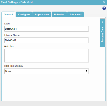
General
Specifies the basic configuration for the Data Grid form control.
Fields
| Field Name | Definition |
|---|---|
Label |
|
Internal Name |
|
Help Text |
|
Help Text Display |
|
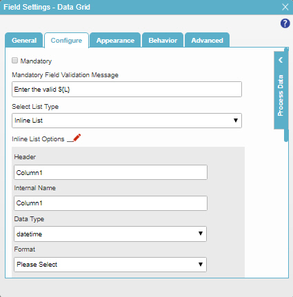
Configure
Configures advanced settings for your form control.
Fields
| Field Name | Definition |
|---|---|
Mandatory |
|
Mandatory Field Validation Message |
|
Select List Type |
|
Header |
|
Internal Name |
|
Data Type |
|
Format |
|
Width (%) |
|
Mandatory |
|
Visible |
|
Visible in Mobile |
|
Groupable |
|
Delete |
|
Add Column |
|
Lookup Source |
|
Add Lookup |
|
Auto Generate Lookup Columns |
|
Bound Column |
|
Format |
|
Configure Enum( |
|
Allow Add |
|
Allow Delete |
|
Allow Edit |
|
Pop-up Edit |
|
DateTime Conversion |
|
Mandatory Column Validation Message |
|
Minimum Records Validation Message |
|
Maximum Items |
|
Minimum Items |
|


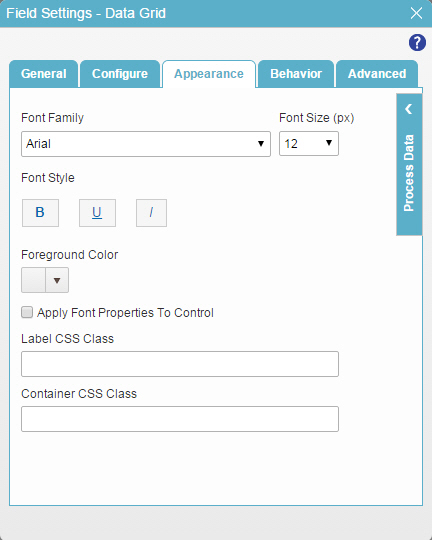
Appearance
Specifies the look and feel for your form control.
Fields
| Field Name | Definition |
|---|---|
Font Family |
|
Font Style |
|
Foreground Color |
|
Apply Font Properties To Control |
|
Label CSS Class |
|
Container CSS Class |
|
Font Size (px) |
|

Behavior
Specifies how the control shows on your form.
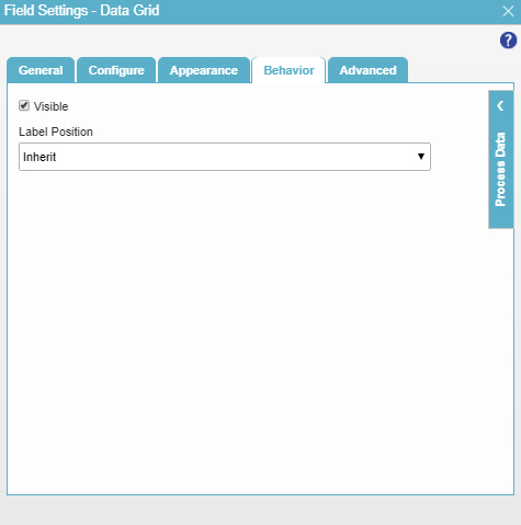
Fields
| Field Name | Definition |
|---|---|
Visible |
|
Label Position |
|
Advanced
Specifies advanced settings for your form control.
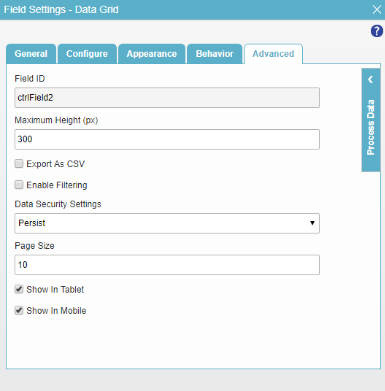
Fields
| Field Name | Definition |
|---|---|
Field ID |
|
Maximum Height (px) |
|
Export as CSV |
|
Enable Filtering |
|
Page Size |
|
Data Security Settings |
|
Show In Tablet |
|
Show In Mobile |
|