Auto-Lookup form control

A form control that shows the values when an associated form control or field value is changed .

Configure the Auto Lookup form control

To configure the Auto Lookup Auto Lookup icon control, do the procedure in this topic.

Video: Show Data from a Database on an eForm

Video: Configure Form Controls with Cascading Lookups

Video: Show Data from a REST Service on an eForm

Video: Show Data from a Web Service on an eForm

Video: Show Data from Salesforce on an eForm

Video: Show Data from SharePoint on an eForm

Video: Add a Custom Search Screen

Video: Common Configuration Settings in eForm Controls

Good to Know

  • Some information about third-party integrations is outside the scope of the AgilePoint NX Product Documentation, and it is the responsibility of the vendors who create and maintain these technologies to provide this information. This includes specific business uses cases and examples; explanations for third-party concepts; details about the data models and input and output data formats for third-party technologies; and various types of IDs, URL patterns, connection string formats, and other technical information that is specific to the third-party technologies. For more information, refer to Where Can I Find Information and Examples for Third-Party Integrations?

How to Start

  1. On the Application Explorer screen, do one of these:
  2. Do one of these:
    • Add a Auto Lookup Auto Lookup icon control:
      1. On the eForm Builder screen, in the Toolbox, open the Advanced Controls Advanced Controls icon tab.
      2. On the Advanced Controls Advanced Controls icon tab, drag a Auto Lookup Auto Lookup icon form control onto your eForm.
    • Change a Auto Lookup Auto Lookup icon control:
      1. On your eForm, click the control, and click Edit Edit icon.

Procedure

  1. Complete the settings on the configuration screens. You can use the Process Data screen to specify a variable.

General

Specifies the basic configuration for the Auto-Lookup form control.
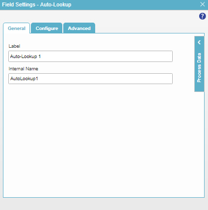
Figure: General tab

General tab

Fields

Field Name Definition

Label

Function:
Specifies the text label that shows on your form for the control.
Accepted Values:
One line of text that can have spaces.
Default Value:
Different for different controls.
Example:
This is a common configuration field that is used in many examples. Refer to:
  • Examples - Step-by-step use case examples, information about what types of examples are provided in the AgilePoint NX Product Documentation, and other resources where you can find more examples.

Internal Name

Function:
Specifies a unique, technical name for your control.
Accepted Values:
One line of text with no spaces.
Default Value:
Different for different controls.
Example:
This is a common configuration field that is used in many examples. Refer to:
  • Examples - Step-by-step use case examples, information about what types of examples are provided in the AgilePoint NX Product Documentation, and other resources where you can find more examples.

Configure

Configures advanced settings for your form control.
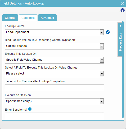
Figure: Configure tab

Configure tab

Fields

Field Name Definition

Lookup Source

Function:
Specifies a reusable lookup configuration. The lookup configuration includes the data source and other configuration values for the lookup.
Accepted Values:
A valid lookup source
Default Value:
None
Example:
Refer to:

Add Lookup Add Lookup icon

Opens this Screen:
Select Data Source Type screen
To Open this Field:
  1. In the Select List Type field, select Lookup List.
Function of this Screen:
Specifies the data source where the form control will do the lookup procedure.
Example:
Refer to:

Bind Lookup Values To A Repeating Control (Optional)

Function:
Specifies to bind the lookup values to either a Subform or a Data Grid form control to store the results of the lookup procedure.

This is an alternative to binding each field of the specified form control with the results of the lookup.

To Open this Field:
  1. In the Lookup Source field, select your lookup from the list.
Accepted Values:
  • The display name of a Subform form control.
  • The display name of a Data Grid form control.
Default Value:
None
Example:
Refer to:

Execute This Lookup On

Function:
Specifies when the control does the data lookup.
To Open this Field:
  1. In the Lookup Source field, select your lookup from the list.
Accepted Values:
  • Form Load - Does the lookup when the form opens.
  • Related Field Value Change - Does the lookup when the value in a related field configured in your lookup changes.
  • Specific Field Value Change - Does the lookup when a value in a specific field on the eForm changes.
  • Form Load & Related Field Value Change - Does the lookup when the form opens or when there is a change in the value of the related field.

In these settings, "related field value" means the value of a different field that can change the data the lookup gets. For example, changing the value of request mapping fields may change the data retrieved by a REST service lookup. Changing the value of a WHERE clause field may change the data retrieved by a database lookup. This setting monitors those fields and runs the lookup if the field values change.

Default Value:
Form Load & Related Field Value Change
Example:
Refer to:

Select A Field To Execute This Lookup On Value Change

Function:
Specifies the eForm form controlfield where the value changes when the lookup runs.
To Open this Field:
In the Execute This Lookup On list, select Specific Field Value Change.
Accepted Values:
A form control field on your eForm.
Default Value:
None
Example:
Refer to:

Javascript To Execute After Lookup Completion

Function:
Specifies which JavaScript function to run after the lookup is complete.
Accepted Values:
The name of a Javascript function that exists in your application.

For more information, refer to Add a JavaScript Code Snippet to an eForm.

Default Value:
None
Example:

ConfirmSubmission where one of these is your function:

function ConfirmSubmission()
  {
    alert ('Are you sure to submit this form?');
    return true;
  }
function ConfirmSubmission(parameter1,parameter2)
  {
    window.alert ( parameter1 * parameter2);
    
  }

Also refer to:

Execute On Session

Function:
Specifies the sessions the lookup runs.
Accepted Values:
  • First Session - The lookup runs only the first time the eForm loads in the form user's browser.
  • Subsequent Sessions - The lookup does not run the first time the eForm loads in the form user's browser, but runs all subsequent times the eForm loads.
  • Specific Sessions - The lookup runs only in the sessions, or page loads, specified by the numbers in the Enter Sessions field.
Default Value:
First Session

Enter Sessions

Function:
Specifies one or more sessions the lookup runs.
To Open this Field:
In the Execute on Session list, select Specific Sessions.
Accepted Values:
An integer separated by semi-colons (;).
Default Value:
None
Example:
1;3

This value would cause the JavaScript to run in the first and third sessions, but not the second.

On Lookup Completion, Trigger Change Event For

Function:
The change event JavaScript function runs when the value of a lookup is changed.

You can add the change event function in your application. For more information, refer to Add a JavaScript Code Snippet to an eForm

Accepted Values:
  • None - The value of the form controls do not change based on a lookup.
  • All Target Controls - The value of the form controls change based on lookup.
Default Value:
None
Example:
Refer to:

Advanced

Specifies advanced settings for your form control.
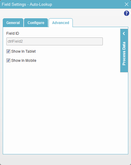
Figure: Advanced tab

Advanced tab

Fields

Field Name Definition

Field ID

Function:
Shows an ID of the control.
Accepted Values:
Read only.
Default Value:
Different for different controls.
Example:
Refer to:

Show In Tablet

Function:
Specifies if the form field shows on a tablet.
Accepted Values:
  • Selected - The form field shows on a tablet.
  • Deselected - The form field does not show on a tablet.
Default Value:
Selected
Example:
Refer to:

Show In Mobile

Function:
Specifies if the form field shows on a mobile device.
Accepted Values:
  • Selected - The form field shows on a mobile device.
  • Deselected - The form field does not show on a mobile device.
Default Value:
Selected
Example:
Refer to: