Timer form control

A form control that lets a form user measure time by counting up or down.


Timer form control

Configure the Timer form control

To configure the Timer Timer icon control, do the procedure in this topic.

Video: Common Configuration Settings in eForm Controls

How to Start

  1. On the Application Explorer screen, do one of these:
  2. Do one of these:
    • Add a Timer Timer icon control:
      1. On the eForm Builder screen, in the Toolbox, open the Advanced Controls Advanced Controls icon tab.
      2. On the Advanced Controls Advanced Controls icon tab, drag a Timer Timer icon form control onto your eForm.
    • Change a Timer Timer icon control:
      1. On your eForm, click the control, and click Edit Edit icon.

Procedure

  1. Complete the settings on the configuration screens. You can use the Process Data screen to specify a variable.

General

Specifies the basic configuration for the Timer form control.
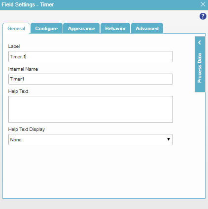
Figure: General tab

General tab

Fields

Field Name Definition

Label

Function:
Specifies the text label that shows on your form for the control.
Accepted Values:
One line of text that can have spaces.
Default Value:
Different for different controls.
Example:
This is a common configuration field that is used in many examples. Refer to:
  • Examples - Step-by-step use case examples, information about what types of examples are provided in the AgilePoint NX Product Documentation, and other resources where you can find more examples.

Internal Name

Function:
Specifies a unique, technical name for your control.
Accepted Values:
One line of text with no spaces.
Default Value:
Different for different controls.
Example:
This is a common configuration field that is used in many examples. Refer to:
  • Examples - Step-by-step use case examples, information about what types of examples are provided in the AgilePoint NX Product Documentation, and other resources where you can find more examples.

Help Text

Function:
Specifies the text to shows when a runtime app user hovers their cursor over the form control.
Accepted Values:
More than one line of text.
Default Value:
None
Example:
Refer to:

Help Text Display

Function:
Specifies if the field shows the text in Help Text field when the form user puts the mouse on the label or field.
Accepted Values:
  • None - Does not show the help text.
  • Hover On Label - Shows the help text when you put your mouse on the label.
  • Hover On Field - Shows the help text when you put your mouse on the field.
  • Hover On Both - Shows the help text when you put your mouse on the label and Field.
Default Value:
None
Example:
Refer to:

Configure

Configures advanced settings for your form control.
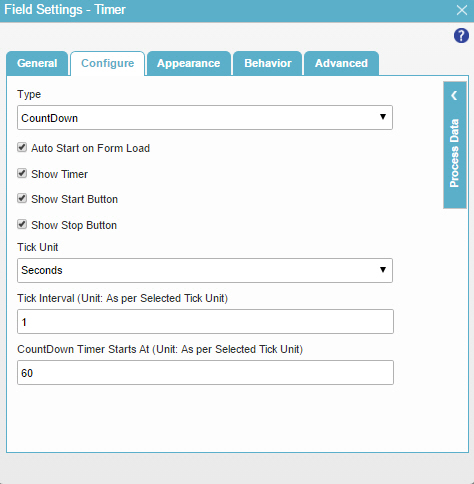
Figure: Configure tab

Configure tab

Fields

Field Name Definition

Type

Function:
Specifies the type of timer to show on your eForm.
Accepted Values:
  • StopWatch - Shows timer to count up from zero (0).
  • CountDown - Shows timer to count down from a specified time.
Default Value:
CountDown

Auto Start on Form Load

Function:
Specifies whether the count starts when the eForm opens in a web browser.
Accepted Values:
  • Selected - The count starts when the eForm opens in a web browser.
  • Deselected - The count starts when a form user clicks the timer start button.
Default Value:
Selected

Show Timer

Function:
Specifies if the form control shows the counter in the Hour:Minute:Second format.
Accepted Values:
  • Selected - Shows the counter on the form control.
  • Deselected - Shows the Timer form control with no counter.
Default Value:
Selected

Show Start Button

Function:
Specifies if the form control shows a button to start the timer.
Accepted Values:
  • Selected - Shows the start button on the form control.
  • Deselected - Shows the Timer form control with no start button for the timer.
Default Value:
Selected

Show Stop Button

Function:
Specifies if the form control shows a button to stop the timer.
Accepted Values:
  • Selected - Shows the stop button on the Timer form control.
  • Deselected - Shows the Timer form control with no stop button.
Default Value:
Selected

Tick Unit

Function:
Specifies the units for the timer shows.
Accepted Values:
  • Seconds - The timer shows seconds.
  • Minutes - The timer shows minutes.
  • Hours - The timer shows hours.
Default Value:
Seconds

Tick Interval

Function:
Specifies the number of tick units that pass before the counter value changes.
Accepted Values:
A positive integer.
Default Value:
1
Example:
Under these conditions:
  • Tick Unit = Seconds
  • Tick Interval = 5
  • CountDown Timer Starts At = 60

These values show on the counter:

  • 00:00:60
  • 00:00:55
  • 00:00:50

CountDown Timer Starts At

Function:
Specifies the numeric timer value from which the countdown starts.
To Open this Field:
  1. In the Type field, select CountDown.
Accepted Values:
A positive integer.
Default Value:
60

Auto Stop At

Function:
Specifies the timer value where the timer stops counting up.
To Open this Field:
  1. In the Type field, select StopWatch.
Accepted Values:
A positive integer.
Default Value:
None

Appearance

Specifies the look and feel for your form control.

Figure: Appearance tab

Appearance tab

Fields

Field Name Definition

Font Family

Function:
Specifies the font family of the input text and label.
Accepted Values:
A font name from the list.
Default Value:
Arial
Example:
Refer to:

Font Size (px)

Function:
Specifies the size of the input text and label for your form control.
Accepted Values:
A positive integer.
Default Value:
12
Example:
Refer to:

Font Style

Function:
Specifies the style of the font for the input text and label.
Accepted Values:
  • Bold - Shows the input text and label in bold.
  • Underline - Shows the label underlined.
  • Italic - Shows the label in italic.
Default Value:
None
Example:
Refer to:

Background Color

Function:
Specifies the background color for your control.
Accepted Values:
A color value using a hex code, RGB code, or RGBA code.

You can enter a color code, or select a color from the palette.

Default Value:
#ff0000
Example:
Refer to:

Border Color

Function:
Specifies the border color for your control.
Accepted Values:
A color value using a hex code, RGB code, or RGBA code.

You can enter a color code, or select a color from the palette.

Default Value:
#ff0000
Example:
Refer to:

Foreground Color

Function:
Specifies the foreground color for your control.
Accepted Values:
A color value using a hex code, RGB code, or RGBA code.

You can enter a color code, or select a color from the palette.

Default Value:
#ff0000
Example:
Refer to:

Apply Font Properties To Control

Function:
Specifies if the control gets the font properties from the properties set in the form settings.
Accepted Values:
  • Selected - The control gets the font properties from the properties set in the form settings.
  • Deselected - The control does not get the font properties from the properties set in the form settings.
Default Value:
Deselected
Example:
Refer to:

Label CSS Class

Function:
Specifies a CSS class for the label of your control.
Accepted Values:
A valid CSS class.
Default Value:
None

If you specify your CSS CSS icon on the top menu, the CSS is populated.

Example:
Refer to:

Field CSS Class

Function:
Specifies a CSS class for the field in your control.
Accepted Values:
A valid CSS class.
Default Value:
None

If you specify your CSS CSS icon on the top menu, the CSS is populated.

Example:
Refer to:

Container CSS Class

Function:
Specifies a CSS class for the container of your control.
Accepted Values:
A valid CSS class.
Default Value:
None

If you specify your CSS CSS icon on the top menu, the CSS is populated.

Example:
Refer to:

Behavior

Specifies how the control shows on your form.
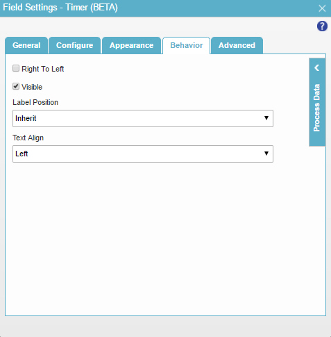
Figure: Behavior tab

Behavior tab

Fields

Field Name Definition

Right To Left

Function:
Specifies if the text for this control, including user input, shows from right to left.
Accepted Values:
  • Deselected - The text shows from left to right.
  • Selected - The text shows from right to left.
Default Value:
Deselected
Example:
Refer to:

Visible

Function:
Specifies if the form user sees the field.
Accepted Values:
  • Selected - The form user sees the field.
  • Deselected - The form user does not see the field.
Default Value:
Selected
Example:
Refer to:

Label Position

Function:
Specifies the position of the text label that shows on your form for the control.
Accepted Values:
  • Inherit - The position of the label is as specified in the form settings.
  • Left - Specifies that the position of the label is to the left of the container.
  • Top - Specifies that the position of the label is to the top of the container.
Default Value:
Inherit
Example:
Refer to:

Text Align

Function:
Specifies the horizontal alignment of user input for this control.
Accepted Values:
  • Left - Aligns the text to the left.
  • Center - Centers the text.
  • Right - Aligns the text to the right.
Default Value:
Left
Example:
Refer to:

Advanced

Specifies advanced settings for your form control.
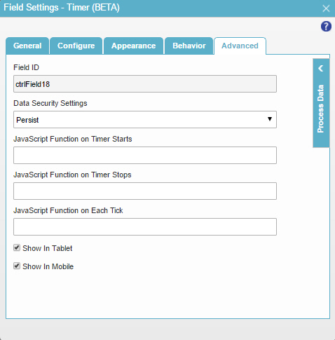
Figure: Advanced tab

Advanced tab

Fields

Field Name Definition

Field ID

Function:
Shows an ID of the control.
Accepted Values:
Read only.
Default Value:
Different for different controls.
Example:
Refer to:

Data Security Settings

Function:
Specifies whether to store information from the field in the process schema, so the application can use it again, or to simply pass on the information after the form is submitted without storing the information. This option helps to protect sensitive user information.
Accepted Values:
  • Persist - Stores the data from the field in the process schema, so the application can use it again.
  • Do Not Persist - Does not store the data from the field in the process schema. This option provides greater security for sensitive user information.
Default Value:
Persist
Example:
Refer to:

JavaScript Function On Timer Starts

Function:
Specifies the name of a JavaScript function to run when the timer starts.
Accepted Values:
The name of a Javascript function that exists in your application.

For more information, refer to Add a JavaScript Code Snippet to an eForm.

Default Value:
None
Example:

TimeStarts where one of these is your function:

function TimeStarts()
  {
    alert('Your time starts now!');
    return true;
  }

JavaScript Function On Timer Stops

Function:
Specifies the name of a JavaScript function to run when the timer stops.
Accepted Values:
The name of a Javascript function that exists in your application.

For more information, refer to Add a JavaScript Code Snippet to an eForm.

Default Value:
None
Example:

TimeStops where one of these is your function:

function TimeStops()
  {
    alert('Your time is up!');
    return true;
  }

JavaScript Function On Each Tick

Function:
Specifies the name of a JavaScript function to run when the timer display value changes.
Accepted Values:
The name of a Javascript function that exists in your application.

For more information, refer to Add a JavaScript Code Snippet to an eForm.

Default Value:
None

Show In Tablet

Function:
Specifies if the form field shows on a tablet.
Accepted Values:
  • Selected - The form field shows on a tablet.
  • Deselected - The form field does not show on a tablet.
Default Value:
Selected
Example:
Refer to:

Show In Mobile

Function:
Specifies if the form field shows on a mobile device.
Accepted Values:
  • Selected - The form field shows on a mobile device.
  • Deselected - The form field does not show on a mobile device.
Default Value:
Selected
Example:
Refer to: