File Upload form control

A form control that lets a form user upload more than one file to your storage system.


File Upload form control

Configure the File Upload form control

To configure the File Upload File Upload icon control, do the procedure in this topic.

Video: Form Designer Overview

Video: Common Configuration Settings in eForm Controls

Examples

Good to Know

  • Some information about third-party integrations is outside the scope of the AgilePoint NX Product Documentation, and it is the responsibility of the vendors who create and maintain these technologies to provide this information. This includes specific business uses cases and examples; explanations for third-party concepts; details about the data models and input and output data formats for third-party technologies; and various types of IDs, URL patterns, connection string formats, and other technical information that is specific to the third-party technologies. For more information, refer to Where Can I Find Information and Examples for Third-Party Integrations?

How to Start

  1. On the Application Explorer screen, do one of these:
  2. Do one of these:
    • Add a File Upload File Upload icon control:
      1. On the eForm Builder screen, in the Toolbox, open the Common Controls Common Controls icon tab.
      2. On the Common Controls Common Controls icon tab, drag a File Upload File Upload icon form control onto your eForm.
    • Change a File Upload File Upload icon control:
      1. On your eForm, click the control, and click Edit Edit icon.

Procedure

  1. Complete the settings on the configuration screens. You can use the Process Data screen to specify a variable.

General

Specifies the basic configuration for the File Upload form control.
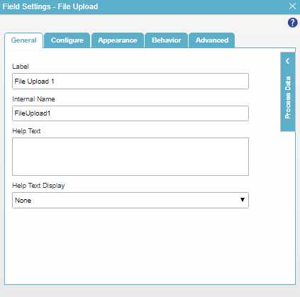
Figure: General tab

General tab

Fields

Field Name Definition

Label

Function:
Specifies the text label that shows on your form for the control.
Accepted Values:
One line of text that can have spaces.
Default Value:
Different for different controls.
Example:
This is a common configuration field that is used in many examples. Refer to:
  • Examples - Step-by-step use case examples, information about what types of examples are provided in the AgilePoint NX Product Documentation, and other resources where you can find more examples.

Internal Name

Function:
Specifies a unique, technical name for your control.
Accepted Values:
One line of text with no spaces.
Default Value:
Different for different controls.
Example:
This is a common configuration field that is used in many examples. Refer to:
  • Examples - Step-by-step use case examples, information about what types of examples are provided in the AgilePoint NX Product Documentation, and other resources where you can find more examples.

Help Text

Function:
Specifies the text to shows when a runtime app user hovers their cursor over the form control.
Accepted Values:
More than one line of text.
Default Value:
None
Example:
Refer to:

Help Text Display

Function:
Specifies if the field shows the text in Help Text field when the form user puts the mouse on the label or field.
Accepted Values:
  • None - Does not show the help text.
  • Hover On Label - Shows the help text when you put your mouse on the label.
  • Hover On Field - Shows the help text when you put your mouse on the field.
  • Hover On Both - Shows the help text when you put your mouse on the label and Field.
Default Value:
None
Example:
Refer to:

Configure

Configures advanced settings for your form control.
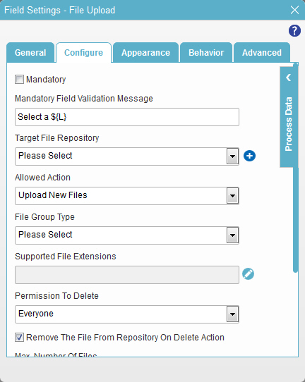
Figure: Configure tab

Configure tab

Fields

Field Name Definition

Mandatory

Function:
Specifies if the field is mandatory.
Accepted Values:
  • Deselected - The field is not mandatory.
  • Selected - The field is mandatory.
Default Value:
Deselected
Example:
Refer to:

Mandatory Field Validation Message

Function:
Specifies the message to show if the form user does not enter data in a mandatory form control.
Accepted Values:
More than one line of text that can have letters, numbers, spaces, and special characters.
Default Value:
Enter the ${L}

${L} is a process data variable that shows the label for a form control.

Example:
Refer to:

Target File Repository

Function:
Specifies the place to store the files.
Accepted Values:
A valid repository name.

If the document repository is configured for the subapplication, it shows in a drop-down list.

Default Value:
None
Example:
Refer to:

Add Repository Add Repository icon

Opens this Screen:
Choose Document Repository screen
Function of this Screen:
Specifies your data source.
Example:
Refer to:

Allowed Action

Function:
Specifies what the form control does.

Options include view, upload and download. If you select a view option, AgilePoint tries to show the file in the form user's web browser. However, in some cases, this is not possible — for example, if the file is a PDF, but there is no software to view a PDF file installed on the client machine. If it is not possible to show the file on the user's machine, the file is downloaded instead.

Accepted Values:
  • View The Files - Lets the form user view the files.
  • Upload New Files - Lets the form user upload the files.
  • View And Download Files - Lets the form user download the files.
  • View And Upload Files - Lets the form user view and upload files.
  • View, Upload, And Download Files - Lets the form user view, upload, and download the files.
Default Value:
Upload new Files
Example:
Refer to:

File Group Type

Function:
Specifies the groups of file types, such as all document types, all image types, or all file types.

For more information, refer to Create a File Type Group or Change a File Type Group.

Accepted Values:
A valid file group type from the list.
Default Value:
None

Supported File Extensions

Function:
Specifies the file extensions for the set file group type.
Accepted Values:
  • .pdf,.doc,.docx, .xls,.xlsx - Documents.
  • .png,.jpeg,.jpg,.gif - Images.

To change the file extensions click Edit Edit icon

Default Value:
Blank

Permission To Delete

Function:
Specifies which users have permission to delete the files.
Accepted Values:
  • Everyone - Lets all users delete the files.
  • None - Lets no user delete the files.
  • User Who Has Uploaded The File - Lets only the user who uploaded the files delete them.
  • Selected Users - Lets a specified group of users delete the files.
Default Value:
Everyone

Remove the file from repository on delete action

Function:
Specifies if the file is deleted from the repository when the form user deletes the file on the form control.
Accepted Values:
  • Deselected - The file stays in the file repository.
  • Selected - The file is deleted from the file repository.
Default Value:
Selected

Remove the File From Repository On Form Cancel

Function:
Specifies whether the file is deleted from the repository if the form user cancels the form.
Accepted Values:
  • Deselected - The file stays in the file repository.
  • Selected - The file is deleted from the file repository.
Default Value:
Deselected

Auto Rename Duplicate Files

Function:
Specifies whether the form control changes the name of the duplicate files when the form user upload the files to the repository.
Accepted Values:
  • Selected - Changes the name of the duplicate files.
  • Deselected - Does not change the name of the duplicate files, and overwrites the old files.
Default Value:
Deselected

Max. Number Of Files

Function:
Specifies the maximum total number of files the form user can upload.
To Open this Field:
  1. In the Allowed Action list, select one of these from the list.
    • Upload New Files
    • View and Upload Files
    • View, Upload, and Download Files
Accepted Values:
An integer.
Default Value:
5
Limitations:

If you have more than one instance of the File Upload form control in your app, it is highly recommended to set the Max. Number of Files to the same value in all instances. If the values are different in different instances of the form control, form validation will fail under these conditions at following runtime:

  • If this value is set to a higher value (for example, 5) on one form, and a form user uploads the maximum number of files (5), and then on a form associated with a task that occurs later in the process, this value is set to a lower value (for example, 3), form validation will fail for the File Upload form control because the number of uploaded files exceeds the maximum number of files allowed in the configuration of that instance of the form control.
  • This issue only occurs if the File Upload form controls have the same value in the Internal Name field. If you have File Upload form controls that are independent of each other, this runtime issue does not occur.

Because each instance of a form control can have its own configuration, the App Builder does not check for this issue during form or process validation.

Max. Individual File Size (MB)

Function:
Specifies the maximum size, in MB, of the file that the form user can upload.
To Open this Field:
  1. In the Allowed Action list, select one of these from the list.
    • Upload New Files
    • View and Upload Files
    • View, Upload, and Download Files
Accepted Values:
An integer.
Default Value:
10

Max. Total Files Size (MB)

Function:
Specifies the maximum sum total size in megabytes of the all files that the form user can upload.
To Open this Field:
  1. In the Allowed Action list, select one of these from the list.
    • Upload New Files
    • View and Upload Files
    • View, Upload, and Download Files
Accepted Values:
An integer.
Default Value:
100

Confirm Delete

Function:
Specifies if the form user must confirm before he deletes the file.
Accepted Values:
  • Selected - The form user must confirm before he deletes the file.
  • Deselected - The form user does not confirm before he deletes the file.
Default Value:
Deselected

Appearance

Specifies the look and feel for your form control.
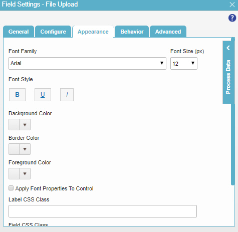
Figure: Appearance tab

Appearance tab

Fields

Field Name Definition

Font Family

Function:
Specifies the font family of the input text and label.
Accepted Values:
A font name from the list.
Default Value:
Arial
Example:
Refer to:

Font Style

Function:
Specifies the style of the font for the input text and label.
Accepted Values:
  • Bold - Shows the input text and label in bold.
  • Underline - Shows the label underlined.
  • Italic - Shows the label in italic.
Default Value:
None
Example:
Refer to:

Background Color

Function:
Specifies the background color for your control.
Accepted Values:
A color value using a hex code, RGB code, or RGBA code.

You can enter a color code, or select a color from the palette.

Default Value:
#ff0000
Example:
Refer to:

Border Color

Function:
Specifies the border color for your control.
Accepted Values:
A color value using a hex code, RGB code, or RGBA code.

You can enter a color code, or select a color from the palette.

Default Value:
#ff0000
Example:
Refer to:

Foreground Color

Function:
Specifies the foreground color for your control.
Accepted Values:
A color value using a hex code, RGB code, or RGBA code.

You can enter a color code, or select a color from the palette.

Default Value:
#ff0000
Example:
Refer to:

Apply Font Properties To Control

Function:
Specifies if the control gets the font properties from the properties set in the form settings.
Accepted Values:
  • Selected - The control gets the font properties from the properties set in the form settings.
  • Deselected - The control does not get the font properties from the properties set in the form settings.
Default Value:
Deselected
Example:
Refer to:

Label CSS Class

Function:
Specifies a CSS class for the label of your control.
Accepted Values:
A valid CSS class.
Default Value:
None

If you specify your CSS CSS icon on the top menu, the CSS is populated.

Example:
Refer to:

Field CSS Class

Function:
Specifies a CSS class for the field in your control.
Accepted Values:
A valid CSS class.
Default Value:
None

If you specify your CSS CSS icon on the top menu, the CSS is populated.

Example:
Refer to:

Container CSS Class

Function:
Specifies a CSS class for the container of your control.
Accepted Values:
A valid CSS class.
Default Value:
None

If you specify your CSS CSS icon on the top menu, the CSS is populated.

Example:
Refer to:

Font Size (px)

Function:
Specifies the size of the input text and label for your form control.
Accepted Values:
A positive integer.
Default Value:
12
Example:
Refer to:

Behavior

Specifies how the control shows on your form.
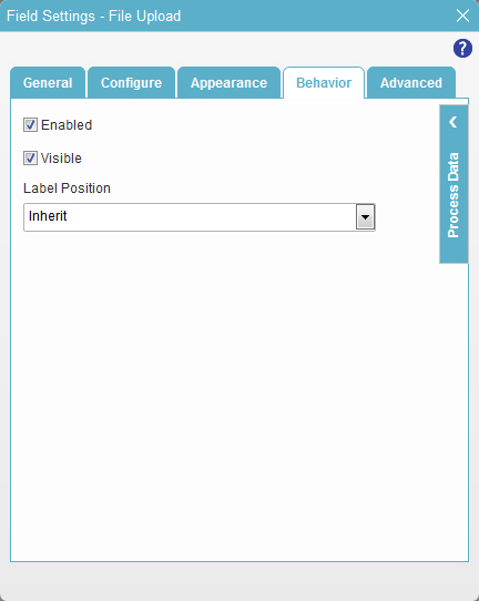
Figure: Behavior tab

Behavior tab

Fields

Field Name Definition

Enabled

Function:
Specifies if the form user can change the value of a field.
Accepted Values:
  • Selected - The form user can change the value.
  • Deselected - The input cannot change the value.
Default Value:
Selected
Example:
Refer to:

Visible

Function:
Specifies if the form user sees the field.
Accepted Values:
  • Selected - The form user sees the field.
  • Deselected - The form user does not see the field.
Default Value:
Selected
Example:
Refer to:

Label Position

Function:
Specifies the position of the text label that shows on your form for the control.
Accepted Values:
  • Inherit - The position of the label is as specified in the form settings.
  • Left - Specifies that the position of the label is to the left of the container.
  • Top - Specifies that the position of the label is to the top of the container.
Default Value:
Inherit
Example:
Refer to:

Advanced

Specifies advanced settings for your form control.
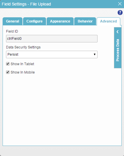
Figure: Advanced tab

Advanced tab

Fields

Field Name Definition

Field ID

Function:
Shows an ID of the control.
Accepted Values:
Read only.
Default Value:
Different for different controls.
Example:
Refer to:

Data Security Settings

Function:
Specifies whether to store information from the field in the process schema, so the application can use it again, or to simply pass on the information after the form is submitted without storing the information. This option helps to protect sensitive user information.
Accepted Values:
  • Persist - Stores the data from the field in the process schema, so the application can use it again.
  • Do Not Persist - Does not store the data from the field in the process schema. This option provides greater security for sensitive user information.
Default Value:
Persist
Example:
Refer to:

Show In Tablet

Function:
Specifies if the form field shows on a tablet.
Accepted Values:
  • Selected - The form field shows on a tablet.
  • Deselected - The form field does not show on a tablet.
Default Value:
Selected
Example:
Refer to:

Show In Mobile

Function:
Specifies if the form field shows on a mobile device.
Accepted Values:
  • Selected - The form field shows on a mobile device.
  • Deselected - The form field does not show on a mobile device.
Default Value:
Selected
Example:
Refer to: