
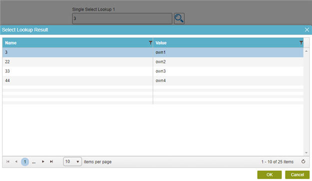
Single Select Lookup form control
A form control that shows the list of items that are populated from a name/value type lookup. A form user can select 1 item from the list.
Configure the Single Select Lookup form control
To configure
the
Single Select Lookup  control,
do the procedure in this topic.
control,
do the procedure in this topic.
Video: Common Configuration Settings in eForm Controls
Prerequisites
- AgilePoint NX OnDemand (public cloud), or AgilePoint NX Private Cloud or AgilePoint NX OnPremises v7.0 Software Update 2 or higher.
Good to Know
- The Single Select Lookup form control has 2 data source configuration fields:
- Lookup Source For User Input - This is the primary data source field that specifies the lookup configuration when the runtime app user selects a value.
- Lookup Source For Updated Records - This data source is only used if you want to execute the lookup on subsequent forms to account for updated values in the data source.
For example, if you have an app where a process instance usually takes 2-3 weeks to complete, new values might be added to the data source between the time the Single Select form control value is selected first and the time the process instance completes. In this case, you may want form users later in the process to be able to check for updated values.
This field is optional because using it can have a significant impact on eForm performance.
- The Lookup Source For Updated Records field may be configured or not, depending on how you add the Single Select Lookup control to an eForm:
- If you add the Single Source Lookup control to an eForm with a configured data source (for example, a from-based app that is configured to use Data Entities as its data source), the Lookup Source For Updated Records field is configured to match the Lookup Source For User Input field configuration.
- If you add the Single Source Lookup control in any other way (for example, from the My Control Library), the Lookup Source For Updated Records field is not configured.
- If you change the configuration for the Lookup Source For User Input field, you may also need to change the configureation for the Lookup Source For Updated Records field, depending on your requirements.
- Some information about third-party integrations is outside the scope of the AgilePoint NX Product Documentation. It is the responsibility of the vendors who create and maintain these technologies to provide this information. This includes specific business use cases and examples; explanations for third-party concepts; details about the data models and input and output data formats for third-party technologies; and various types of IDs, URL patterns, connection string formats, or other technical information that is specific to the third-party technologies. For more information, refer to Where Can I Find Information and Examples for Third-Party Integrations?
How to Start
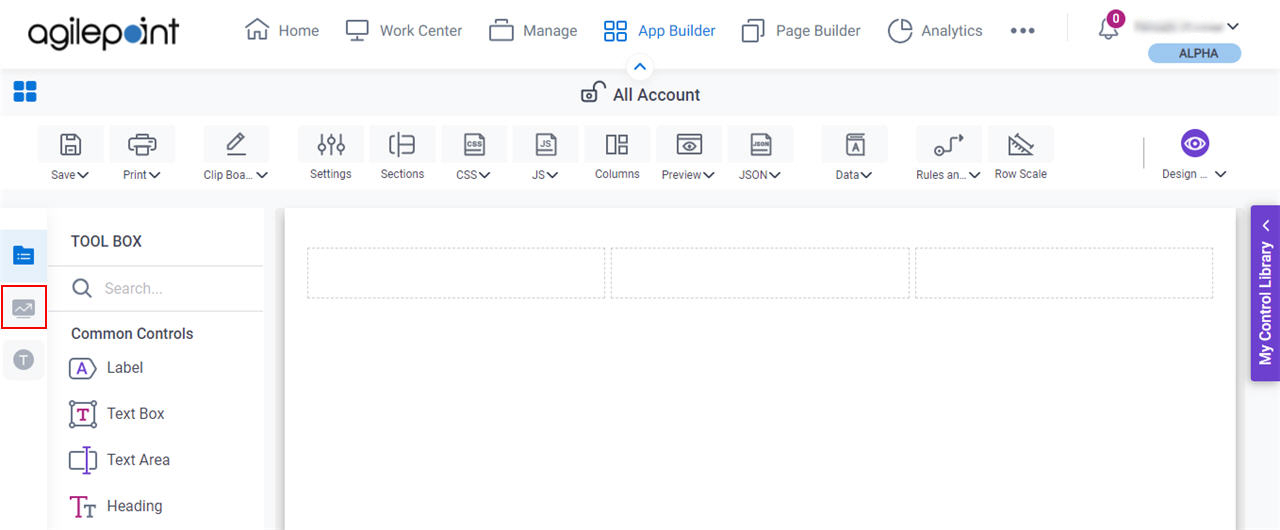
- Open eForm Builder.
For information about how to open this screen, refer to eForm Builder screen.
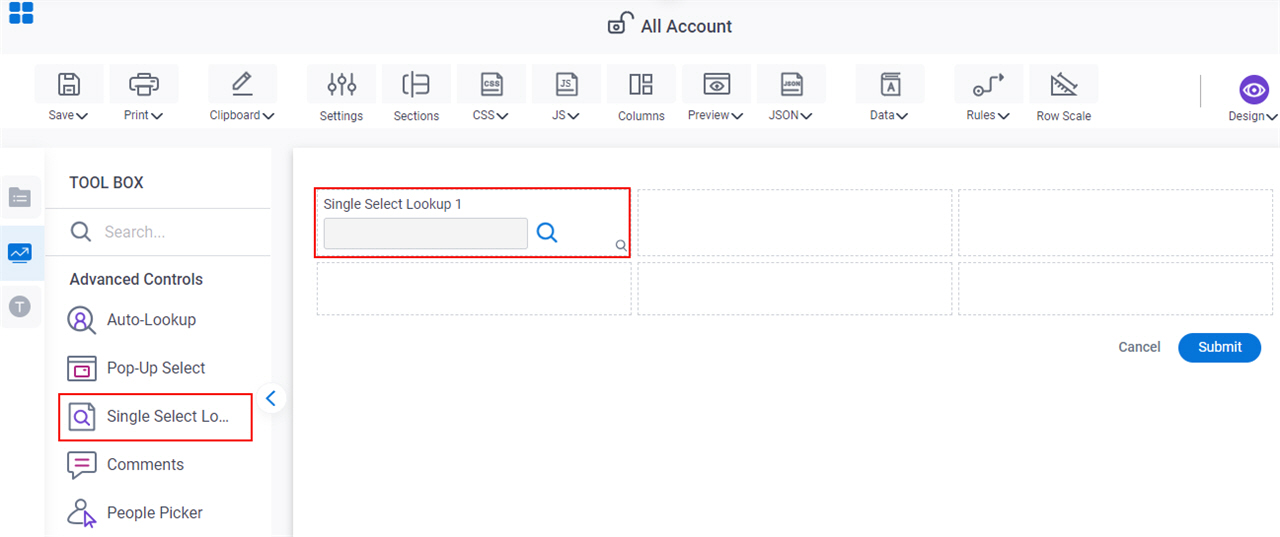
- On the eForm Builder screen, in the Toolbox, open the Advanced Controls tab.
- On the Advanced Controls tab, drag a Single Select Lookup
form control onto your eForm.
Procedure
- Complete the settings on the configuration screens.
You can use the Data screen screen to specify a variable.
General
Specifies the basic configuration for the Single Select Lookup form control.
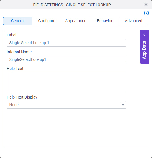
Fields
| Field Name | Definition |
|---|---|
Label |
|
Internal Name |
|
Help Text |
|
Help Text Display |
|
Configure
Configures advanced settings for your form control.
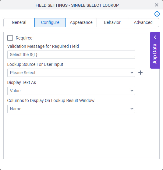
Fields
| Field Name | Definition |
|---|---|
Validation Message for Required Field |
|
Lookup Source For User Input |
|
Add Lookup |
|
Javascript To Execute After Lookup Completion |
|
Display Text As |
|
Columns to Display On Lookup Result Window |
|
Lookup Source For Updated Records |
|
Always retrieve the updated record from the data source |
|

Appearance
Specifies the look and feel for your form control.
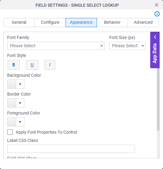
Fields
| Field Name | Definition |
|---|---|
Font Family |
|
Font Size (px) |
|
Font Style |
|
Background Color |
|
Border Color |
|
Foreground Color |
|
Apply Font Properties To Control |
|
Label CSS Class |
|
Field CSS Class |
|
Container CSS Class |
|

Behavior
Specifies how the control shows on your form.
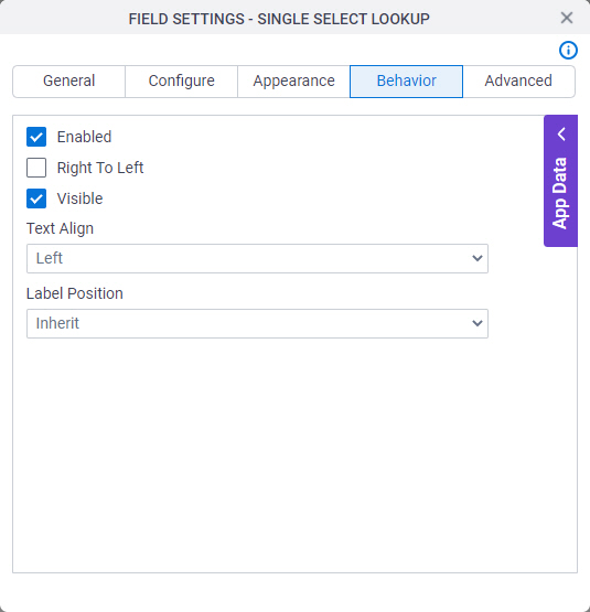
Fields
| Field Name | Definition |
|---|---|
Required |
|
Enabled |
|
Right To Left |
|
Visible |
|
Text Align |
|
Label Position |
|
Advanced
Specifies advanced settings for your form control.
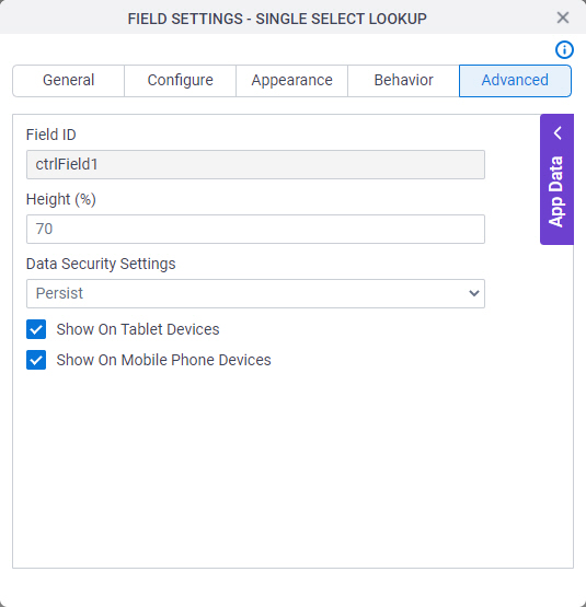
Fields
| Field Name | Definition |
|---|---|
Field ID |
|
Data Security Settings |
|
Show On Tablet Devices |
|
Show On Mobile Phone Devices |
|