
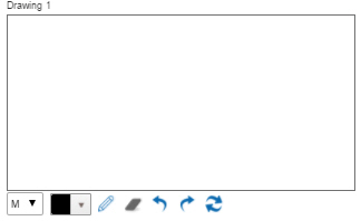
Drawing form control
A form control that lets a form user draw a digital signature on an eForm with an input device, such as a touch screen or mouse.
Configure the Drawing form control
To configure
the
Drawing  control,
do the procedure in this topic.
control,
do the procedure in this topic.
Video: Common Configuration Settings in eForm Controls
Good to Know
- In this form control, you can map a
field from
the associated data source.
This feature requires AgilePoint NX OnDemand (public cloud), or AgilePoint NX Private Cloud or AgilePoint NX OnPremises v7.0 Software Update 2 or higher.
How to Start
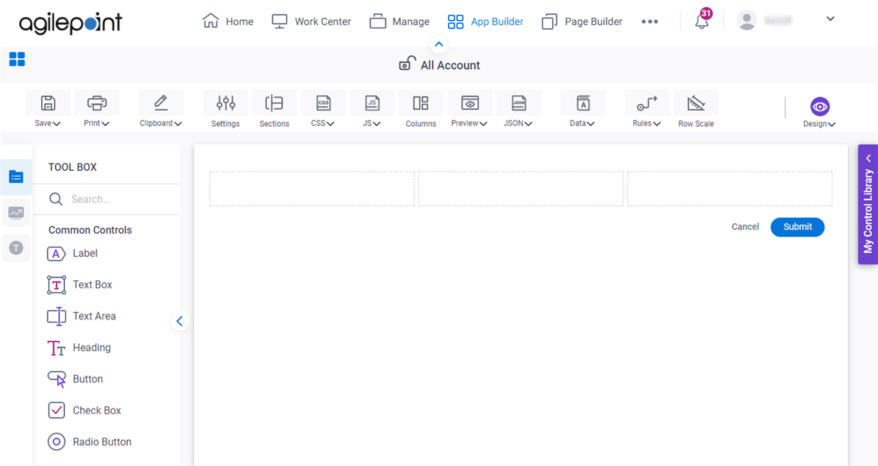
- Open eForm Builder.
For information about how to open this screen, refer to eForm Builder screen.
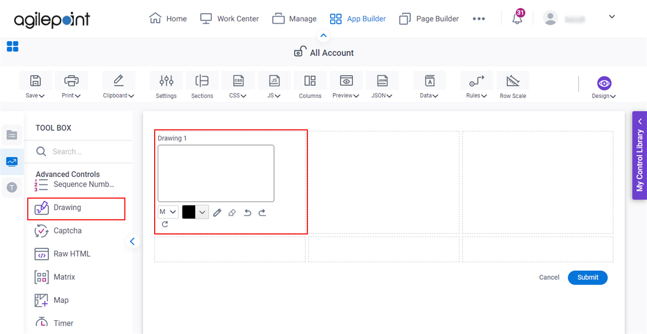
- On the eForm Builder screen, in the Toolbox, open the Advanced Controls tab.
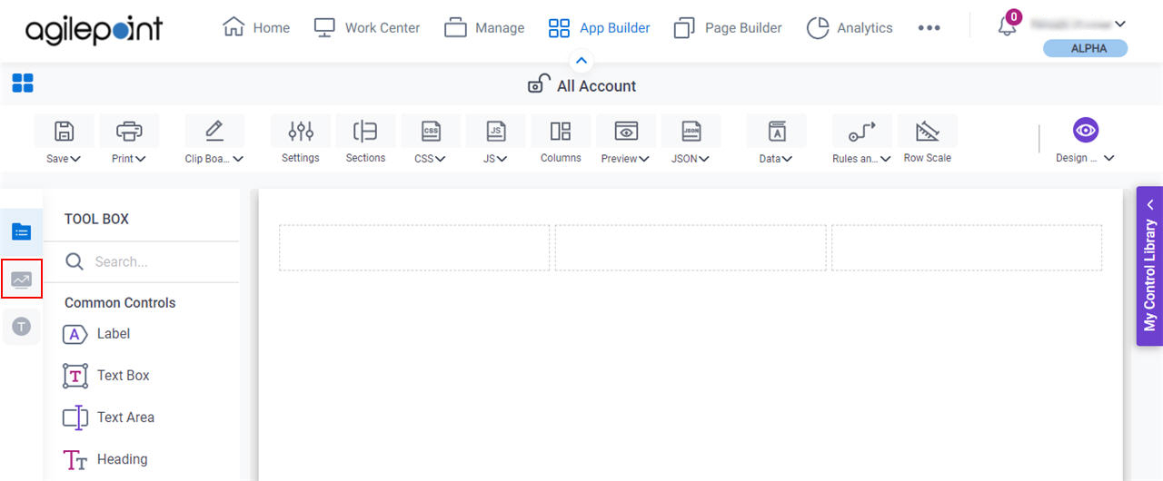
- On the Advanced Controls tab, drag a Drawing
form control onto your eForm.
Procedure
- Complete the settings on the configuration screens.
You can use the Data screen screen to specify a variable.
General
Specifies the basic configuration for the Drawing form control.
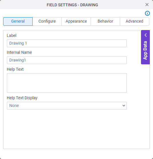
Fields
| Field Name | Definition |
|---|---|
Label |
|
Internal Name |
|
Help Text |
|
Help Text Display |
|
Configure
Configures advanced settings for your form control.
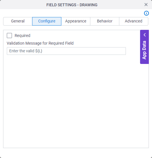
Fields
| Field Name | Definition |
|---|---|
Required |
|
Validation Message for Required Field |
|
Appearance
Specifies the look and feel for your form control.
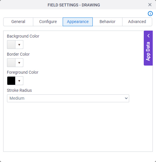
Fields
| Field Name | Definition |
|---|---|
Background Color |
|
Border Color |
|
Foreground Color |
|
Stroke Radius |
|
Behavior
Specifies how the control shows on your form.
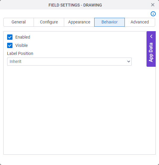
Fields
| Field Name | Definition |
|---|---|
Enabled |
|
Visible |
|
Label Position |
|
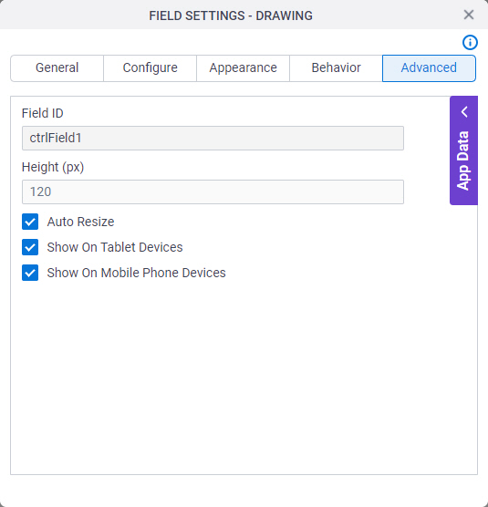
Advanced
Specifies advanced settings for your form control.
Fields
| Field Name | Definition |
|---|---|
Field ID |
|
Height (px) |
|
Auto Resize |
|
Show On Tablet Devices |
|
Show On Mobile Phone Devices |
|