
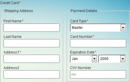
Credit Card form control
A form control that lets form users specify their shipping address, billing address, and credit card payment information.
Configure the Credit Card form control
To configure
the
Credit Card  control,
do the procedure in this topic.
control,
do the procedure in this topic.
Video: Common Configuration Settings in eForm Controls
Good to Know
- The CVV field accepts numbers only.
This feature requires AgilePoint NX OnDemand (public cloud), or AgilePoint NX Private Cloud or AgilePoint NX OnPremises v7.0 Software Update 1 or higher.
How to Start
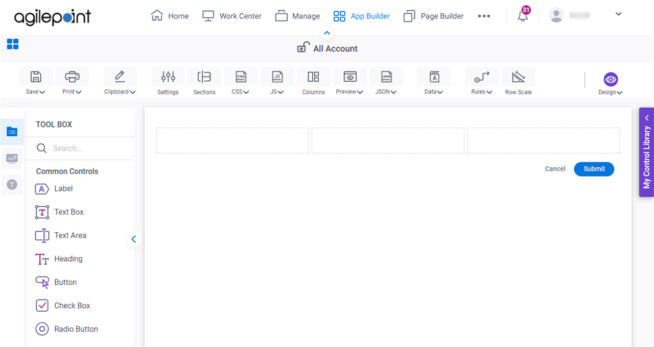
- Open eForm Builder.
For information about how to open this screen, refer to eForm Builder screen.
- On the eForm Builder screen, in the Toolbox, open the Advanced Controls tab.
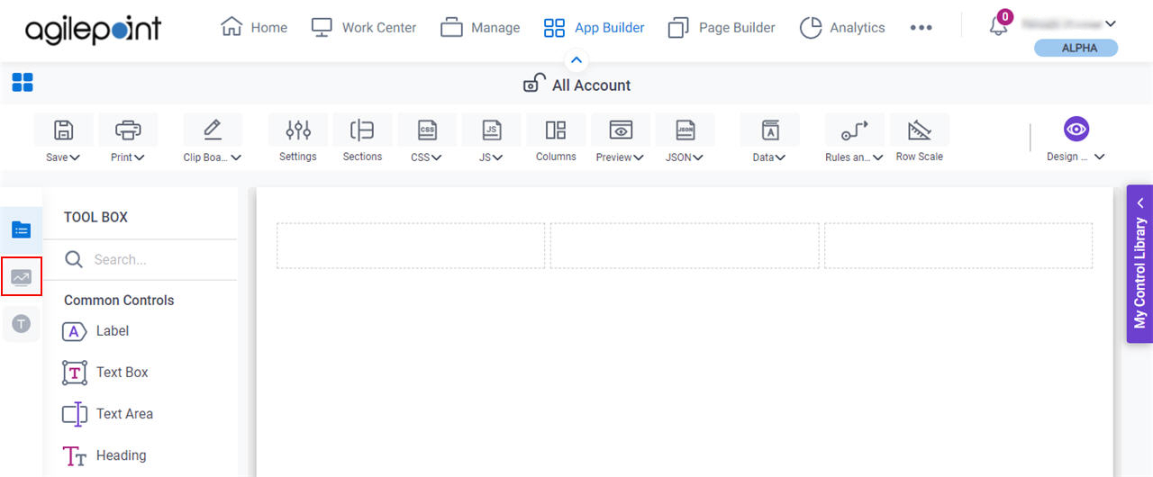
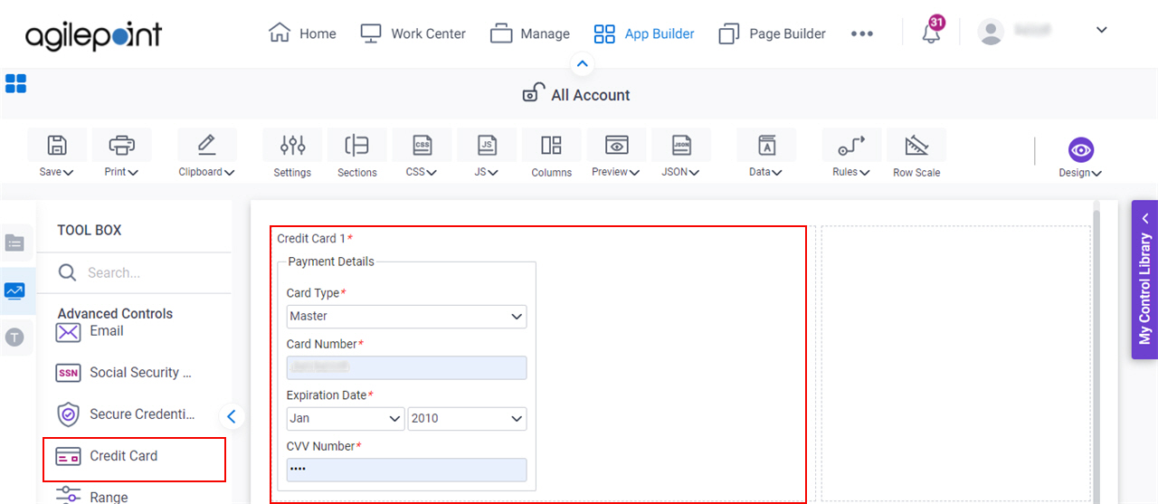
- On the Advanced Controls tab,
drag a Credit Card
form control onto your eForm.
Procedure
- Complete the settings on the configuration screens.
You can use the Data screen screen to specify a variable.
General
Specifies the basic configuration for the Credit Card form control.
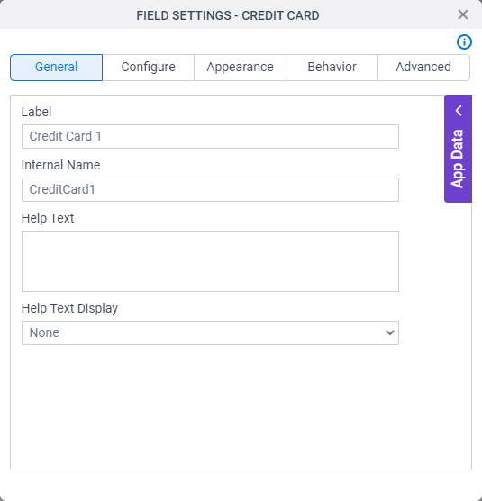
Fields
| Field Name | Definition |
|---|---|
Label |
|
Internal Name |
|
Help Text |
|
Help Text Display |
|
Configure
Configures advanced settings for your form control.
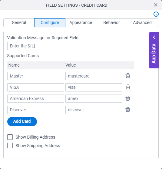
Fields
| Field Name | Definition |
|---|---|
Validation Message for Required Field |
|
Name |
|
Value |
|
Delete |
|
Add Card |
|
Show Billing Address | |
Show Shipping Address |
|
* (Asterisk) |
|
Include |
|
Address Fields |
|

Appearance
Specifies the look and feel for your form control.
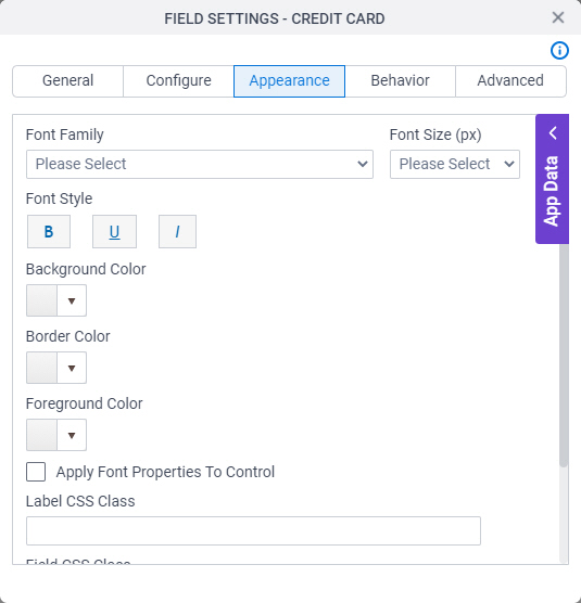
Fields
| Field Name | Definition |
|---|---|
Font Family |
|
Font Size (px) |
|
Font Style |
|
Background Color |
|
Border Color |
|
Foreground Color |
|
Apply Font Properties To Control |
|
Label CSS Class |
|
Field CSS Class |
|
Container CSS Class |
|

Behavior
Specifies how the control shows on your form.
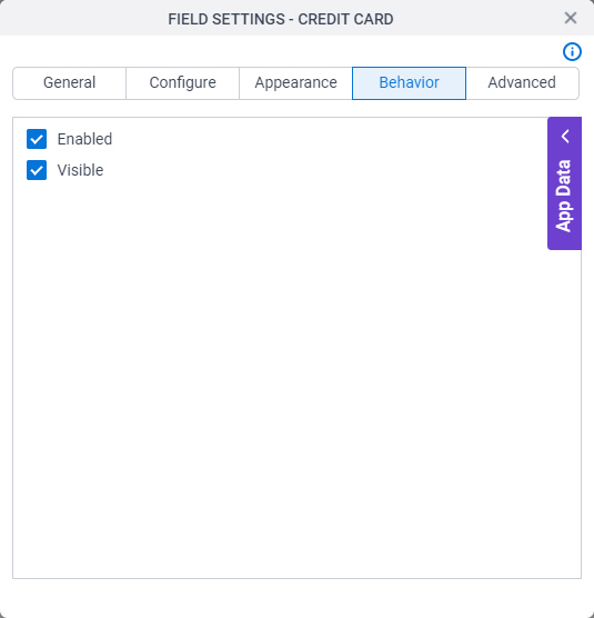
Fields
| Field Name | Definition |
|---|---|
Enable |
|
Visible |
|
Advanced
Specifies advanced settings for your form control.
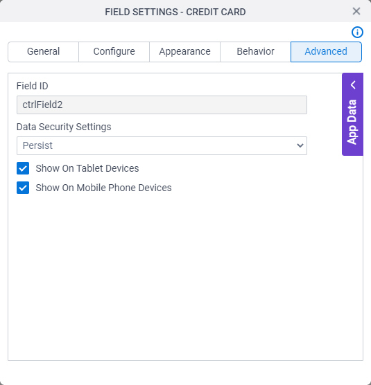
Fields
| Field Name | Definition |
|---|---|
Field ID |
|
Data Security Settings |
|
Show On Tablet Devices |
|
Show On Mobile Phone Devices |
|