
Form Settings
Configures the settings for an eForm.
Background and Setup
Video: eForm Builder Interface
Video: Create Your First eForm
Examples
- (Example) Show an eForm in More Than One Language (Multi-Language Forms)
- Examples - Step-by-step use case examples, information about what types of examples are provided in the AgilePoint NX Product Documentation, and other resources where you can find more examples.
Good to Know
- The option to show the Save button on an eForm only applies to process-based apps. You can not save an eForm in a form-based app.
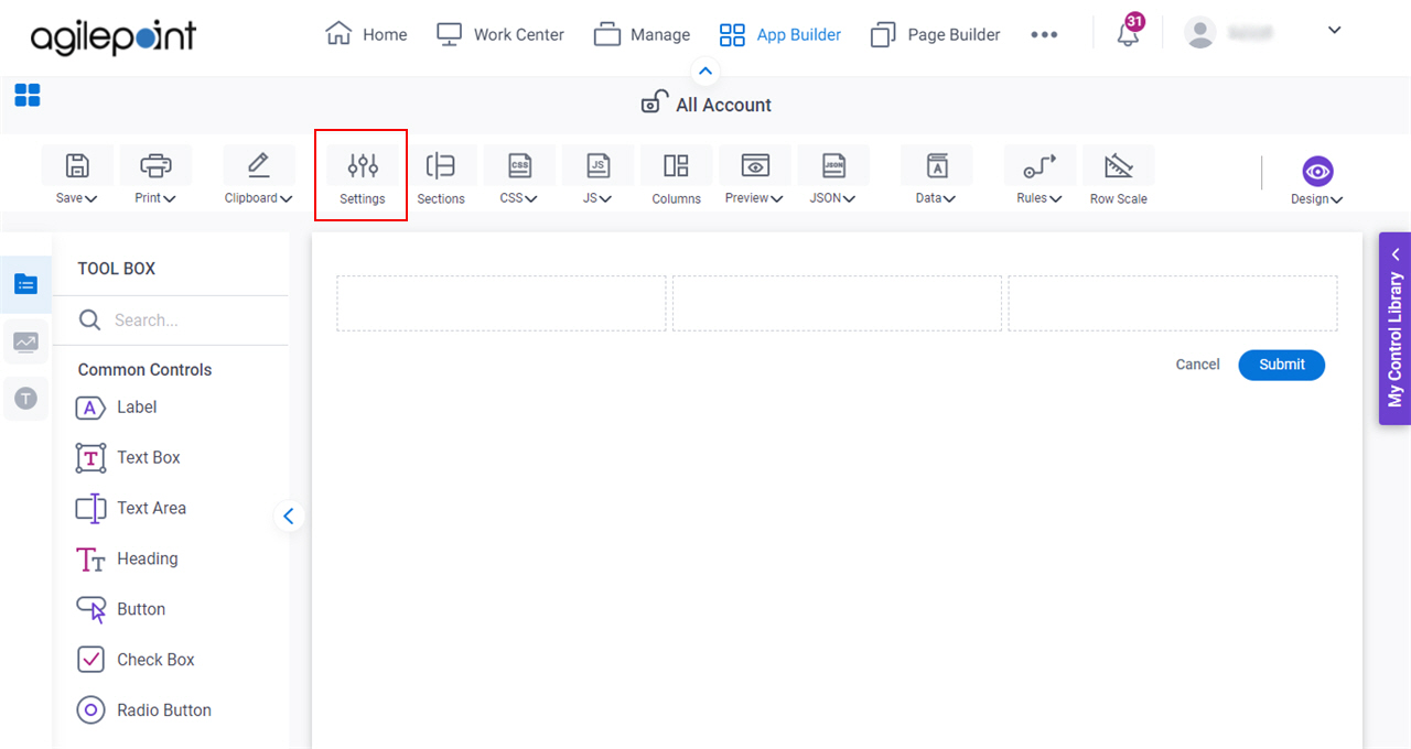
How to Start
- Open eForm Builder.
For information about how to open this screen, refer to eForm Builder screen.
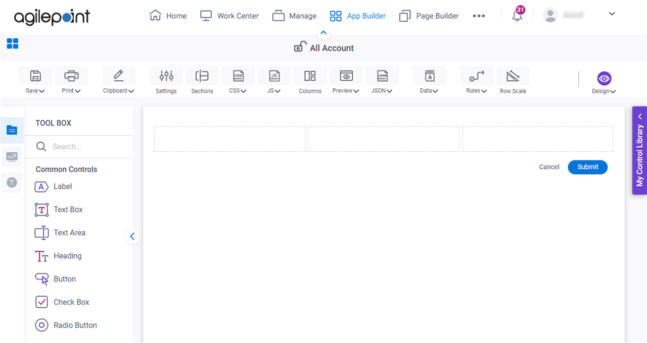
- On the eForm Builder screen, click Settings.
General
Specifies the basic configuration for your eForm.

Fields
| Field Name | Definition |
|---|---|
Form Title |
|
Form Title Style |
|
Form Title Alignment |
|
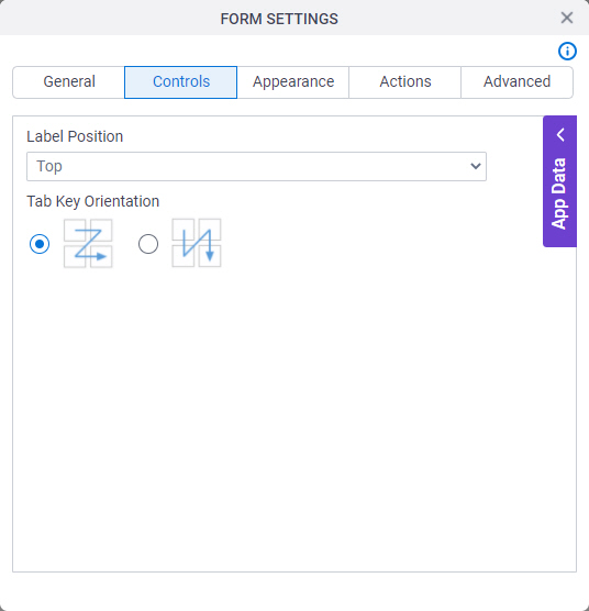
Controls
Specifies the configuration for your controls on your eForm.
Fields
| Field Name | Definition |
|---|---|
Label Position |
|
Tab Key Orientation |
|
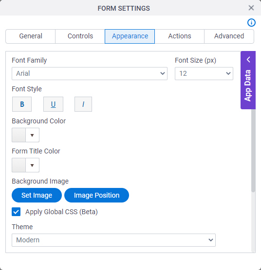
Appearance
Specifies the look and feel for your eForm.
Fields
| Field Name | Definition |
|---|---|
Font Family |
|
Font Size (px) |
|
Font Style |
|
Background Color |
|
Form Title Color |
|
Set Image |
|
Image Position |
|
Apply Global CSS |
|
Theme |
|
CSS Class |
|
Show Form Background |
|
Show Header |
|

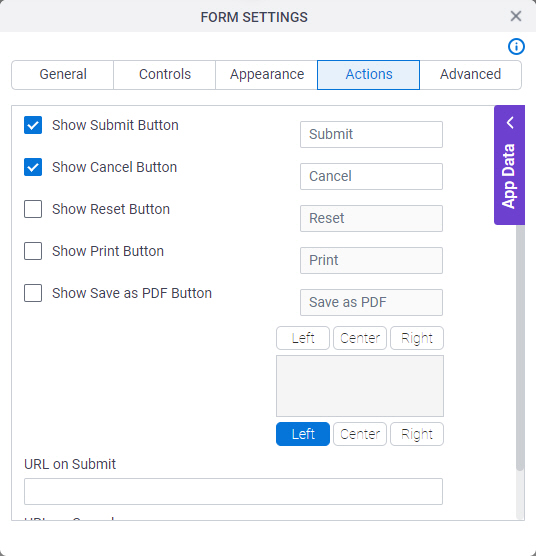
Actions
Configures the action buttons on your eForm.
Fields
| Field Name | Definition |
|---|---|
Show Submit Button |
|
Show Cancel Button |
|
Show Save Button |
|
Show Reset Button |
|
Show Print Button |
|
Show Save as PDF Button |
|
Action Buttons Position |
|
URL on Submit | |
URL on Cancel |
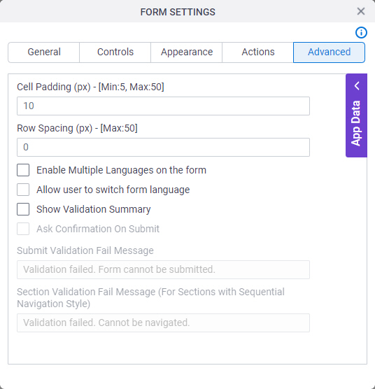
Advanced
Specifies advanced settings for your eForm.
Fields
| Field Name | Definition |
|---|---|
Cell Padding (px) |
|
Row Spacing (px) |
|
Enable Multiple Languages on the Form | |
Allow User to Switch Form Language |
|
Default Language Name |
|
Excluded Language Name | |
Show Validation Summary |
|
Ask Confirmation On Submit | |
Ask Confirmation On Save | |
Submit Validation Fail Message | |
Section Validation Fail Message (For Sections with Sequential Navigation Style) |
|