Form Section Settings

Configures the form section and navigation bar settings for your eForm.

Background and Setup

Video: Form Designer Overview

Video: eForm Builder Interface

Video: Salesforce Query and Second Form

Examples

Good to Know

How to Start

  1. Open eForm Builder.

    For information about how to open this screen, refer to eForm Builder screen.


    Eform Builder screen
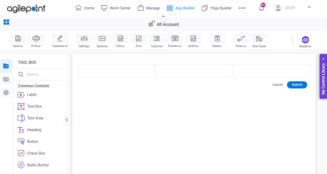
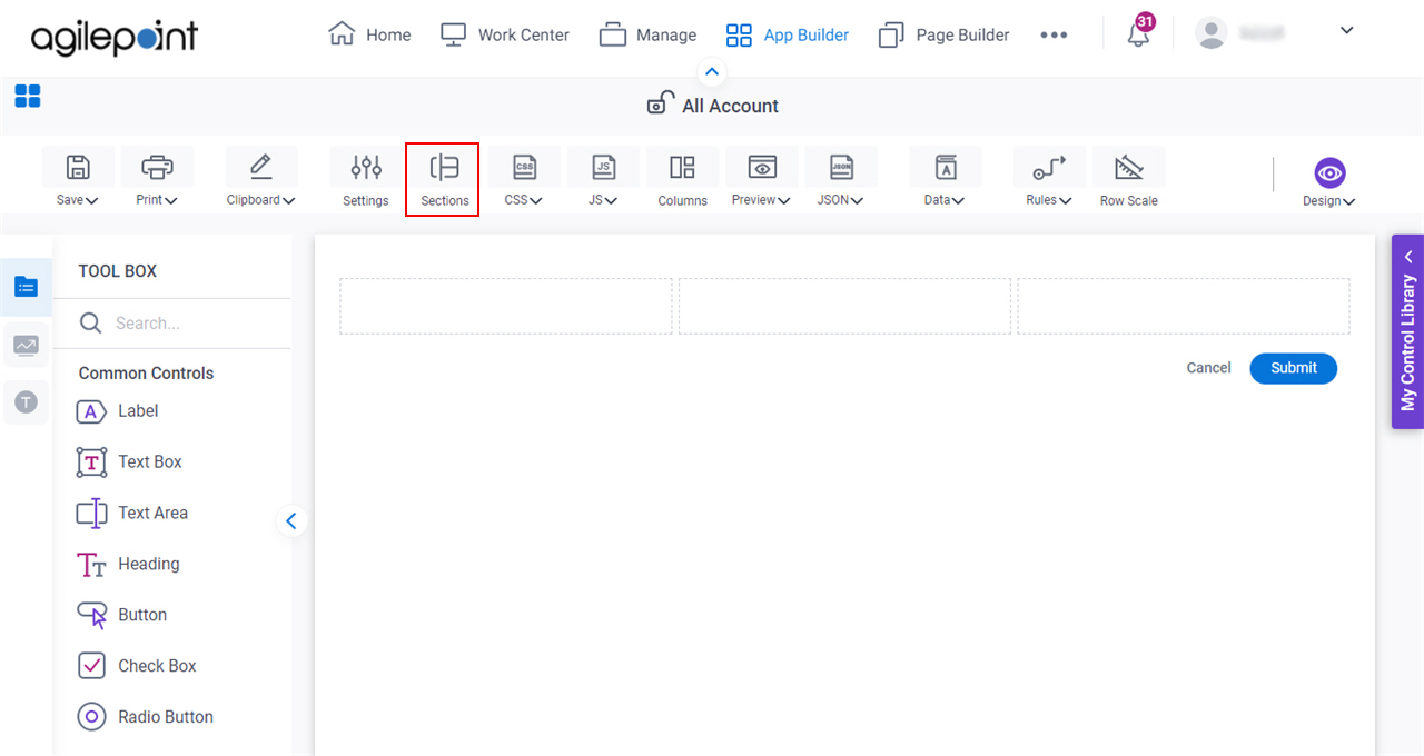
  2. On the eForm Builder screen, click Sections.

    Click Form Sections

General

Specifies the basic configuration for sections on your eForm.
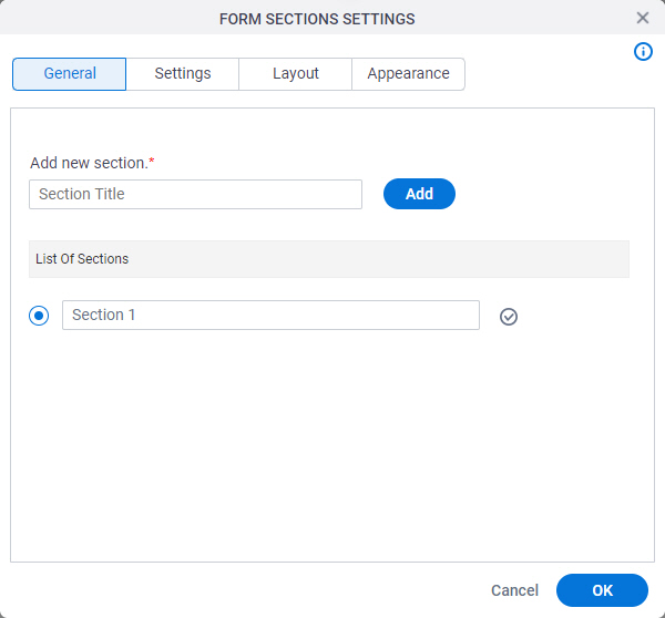
Figure: Form Sections Settings General tab

Form Sections Settings General tab

Fields

Field NameDefinition

Add New Section

Function:
Specifies the title for a form section.
Accepted Values:
One line of text that can have spaces.

Click Add to add a new section.

Default Value:
None
Example:
Refer to:

List Of Sections

Function:
Specifies the first form section to show to the form user.
Accepted Values:
A list of sections on your eForm.
Default Value:
Section 1
Example:
Refer to:

Delete Delete icon

Function:
Deletes the form section.

Validation Rule Validation Rule icon

Opens this Screen:
Validation Rule Builder screen
Function of this Screen:
Lets you configure validation rules for your eForm.
Example:
Refer to:

Display Rule Display Rule icon

Opens this Screen:
Display Rule Builder screen
Function of this Screen:
Lets you configure display rules for an eForm.
Example:
Refer to:

Settings

Specifies the settings for your form sections.
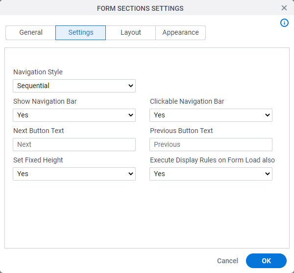
Figure: Form Sections Settings tab

Form Sections Settings tab

Fields

Field NameDefinition

Navigation Style

Function:
Specifies how the form user can go through the form section.
Accepted Values:
  • Sequential - Lets the form user go through the sections in a specified sequence.
  • Adhoc - Lets the form user go to any section.
Default Value:
Sequential
Example:
Refer to:

Show Navigation Bar

Function:
Specifies if the navigation bar shows on the eForm.
Accepted Values:
  • Yes - Shows the navigation bar in the eForm.
  • No - Does not the navigation bar in the eForm.
Default Value:
Yes
Example:
Refer to:

Next Button Text

Function:
Specifies the text to show on your next button.
Accepted Values:
One line of text that can have spaces
Default Value:
Next
Example:
Refer to:

Set Fixed Height

Function:
Specifies if the sections are set to a specified height.
Accepted Values:
  • Yes - The sections have a fixed height.
  • No - The sections do not have a fixed height.
Default Value:
Yes
Example:
Refer to:

Clickable Navigation Bar

Function:
Specifies if the form user can click the navigation bar to go to a different form section.
Accepted Values:
  • Yes - The form user can click the navigation bar.
  • No - The form user can not click the navigation bar.
Default Value:
Yes
Example:
Refer to:

Previous Button Text

Function:
Specifies the text to show on your previous button.
Accepted Values:
One line of text that can have spaces
Default Value:
Previous
Example:
Refer to:

Execute Display Rules on Form Load also

Function:
Specifies whether to run the display rules for the form section.
Accepted Values:
  • Yes - The display rules run when the form shows.
  • No - The display rules do not run when the form shows.
Default Value:
Yes
Example:
Refer to:

Layout

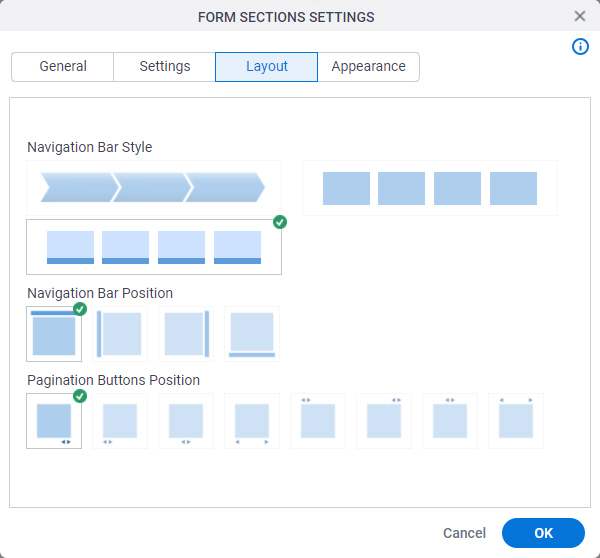
Specifies the style and position of the navigation bar on your eForm.

Figure: Form Sections Settings Layout tab

Form Sections Settings Layout tab

Fields

Field NameDefinition

Navigation Bar Style

Function:
Specifies the style of the navigation bar.
Accepted Values:
A list of navigation bar styles.
Default Value:
The first navigation bar style.
Example:
Refer to:

Navigation Bar Position

Function:
Specifies the position of the navigation bar.
Accepted Values:
  • Top
  • Left
  • Right
  • Bottom
Default Value:
Top
Example:
Refer to:

Pagination Buttons Position
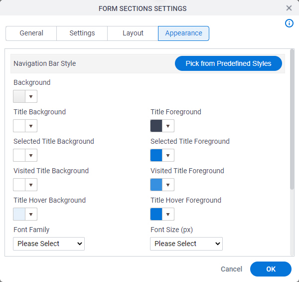
Function:
Specifies the position of the page navigation buttons.
Accepted Values:
  • Bottom Right
  • Bottom Left
  • Bottom Center
  • Bottom Left and Right
  • Top Left
  • Top Right
  • Top Center
  • Top Left and Right
Default Value:
Bottom Right
Example:
Refer to:

Appearance

Specifies the appearance of the form sections.

Figure: Form Sections Settings Appearance tab

Form Sections Settings Appearance tab

Fields

Field NameDefinition

Pick from Predefined Styles

Function:
Lets you choose the style of the navigation bar.
Accepted Values:
  • Default - Sets the color of the section of the navigation bar based on the default color.
  • Red - Sets the title background color, the title foreground color, and the title hover background color for the navigation bar to red.
  • Green - Sets the visited title foreground color for the navigation bar to green.
  • Orange - Sets the visited title foreground color for the navigation bar to orange.
Default Value:
None
Example:
Refer to:

Background

Function:
Specifies the background color for your navigation bar.
Accepted Values:
A color value using a hex code, RGB code, or RGBA code.

You can enter a color code, or select a color from the palette.

Default Value:
#ff0000
Example:
Refer to:

Title Background

Function:
Specifies the title background color of your navigation bar.
Accepted Values:
A color value using a hex code, RGB code, or RGBA code.

You can enter a color code, or select a color from the palette.

Default Value:
#ff0000
Example:
Refer to:

Title Foreground

Function:
Specifies the title foreground color of your navigation bar.
Accepted Values:
A color value using a hex code, RGB code, or RGBA code.

You can enter a color code, or select a color from the palette.

Default Value:
#ff0000
Example:
Refer to:

Selected Title Background

Function:
Specifies the title background color of the selected navigation bar.
Accepted Values:
A color value using a hex code, RGB code, or RGBA code.

You can enter a color code, or select a color from the palette.

Default Value:
#ff0000
Example:
Refer to:

Selected Title Foreground

Function:
Specifies the title foreground color of selected navigation bar.
Accepted Values:
A color value using a hex code, RGB code, or RGBA code.

You can enter a color code, or select a color from the palette.

Default Value:
#ff0000
Example:
Refer to:

Visited Title Background

Function:
Specifies the title background color of the section of the navigation bar the form user has opened before.
Accepted Values:
A color value using a hex code, RGB code, or RGBA code.

You can enter a color code, or select a color from the palette.

Default Value:
#ff0000
Example:
Refer to:

Visited Title Foreground

Function:
Specifies the title foreground color of the section of the navigation bar the form user has opened before.
Accepted Values:
A color value using a hex code, RGB code, or RGBA code.

You can enter a color code, or select a color from the palette.

Default Value:
#ff0000
Example:
Refer to:

Title Hover Background

Function:
Specifies the title background color of the navigation bar when the form user hovers the cursor over it.
Accepted Values:
A color value using a hex code, RGB code, or RGBA code.

You can enter a color code, or select a color from the palette.

Default Value:
#ff0000
Example:
Refer to:

Title Hover Foreground

Function:
Specifies the title foreground color of the navigation bar when the form user hovers the cursor over it.
Accepted Values:
A color value using a hex code, RGB code, or RGBA code.

You can enter a color code, or select a color from the palette.

Default Value:
#ff0000
Example:
Refer to:

Font Family

Function:
Specifies the font family of the input text and label for your navigation bar.
Accepted Values:
A font name from the list.
Default Value:
None
Example:
Refer to:

Font Size (px)

Function:
Specifies the font size of the input text and label for your navigation bar.
Accepted Values:
A positive integer.
Default Value:
None
Example:
Refer to:

Font Style

Function:
Specifies the style of the font for the input text and label for your navigation bar.
Accepted Values:
  • Bold - Shows the input text and label in bold.
  • Underline - Shows the label underlined.
  • Italic - Shows the label in italic.
Default Value:
None
Example:
Refer to:

Background (Section Style)

Function:
Specifies the background color of the form section.
Accepted Values:
A color value using a hex code, RGB code, or RGBA code.

You can enter a color code, or select a color from the palette.

Default Value:
#ff0000
Example:
Refer to:

Show Border

Function:
Specifies if the eForm shows a border around the panel.
Accepted Values:
  • Deselected - Shows no border.
  • Selected - Shows the border.
Default Value:
Selected
Example:
Refer to:

Border Width (px)

Function:
Specifies the width of the border in pixels.
Accepted Values:
  • 1
  • 2
  • 3
  • 4
  • 5
Default Value:
1
Example:
Refer to:

Border Color

Function:
Specifies the border color for your control.
Accepted Values:
A color value using a hex code, RGB code, or RGBA code.

You can enter a color code, or select a color from the palette.

Default Value:
#ff0000
Example:
Refer to: