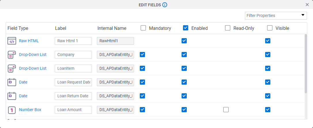
Bulk Edit screen

Lets you configure the properties of all form controls in your eForm at one time.

Figure: Bulk Edit screen

Bulk Edit screen

Video: eForm Builder Interface
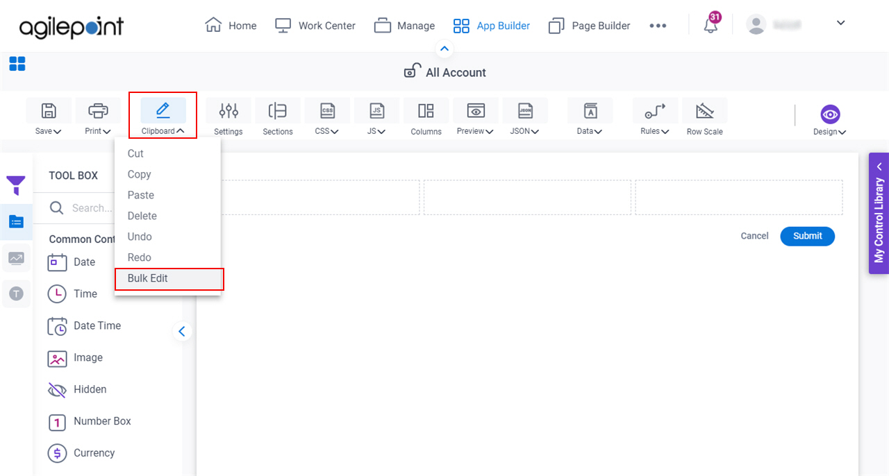
How to Start

  1. Open eForm Builder.

    For information about how to open this screen, refer to eForm Builder screen.


    Eform Builder screen
  2. On the eForm Builder screen, click Clipboard > Bulk Edit.

    Click Bulk Edit

Fields

Field NameDefinition

Filter Properties

Function:
Specifies the which properties of the form controls on the eForm to show.
Accepted Values:
  • Select All - Selects all the properties of the form controls.
  • Field Type - Specifies the type of form control used in eForm.
  • Label - Specifies the text label that shows on your form for the control.
  • Internal Name - Specifies a unique, technical name for your control.
  • Help Text - Specifies the text to shows when a runtime app user hovers their cursor over the form control.
  • Help Text Display - Specifies if the field shows the text in Help Text field when the form user puts the mouse on the label or field.
  • Mandatory - Specifies if the field is mandatory.
  • Mandatory Message - Specifies the message to show if the form user does not enter data in a mandatory form control.
  • Enabled - Specifies if the form user can change the value of a field.
  • Read-Only - Specifies if the field accepts user input.
  • Visible - Specifies if the form user sees the field.
  • Right to Left - Specifies if the text for this control, including user input, shows from right to left.
  • Text Align - Specifies the horizontal alignment of user input for this control.
  • Font Name - Specifies the font family of the input text and label.
  • Font Size - Specifies the size of the input text and label for your form control.
  • Bold - Specifies if the label of your control is bold.
  • Italic - Specifies if the label of your control is italic.
  • Underline - Specifies if the label for your control is underlined.
  • Background Color - Specifies the background color for your navigation bar.
  • Border Color - Specifies the border color for your control.
  • Foreground Color - Specifies the foreground color for your control.
  • Apply Font Properties to Control - Specifies if the control gets the font properties from the properties set in the form settings.
  • Container CSS Class - Specifies a CSS class for the container of your control.
  • Field CSS Class - Specifies a CSS class for the field in your control.
  • Label CSS Class - Specifies a CSS class for the label of your control.
  • Data Security - Specifies whether to store information from the field in the process schema, so the app can use it again, or to simply pass on the information after the form is submitted without storing the information.

You can click Select All to show all the properties of all the form controls on the eForm.

Default Value:
  • Field Type
  • Label
  • Internal Name
  • Help Text
  • Mandatory
  • Enabled
  • Read-Only
  • Visible
Example:
Refer to:

Field Type

Function:
Specifies the type of form control used in eForm.
Accepted Values:
A list of the types form controls that exist in your eForm.
Default Value:
None
Example:
Refer to: