
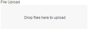
File Upload form control
A form control that lets a form user upload more than one file to your storage system.
Configure the File Upload form control
To configure
the
File Upload  control,
do the procedure in this topic.
control,
do the procedure in this topic.
Video: Common Configuration Settings in eForm Controls
Examples
Good to Know
- Some information about third-party integrations is outside the scope of the AgilePoint NX Product Documentation. It is the responsibility of the vendors who create and maintain these technologies to provide this information. This includes specific business use cases and examples; explanations for third-party concepts; details about the data models and input and output data formats for third-party technologies; and various types of IDs, URL patterns, connection string formats, or other technical information that is specific to the third-party technologies. For more information, refer to Where Can I Find Information and Examples for Third-Party Integrations?
How to Start
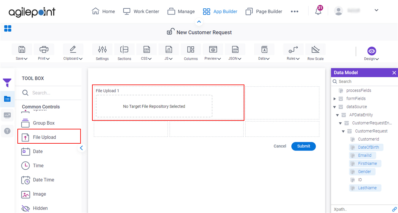
- Open eForm Builder.
For information about how to open this screen, refer to eForm Builder screen.
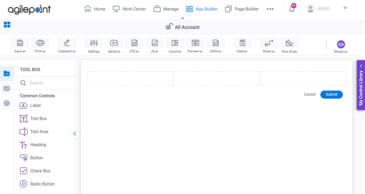
- On the eForm Builder screen, in the Tool Box, open the Commmon Controls tab.
- On the
Common Controls tab, drag a File Upload
form control onto your eForm.
Procedure
- Complete the settings on the configuration screens.
You can use the Data screen screen to specify a variable.
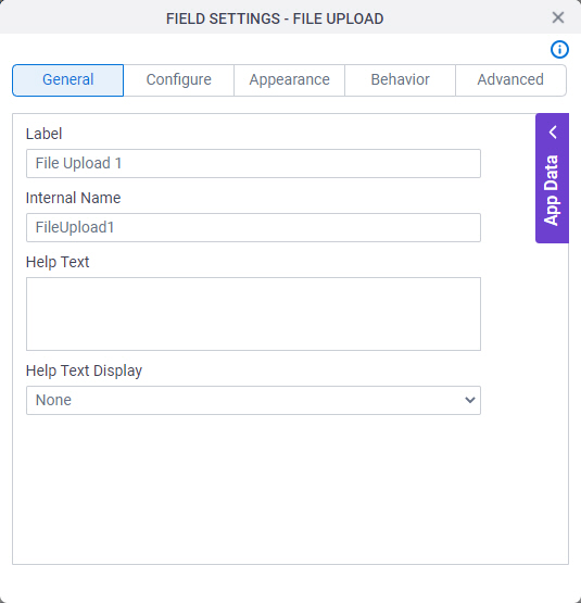
General
Specifies the basic configuration for the File Upload form control.
Fields
| Field Name | Definition |
|---|---|
Label |
|
Internal Name |
|
Help Text |
|
Help Text Display |
|
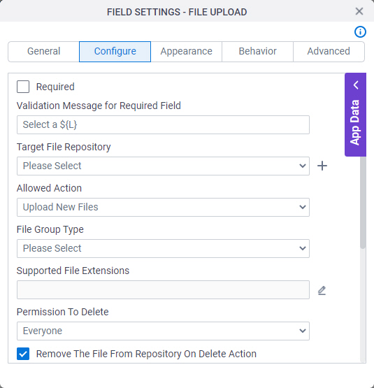
Configure
Configures advanced settings for your form control.
Fields
| Field Name | Definition |
|---|---|
Required |
|
Validation Message for Required Field |
|
Target File Repository |
|
Add Repository |
|
Allowed Action |
|
File Group Type |
|
Supported File Extensions |
|
Permission To Delete |
|
Remove the file from repository on delete action |
|
Remove the File From Repository On Form Cancel |
|
Auto Rename Duplicate Files |
|
Max. Number Of Files |
|
Max. Individual File Size (MB) |
|
Max. Total Files Size (MB) |
|
Confirm Delete |
|


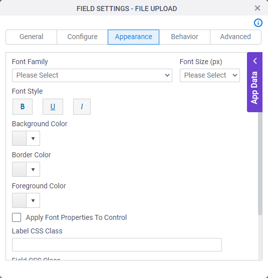
Appearance
Specifies the look and feel for your form control.
Fields
| Field Name | Definition |
|---|---|
Font Family |
|
Font Style |
|
Background Color |
|
Border Color |
|
Foreground Color |
|
Apply Font Properties To Control |
|
Label CSS Class |
|
Field CSS Class |
|
Container CSS Class |
|
Font Size (px) |
|

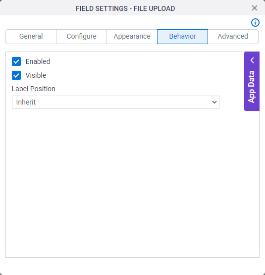
Behavior
Specifies how the control shows on your form.
Fields
| Field Name | Definition |
|---|---|
Enabled |
|
Visible |
|
Label Position |
|
Advanced
Specifies advanced settings for your form control.
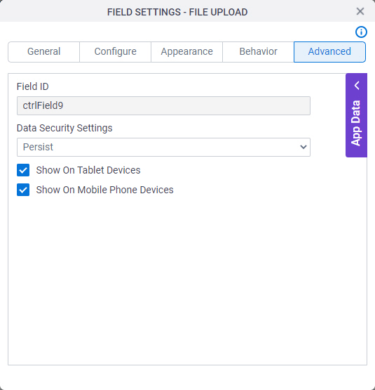
Fields
| Field Name | Definition |
|---|---|
Field ID |
|
Data Security Settings |
|
Show On Tablet Devices |
|
Show On Mobile Phone Devices |
|