Button form control

A form control that shows a button on a form.


Button form control

Configure the Button form control

To configure the Button Button icon control, do the procedure in this topic.

Video: Button Form Control

Video: Common Configuration Settings in eForm Controls

Examples

Good to Know

How to Start

  1. Open eForm Builder.

    For information about how to open this screen, refer to eForm Builder screen.


    Eform Builder screen
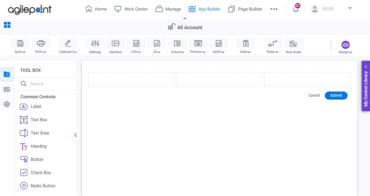
  2. On the eForm Builder screen, in the Tool Box, open the Commmon Controls tab.
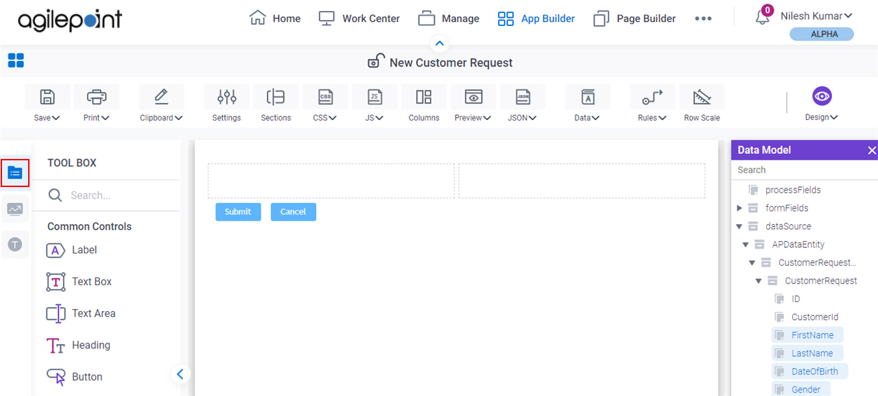
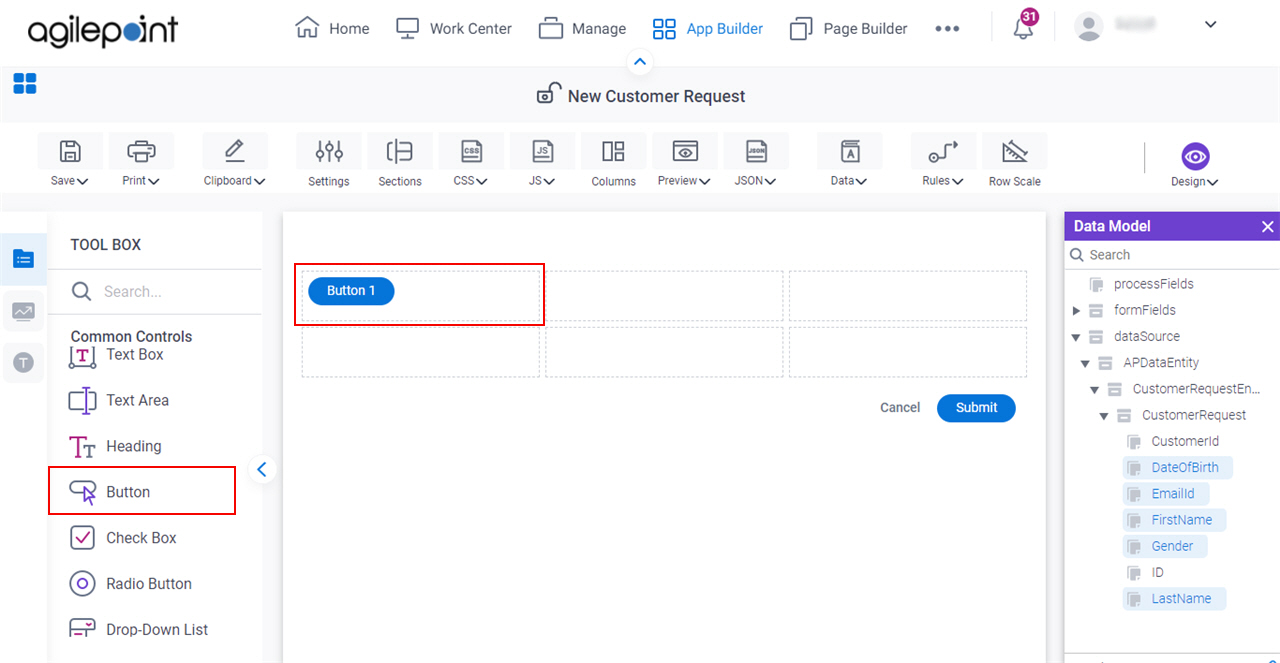
    Common Controls tab
  3. On the Common Controls tab, drag a Button Button icon form control onto your eForm.

    Button Form Control

Procedure

  1. Complete the settings on the configuration screens.

    You can use the Data screen screen to specify a variable.

General

Specifies the basic configuration for the Button form control.
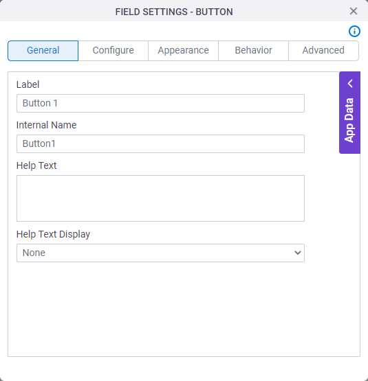
Figure: General tab

General tab

Fields

Field NameDefinition

Label

Function:
Specifies the text label that shows on your form for the control.
Accepted Values:
One line of text that can have spaces.
Default Value:
Different for different controls.
Example:
This is a common configuration field that is used in many examples. Refer to:
  • Examples - Step-by-step use case examples, information about what types of examples are provided in the AgilePoint NX Product Documentation, and other resources where you can find more examples.

Internal Name

Function:
Specifies a unique, technical name for your control.
Accepted Values:
One line of text (a string) with no spaces.
Default Value:
Different for different controls.
Example:
This is a common configuration field that is used in many examples. Refer to:
  • Examples - Step-by-step use case examples, information about what types of examples are provided in the AgilePoint NX Product Documentation, and other resources where you can find more examples.

Help Text

Function:
Specifies the text to shows when a runtime app user hovers their cursor over the form control.
Accepted Values:
More than one line of text.
Default Value:
None
Example:
Refer to:

Help Text Display

Function:
Specifies if the field shows the text in Help Text field when the form user puts the mouse on the label or field.
Accepted Values:
  • None - Does not show the help text.
  • Hover On Label - Shows the help text when you put your mouse on the label.
  • Hover On Field - Shows the help text when you put your mouse on the field.
  • Hover On Both - Shows the help text when you put your mouse on the label and Field.
Default Value:
None
Example:
Refer to:

Configure

Configures advanced settings for your form control.
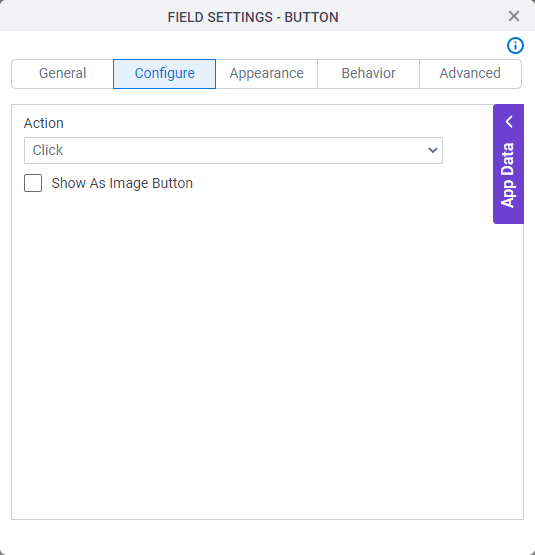
Figure: Configure tab

Configure tab

Fields

Field NameDefinition

Action

Function:
Specifies what the form does.
Accepted Values:
  • Click - Configure a custom action for the button with a Javascript function.
  • Submit - Submits the form data.
  • Cancel - Cancels the form data.
  • Save - Saves the form data to be submitted later.

    This option only applies to process-based apps. You can not save an eForm in a form-based app.

  • Reset - Resets the form fields to empty.
  • Print - Prints the form.
  • Save as PDF - Saves the form in PDF format.
  • Navigate to Previous Section - Goes back to the last section of the form.
  • Navigate to Next Section - Goes to the next section of the form.
Default Value:
Click
Example:
Refer to:

Show As Image Button

Function:
Specifies whether the form control shows as an image.
Accepted Values:
  • Selected - Shows the form control as an image.
  • Deselected - Does not show the form control as an image.
Default Value:
Deselected
Example:
Refer to:

Appearance

Specifies the look and feel for your form control.
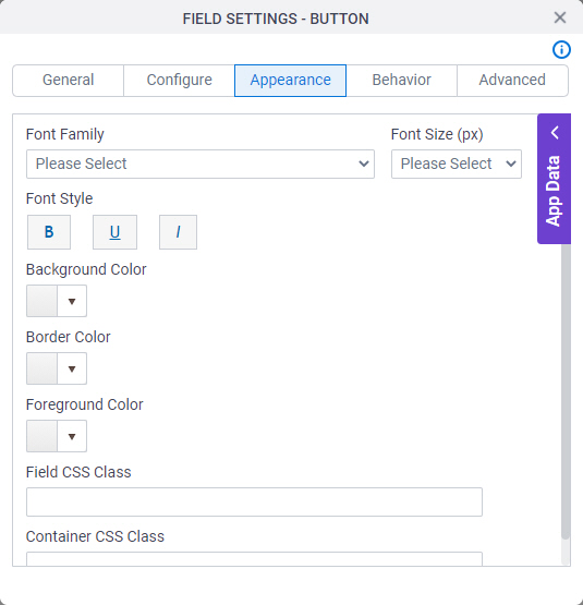
Figure: Appearance tab

Appearance tab

Fields

Field NameDefinition

Font Family

Function:
Specifies the font family of the input text and label.
Accepted Values:
A font name from the list.
Default Value:
  • Modern theme - Roboto
  • Classic theme - Arial
Example:
Refer to:

Font Style

Function:
Specifies the style of the font for the input text and label.
Accepted Values:
  • Bold - Shows the input text and label in bold.
  • Underline - Shows the label underlined.
  • Italic - Shows the label in italic.
Default Value:
None
Example:
Refer to:

Background Color

Function:
Specifies the background color for your control.
Accepted Values:
A color value using a hex code, RGB code, or RGBA code.

You can enter a color code, or select a color from the palette.

Default Value:
#ff0000
Example:
Refer to:

Border Color

Function:
Specifies the border color for your control.
Accepted Values:
A color value using a hex code, RGB code, or RGBA code.

You can enter a color code, or select a color from the palette.

Default Value:
#ff0000
Example:
Refer to:

Foreground Color

Function:
Specifies the foreground color for your control.
Accepted Values:
A color value using a hex code, RGB code, or RGBA code.

You can enter a color code, or select a color from the palette.

Default Value:
#ff0000
Example:
Refer to:

Field CSS Class

Function:
Specifies a CSS class for the field in your control.
Accepted Values:
A valid CSS class.
Default Value:
None

If you specify your CSS CSS icon on the top menu, the CSS is populated.

Example:
Refer to:

Container CSS Class

Function:
Specifies a CSS class for the container of your control.
Accepted Values:
A valid CSS class.
Default Value:
None

If you specify your CSS CSS icon on the top menu, the CSS is populated.

Example:
Refer to:

Font Size (px)

Function:
Specifies the size of the input text and label for your form control.
Accepted Values:
A positive integer.
Default Value:
  • Classic theme - 12
  • Modern theme - 14
Example:
Refer to:

Behavior

Specifies how the control shows on your form.
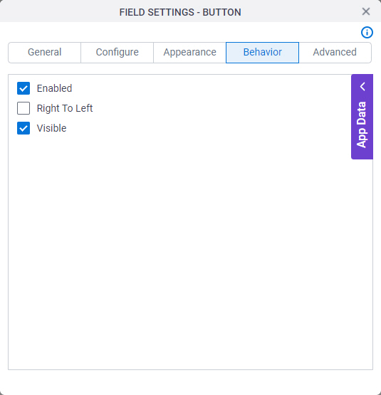
Figure: Behavior tab

Behavior tab

Fields

Field NameDefinition

Enabled

Function:
Specifies if the form user can change the value of a field.
Accepted Values:
  • Selected - The form user can change the value.
  • Deselected - The input cannot change the value.
Default Value:
Selected
Example:
Refer to:

Right To Left

Function:
Specifies if the text for this control, including user input, shows from right to left.
Accepted Values:
  • Deselected - The text shows from left to right.
  • Selected - The text shows from right to left.
Default Value:
Deselected
Example:
Refer to:

Visible

Function:
Specifies if the form user sees the field.
Accepted Values:
  • Selected - The form user sees the field.
  • Deselected - The form user does not see the field.
Default Value:
Selected
Example:
Refer to:

Advanced

Specifies advanced settings for your form control.
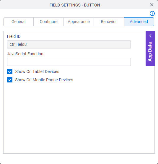
Figure: Advanced tab

Advanced tab

Fields

Field NameDefinition

Field ID

Function:
Shows an ID of the control.
Accepted Values:
Read only.
Default Value:
Different for different controls.
Example:
Refer to:

JavaScript Function

Function:
Specifies the name of a JavaScript function to complete the activity.
Accepted Values:
The name of a Javascript function that exists in your app.

For more information, refer to (Example) Use Custom JavaScript in an eForm.

Default Value:
None
Example:

ConfirmSubmission where one of these is your function:

function ConfirmSubmission()
  {
    alert ('Are you sure to submit this form?');
    return true;
  }
function ConfirmSubmission(parameter1,parameter2)
  {
    window.alert ( parameter1 * parameter2);
    
  }

Also refer to:

Show On Tablet Devices

Function:
Specifies if the form field shows on a tablet.
Accepted Values:
  • Selected - The form field shows on a tablet.
  • Deselected - The form field does not show on a tablet.
Default Value:
Selected
Example:
Refer to:

Show On Mobile Phone Devices

Function:
Specifies if the form field shows on a mobile device.
Accepted Values:
  • Selected - The form field shows on a mobile device.
  • Deselected - The form field does not show on a mobile device.
Default Value:
Selected
Example:
Refer to: