
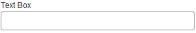
Text Box form control
A form control that lets a form user enter one line of text.
Configure the Text Box form control
To configure
the
Text Box  control,
do the procedure in this topic.
control,
do the procedure in this topic.
Video: Add a Text Box Control to eForm
Video: Form Designer Overview
Video: Common Configuration Settings in eForm Controls
Examples
- (Example) Create an eForm to Start the Process (Create Absence Request)
- (Example) Create an eForm (Set Available Leave Hours)
- Examples - Step-by-step use case examples, information about what types of examples are provided in the AgilePoint NX Product Documentation, and other resources where you can find more examples.
How to Start
- Open eForm Builder.
For information about how to open this screen, refer to eForm Builder screen.
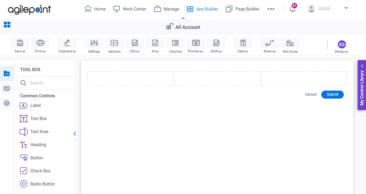
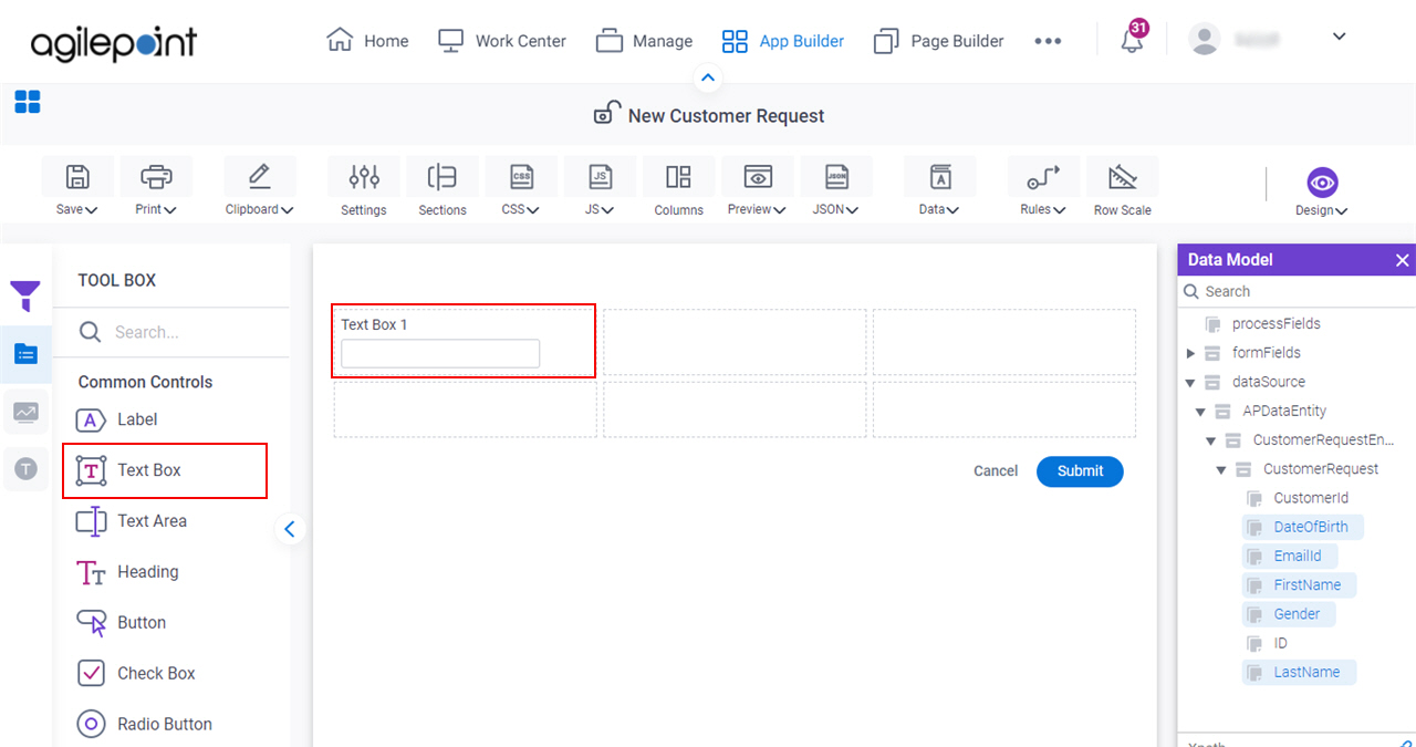
- On the eForm Builder screen, in the Tool Box, open the Commmon Controls tab.
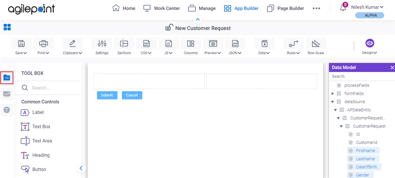
- On the
Common Controls tab, drag a Text Box
form control onto your eForm.
Procedure
- Complete the settings on the configuration screens.
You can use the Data screen screen to specify a variable.
General
Specifies the basic configuration for the Text Box form control.
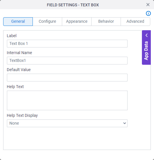
Fields
| Field Name | Definition |
|---|---|
Label |
|
Internal Name |
|
Default Value |
|
Help Text |
|
Help Text Display |
|
Configure
Configures advanced settings for your form control.
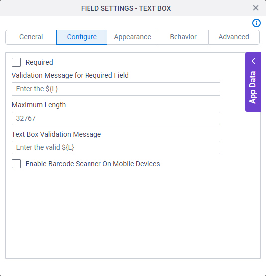
Fields
| Field Name | Definition |
|---|---|
Required |
|
Validation Message for Required Field |
|
Maximum Length |
|
Text Box Validation Message |
|
Enable Barcode Scanner On Mobile Devices |
|
Appearance
Specifies the look and feel for your form control.
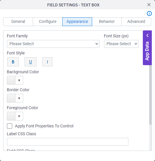
Fields
| Field Name | Definition |
|---|---|
Font Family |
|
Font Style |
|
Background Color |
|
Border Color |
|
Foreground Color |
|
Apply Font Properties To Control |
|
Label CSS Class |
|
Field CSS Class |
|
Container CSS Class |
|
Font Size (px) |
|

Behavior
Specifies how the control shows on your form.
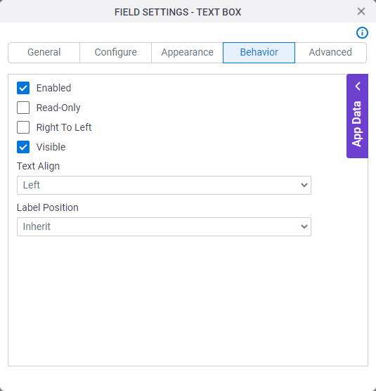
Fields
| Field Name | Definition |
|---|---|
Enabled |
|
Read-Only |
|
Right To Left |
|
Visible |
|
Text Align |
|
Label Position |
|
Advanced
Specifies advanced settings for your form control.
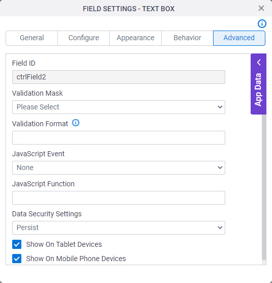
Fields
| Field Name | Definition |
|---|---|
Field ID |
|
Validation Mask |
|
Validation Format |
|
JavaScript Event |
|
JavaScript Function |
|
Data Security Settings |
|
Show On Tablet Devices |
|
Show On Mobile Phone Devices |
|