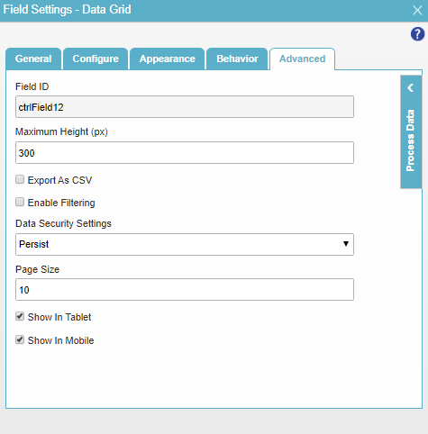
Required |
- Function:
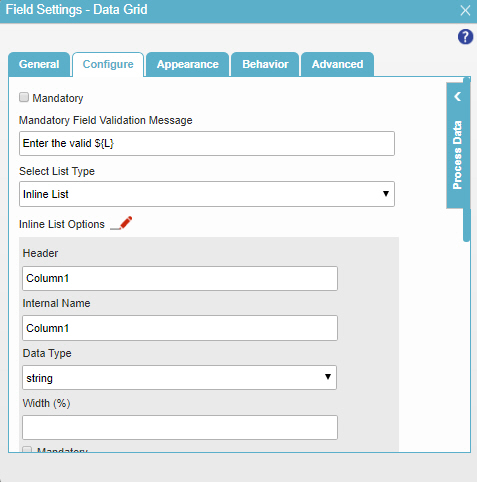
- Specifies if the field is mandatory.
- Accepted Values:
-
- Deselected - The field is not mandatory.
- Selected - The field is mandatory.
- Default Value:
- Deselected
- Example:
- Refer to:
|
Validation Message for Required Field |
- Function:
- Specifies the message to show if the form user does not enter data in a mandatory
form control.
- Accepted Values:
- More than one line of text that can have letters, numbers, spaces, and special characters.
- Default Value:
- Enter the ${L}
${L} is a process data variable that shows the label for a form control.
- Example:
- Refer to:
|
List Type |
- Function:
- Specifies the data source to get the options in the list.
- Accepted Values:
-
- Inline List - Completes the list with the values specified in the form control.
- Lookup List - Completes the list with the values from an external data source.
- Default Value:
- Inline List
- Example:
- Refer to:
|
Header |
- Function:
- Specifies the heading for the column.
- To Open this Field:
-
- On the Configure tab, in the List Type field, select Inline List.
- Accepted Values:
- One line of text that can have spaces.
- Default Value:
- Column 1
|
Internal Name |
- Function:
- Specifies a unique, technical name for your header.
- To Open this Field:
-
- On the Configure tab, in the List Type field, select Inline List.
- Accepted Values:
- One line of text (a string) with no spaces.
- Default Value:
- Column1
|
Data Type |
- Function:
- Specifies the data type for the column.
- To Open this Field:
-
- On the Configure tab, in the List Type field, select Inline List.
- Accepted Values:
-
- string
- number
- boolean
- datetime
- enum
|
Format |
- Function:
- Specifies the date and time format that the form control shows.
- To Open this Field:
-
- On the Configure tab, in the List Type field, select Inline List.
- In the Data Type field, select datetime.
- Accepted Values:
-
- yyyy-MM-dd HH:mm:ss - Shows the date-time in the format year-Month-day hour:minute:second.
- yyyy/MM/dd - Shows the date in the format year/Month/day.
- yyyy-MM-dd - Shows the date in the format year-Month-day.
- MM/dd/yyyy HH:mm:ss - Shows the date-time in the format Month/day/year hour:minute:second.
- MM/dd/yyyy - Shows the date in the format Month/day/year.
- dd-MM-yyyy HH:mm:ss - Shows the date-time in the format day-Month-year hour:minute:second.
- dd-MM-yyyy - Shows the date in the format day-Month-year.
- dd MMM yyyy HH:mm:ss - Shows the date-time in the format day Month year hour:minute:second.
- dd MMM yyyy - Shows the date in the format day Month year.
- MMM dd yyyy HH:mm:ss - Shows the date-time in the format Month day year hour:minute:second.
- MMM dd yyyy - Shows the date in the format Month day year.
- Default Value:
- None
- Example:
-
- Limitations:
-
This field
is available in these releases:
|
Width (%) |
- Function:
- Specifies width of the column in proportion to the area
of your form control.
- To Open this Field:
-
- On the Configure tab, in the List Type field, select Inline List.
- Accepted Values:
- An integer that represents a percentage.
- Default Value:
- None
|
Mandatory |
- Function:
- Specifies if the column is mandatory.
- To Open this Field:
-
- On the Configure tab, in the List Type field, select Inline List.
- Accepted Values:
-
- Deselected - The column is not mandatory.
- Selected - The column is mandatory.
- Default Value:
- Deselected
|
Visible |
- Function:
- Specifies to show or hide the columns on the form.
- To Open this Field:
-
- On the Configure tab, in the List Type field, select Inline List.
- Accepted Values:
-
- Selected - Shows the column on the form.
- Deselected - Hides the column on the form.
- Default Value:
- Selected
- Limitations:
-
AgilePoint NX OnDemand (public cloud), or
AgilePoint NX Private Cloud
or AgilePoint NX OnPremises
v7.0 Software Update 1 or higher.
|
Visible in Mobile |
- Function:
- Specifies if the form field shows on a mobile device.
- To Open this Field:
-
- On the Configure tab, in the List Type field, select Inline List.
- Accepted Values:
-
- Selected - The form field shows on a mobile device.
- Deselected - The form field does not show on a mobile device.
- Default Value:
- Deselected
- Limitations:
-
AgilePoint NX OnDemand (public cloud), or
AgilePoint NX Private Cloud
or AgilePoint NX OnPremises
v7.0 Software Update 2 or higher.
|
Groupable |
- Function:
- Specifies whether to group the column based
on a column header at runtime.
The form user can drag a column header to group.
- To Open this Field:
-
- On the Configure tab, in the List Type field, select Inline List.
- Accepted Values:
-
- Selected - Groups the column based on a column
header selected at runtime.
- Deselected - Runtime grouping is disabled.
- Default Value:
- Deselected
- Limitations:
-
AgilePoint NX OnDemand (public cloud), or
AgilePoint NX Private Cloud
or AgilePoint NX OnPremises
v7.0 Software Update 2 or higher.
|
Delete 
|
- Function:
- Deletes the selected row.
- To Open this Field:
-
- In the List Type field, select Inline List.
|
Add Column
|
- Function:
- Adds more rows.
|
Lookup Source |
- Function:
- Specifies a reusable lookup configuration. The lookup configuration
includes the data source and other configuration values for the lookup.
- To Open this Field:
-
- In the List Type field, select Lookup List.
- Accepted Values:
- A valid lookup source
- Default Value:
- None
- Example:
- Refer to:
|
Add Lookup  |
- Function:
- Opens the screen to configure a lookup.
There is more than one path to configure a lookup. Make sure you use the document that shows the path for your lookup.
- To Open this Field:
-
- In the List Type field, select Lookup List.
- Example:
- Refer to:
|
Auto Generate Lookup Columns |
- Function:
- Specifies if the form control completes the header and columns using information
from your data source.
- To Open this Field:
-
- In the List Type field, select Lookup List.
- Accepted Values:
- Selected - Completes the header and columns of the grid using
data from your data source.
- Deselected - Does not complete the header and columns of the grid.
- Default Value:
- Selected
|
Bound Column |
- Function:
- Completes the column value using a specified field from your lookup source.
- To Open this Field:
-
- In the List Type field, select Lookup List.
- Deselect Auto Generate Lookup Columns.
- Accepted Values:
- A column value from the list.
- Default Value:
- None
|
Format |
- Function:
- Specifies the date format that the form control shows.
- To Open this Field:
-
- In the List Type field, select Lookup List.
- Deselect Auto Generate Lookup Columns.
- In the Bound Column field, select any field that specifies the date value.
- Accepted Values:
-
- yyyy/MM/dd - Shows the date in the format year/Month/day.
- yyyy-MM-dd - Shows the date in the format year-Month-day.
- MM/dd/yyyy - Shows the date in the format Month/day/year.
- dd-MM-yyyy - Shows the date in the format day-Month-year.
- dd MMM yyyy - Shows the date in the format day Month year.
- MMM dd yyyy - Shows the date in the format Month day year.
- Default Value:
- None
- Example:
-
- Limitations:
-
This field
is available in these releases:
|
Configure Enum  |
- Opens this Screen:
- Configure Option
- To Open this Field:
-
- In the List Type field, select Lookup List.
- Deselect Auto Generate Lookup Columns.
- Function of this Screen:
- Configures the list of values for the columns.
|
Allow Add |
- Function:
- Specifies whether the form user can add new records.
- Accepted Values:
-
- Selected - Lets the form user add new records.
- Deselected - Does not let the form user add new records.
- Default Value:
- Selected
|
Allow Delete |
- Function:
- Specifies whether the form user can delete records.
- Accepted Values:
-
- Selected - Lets the form user delete records.
- Deselected - Does not let the form user delete records.
- Default Value:
- Selected
|
Allow Edit |
- Function:
- Specifies if the form user can change values in the data grid.
- Accepted Values:
-
- Selected - Lets the form user change the values.
- Deselected - Does not let the form user change the values.
- Default Value:
- Selected
|
Pop-up Edit |
- Function:
- Specifies if the form user can change values in the data grid on an edit screen.
- Accepted Values:
-
- Selected - Lets the form user change values in
the data grid in an edit screen.
- Deselected - Does not let the form user change records in the data grid on an edit screen.
- Default Value:
- Deselected
|
DateTime Conversion |
- Function:
- Specifies whether to change the date-time to ISO format.
- Accepted Values:
-
- Selected - The date-time value uses ISO format.
- Deselected - The date-time value uses a specified, non-ISO format.
- Default Value:
- Deselected
|
Mandatory Column Validation Message |
- Function:
- Specifies the message to show if the form user does not complete a mandatory column in the form.
- Accepted Values:
- More than one line of text that can have letters, numbers, spaces, and special characters.
- Default Value:
- Please complete the mandatory columns for ${L}
${L} is a process data variable that shows the label for a form control.
|
Minimum Records Validation Message |
- Function:
- Specifies the message to show if the form user
does not enter a set minimum number of values in
the form.
- Accepted Values:
- More than one line of text that can have letters, numbers, spaces, and special characters.
- Default Value:
- Please enter minimum number of records for ${L}
${L} is a process data variable that shows the label for a form control.
|
Maximum Items |
- Function:
- Specifies the maximum number of records the form user can enter in the form.
- Accepted Values:
- An integer.
- Default Value:
- 10
|
Minimum Items |
- Function:
- Specifies the minimum number of values for the form user to enter in the form.
- Accepted Values:
- An integer.
- Default Value:
- 0
|
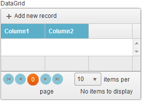
 control,
do the procedure in this topic.

 control:
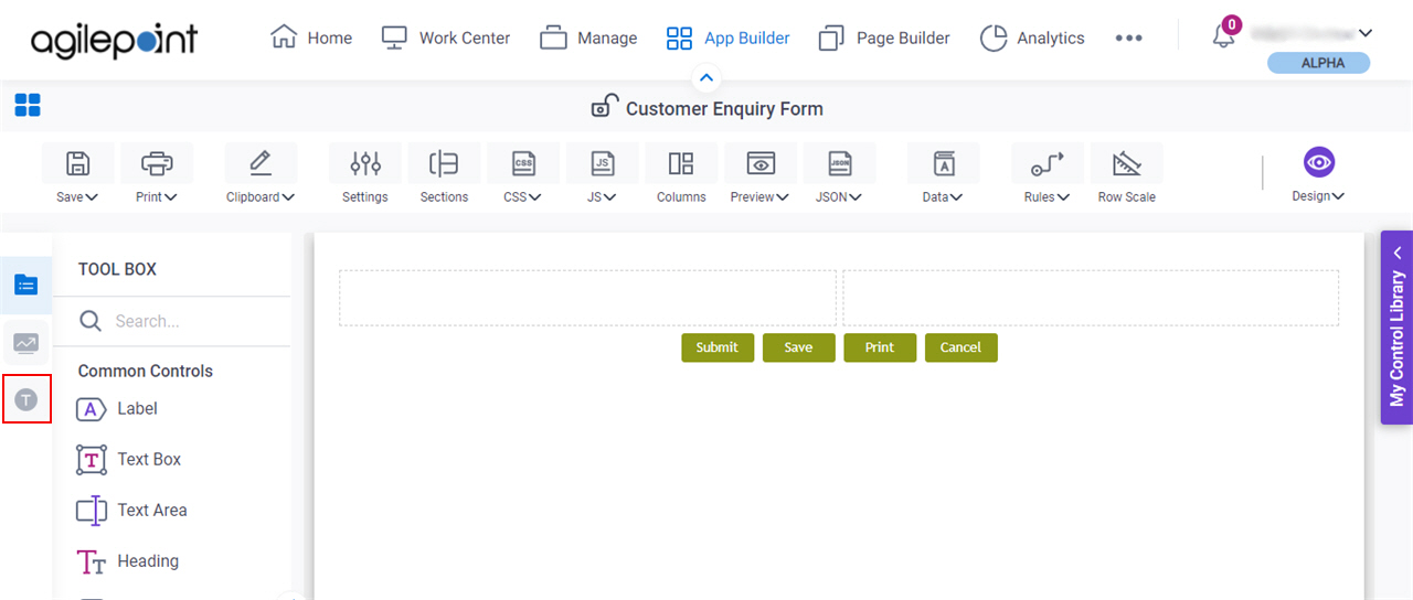
 form control onto your eForm.