
Configure Your Form (Auto-Generate Form Based On A Data Source, Data Entities)

Configures a Data Entities as the data source for the app, and creates the form based on the entity fields.

Background and Setup

Prerequisites

Good to Know

  • After you create a form-based app, you cannot change the app to use a different data source. For example, you can not change a form-based app to use a different entity or SharePoint list than the one specified when the app was created. This limitation also applies to cloned apps. That is, you cannot clone a form-based app, and then change the data source in the cloned app.
  • Once configured, the primary data source in a data source bound app cannot be deleted. Deleting the primary data source can lead to unexpected behavior or errors in your app because it is the main source of data for the app.
  • When you create a form-based app, these forms are created:
    • New form
    • Update form
    • 3 types of View form:
      • All Records - Shows all the records created for the form-based app.
      • Recently Created Records - Shows the records created for the form-based app in the last 7 days.
      • Recently Modified Records - Shows the records changed for the form-based app in the last 7 days.

      A lookup is created for each view form.

How to Start

  1. Create an app.

    For more information, refer to Create an app.

  2. On the Do you want AI to create your form? screen, click Auto-Generate Form Based On A Data Source.
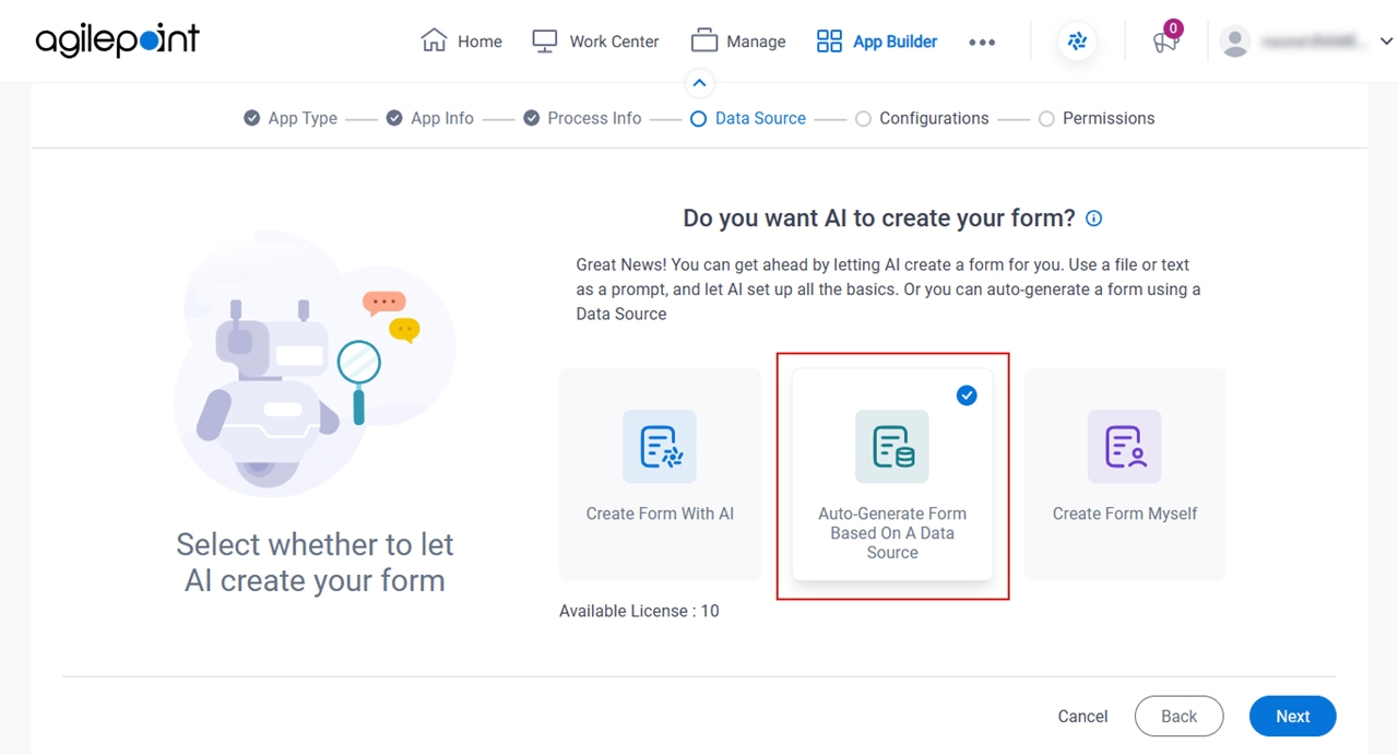
    Click Auto Generate Form Based On A Data Source
  3. Click Next.
  4. On the Where do you want to store the data for your app? screen, click Data Entities.
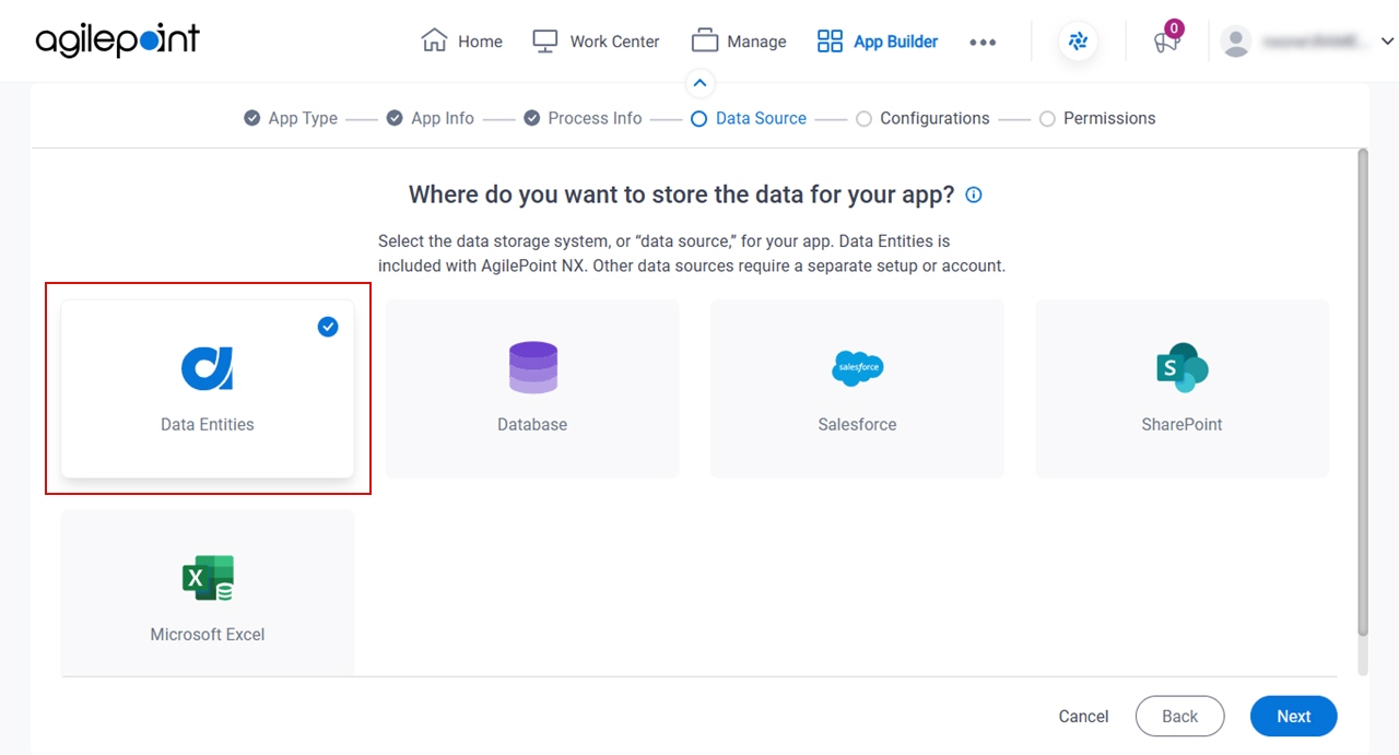
    Click Data Entities
  5. Click Next.

How do you want to set up your entity? > Configuration tab

Configures how to collect data from Data Entities for your eForm.
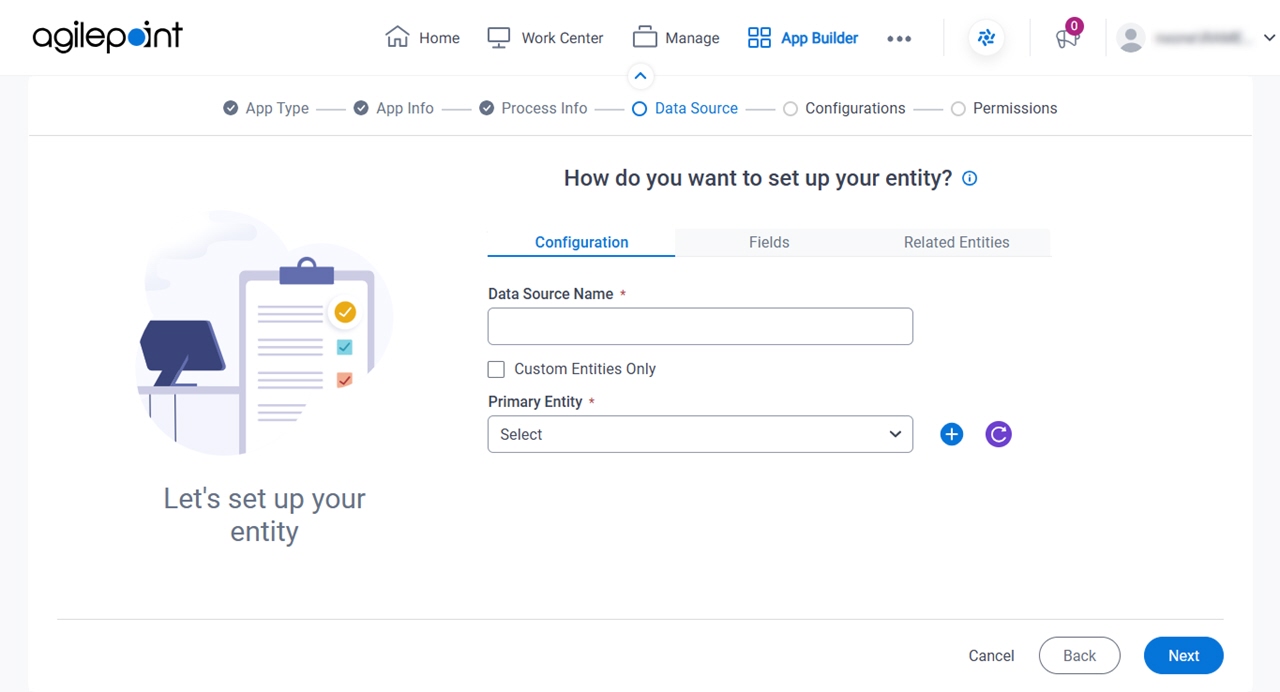
Figure 1. How do you want to set up your entity? > Configuration tab

Configuration tab

Fields

Field NameDefinition

Data Source Name

Description:
Specifies a name for the data source.
Allowed Values:
One line of text (a string).

Not Accepted:

  • Spaces
Default Value:
None
Accepts Variables:
No

Custom Entities Only

Description:
Specifies whether to show only custom entities in the Primary Entity list.
Allowed Values:
  • Selected - Shows only the custom entities in the Primary Entity list.
  • Deselected - Shows both standard entities and custom entities in the Primary Entity list.
Default Value:
Selected
Accepts Variables:
No

Primary Entity

Description:
Specifies the AgilePoint NX entity from which your form collects data.
Allowed Values:
The AgilePoint NX entity from the list.
Default Value:
AgilePoint NX entities.
Accepts Variables:
No

Add Entity Add Entity icon

Opens this Screen:
New Entity screen.
Function of this Screen:
Creates a custom entity.

How do you want to set up your entity? > Fields tab

Specifies the entity fields from entity.
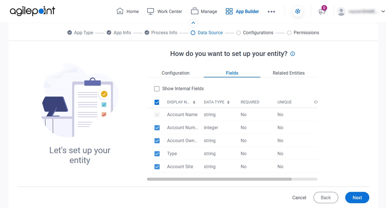
Figure 2. How do you want to set up your entity? > Fields tab

Fields tab

Fields

Field NameDefinition

Show Internal Fields

Description:
Specifies whether to show the internal names of default entity fields from AgilePoint Data Entities.
Allowed Values:
  • Selected - Shows the internal names of default entity fields.
  • Deselected - Does not show default entity fields.
Default Value:
Deselected

Check box

Description:
Specifies the fields to use on your form.
Allowed Values:
  • Selected - Your form contains the field.
  • Deselected - The field does not show on your form.
Default Value:
Selected

Display Name

Description:
Shows the fields associated with an entity.
Allowed Values:
Read only.

Data Type

Description:
Shows the data type of a field.
Allowed Values:
Read only.

Required

Description:
Specifies whether the field is required.
Allowed Values:
Read only.

Unique

Description:
Shows whether a duplicate value is permitted in the field.
Allowed Values:
Read only.

How do you want to set up your entity? > Related Entities tab

Specifies related entity to use on your form for AgilePoint NX Data Entities.
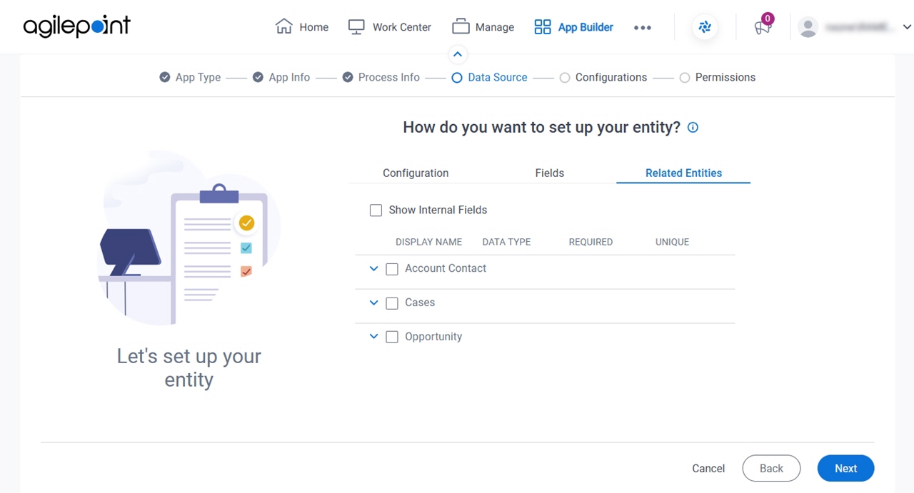
Figure 3. How do you want to set up your entity? > Related Entities tab

Related Entities tab

Prerequisites

Good to Know

Fields

Field NameDefinition

Checkbox

Description:
Specifies the related entities to use on your form.
Allowed Values:
  • Selected - Your form contains related entity.
  • Deselected - Your form does not use the related entity.
Default Value:
Deselected

Display Name

Description:
Shows the entities that have relationships with the primary entity.
Note:
The word entity on this screen refers to a container within your data model. For Data Entities or Salesforce, this container is called an entity. For a database, entity refers to a database table. For SharePoint Integration, entity refers to a SharePoint list. For Microsoft Excel, entity refers to an Excel table.
Allowed Values:
Read only.

Data Type

Description:
Shows the data type of an entity.
Allowed Values:
Read only.

Required

Description:
Specifies whether the related entity is required.
Allowed Values:
Read only.

Unique

Description:
Shows whether a duplicate value is permitted in the related entity.
Allowed Values:
Read only.

Review the data fields for your app screen

Configures the fields for your eForm.
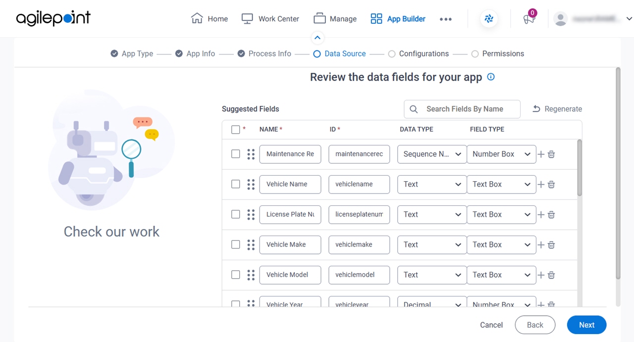
Figure 4. Review the data fields for your app screen

Review the data fields for your app screen

Fields

Field NameDefinition

Select All

Description:
Selects all the fields.
Allowed Values:
  • Selected - Selects all the form fields.
  • Deselected - Deselects all the form fields.

Name

Description:
Specifies the text label for the field that displays on the form.
Allowed Values:
One line of text (a string).

Accepted:

  • Letters
  • Numbers
  • Spaces
  • Special characters
Default Value:
The field name specified in the imported file.

ID

Description:
Specifies a unique, technical name for the form field.

When you enter the value in the Name field, this field shows the value you entered in the Name field with no spaces.

Allowed Values:
One line of text (a string).

Accepted:

  • Letters
  • Numbers
Default Value:
Shows the value in the Name field with no space.

Data Type

Description:
Specifies the data type used in the form field.
Allowed Values:
A data type from the list.
Default Value:
Shows a data type interpreted for the field from the imported file.

Field Type

Description:
Specifies the type of form control used for the field.
Allowed Values:
A form control from the list.
Default Value:
A form control type that is interpreted from the input.

For example, a field called "Amount" might be assigned a Currency form control.

Regenerate

Description:
Deletes the changes and restores the default values for the form.

Apply Layout

Opens this Screen:
Apply Fields Layout screen
Description:
Specifies a file that depicts a form layout, and it applies the layout to the eForm.
Example:
Refer to:

Add Field Add Field icon

Function:
Adds a row for a new field.

Delete Field Delete Field icon

Function:
Deletes the selected row from the fields list.

Configure Picklist Configure Picklist icon

Opens this Screen:
Configure Picklist screen
Description:
Configures a picklist with GenAI.
Example:
Refer to:
Limitations:
This field shows only if the data type for the field is Picklist.

Configure Child Table Configure Child Table icon

Opens this Screen:
Configure child entity fields screen
Description:
Configures the form fields for fields that are formatted as a table in the uploaded file.
Limitations:
This field shows only if the data type for the field is Table.

Mark as Mandatory

Description:
Specifies whether the form field is required.
Allowed Values:
  • Selected - The field must have a value.
  • Deselected - A value is not required for the field.
Default Value:
The value configured for the field.

Number Of Columns

Description:
Specifies the number of columns to show on the eForm.
Allowed Values:
An integer.

Range:

  • 1-10
Default Value:
2

Show Line Break Fields

Description:
Specifies whether to group the form fields based on the column layout on the form template you upload.
Allowed Values:
  • Selected - Groups the form fields with horizontal line breaks based on the column layout shown in the uploaded file.

    If you create the fields with the Excel or Generate using AI options, the fields are grouped based on the number of columns specified in the Number Of Columns field.

  • Deselected - Groups the form fields in a single list in the order shown in the uploaded file, as it reads left to right.
Default Value:
Deselected
Example:
Refer to:

Apply Fields Layout screen

Specifies a file that depicts a form layout, and it applies the layout to the eForm.
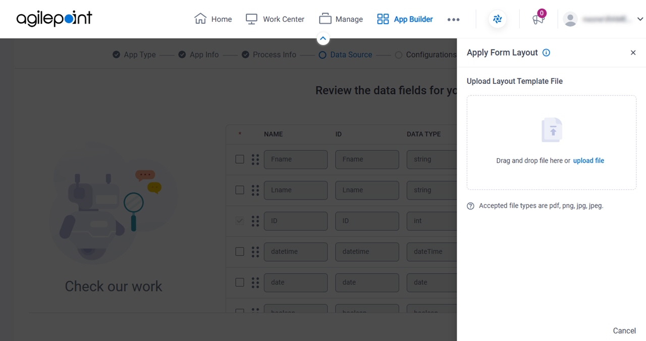
Figure 5. Apply Fields Layout screen

Apply Fields Layout screen

Good to Know

  • You can use a file that represents a form layout, and the system applies the layout to your form.

    The supported file types are .pdf, .png, .jpg, and .jpeg.

Fields

Field NameDefinition

Upload Layout Template File

Function:
Specifies a file that depicts a form layout, and it applies the layout to the eForm.

You can drag the file from your local machine.

Allowed Values:
A PDF or an image file that shows a form layout.

Click Upload File to select a file from your local machine.

The file can be one of these types:

  • .pdf
  • .png
  • .jpg
  • .jpeg
Default Value:
None
Example:
Refer to:

Configure List Options > Generate With AI screen

Full documentation coming soon.
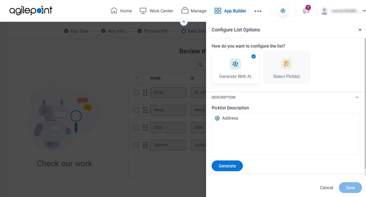
Figure 6. Configure List Options > Generate With AI screen

Configure List Options screen

Good to Know

  • This screen applies to the Generate With AI option on the Configure List Options screen. For the Select Picklist option, refer to Configure List Options > Select Picklist screen.

How to Start

  1. On the Review the data fields for your app screen, in the Field Type field, select one of these:
    • Check Box
    • Switch
    • Radio Button
    • Drop-Down List
    • List Box
    • Multi-Select List Box
  2. Click Configure Configure icon.

Configure List Options > Select Picklist screen

Full documentation coming soon.
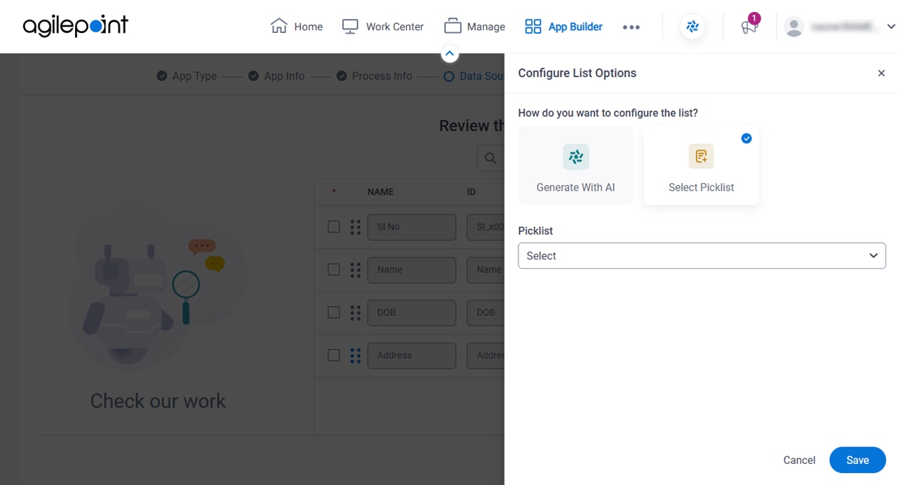
Figure 7. Configure List Options > Select Picklist screen

Configure List Options screen

Good to Know

  • This screen applies to the Select Picklist option on the Configure List Options screen. For the Generate With AI option, refer to Configure List Options > Generate With AI screen.

How to Start

  1. On the Review the data fields for your app screen, in the Field Type field, select one of these:
    • Check Box
    • Switch
    • Radio Button
    • Drop-Down List
    • List Box
    • Multi-Select List Box
  2. Click Configure Configure icon.

Select the forms to create for your human tasks screen

Specifies the human task activities for which you want to create eForms.
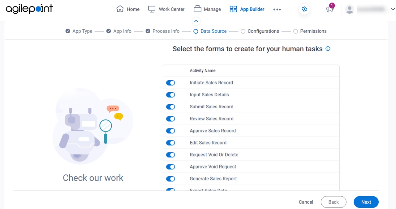
Figure 8. Select the forms to create for your human tasks screen

Select the forms to create for your human tasks screen

Fields

Field NameDefinition

Human Task Activities

Description:
Shows the list of human task activities configured on the Review the activities for your app screen.
Allowed Values:
Read only.

Create Task Form

Description:
Specifies whether to create an eForm for the human task activity.
Allowed Values:
  • On - Creates an eForm for the human task activity and adds it to the associated activity.
  • Off - Does not create an eForm for the activity. The activity is created with no eForm.
Default Value:
On
Example:
Refer to: