Chart form control

A form control that shows a chart that uses process data.


Chart form control

Configure the Chart form control

To configure the Chart Chart icon control, do the procedure in this topic.

Video: Common Configuration Settings in eForm Controls

Examples

Good to Know

  • This form control does not show in print or PDF formats.

How to Start

  1. Open eForm Builder.

    For information about how to open this screen, refer to eForm Builder screen.


    Eform Builder screen
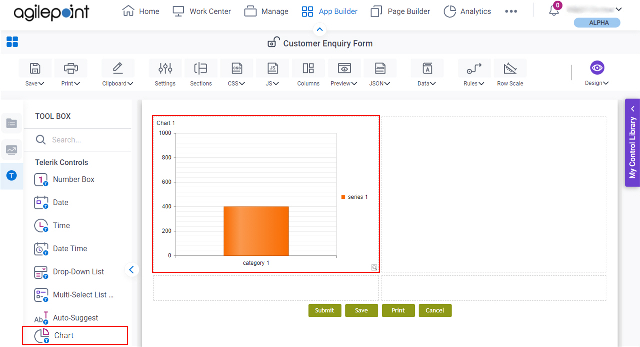
  2. On the eForm Builder screen, in the Tool Box, open the Telerik Controls tab.

    Telerik Controls tab
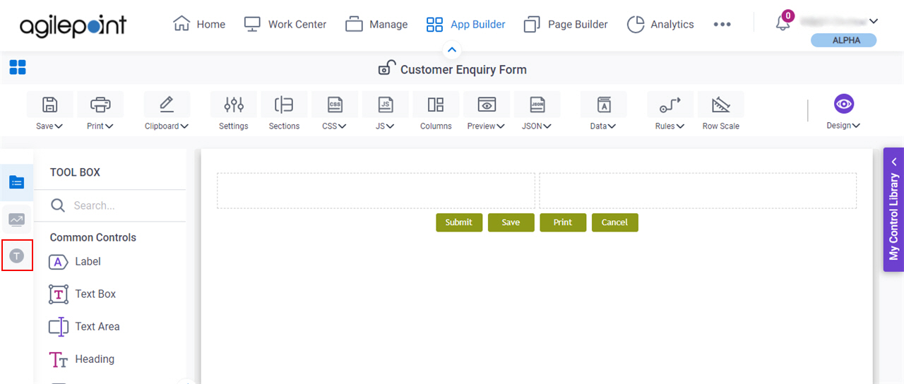
  3. On the Telerik Controls tab, drag a Chart Chart icon form control onto your eForm.

    Chart form control

Procedure

  1. Complete the settings on the configuration screens.

    You can use the Data screen screen to specify a variable.

General

Specifies the basic configuration for the Chart form control.
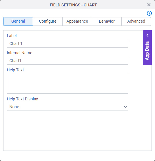
Figure: General tab

General tab

Fields

Field NameDefinition

Label

Description:
Specifies the text label that shows on your form for the control.
Allowed Values:
One line of text (a string).

Accepted:

  • Letters
  • Numbers
  • Spaces
Default Value:
Different for different controls.
Example:
This is a common configuration field that is used in many examples. Refer to:
  • Examples - Step-by-step use case examples, information about what types of examples are provided in the AgilePoint NX Product Documentation, and other resources where you can find more examples.

Internal Name

Description:
Specifies a unique, technical name for your control.
Allowed Values:
One line of text (a string).

Not Accepted:

  • Spaces
Default Value:
Different for different controls.
Example:
This is a common configuration field that is used in many examples. Refer to:
  • Examples - Step-by-step use case examples, information about what types of examples are provided in the AgilePoint NX Product Documentation, and other resources where you can find more examples.

Help Text

Description:
Specifies the text to shows when a runtime app user hovers their cursor over the form control.
Allowed Values:
More than one line of text.
Default Value:
None
Example:
Refer to:

Help Text Display

Description:
Specifies if the field shows the text in the Help Text field when the runtime app user hovers over the label or field.
Allowed Values:
  • None - Does not show the help text.
  • Hover On Label - Shows the help text when you put your mouse on the label.
  • Hover On Field - Shows the help text when you put your mouse on the field.
  • Hover On Both - Shows the help text when you put your mouse on the label and Field.
Default Value:
None
Example:
Refer to:

Configure

Specifies detailed configuration settings for your form control.
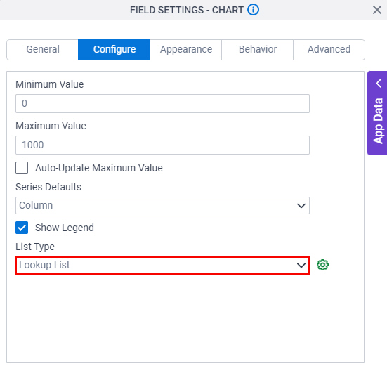
Figure: Configure tab

Configure tab

Fields

Field NameDefinition

Minimum Value

Description:
Specifies the minimum value for an axis on your chart.
Allowed Values:
An integer.
Default Value:
0
Example:
Refer to:

Maximum Value

Description:
Specifies the maximum value for an axis on your chart.
Allowed Values:
An integer.
Default Value:
1000
Example:
Refer to:

Series Defaults

Description:
Specifies the type of chart to show.
Allowed Values:
  • Column - Shows the chart in a column format.
  • Bar - Shows a bar chart.
  • Line - Shows a line chart.
  • Pie - Shows a pie chart.
Default Value:
Column
Example:
Refer to:

Show Legend

Description:
Specifies if the chart shows a label beside the chart.
Allowed Values:
  • Deselected - Shows no label beside the chart.
  • Selected - Shows label beside the chart.
Default Value:
Selected

List Type

Description:
Specifies the data source to get the options in the chart.
Allowed Values:
  • Lookup List - Specifies configuration settings to create your chart with a lookup from a specified data source.
  • Process Data - Specifies how to use process data from a schema to create a chart.
  • Triggered from Auto/Manual Lookup - Specifies how to create your chart with a lookup that starts with an Auto-Lookup or Pop-Up Select form control.
Default Value:
None
Example:
Refer to:

Configure Chart DataSource Configure Chart DataSource icon

Function:
Configures the data source for the chart.
Opens this Screen:
Example:
Refer to:

Appearance

Specifies the look and feel for your form control.
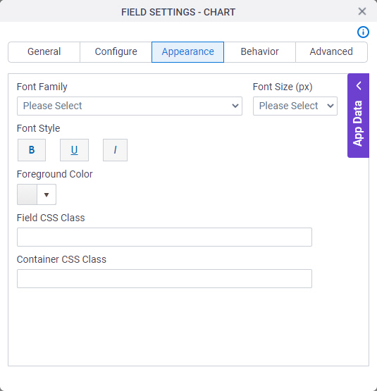
Figure: Appearance tab

Appearance tab

Fields

Field NameDefinition

Font Family

Description:
Specifies the font family of the input text and label.
Allowed Values:
A font name from the list.
Default Value:
  • Modern theme - Roboto
  • Classic theme - Arial
Example:
Refer to:

Font Style

Description:
Specifies the style of the font for the input text and label.
Allowed Values:
  • Bold - Shows the input text and label in bold.
  • Underline - Shows the label underlined.
  • Italic - Shows the label in italic.
Default Value:
None
Example:
Refer to:

Foreground Color

Description:
Specifies the foreground color for your control.
Allowed Values:
A color value using a hex code, RGB code, or RGBA code.

You can enter a color code, or select a color from the palette.

Default Value:
#ff0000
Example:
Refer to:

Field CSS Class

Description:
Specifies a CSS class for the field in your control.
Allowed Values:
A valid CSS class.
Default Value:
None

If you specify your CSS CSS icon on the top menu, the CSS is populated.

Example:
Refer to:

Container CSS Class

Description:
Specifies a CSS class for the container of your control.
Allowed Values:
A valid CSS class.
Default Value:
None

If you specify your CSS CSS icon on the top menu, the CSS is populated.

Example:
Refer to:

Font Size (px)

Description:
Specifies the size of the input text and label for your form control.
Allowed Values:
An integer.

Range

  • Greater than 0
Default Value:
  • Classic theme - 12
  • Modern theme - 14
Example:
Refer to:

Behavior

Specifies how the control shows on your form.
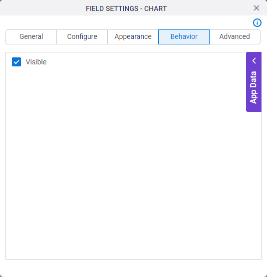
Figure: Behavior tab

Behavior tab

Fields

Field NameDefinition

Visible

Description:
Specifies if the runtime app user sees the field.
Allowed Values:
  • Selected - The runtime app user sees the field.
  • Deselected - The runtime app user does not see the field.
Default Value:
Selected
Example:
Refer to:

Advanced

Specifies advanced settings for your form control.
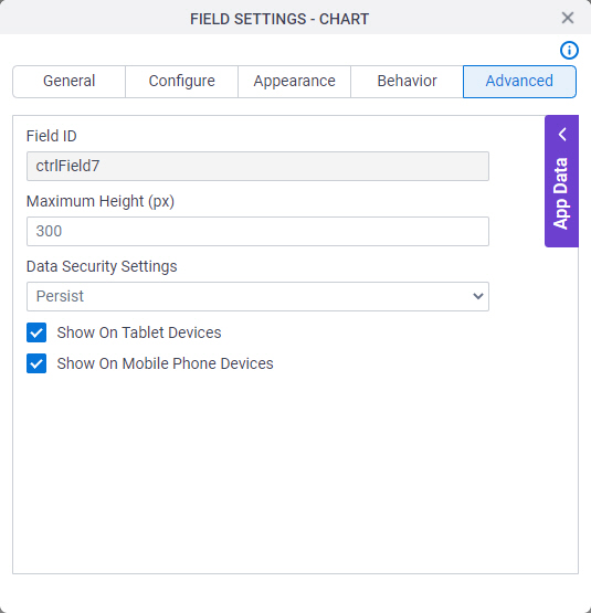
Figure: Advanced tab

Advanced tab

Fields

Field NameDefinition

Field ID

Description:
Shows an ID of the control.
Allowed Values:
Read only.
Default Value:
Different for different controls.
Example:
Refer to:

Maximum Height (px)

Description:
Specifies the maximum height for your control in pixels.
Allowed Values:
An integer.

Range

  • 1-9999
Default Value:
300

Data Security Settings

Description:
Specifies whether to store information from the field in the process schema, so the app can use it again, or to simply pass on the information after the form is submitted without storing the information. This option helps to protect sensitive user information.
Allowed Values:
  • Persist - Stores the data from the field in the process schema, so the app can use it again.
  • Do Not Persist - Does not store the data from the field in the process schema. This option provides greater security for sensitive user information.
Default Value:
Persist
Example:
Refer to:

Show On Tablet Devices

Description:
Specifies if the form field shows on a tablet.
Allowed Values:
  • Selected - The form field shows on a tablet.
  • Deselected - The form field does not show on a tablet.
Default Value:
Selected
Example:
Refer to:

Show On Mobile Phone Devices

Description:
Specifies if the form field shows on a mobile device.
Allowed Values:
  • Selected - The form field shows on a mobile device.
  • Deselected - The form field does not show on a mobile device.
Default Value:
Selected
Example:
Refer to: