Creating Your First Dashboard
In our previous tutorials, we’ve tasted a small dose of the power of report design. In this tutorial, we will introduce the concepts of another powerful tool—the dashboard.
Overview
A Collection of Data Analytics
Suppose we have 10 reports with 10 report parts. Each report part is important (hence, the reason the report was created) but you may only be interested in 1 per report. While you could sift through every report to find your relevant information, it becomes increasingly difficult navigate 10 reports. Therefore, we have the dashboard—an all-in-one solution to interacting with all of our data visualizations in one place.
What A Dashboard Can’t Do
Apart from reports, a dashboard is merely a blank canvas. We cannot create new report parts, reference new data sources, add new filters to a report, or grant users rights to data sources or data visualizations.
What A Dashboard Can Do
Apart from reports, a dashboard is merely a blank canvas. We have the ability to create a “hub” of data visualizations for any and all users to consume. If another user doesn’t have access to a report or data source and our dashboard references that report or data source, no problem! The user simply doesn’t have access to that particular report part. Can we limit access to a dashboard? Can we export a dashboard? Can we schedule updates to a dashboard? You bet! Our tool is designed to provide as much parity with the Report Designer as possible.
Creating Your First Dashboard
Selecting Report Sources
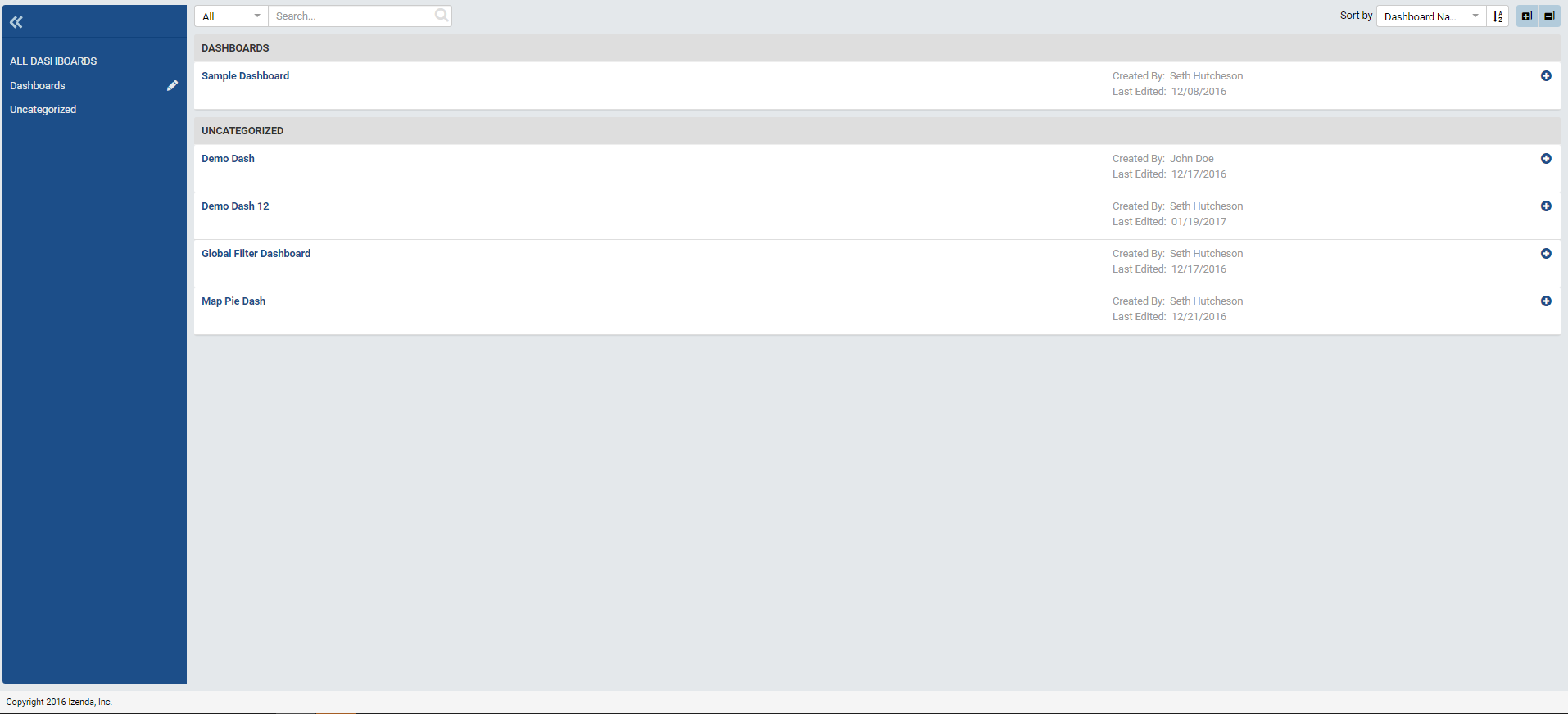
If you click on the Dashboards tab at the top of the page, you will be presented with the Dashboard List, a familiar view from the Report List. If we are creating the first dashboard or you haven’t been given access to other dashboards, this list will be empty, of course.
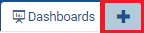
To create a new dashboard, click the + button beside the Dashboards
tab at the top of the screen.
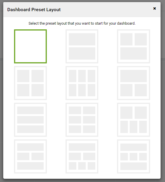
When we first create a dashboard, we’re presented with several default layouts to help us design visually pleasing Dashboards. The preset layouts aren’t static– report parts can always be resized, removed from, and added from Dashboards For now, let’s select a blank Dashboard.
Similar to the Report Designer, if you want to add a tile, click on the grid or click the button labeled Add Dashboard Tile at the top of the page. Let’s add a tile to our Dashboard.
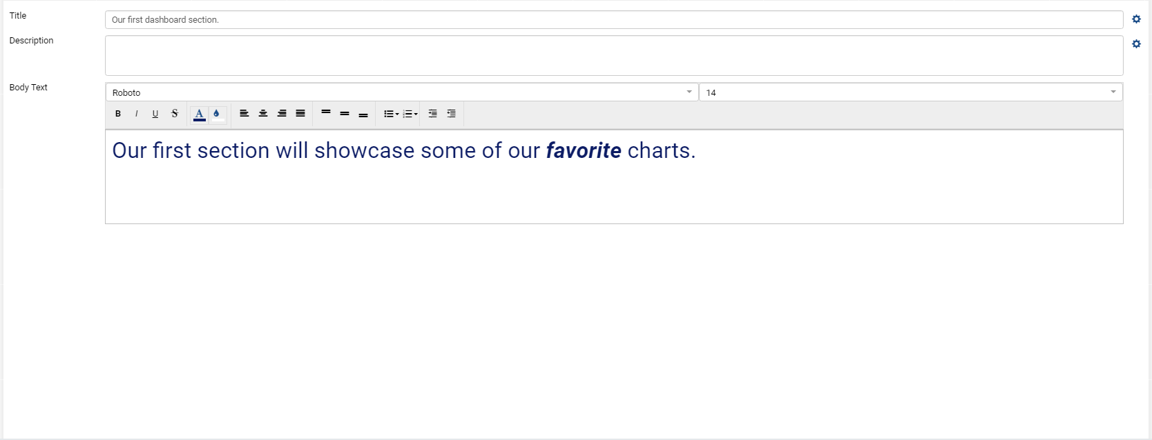
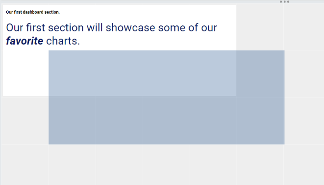
Once you add a tile to your Dashboard, you’ll have the option to either add a Text tile or a Report Part tile. Let’s create a Text Tile. Text tiles are handy tools when you wish to provide a static information of your dashboard. When we add a Text tile to our dashboard, we’re presented with a stylizing text editor. When you’ve finished filling in your tile, you flip it from Preview Mode to Configuration Mode just as you would flip a Report Part in the Report Designer.
Dashboard Tiles are resizable and movable in the same manner as Report Parts in the Report Designer.
Now that we have a Dashboard Text Tile, let’s add a Dashboard Report Part Tile.
Note
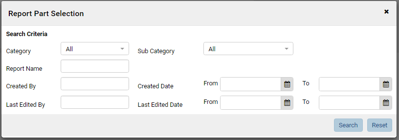
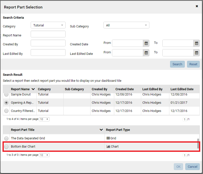
Remember, Dashboards do not have their own report parts. Instead, they “borrow” them from previously created reports. When you add a report part to the Dashboard Tile, you’re given a prompt to select your Report Part. To do this, you will first have to select the report by filling out the presented criteria. If you click Search without filling out the criteria, all reports that you have access to will appear.
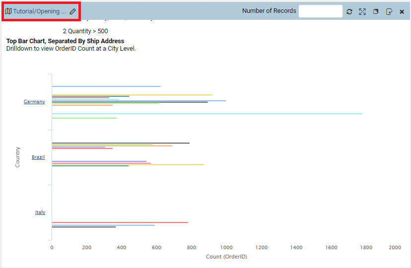
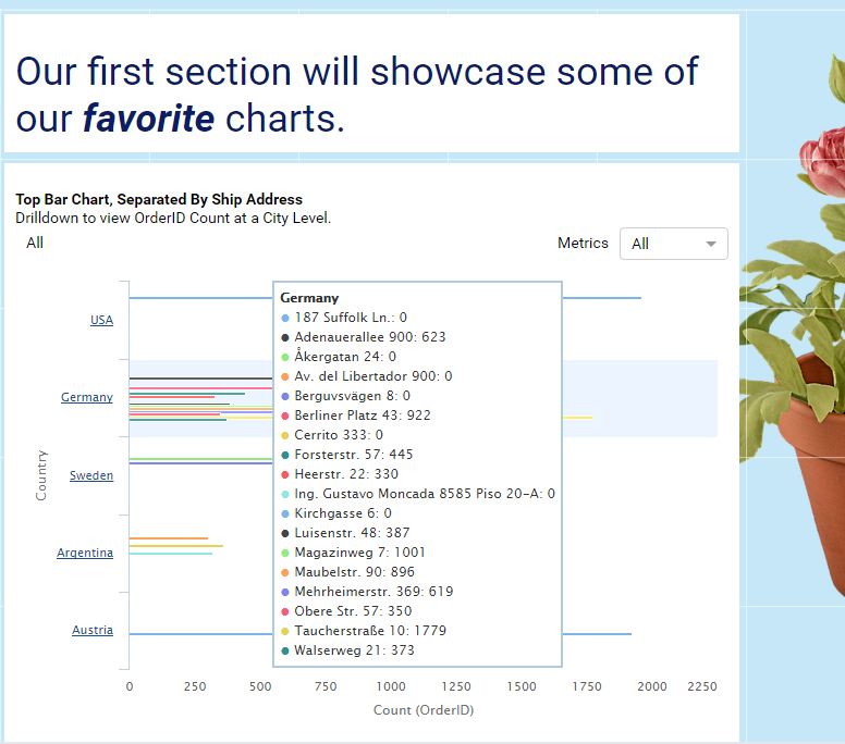
Since we created a report in the Category Tutorial, let’s search for that. Once we find and select our report, we are presented with a list of Report Parts that are found in the Report. Since we cleverly named our Report Parts in a previous tutorial, we can easily locate the Report Part we wish to add. Let’s add Bottom Bar Chart.
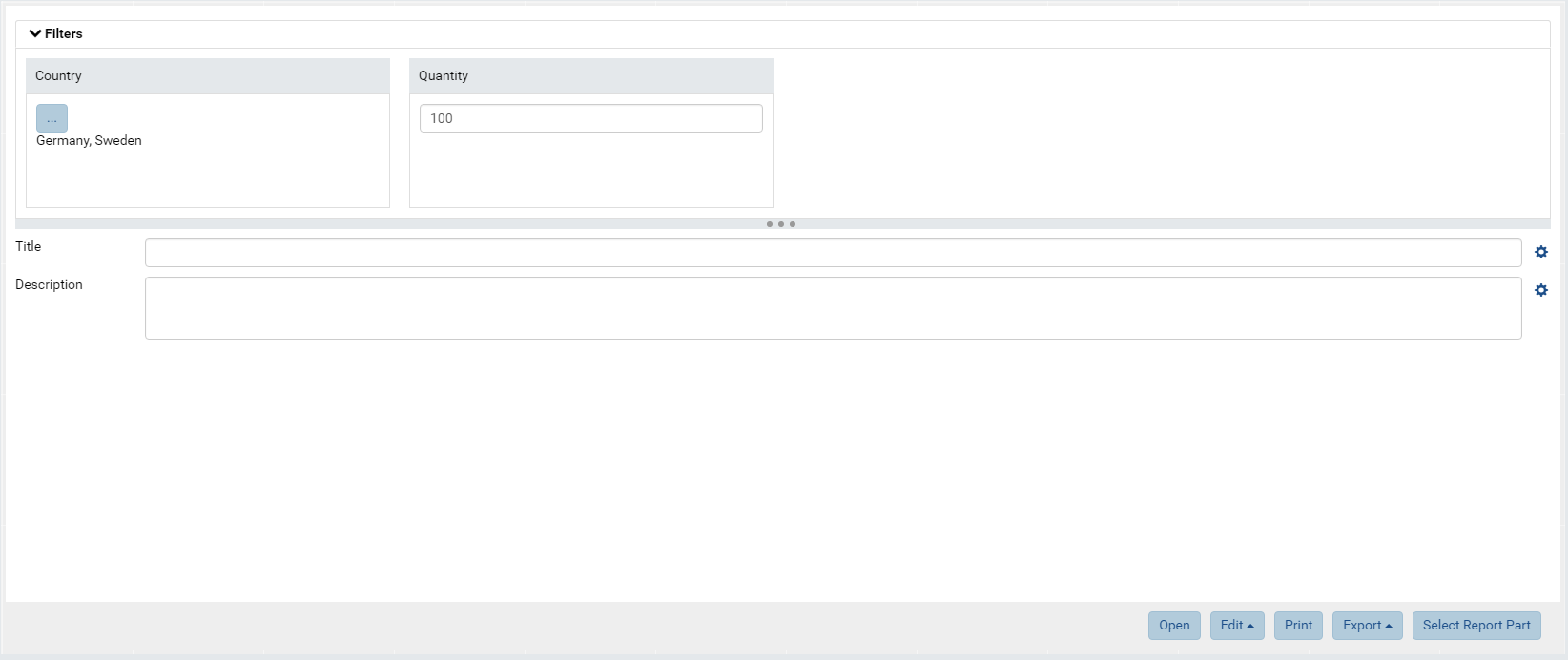
When the Report Part is added to the Dashboard Tile, the Filter information is automatically generated and placed in our Filters panel. To apply the filters, select your desired values and press the Update Results button just as you would in a Report. For more information see: Dashboard Filters
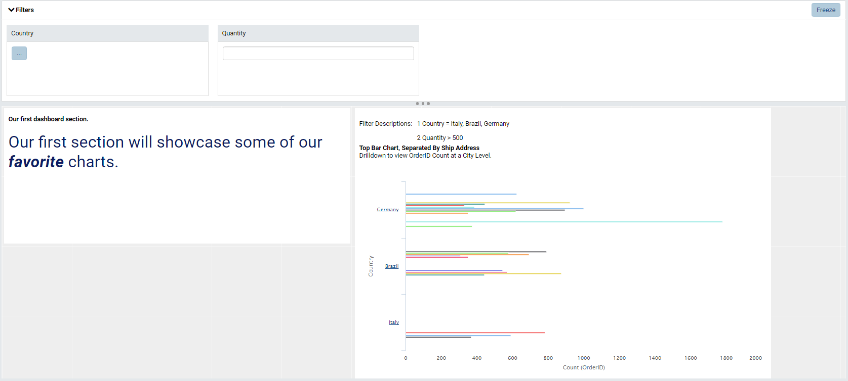
If you recall, we applied a JavaScript Action on Country labels during our report design which made them clickable. Try clicking on a Country label and we’ll see that our JavaScript still works! In fact, all Report Part functionality works. If we click on a bar in the chart, we can view the drilldowns we previously created. Likewise, we can return to a higher drilldown layer by following the familiar breadcrumb structure introduced in Reports.
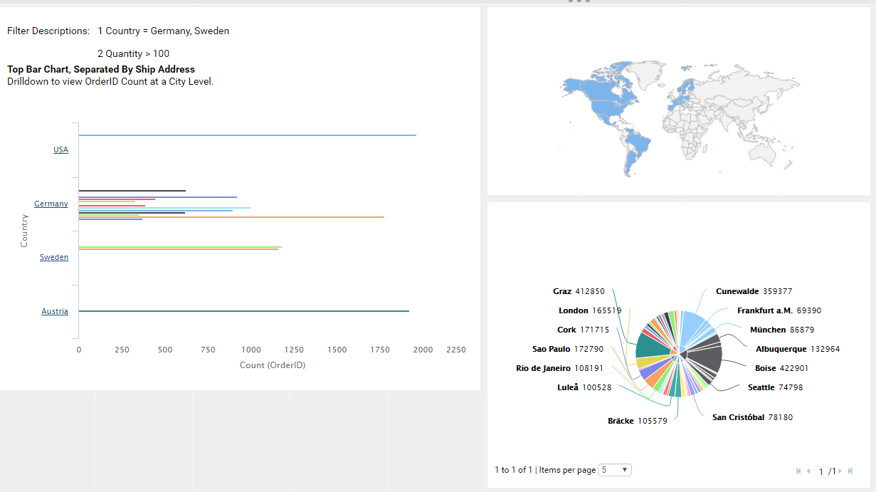
Initially, our filters default to the filtering applied at Report Level. If we modify our filters in the Filter Panel of the Dashboard, the filters are applied to the entire Dashboard. Let’s filter on the Countries Germany and Sweden with a Quantity > 100.
Adding More Report Sources
To add additional report sources, follow the same process from above. Thus far in this tutorial series, we’ve only created one report with three report parts. While we could create a dashboard with all of these report parts, the references would be redundant since a user could simply view the report. For the sake of demonstration, I will add report parts from reports not created in this tutorial series thus far. Hopefully, you’ve had a chance to explore the platform on your own. Please add your own report parts to the dashboard to experience the full functionality.
Modifying Filters With Multiple Reports
Once our reports parts are added to our tiles, you may be in for a bit of surprise—the filters we set earlier may be missing from the Filter Panel! If you look at our Dashboard Tile, however, our filter is still applied.
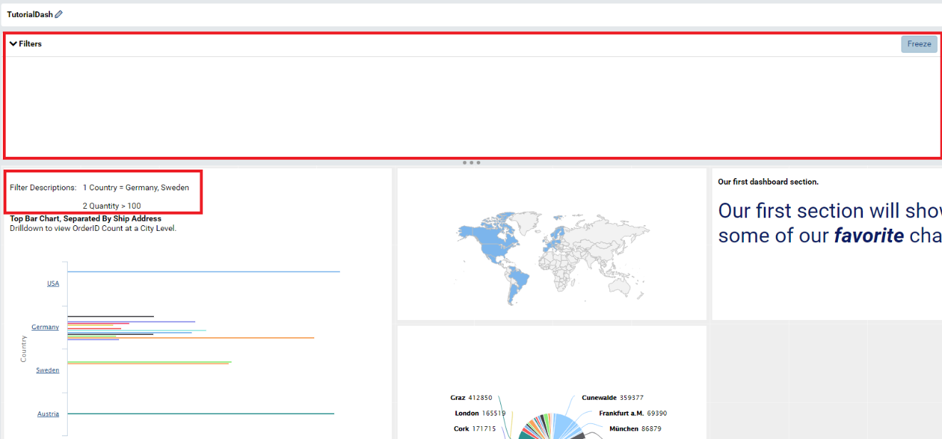
Since filters in the Dashboard’s Filter Panel apply to all tiles on the dashboard, filters that don’t apply to all tiles on the dashboard are removed from the Filters Panel. In order for a filter to appear in the Filter Panel, the filter must be present in all of the report parts used in the dashboard, must be on the same field in the same data source and must have the same filter operator.
In order to modify filters of non-matching data, we must flip the tile to Configuration Mode because the filter only applies to that tile. Let’s flip our “Bottom Bar Chart” tile to Configuration Mode.
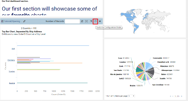
Once the tile is in Configuration Mode, we will be presented with the options to modify our tile-specific filters. Likewise, we will have the option to provide a title and a description to the tile that will appear at the top of the tile when the tile is returned to Preview Mode.
(Please note that if a filter on a Report Part is marked as Required, then the a filter value must be provided prior to saving the Dashboard or clicking Update Results.)
Let’s modify our Country filter to include Argentina.
Dashboard Design
Background and Branding
Now that we have a dashboard fleshed out with functionality, we can now
start to unify it’s look and feel. To edit the Dashboard’s background
color or to add a background image, click the Edit button at the top of
the page.
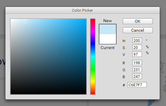
Let’s change the background color to a pale blue. Select Set
Background Color from the Edit dropdown and use the color selector to
create a pale blue color.
Let’s now add a background image. We support images that have transparent backgrounds as well as solid-filled images. Simply add your URL to the image and it will be referenced. For this example, let’s use the free-to-use image located at https://cdn.pixabay.com/photo/2015/12/16/19/16/png-1096410_960_720.png .
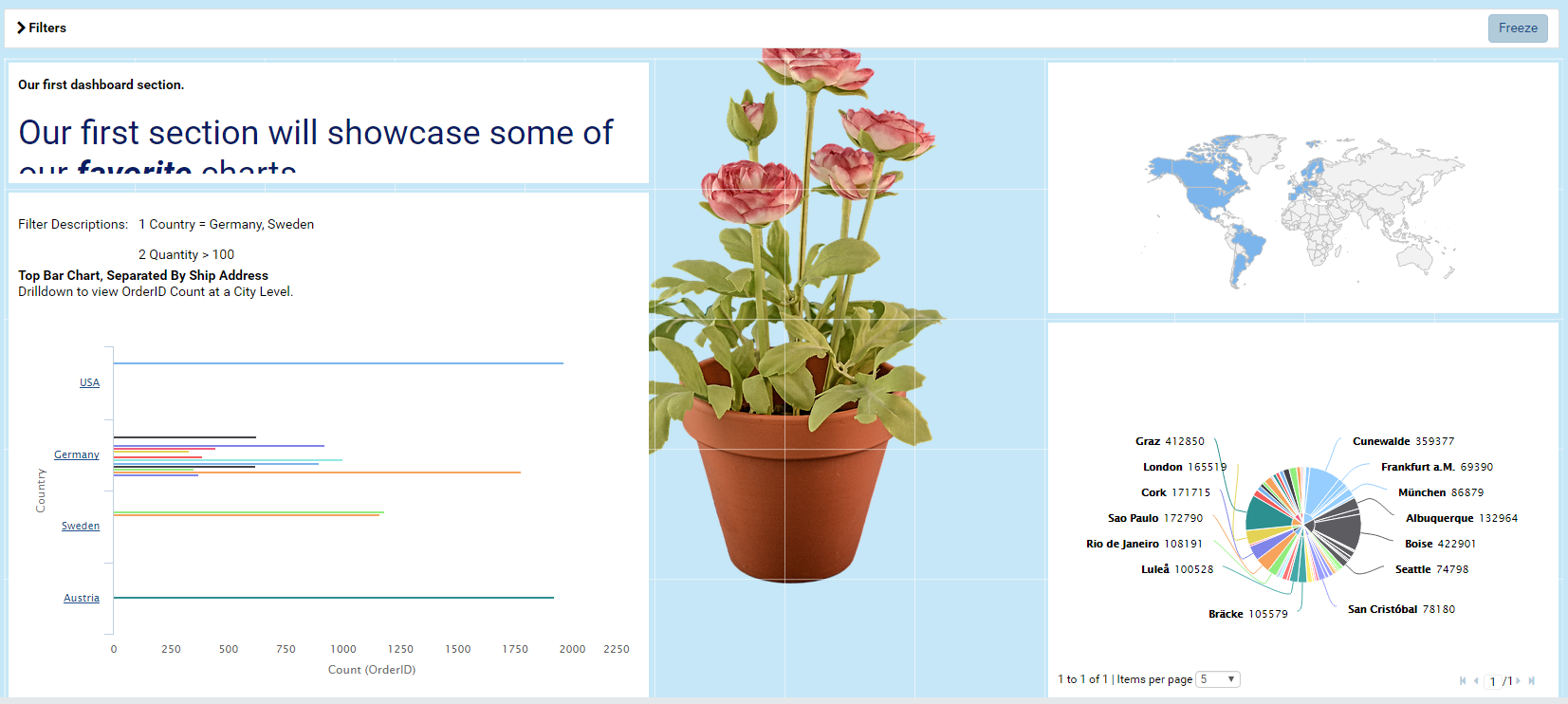
Background images are particularly useful to watermark your dashboard with our company’s logo.
Hiding Filter Descriptions
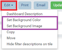
If we examine our “Bottom Bar Chart” tile, we’ll notice the large Filter Descriptions text added to the top of the tile. While these values are certainly useful for exporting and printing, it may not be the most visual appealing option for Presentation Mode. Let’s disable filter descriptions on tiles by going to Edit -> Hide filter descriptions on tile. To enable filter descriptions, you would go to Edit->Show filter descriptions on tile.
Setting Query Record Limits in the Dashboard
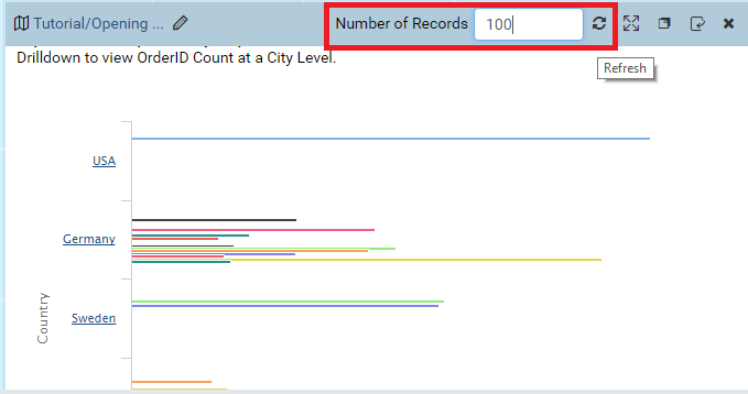
Recall in Reports that you can set Preview Records limit to minimize query latency or to focus in on larger data sets. By default, each Dashboard Tile inherits the query limit defined in the report’s definition. Likewise, query limits can be redefined and saved in the Dashboard per Dashboard Tile. In order to change a Dashboard Tile’s query limit, hover over the top of the “Bottom Bar Chart” tile until we see the blue tile configuration bar. On the configuration bar, locate the Number of Records text box. Let’s type in a value of 100 and press the refresh button beside the text box to refresh the report part.
Using Dashboards as A Visual Report Hub
While the report viewer is a phenomenal tool to locate your reports, it’s impossible to see any trends in our data by the report’s metadata. Therefore, we may never open a report to view its contents simply because we aren’t aware that it’s useful. Good Dashboard design allows us to take the most useful visualizations from several reports and place them in one location. If a user wishes to view the original report a report part originated from, he or she just needs to highlight over the top of the Dashboard Tile and click on the Dashboard Tile Name in the upper left-hand corner. Let’s save our dashboard and then click on our “Bottom Bar Chart” Tile Name to open its report. Notice that filter values from Dashboards do not transfer to an opened report. If you move from a dashboard to a report, ensure that you are looking at the correct data by setting your filters in the Report.